Page Summary
-
A dialog is a modal window that requires immediate user response to task information.
-
Dialogs can be alerts, selection, or confirmation dialogs, and retain focus until dismissed or acted upon.
-
Due to their interruptive nature, dialogs should be used sparingly.
-
Dialogs are distinct from toasts in purpose and priority; dialogs require user interaction and have high priority, while toasts are informative and low priority.
-
Dialogs contain informational text and UI controls and are made up of a dialog background, card header, content area, and card action area.
-
OEMs can customize dialogs through fonts, button styling, and button dimensions and placements.
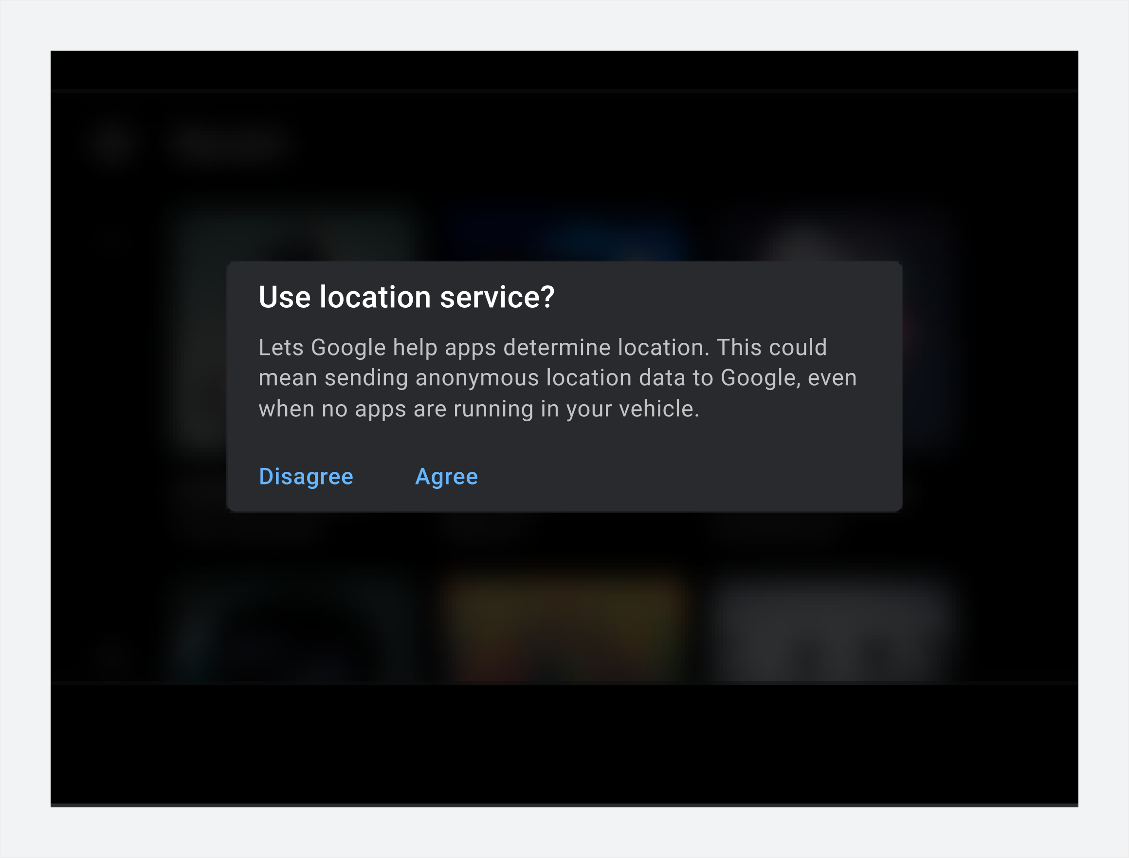
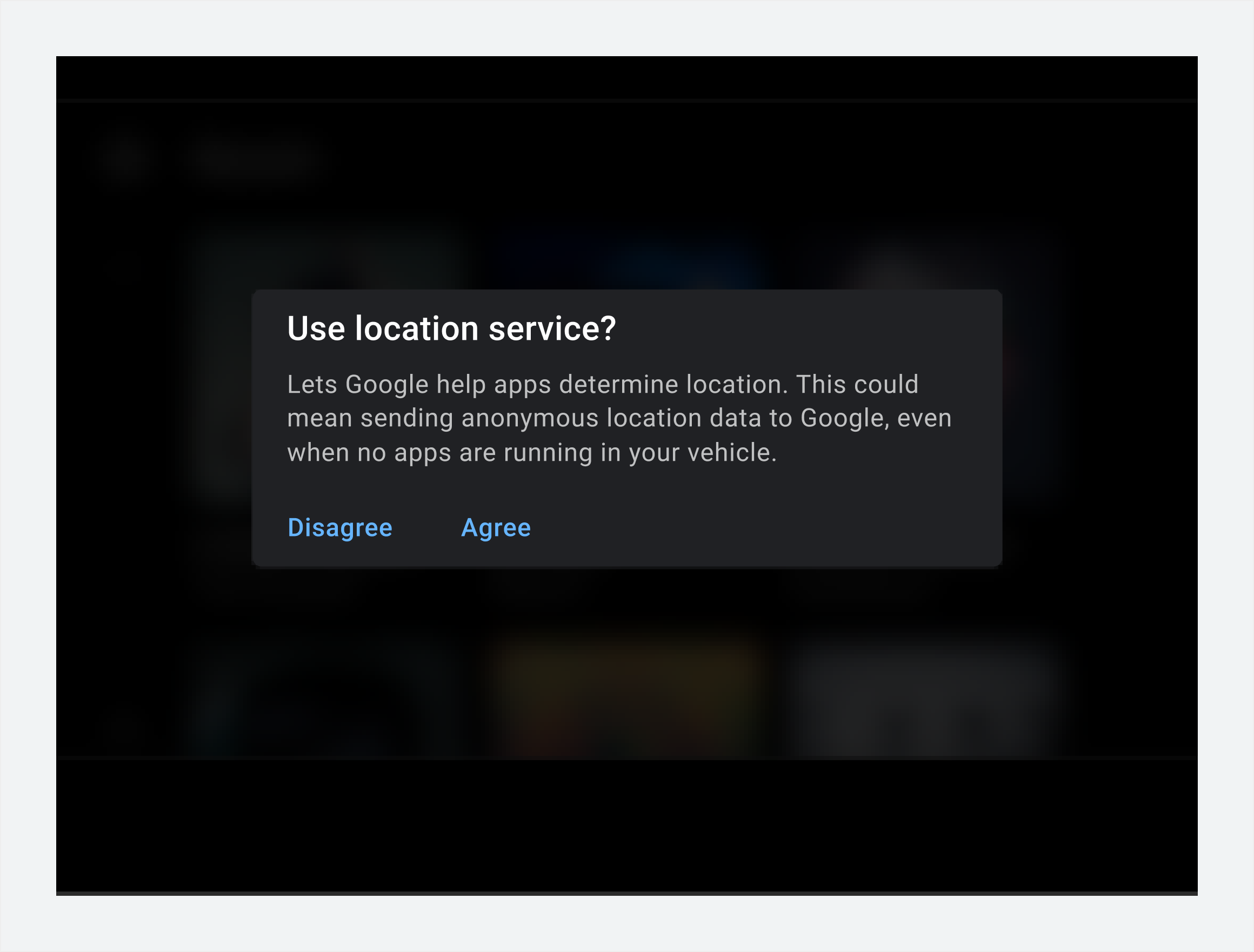
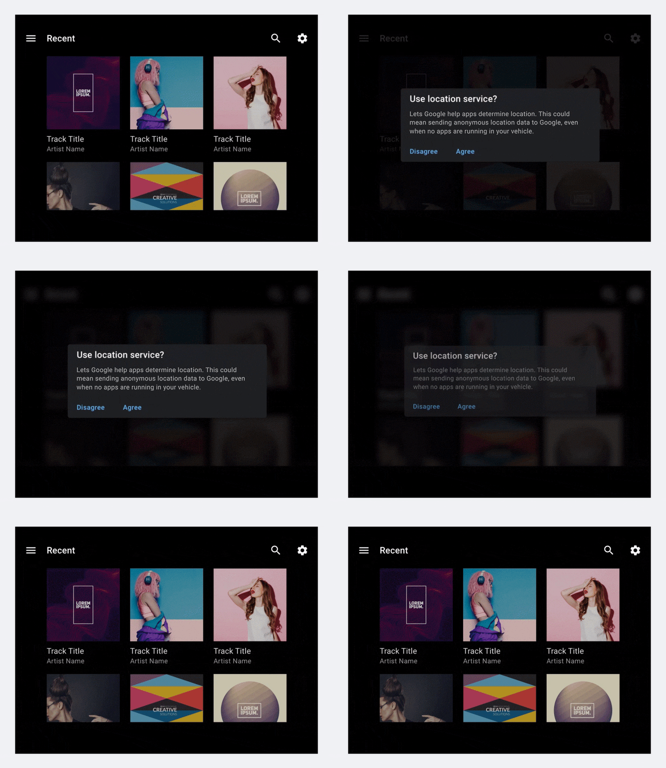
A dialog is a modal window that appears in front of an app to display task information that requires an immediate user response.
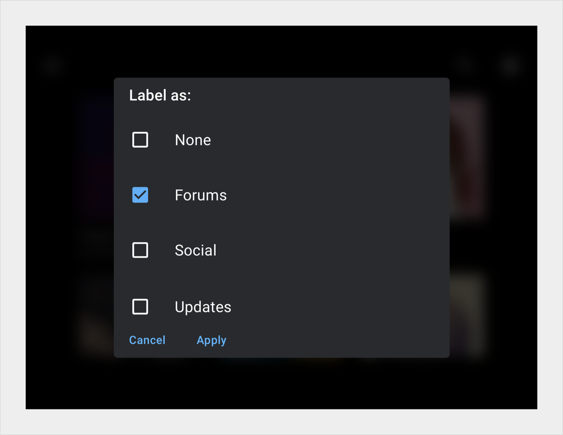
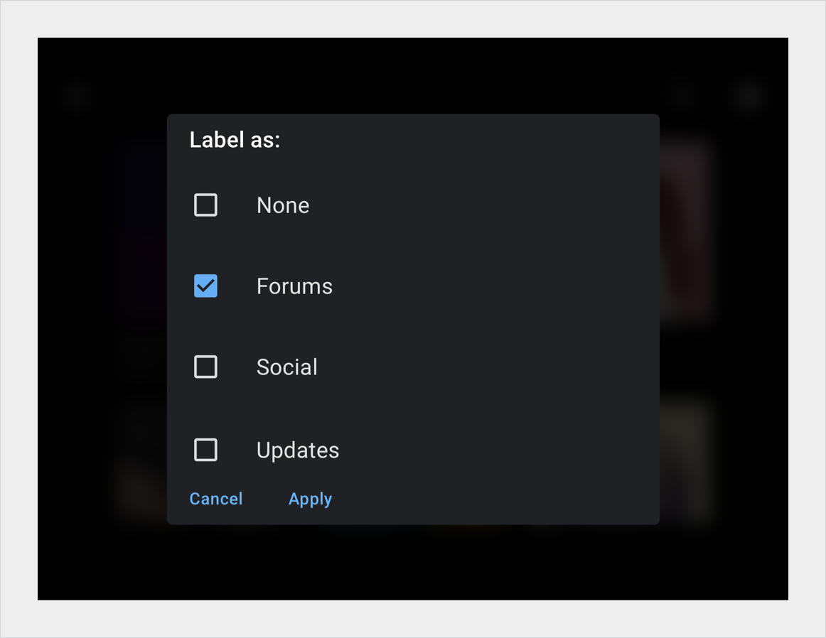
A dialog can be an alert, which requires user interaction. It can also be a selection or confirmation dialog, which requires a user to make or confirm a choice. The dialog retains focus until it’s dismissed or the required action is taken. Because dialogs are interruptive, they should be used sparingly.
Dialogs are related to toasts (both are members of the Dialog family of components), but they differ in purpose and priority, as shown below.
| Component | Purpose | Priority |
| Toasts | Displays an informative message. Doesn’t require user interaction. Disappears after 8 seconds. | Low |
| Dialog | Displays information and task options that require user interaction. A dialog retains focus until a user responds. | High |
Anatomy
Dialogs contain informational text and UI controls that request a user response.
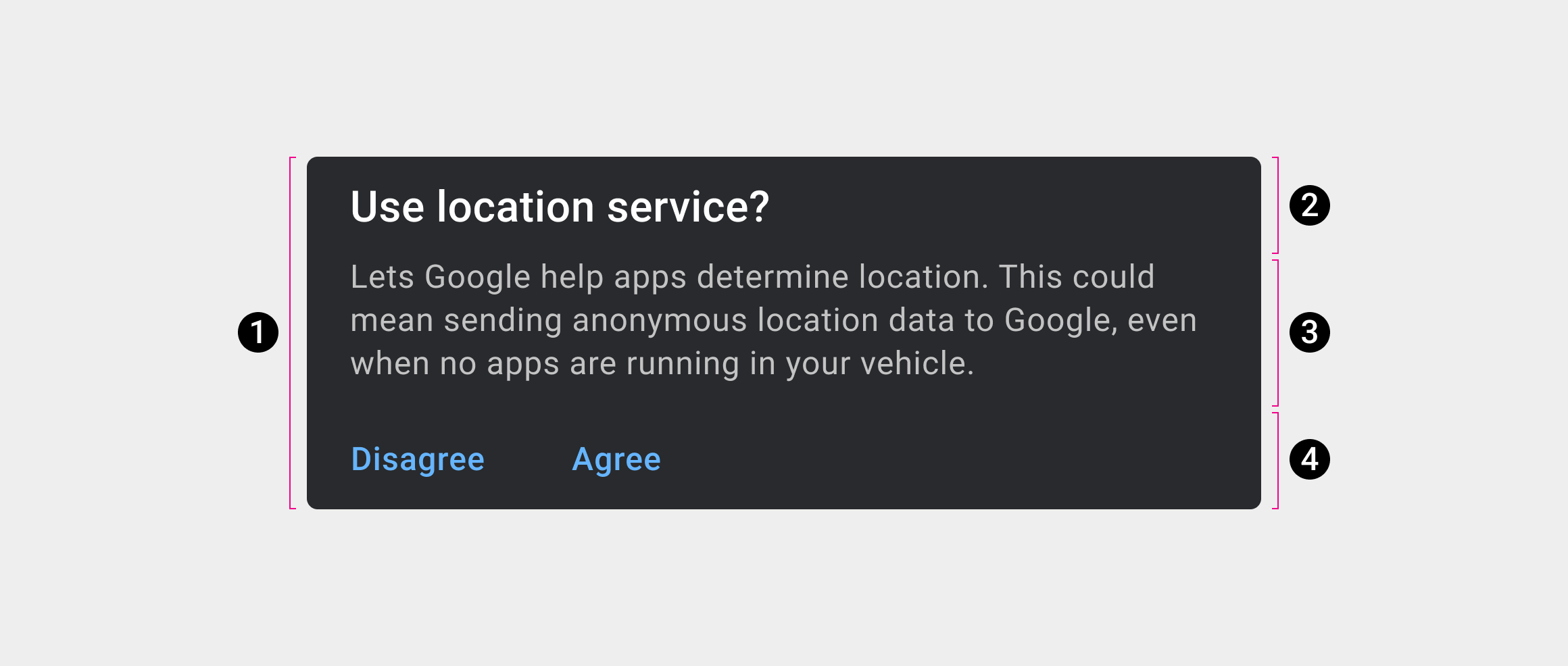
2. Card header
3. Content area
4. Card action area
Specs
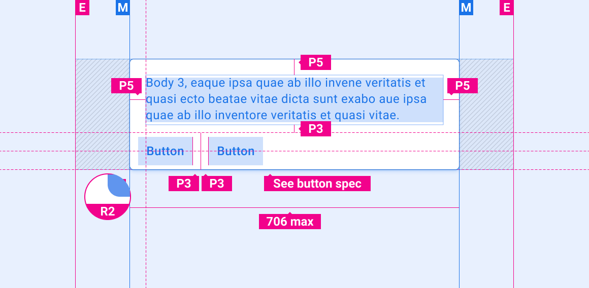
Dialog without title
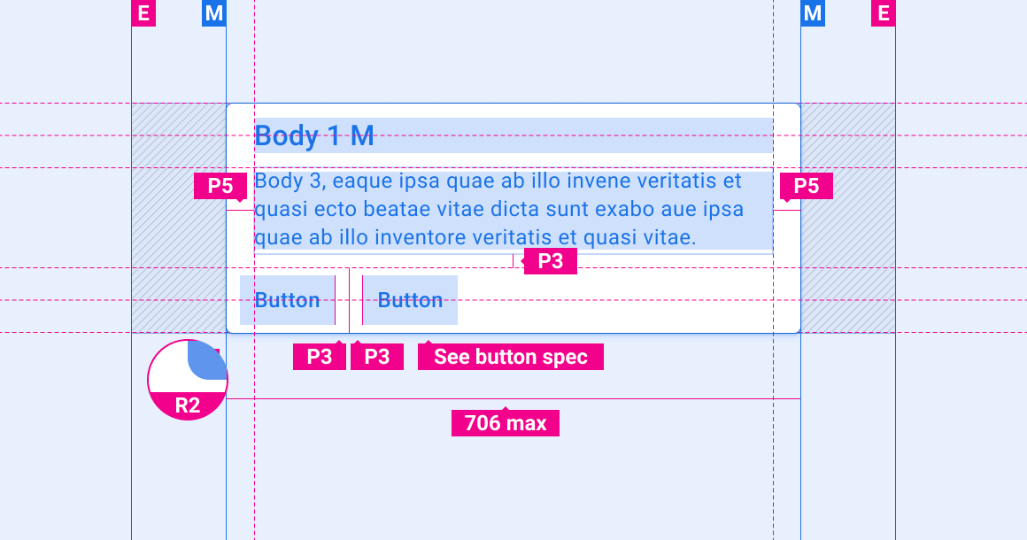
Dialog with title
Dialog with centered title
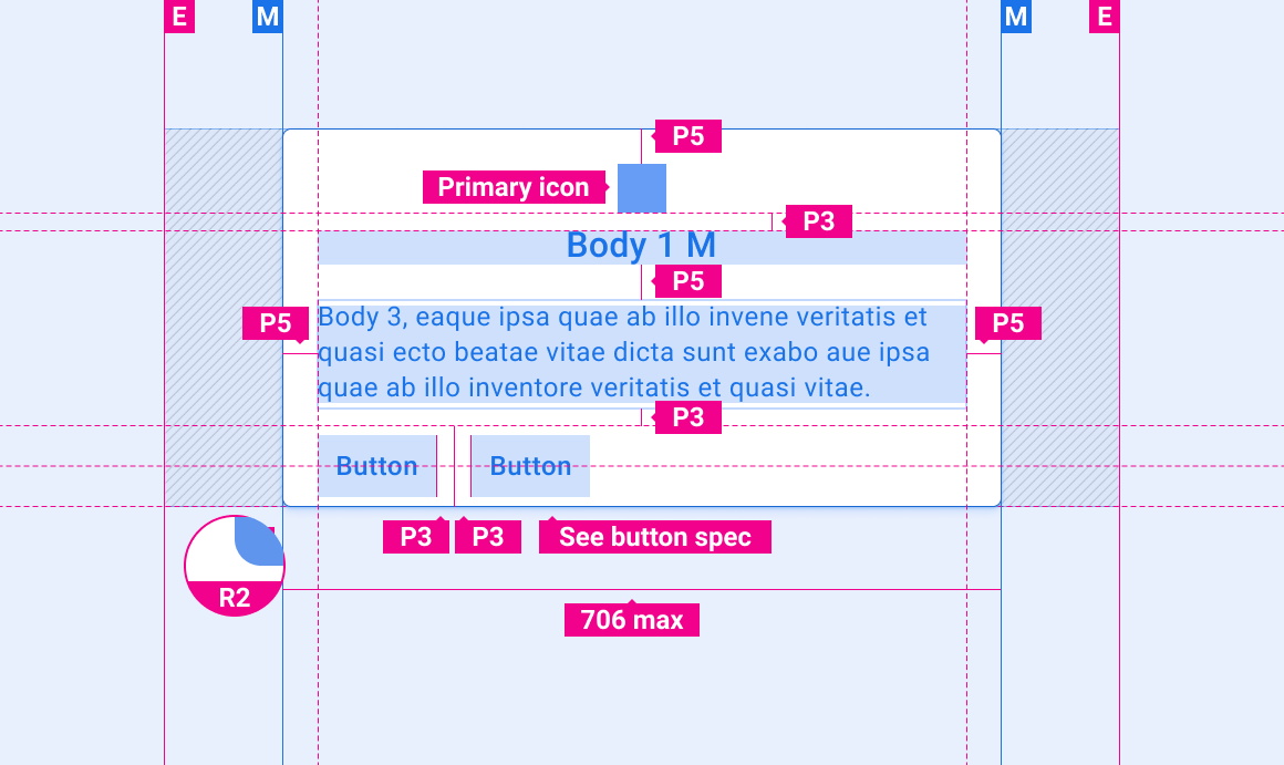
Scrollable dialog
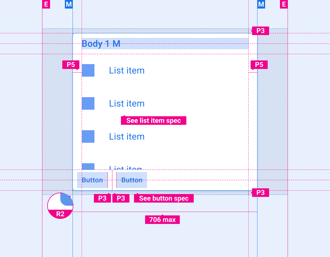
Customization
OEMs can reflect their brand by customizing the following aspects of dialogs:
- Fonts
- Styling of active, inactive, and disabled buttons
- Button dimensions and placements
Design system provides guidance for customizing components using layout, color, typography, and sizing.
Examples
