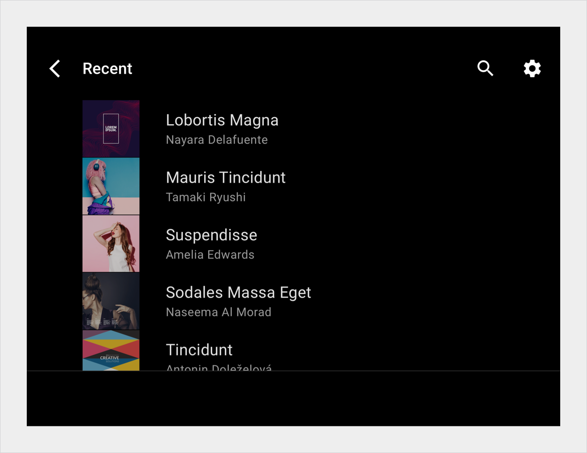
Page Summary
-
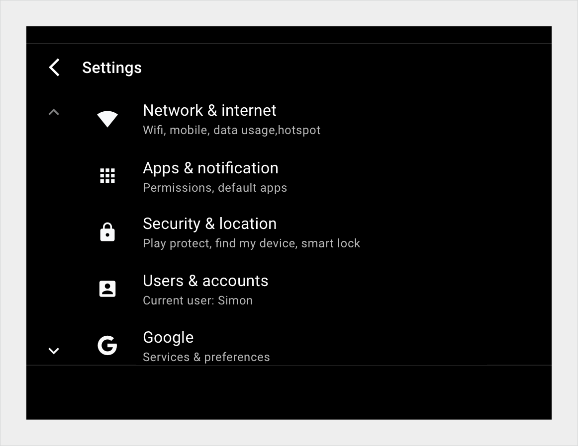
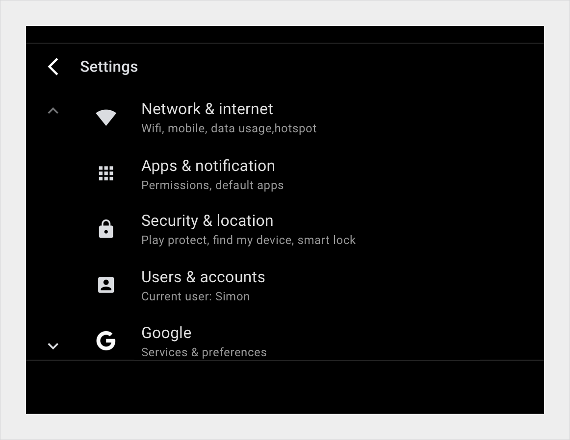
A list view displays content as vertically scrolling line items, ideal for presenting text and data.
-
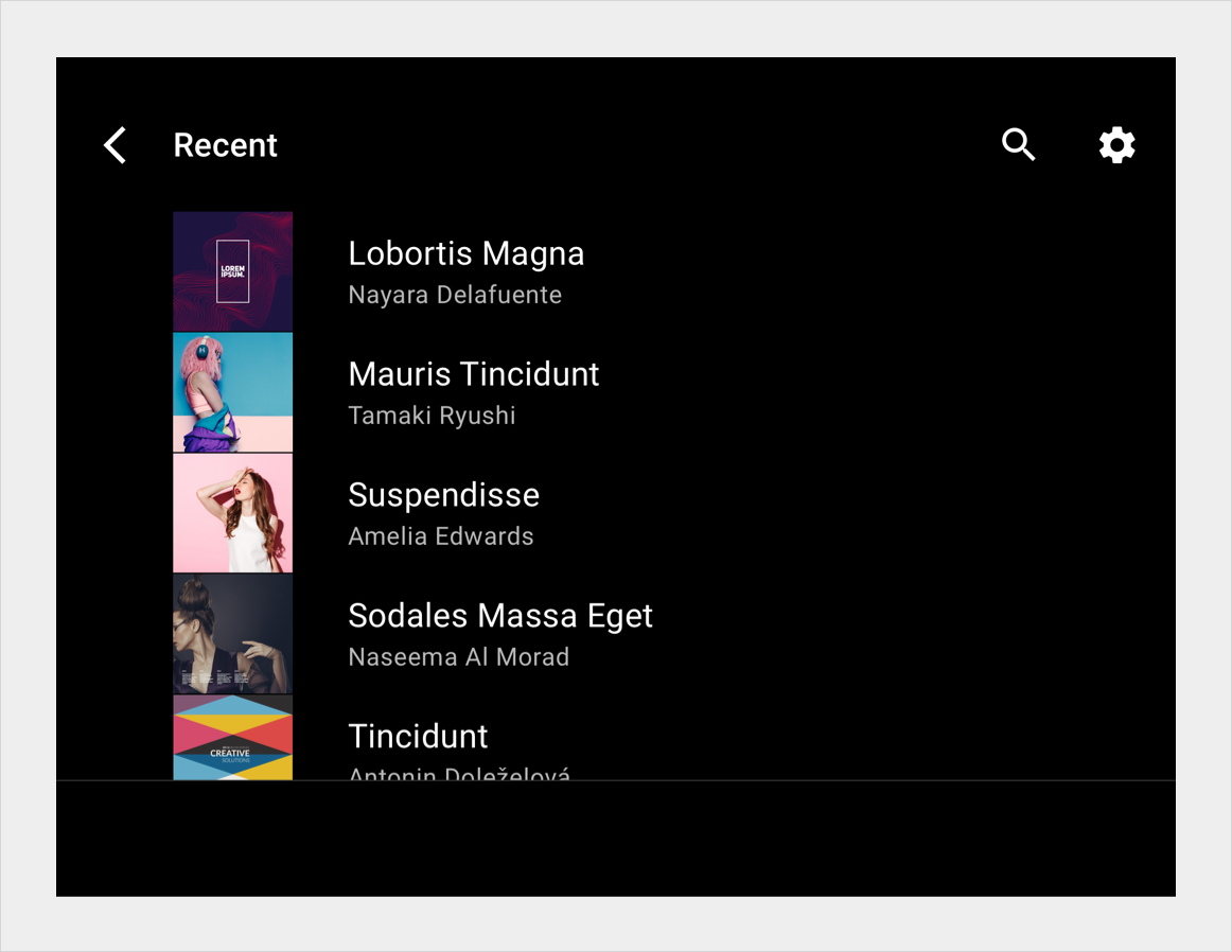
Each row in a list view contains a tile representing a list item, where primary actions can fill the entire tile.
-
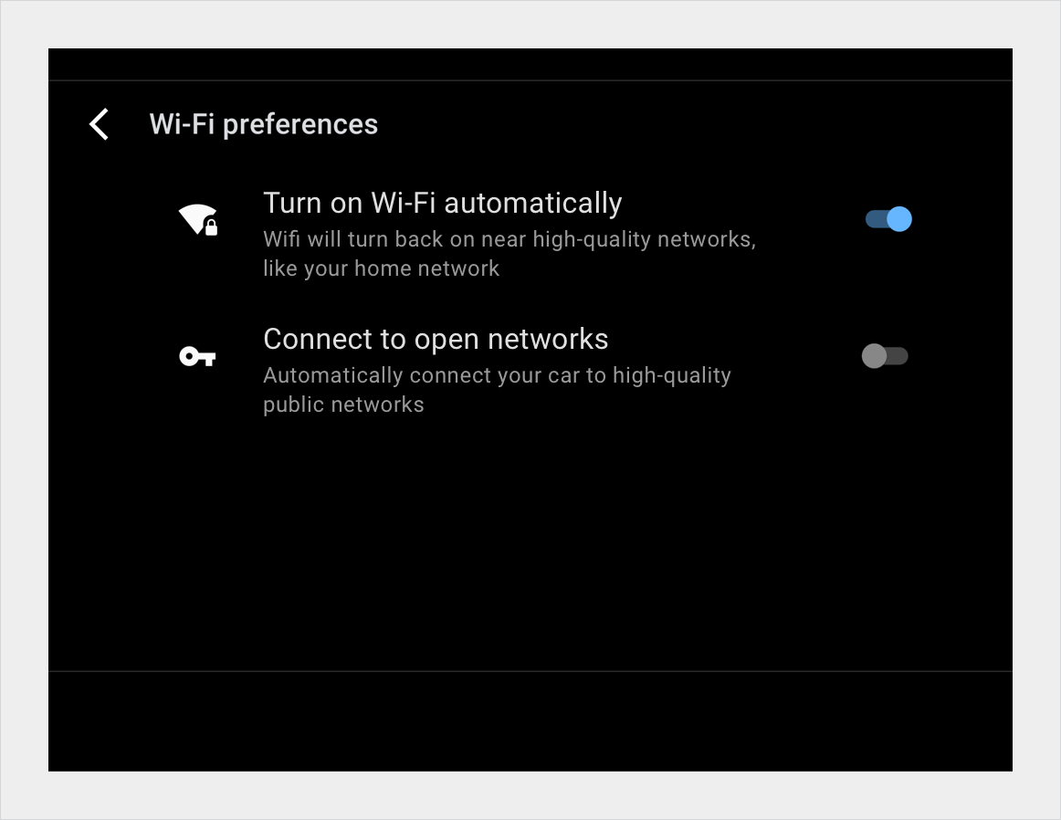
The anatomy of a list item includes primary icons, switcher buttons, text, and a content tile.
-
Various specifications cover single-line, multi-line, and split-action list items.
-
List layouts can scale to accommodate different screen widths and heights.
A list view displays content as line items in a single-column list that scrolls vertically. This view is best when users rely on reading text and viewing data to make their selection.
List items require less vertical space than grid items, allowing more items to be displayed on the screen.
Anatomy
In a list view, each row contains a tile representing one list item. Primary actions can fill the tile, so that users can initiate action from anywhere in the tile. For supplemental actions that are represented by icons and text, only the region containing the icons and text is actionable.
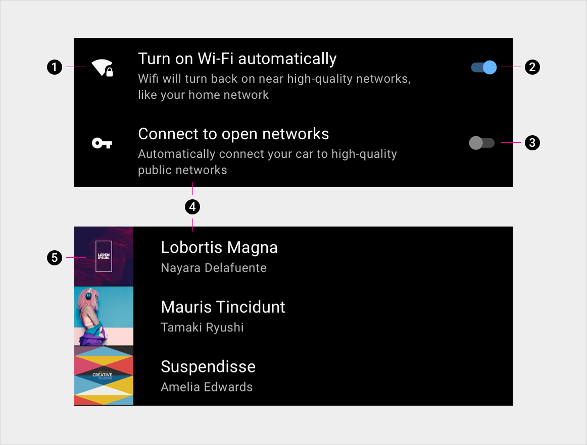
2. Switcher button on
3. Switcher button off
4. Primary and secondary text
5. Content tile
Specs
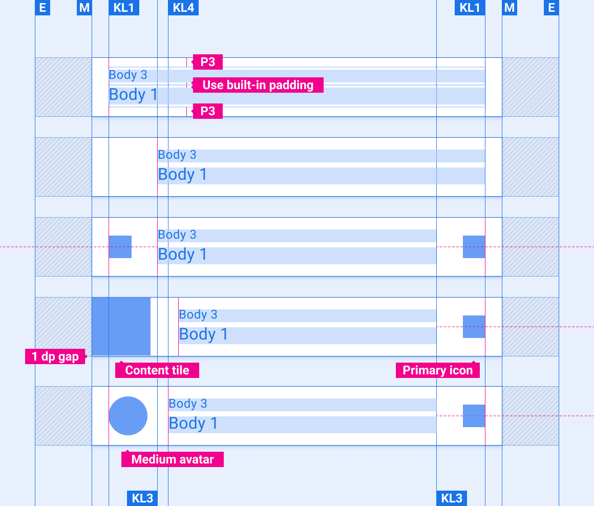
Single-line list item
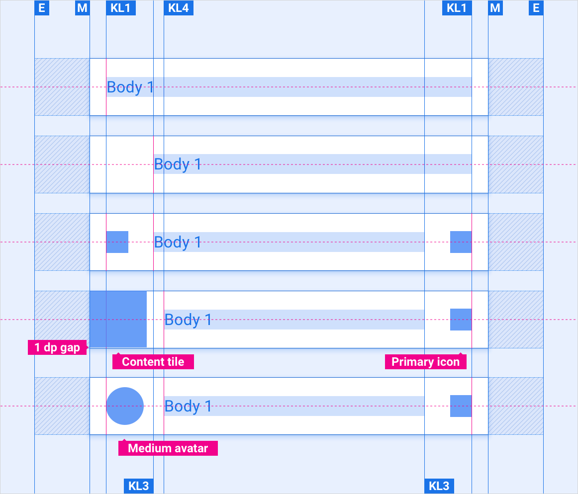
Two-line list item
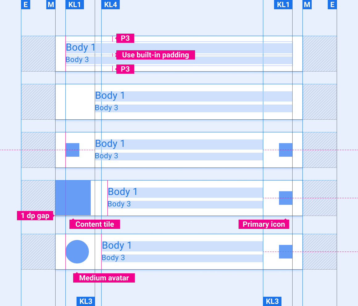
Two-line list item reversed
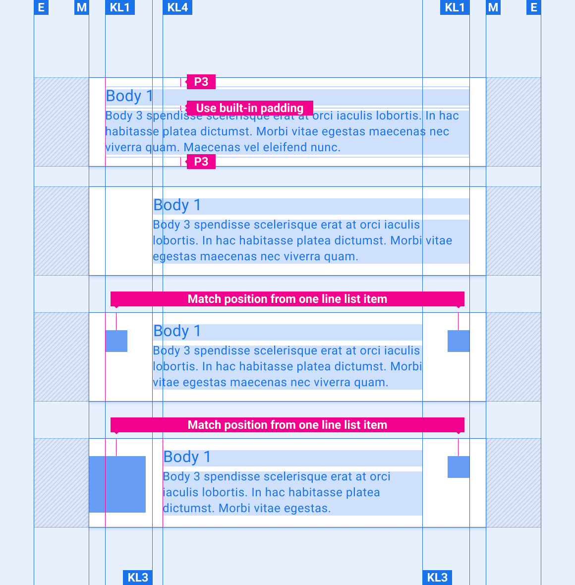
Multiple-line list item with header
Multiple-line list item without header
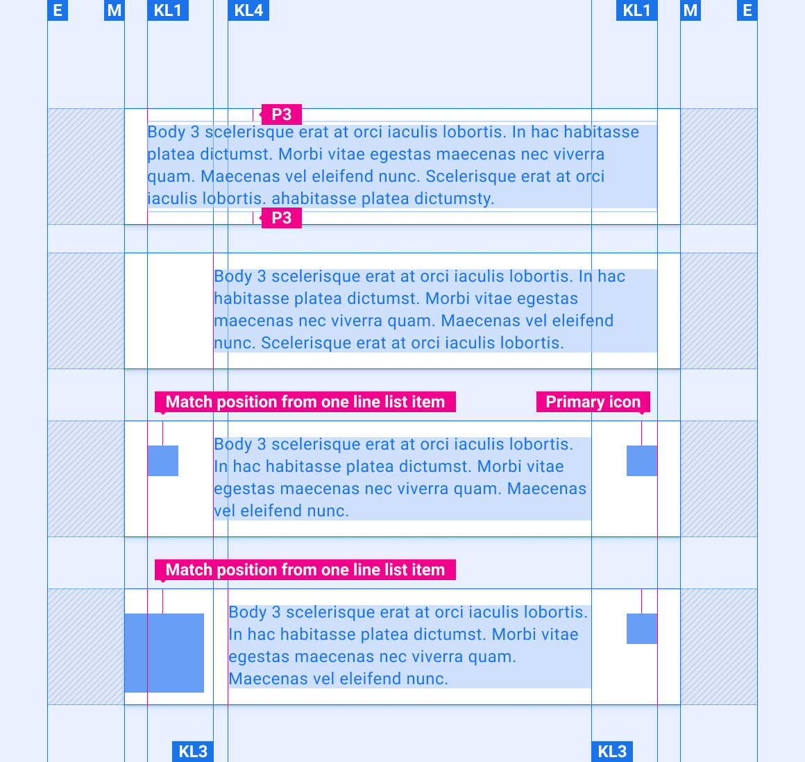
List item with text overflow

List item with split actions
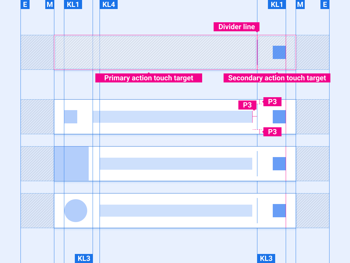
Indicator icon placement in list items
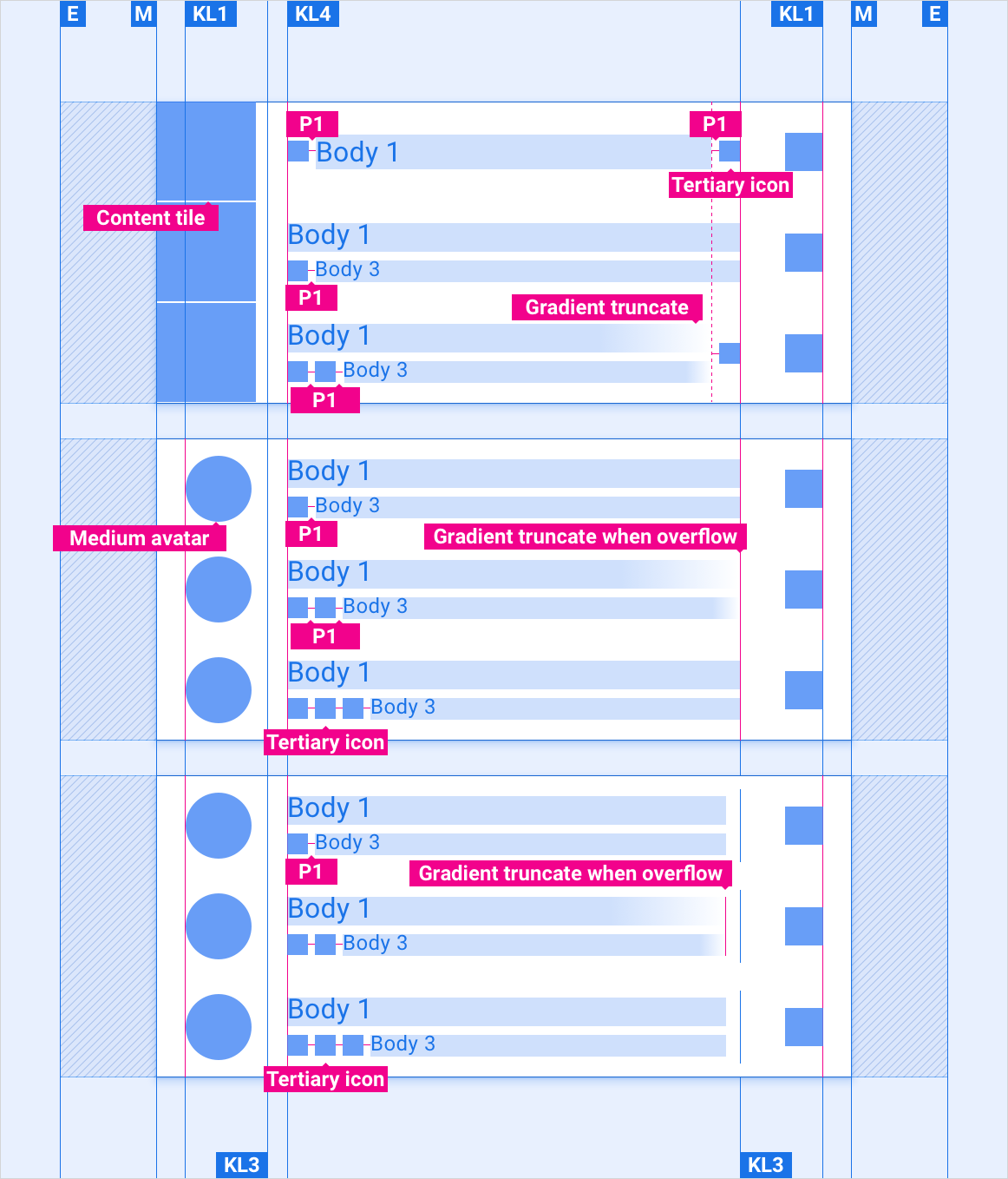
Scaling layouts
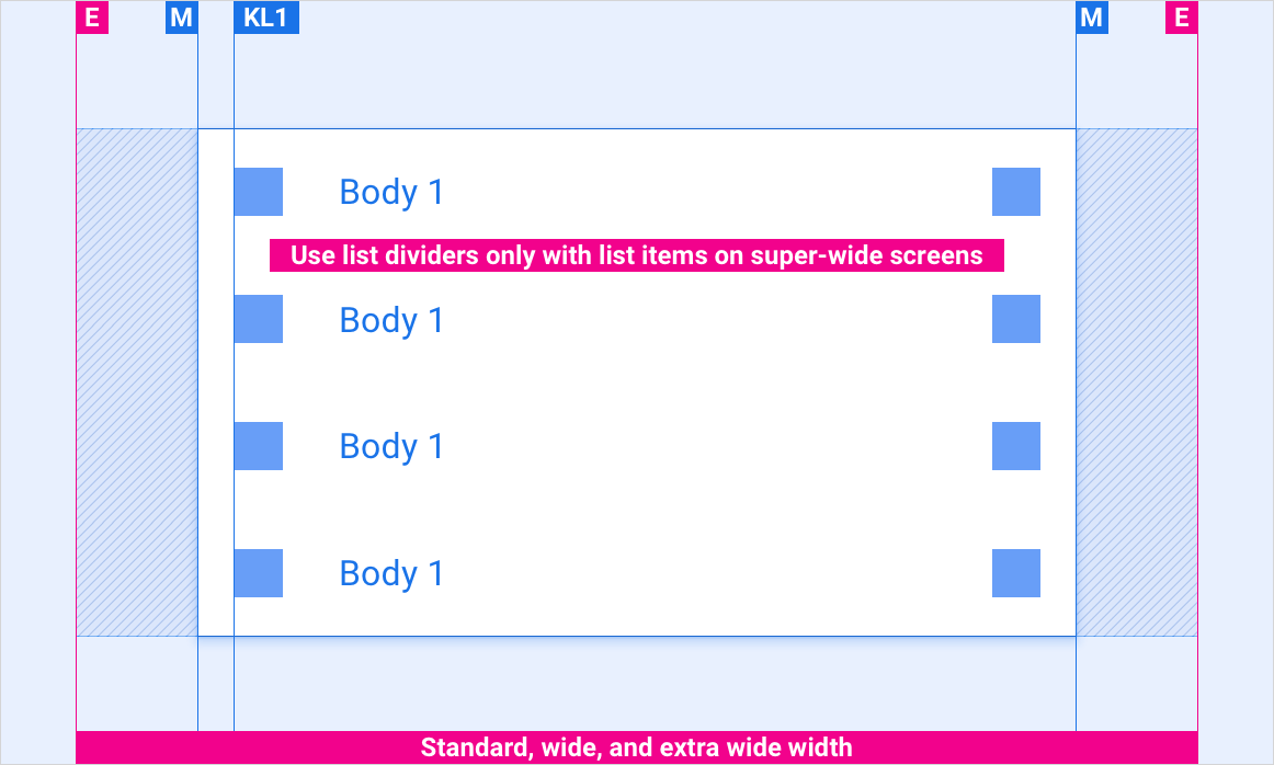
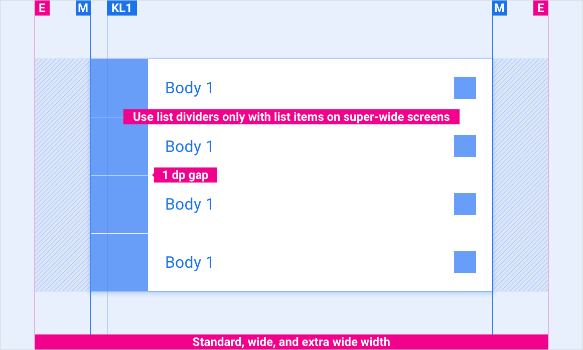
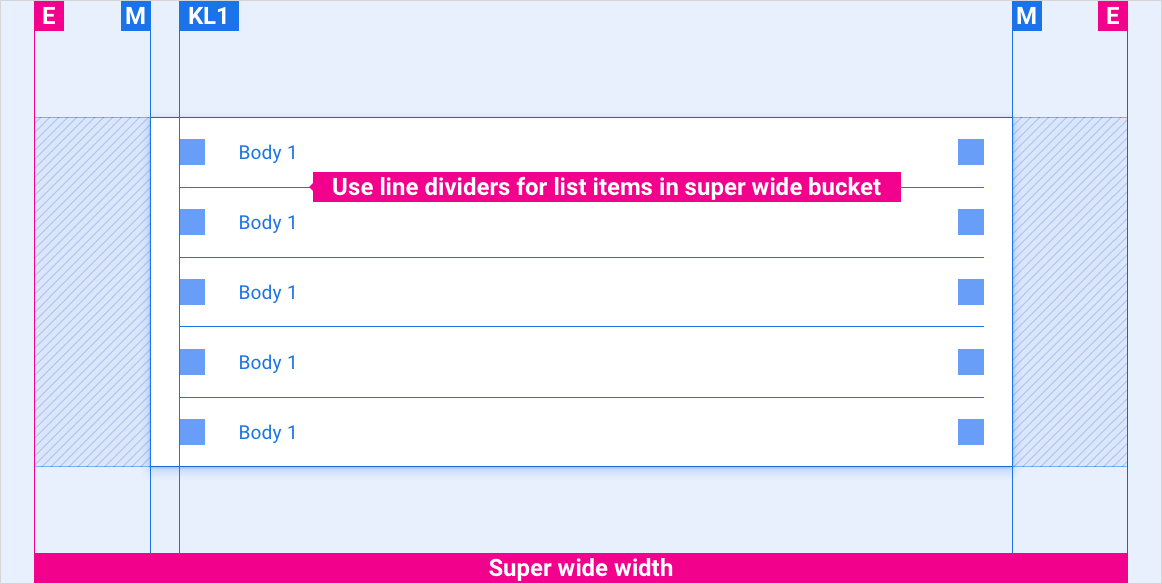
These reference layouts show how to adapt list items to accommodate screens of various widths and heights. (Width and height categories are defined in the Layout section.) Note that all pixel values are in rendered pixels, before any down-sampling or up-sampling occurs.
Standard, wide, and extra-wide screens
Standard, wide, and extra-wide screens with content tile
Super-wide screens
Styles
Typography
| Type style | Typeface | Weight | Size (dp) |
|---|---|---|---|
| Body 1 | Roboto | Regular | 32 |
| Body 3 | Roboto | Regular | 24 |
Color
| Element | Color(day mode) | Color (night mode) |
|---|---|---|
| Primary type / icons | White | White @ 88% |
| Secondary type / icons | White @ 72% | White @ 60% |
| Divider line | White @ 22% | White @ 12% |
| List item background | Black | Black |
Sizing
| Element | Size (dp) |
|---|---|
| List item height | 96 (short screens) / 116 (standard screen) / 128 (tall screen) |
| Primary icon | 44 |
| Tertiary icon | 24 |
| Content tile | List item height minus 1dp |
| Medium avatar | 76 |
| Divider line thickness | 1 |
Examples
