Page Summary
-
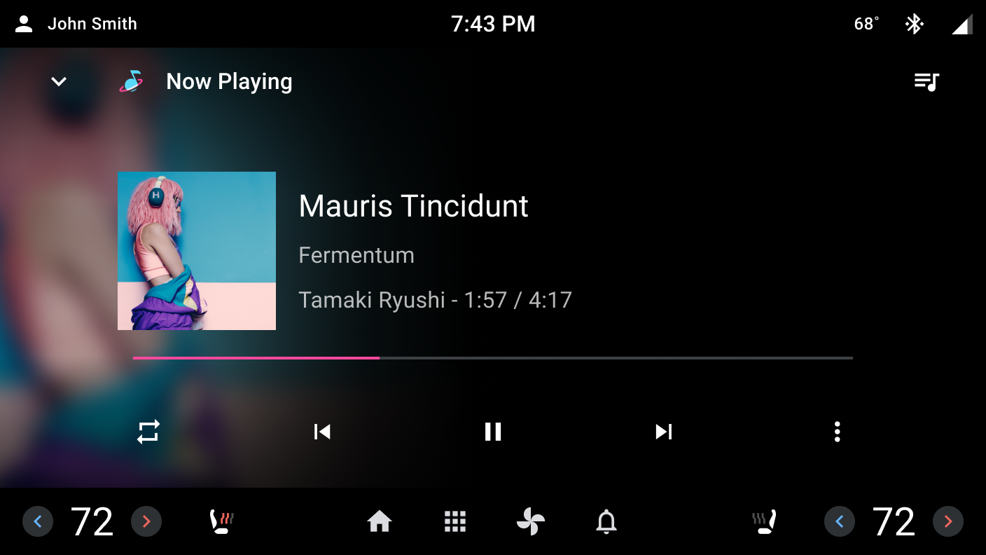
The media progress indicator visually represents media duration and elapsed time during playback in media apps.
-
It consists of an inactive track representing duration and an active track indicating elapsed playing time.
-
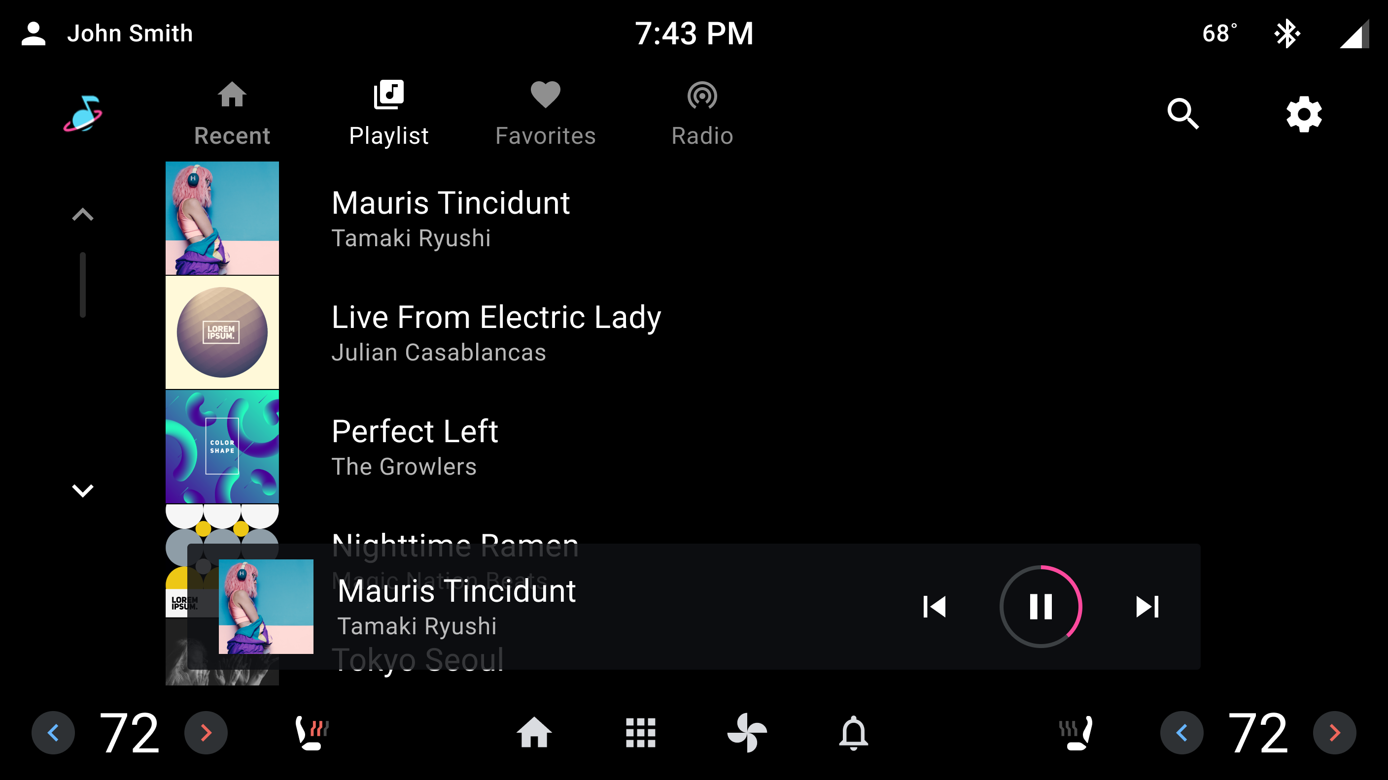
The indicator can be either linear, for taller screens and supporting seeking, or circular, for shorter screens or minimized controls without seeking support.
-
It has four states: Playing, Paused, Buffering, and Error.
-
The active track's accent color can be customized by app developers or OEMs.
The media progress indicator component is unique to media apps.
The progress indicator is a visual representation of the duration and elapsed playing time for a media source. It appears in media apps during playback.
Anatomy
The media progress indicator consists of an inactive track (displayed in gray) that represents the duration of the media source, and an active track (displayed with an accent color) that overlays the inactive track to indicate elapsed playing time.
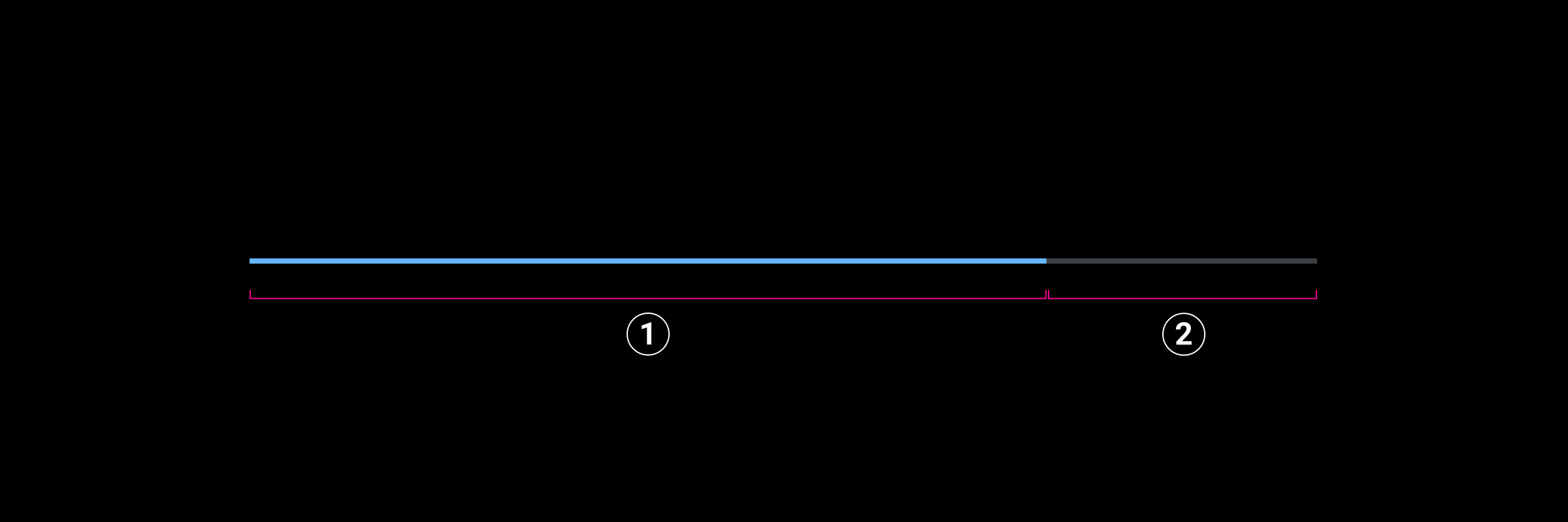
2. Inactive track
The media progress indicator can be linear or circular.

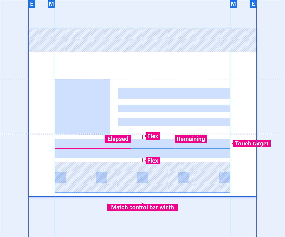
The linear progress indicator displays duration and elapsed time on a horizontal axis. The visible portion of the track is centered in a 76dp touch-target area. Tapping or dragging the elapsed time allows a user to move to different locations in the media source. The linear media progress indicator is intended for screens 800dp or taller.
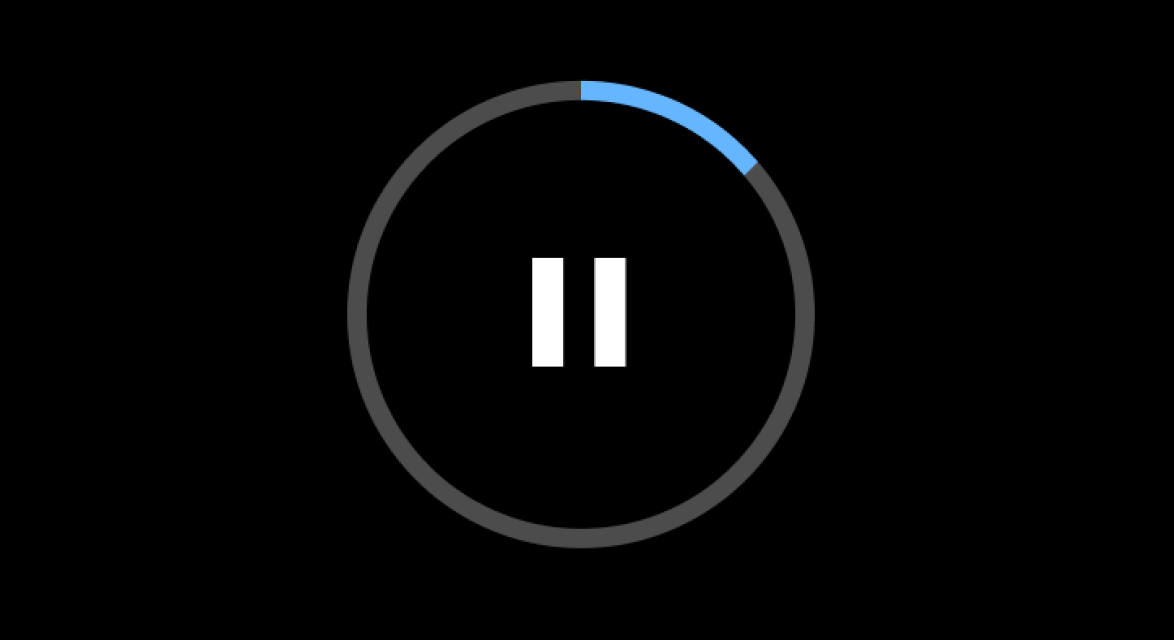
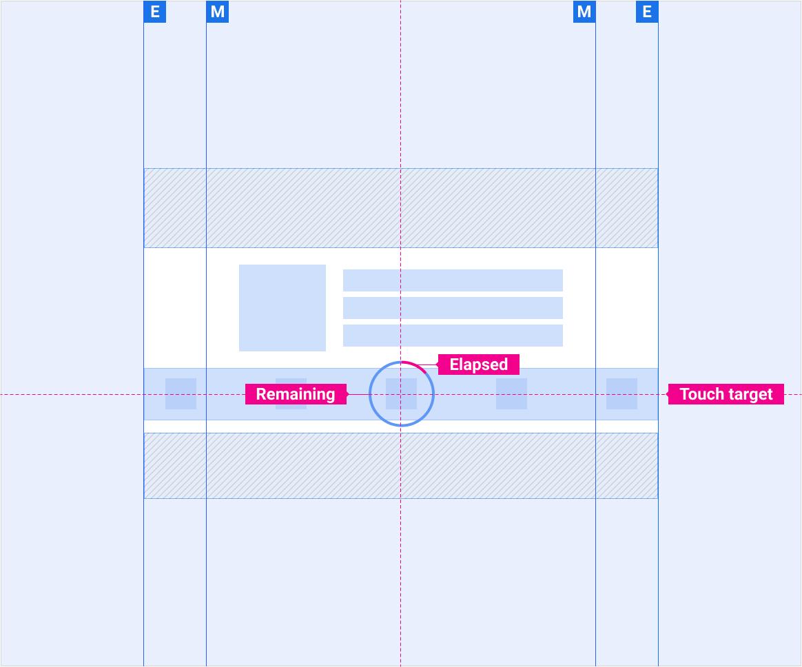
The circular progress indicator displays duration and elapsed time as a circle. Tapping or dragging the elapsed time is not supported for moving to different locations. The circular media progress indicator is intended for screens less than 800dp tall, and for use when media playback controls are minimized.
Media progress indicator states
During playback, the progress indicator is in one of four states:
- Playing: Media is playing and the active track advances across the inactive track to indicate elapsed time.
- Paused: The user paused playback. The active track is stationary at the point where playback is paused.
- Buffering: The media app is loading content to play. The indicator displays a white line that repeatedly advances across the inactive track while content loads.
- Error: Media cannot be played. There is no active track and the inactive track is disabled.


Specs
Linear media progress indicator
Circular media progress indicator
Customization
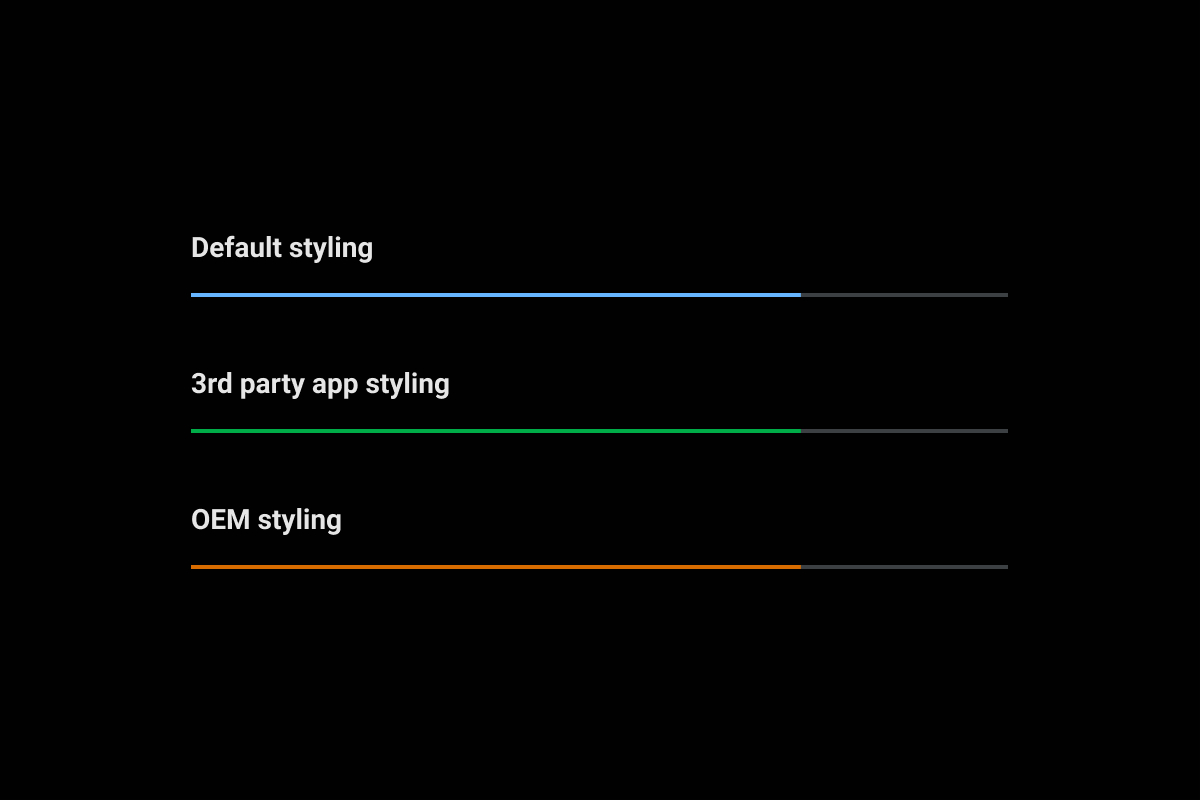
During media playback, the media progress indicator’s active track is displayed using an accent color. The default accent color is a shade of blue. App developers can choose to provide an app accent color that reflects their media brand instead. Similarly, OEMs can supply an accent color that reflects their car brand. If provided, an OEM accent color takes precedence over a an app's accent color.

The Car UI Library Integration Guide provides OEM guidance for customizing components.
For specific guidance for using color to customize components, visit Color.
Examples
