图表、图形和地图是传达数据洞见和信息的强有力工具。如果部署不当或恶意部署,还会造成混淆、误导和虚假信息。
将图表当作艺术而不是科学
机器学习从业者通常会直观呈现潜在的训练数据集,以了解它们对模型的实用性,以及通过模型输出来了解性能。
无论您是要创建还是读取数据可视化图表,都要始终询问数据可视化图表的预期上下文、受众群体和用途。这三个因素是图形通信的关键。在不同的情境中,同一张图表可能既有用且富有洞见,也可能具有误导性和夸张性。1 预期观看者以及观看者对图表和数据的认知水平会有所不同。设计可以起到帮助或阻碍作用。例如,令人惊叹的图表可能过于复杂,无法清晰地传达信息。
关于如何制作完美的图表,没有硬性规定,只有指南和最佳实践。直观呈现数据既是一门科学,也是一门艺术。但在直观呈现数据时,应力求数据清晰坦诚。 提供足够的信息,清晰准确地传达相关信息,但信息不应过多,以免让观看者感到无所适从。
脚手架、内容和误导性动作
Alberto Cairo 在《How Charts Lie》(图表如何欺骗)一书中将数据可视化图表分为两个部分:框架和内容。
图表的基架包括标题、轴、图例、标签和数据源(如有提供)。
内容包括数据的视觉编码和任何简短的文本注释。用于直观编码数据的方法通常包括:
- 长度,如条形图中
- 位置,如散点图中所示
- 饼图中的比例角度、面积和弧线
- 颜色和色相
- 更少见的是,宽度和厚度2
所有这些因素都可用于误导他人。将条形图的起点设为非零基准值,或截断最长的条形,可能会造成不准确的认知,即使目的是节省空间也是如此。请参阅 Sarah Leo 撰写的文章,了解《Economist》中有关数据可视化错误的一些示例。
不恰当的宽高比可能会让小变化看起来非常大,或者大变化看起来非常小。Cairo 建议选择与所描述的比例变化相匹配的宽高比(例如 3:1 代表 30% 的变化),但同时也建议密切关注背景信息,因为此规则存在许多重要的例外情况。例如,全球平均温度的相对较小波动(例如在 100C 中上升 2C)非常显著,在宽高比为 50:1 的图表中会被忽略。3
使用图表的 3D 旋转和其他 3D 效果来追求视觉效果,而不是表示 3D 数据,很可能会误导用户。以 3D 对象替代条形图中的条形即可。如果数据只按长度进行编码(就像标准条形图一样),那么读者可能会将按比例较大的对象解读为体积较大,因此值大于适当值。4如果设计师使用 2D 数据表示形式(例如气泡),并按半径或直径(而不是面积)对数据进行编码,则在比较每个细分(例如面积)时,也会造成难以比较的比例。5饼图还表示,所有细分加起来就是一个整体,不一定是这样。
颜色是一门独立的学科。一般来说:
- 使用 6 个或更少的色度,因为这是大多数人可以不混淆处理的限度。
- 避免提供太多色相选项,因为不同用户对色相的排序不同。6
- 请尽可能选择单一色相的不同深浅,这样在灰度模式下更容易区分。
- 了解不同类型的色盲。
参考
开罗,阿尔贝托。How Charts Lie: Comes Smarter about Visual Information(图表如何谎报:更智能地获取视觉信息)。NY: W.W. Norton, 2019.
Huff, Darrell. 如何从统计学说谎。纽约:W.W. Norton,1954 年。
Monmonier、Mark。How to Lie with Maps(如何用地图说谎),第 3 版。芝加哥:芝加哥大学出版社,2018 年。
图片参考
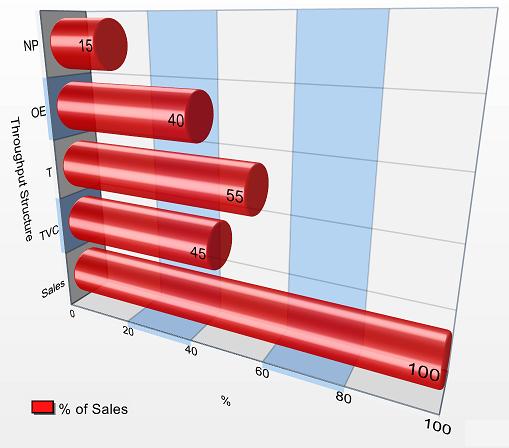
“吞吐量核算结构示例图表。”TAUser, 2008. GNU FDL。来源
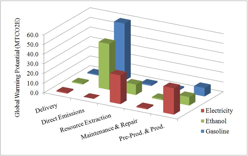
“所有车辆类型在生命周期内的温室效应 (MTCO2E)”。B2.Team.Leader, 2006. 来源