
自定义样式设置
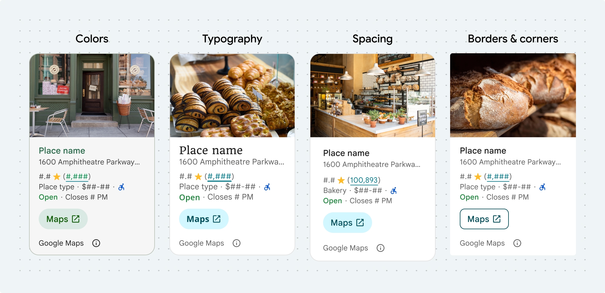
您可以自定义以下 Places UI Kit 组件和非 UI Kit 功能的颜色、排版、间距、边框和边角:
Places UI Kit 采用设计系统方法进行视觉自定义,大致基于 Material Design(进行了一些 Google 地图特有的修改)。请参阅 Material Design 的颜色和排版参考。默认情况下,样式遵循 Google 地图视觉设计语言。

使用 placesMaterialColor、placesMaterialFont、placesMaterialShape 和 placesMaterialTheme 结构体自定义组件的外观和风格。
您可以自定义以下样式:
| 主题属性 | 用法 |
|---|---|
| 颜色 | |
theme.color.surface |
容器和对话框背景 |
theme.color.outlineDecorative |
容器边框 |
theme.color.primary |
链接、加载指示器、概览图标 |
theme.color.onSurface |
标题、对话框内容 |
theme.color.onSurfaceVariant |
地点信息 |
theme.color.secondaryContainer |
按钮背景 |
theme.color.onSecondaryContainer |
按钮文字和图标 |
theme.color.neutralContainer |
查看日期标记、加载占位符形状 |
theme.color.onNeutralContainer |
审核日期,加载时出错 |
theme.color.positiveContainer |
“有电动汽车充电桩”徽章 |
theme.color.onPositiveContainer |
“有电动汽车充电桩”徽章内容 |
theme.color.positive |
放置“营业中”标签 |
theme.color.negative |
“已关闭”地点现在会显示标签 |
theme.color.info |
“无障碍入口”图标 |
theme.measurement.borderWidthButton |
“在地图中打开”按钮和“确定”按钮 |
| 排版 | |
theme.font.bodySmall |
地点信息 |
theme.font.bodyMedium |
地点信息,对话框内容 |
theme.font.labelMedium |
徽章内容 |
theme.font.labelLarge |
按钮内容 |
theme.font.headlineMedium |
对话框标题 |
theme.font.displaySmall |
地点名称 |
theme.font.titleSmall |
地点名称 |
| 间距 | |
theme.measurement.spacingExtraSmall |
|
theme.measurement.spacingSmall |
|
theme.measurement.spacingMedium |
|
theme.measurement.spacinglarge |
|
theme.measurement.spacingExtraLarge |
|
theme.measurement.spacingTwoExtraLarge |
|
| 效果衡量 | |
borderWidth |
Container |
theme.measurement.borderWidthButton |
|
| 形状 | |
theme.shape.cornerRadius |
Container |
theme.shape.cornerRadiusButton |
“在 Google 地图中打开”按钮和“确定”按钮(不包括圆形图标按钮) |
theme.shape.cornerRadiusThumbnail |
地点缩略图 |
theme.shape.cornerRadiusCollageOuter |
媒体拼贴 |
theme.shape.cornerRadiusCard |
地点卡片、用户评价卡片 |
theme.shape.cornerRadiusDialog |
Google 地图披露声明对话框 |
| Google 地图品牌提供方信息 | |
attribution.lightModeColor |
浅色主题 Google 地图署名和披露信息按钮(白色、灰色和黑色枚举) |
attribution.darkModeColor |
深色主题 Google 地图署名和披露信息按钮(白色、灰色和黑色枚举) |
归因颜色
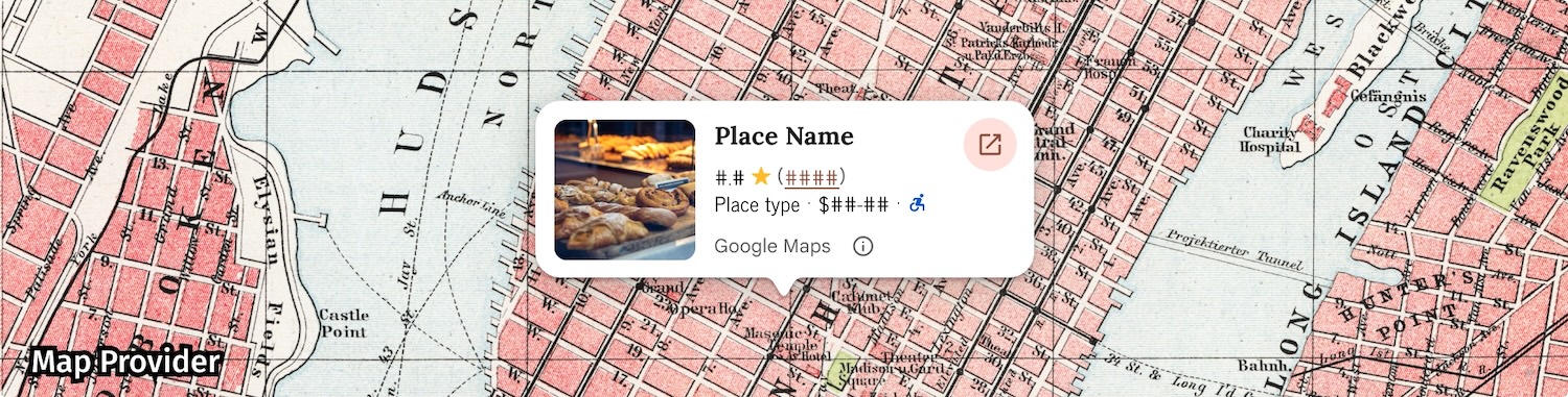
《Google 地图服务条款》要求您使用三种品牌颜色之一来注明 Google 地图的版权归属信息。在进行自定义更改后,此提供方信息必须可见且可访问。
我们提供 3 种品牌颜色供您选择,这些颜色可以针对浅色主题和深色主题分别设置:
- 浅色主题:
attributionColorLight,包含白色、灰色和黑色枚举。 - 深色主题:
attributionColorDark,包含白色、灰色和黑色的枚举。
示例
此函数会创建一个主题,用于替换默认样式属性。未被覆盖的任何主题背景属性都使用默认样式。Swift
  // Same for compact and full
func makeTemplateTheme(colorScheme: ColorScheme) -> PlacesMaterialTheme {
  var theme = PlacesMaterialTheme()
  var color = PlacesMaterialColor()
  color.surface = (colorScheme == .dark ? .blue : .gray)
  color.buttonBorder = (colorScheme == .dark ? .pink : .orange)
  color.outlineDecorative = (colorScheme == .dark ? .white : .black)
  color.onSurface = (colorScheme == .dark ? .yellow : .red)
  color.onSurfaceVariant = (colorScheme == .dark ? .white : .blue)
  color.onSecondaryContainer = (colorScheme == .dark ? .white : .red)
  color.secondaryContainer = (colorScheme == .dark ? .green : .purple)
  color.positive = (colorScheme == .dark ? .yellow : .red)
  color.primary = (colorScheme == .dark ? .yellow : .purple)
  color.info = (colorScheme == .dark ? .yellow : .purple)
  var shape = PlacesMaterialShape()
  shape.cornerRadius = 10
  var font = PlacesMaterialFont()
  font.labelLarge = .system(size: UIFontMetrics.default.scaledValue(for: 18))
  font.headlineMedium = .system(size: UIFontMetrics.default.scaledValue(for: 15))
  font.bodyLarge = .system(size: UIFontMetrics.default.scaledValue(for: 15))
  font.bodyMedium = .system(size: UIFontMetrics.default.scaledValue(for: 12))
  font.bodySmall = .system(size: UIFontMetrics.default.scaledValue(for: 11))
  var attribution = PlacesMaterialAttribution()
  attribution.lightModeColor = .black
  attribution.darkModeColor = .white
  theme.measurement.borderWidthButton = 1
  theme.color = color
  theme.shape = shape
  theme.font = font
  theme.attribution = attribution
  return theme
}