Use sufficient contrast
Stay organized with collections
Save and categorize content based on your preferences.
Higher contrast makes it easier for everyone to read text and images. When there
is low contrast, everyone has difficulty viewing content.
Color blindness affects over 300 million people worldwide: 1 in 12 men and 1 in
200 women.
Higher contrast helps people with color blindness and low vision, or anyone that views a screen in
bright sunlight.
Visit Colour Blind Awareness to learn more about the effects of color blindness.
WCAG suggests these minimum contrast ratios:
- 4.5:1 for small text
- 3:1 for large text (at least 14 pt bold/18 pt regular)
Consider the following contrast examples:
-
Poor contrast
-
Better contrast
-
Best contrast
Exercise: Choose colors with sufficient contrast
Complete the following exercise to practice measuring sufficient color contrast:
- In a separate browser window, open the Contrast Checker by Web Accessibility In Mind (WebAIM).
- In the contrast checker, enter the following Hex colors to find out which foreground-background ratios meet contrast requirements. Record the contrast ratios on a notepad or separate document to compare your answers with the possible answers.
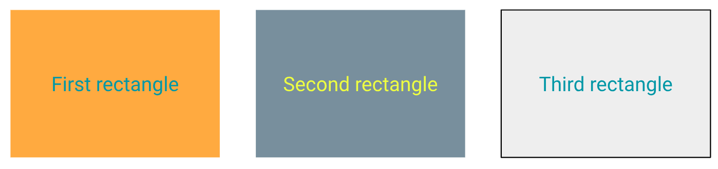
- First rectangle:
- Foreground: #148695
- Background: #FD9C32
- Second rectangle:
- Foreground: #EBFF33
- Background: #667E8B
- Third rectangle:
- Foreground: #128697
- Background: #EAEAEA
Click the icon to see the expected answers.
- First rectangle: FAIL
- Foreground: #148695
- Background: #FD9C32
- Second rectangle: FAIL
- Foreground: #EBFF33
- Background: #667E8B
- Third rectangle: FAIL
- Foreground: #128697
- Background: #EAEAEA
Even though some of the pairs may look higher contrast, none of them actually meets WCAG standards.
Unfortunately, "eyeballing it isn't enough"—it's best to use a contrast checker.
Use minimum contrast guidelines to ensure that everyone can see your content.
Next unit: Choose inclusive language
Except as otherwise noted, the content of this page is licensed under the Creative Commons Attribution 4.0 License, and code samples are licensed under the Apache 2.0 License. For details, see the Google Developers Site Policies. Java is a registered trademark of Oracle and/or its affiliates.
Last updated 2025-03-31 UTC.
[null,null,["Last updated 2025-03-31 UTC."],[[["\u003cp\u003eHigher contrast improves readability for all users, including those with color blindness or low vision.\u003c/p\u003e\n"],["\u003cp\u003eWCAG recommends a minimum contrast ratio of 4.5:1 for small text and 3:1 for large text to ensure accessibility.\u003c/p\u003e\n"],["\u003cp\u003eUsing a contrast checker tool is crucial for accurately measuring and achieving sufficient color contrast, as visual judgment can be unreliable.\u003c/p\u003e\n"],["\u003cp\u003eColor blindness affects a significant portion of the population, emphasizing the importance of accessible design.\u003c/p\u003e\n"],["\u003cp\u003eImplementing higher contrast in design benefits everyone and aligns with web accessibility standards for inclusive content.\u003c/p\u003e\n"]]],["Higher contrast improves readability for all, especially those with color blindness or low vision. WCAG recommends minimum contrast ratios: 4.5:1 for small text and 3:1 for large text. Use a contrast checker like WebAIM's to measure color combinations, as visual assessment is unreliable. The provided examples failed to meet contrast requirements. Choosing colors with sufficient contrast, according to these standards, is necessary to ensure content accessibility.\n"],null,["# Use sufficient contrast\n\n\u003cbr /\u003e\n\nHigher contrast makes it easier for everyone to read text and images. When there\nis low contrast, everyone has difficulty viewing content.\n\nColor blindness affects over 300 million people worldwide: 1 in 12 men and 1 in\n200 women.\n\nHigher contrast helps people with color blindness and low vision, or anyone that views a screen in\nbright sunlight.\n\nVisit [Colour Blind Awareness](https://www.colourblindawareness.org/colour-blindness/types-of-colour-blindness/) to learn more about the effects of color blindness.\n\n[WCAG](https://www.w3.org/TR/UNDERSTANDING-WCAG20/visual-audio-contrast-contrast.html) suggests these minimum contrast ratios:\n\n- 4.5:1 for small text\n- 3:1 for large text (at least 14 pt bold/18 pt regular)\n\nConsider the following contrast examples:\n\n-\n Poor contrast\n\n-\n Better contrast\n\n-\n Best contrast\n\nExercise: Choose colors with sufficient contrast\n------------------------------------------------\n\nComplete the following exercise to practice measuring sufficient color contrast:\n\n1. In a separate browser window, open the [Contrast Checker](http://webaim.org/resources/contrastchecker) by Web Accessibility In Mind (WebAIM).\n2. In the contrast checker, enter the following Hex colors to find out which foreground-background ratios meet contrast requirements. Record the contrast ratios on a notepad or separate document to compare your answers with the [possible answers](#answers).\n\n1. First rectangle:\n - Foreground: #148695\n - Background: #FD9C32\n2. Second rectangle:\n - Foreground: #EBFF33\n - Background: #667E8B\n3. Third rectangle:\n - Foreground: #128697\n - Background: #EAEAEA\n\n\n**Click the icon to see the expected answers.**\n\n1. First rectangle: FAIL\n - Foreground: #148695\n - Background: #FD9C32\n2. Second rectangle: FAIL\n - Foreground: #EBFF33\n - Background: #667E8B\n3. Third rectangle: FAIL\n - Foreground: #128697\n - Background: #EAEAEA\n\n\nEven though some of the pairs may *look* higher contrast, none of them actually meets WCAG standards.\nUnfortunately, \"eyeballing it isn't enough\"---it's best to use a contrast checker.\n\n\u003cbr /\u003e\n\nUse minimum contrast guidelines to ensure that everyone can see your content.\n\n\u003cbr /\u003e\n\n**Next unit:** [Choose inclusive language](/tech-writing/accessibility/self-study/inclusive-language)"]]