此媒体应用模板简介介绍了它的主要元素、它们提供的基本功能以及将这些元素联系在一起的架构。
下文详细介绍了每个元素的工作原理。有关这些部分的指南,请参阅此部分的概览。
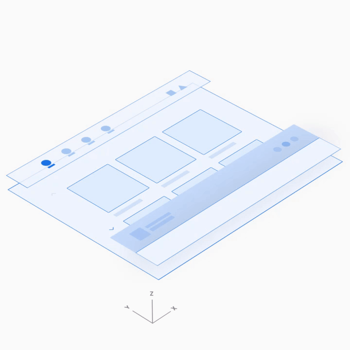
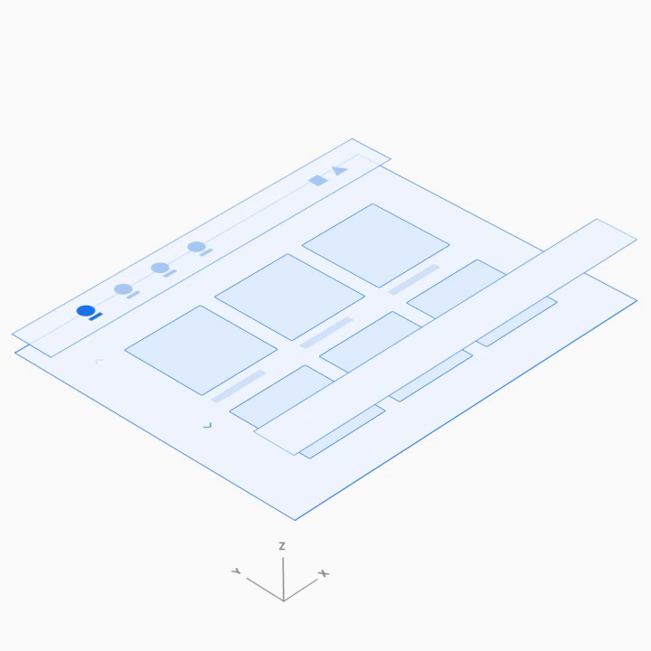
解剖学
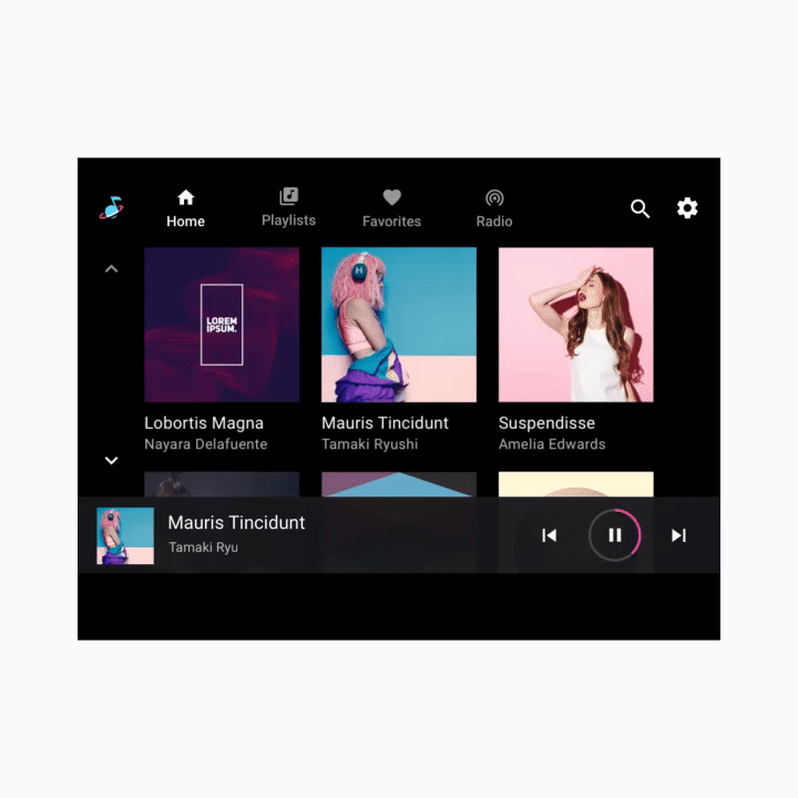
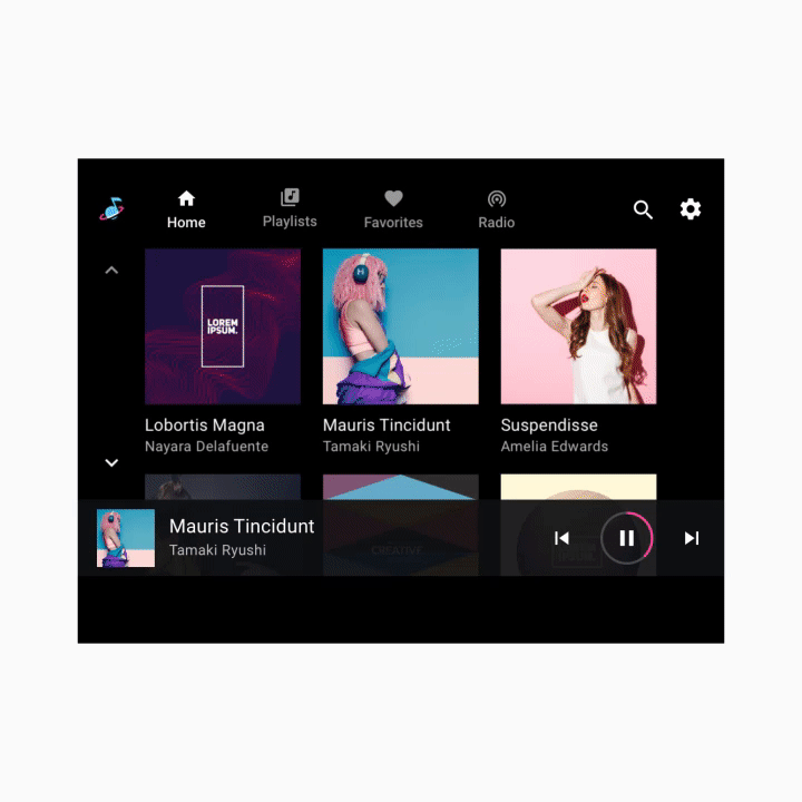
媒体模板包含以下内容:
- 应用栏 - 具有主要应用导航和应用控件(用于应用内搜索和设置),并包含应用图标
- 可浏览的内容空间 - 以网格视图(如此处所示)或列表视图显示内容
- 播放控件 - 此处显示的最小化控件栏包含基本的媒体元数据和播放控件,用户还可以访问包含更多控件的播放叠加层
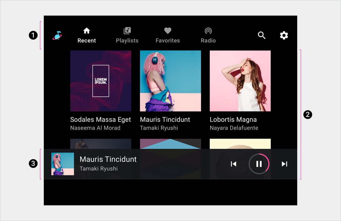
2. 可浏览的内容空间
3. 播放控件(在最小化的控件栏中显示)
此示例布局仅展示了这些元素的一种可能排列方式。例如,汽车制造商可以决定堆叠主要导航和应用控件,而不是将其保留在一个水平栏中,具体取决于屏幕尺寸。下面的部分更详细地介绍了导航层次结构。
主要导航
应用栏中的主要导航栏由显示的标签页组成(屏幕太小的极少数情况除外)。
以下示例展示了一种典型的标签页排列方式:

应用控件
应用控件(如下例的右上角所示)占据了应用栏中不用于品牌推广或主要导航的部分。它们提供对当前媒体应用的应用内搜索和设置功能的访问权限。
选择应用控件即会打开一个叠加层。例如,此处显示的“设置”功能会打开一个叠加层,其中显示了“设置”界面。当用户关闭叠加层后,他们会返回到之前在应用中的位置。

可浏览的内容空间
在可浏览的内容空间内,用户可以滚动浏览内容,并通过 Z 轴空间导航到各个项,沿着层次结构向下逐级。
由于浏览多个层级会增加驾驶员的认知负荷,因此 Google 建议让信息架构保持相对扁平化,尽可能少层级。
播放控件
根据具体情况,媒体应用中的播放控件可以采用以下两种形式之一显示:
- 最小化的控件栏(适用于所有视图)
- 播放视图(带有完整控件栏的叠加层)
在下面的动画示例中,这两种形式在屏幕底部交替显示。
最小化控件栏
最小化的控件栏悬浮在可浏览内容空间的最高层级,即内容上方。它提供了有关当前播放内容的信息,以及供用户控制播放的基本方式。
内容开始播放后,当用户浏览媒体内容时,最小化的控制栏仍然可用。该控件会一直存在,直到用户选择新的媒体应用,或用户点按最小化的控件栏以显示播放视图。
播放视图
完整控制栏仅在播放视图中可用,并且还悬浮在内容上方。除了最小化的控件栏提供的功能外,完整控制栏还可以提供由每个媒体应用定义的更广泛的控件。