
Компонент «Подробная информация о месте»
Компонент «Подробная информация о месте» из набора инструментов Places UI Kit позволяет добавить в ваше приложение отдельный компонент пользовательского интерфейса, отображающий подробную информацию о месте. Этот компонент можно настраивать.
Компонент «Подробная информация о месте» можно использовать как независимо, так и в сочетании с другими API и сервисами платформы Google Maps. Компонент принимает идентификатор места (Place ID) , название ресурса или координаты широты/долготы и возвращает отображаемую подробную информацию о месте .
Компонент «Подробная информация о месте» полностью настраиваемый, что позволяет изменять шрифты, цвета и радиусы скругления углов в соответствии с вашими потребностями и визуальными рекомендациями бренда. Вы можете настроить внешний вид подробной информации о месте, создав тему, которая расширяет PlacesMaterialTheme и предоставляет переопределения для атрибутов темы. Вы также можете настроить, какие поля подробной информации о месте будут включены, указав список записей контента, каждая из которых соответствует фрагменту информации, отображаемой о месте.
Варианты компоновки
Компонент «Подробная информация о месте» поддерживает два основных варианта компоновки:
- Компактный формат: макет для предварительного просмотра ключевой информации.
- Полный вариант: Подробная схема, отображающая все доступные сведения о месте.
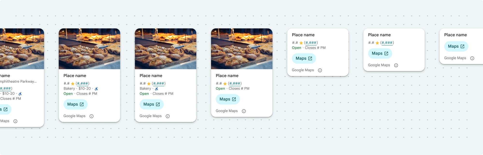
Компактный макет может отображаться как в вертикальной, так и в горизонтальной ориентации. Это позволяет интегрировать компонент в различные дизайнерские решения и размеры экранов. Полный макет может отображаться только в вертикальном положении.
Компонент «Подробная информация о месте» позволяет детально контролировать отображаемое содержимое. Каждый элемент (например, фотографии, отзывы и контактная информация) может отображаться или скрываться по отдельности, что позволяет точно настроить внешний вид компонента и плотность информации.
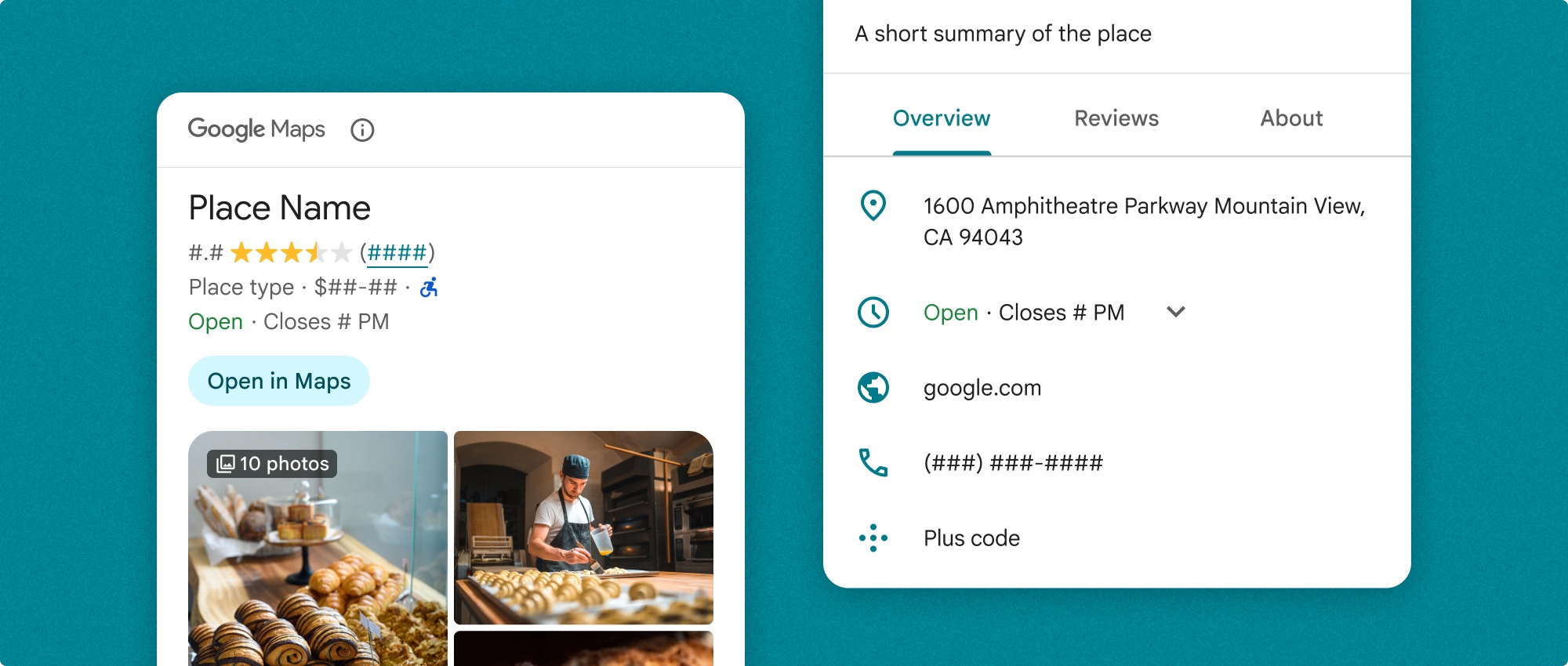
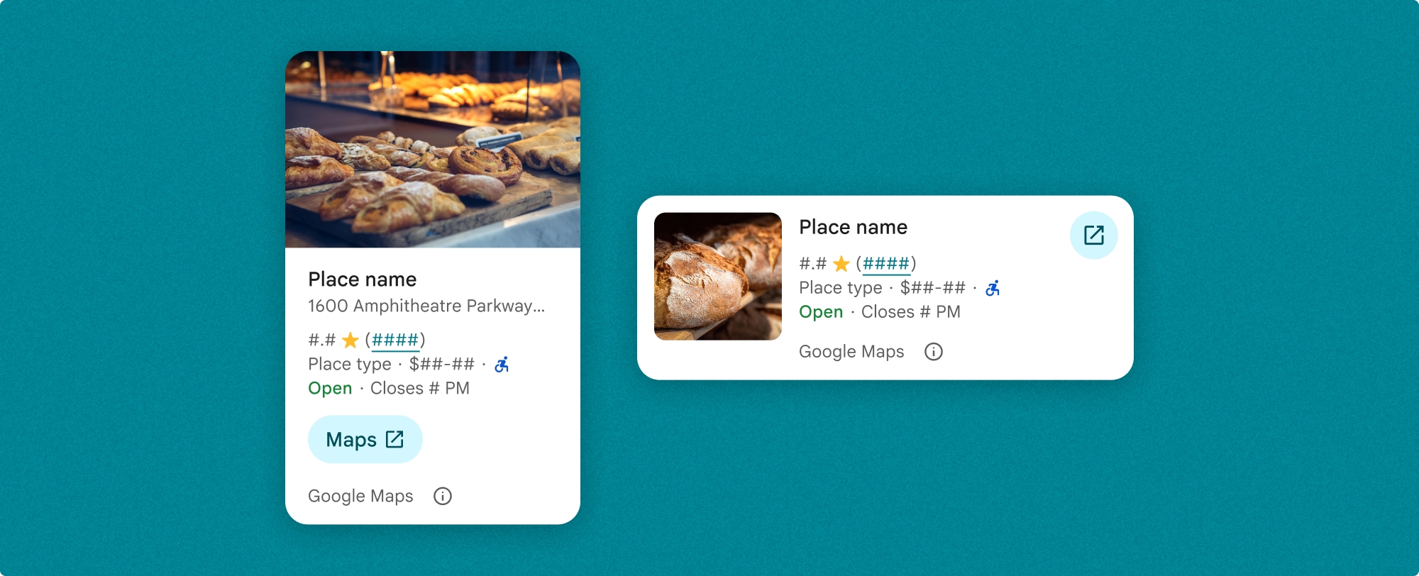
Подробная информация о месте (компактный вид)
Компактный фрагмент «Подробная информация о месте» ( PlaceDetailsCompactFragment ) отображает подробную информацию о выбранном месте, занимая минимальное пространство. Это может быть полезно в информационном окне, выделяющем место на карте, в социальных сетях, например, при обмене местоположением в чате, в качестве подсказки для выбора текущего местоположения или в статье в СМИ для ссылки на место на Google Maps.
Подробная информация о месте (полный просмотр)
Полноэкранный режим отображения подробной информации о месте ( PlaceDetailsFragment ) предоставляет большую площадь для отображения сведений о месте и позволяет отображать больше типов информации.
Параметры отображения содержимого
Вы можете указать, какой контент отображать, используя перечисления в PlaceDetailsCompactFragment.Content или PlaceDetailsFragment.Content .
| Компактный вид | Полный просмотр |
|---|---|
|
|
Выставление счетов
При использовании набора инструментов для создания подробных сведений о местах (Place Details UI Kit) с вас взимается плата за каждый вызов методов .loadWithPlaceId() , .loadWithResourceName() или loadWithCoordinates() . Если вы загружаете одно и то же место несколько раз, с вас взимается плата за каждый запрос.
Чтобы избежать многократного списания средств, не добавляйте методы .loadWithPlaceId() или .loadWithResourceName() напрямую в методы жизненного цикла Android. Например, не вызывайте .loadWithPlaceId() или .loadWithResourceName() напрямую в методе onResume() .
Добавьте подробную информацию о местах в ваше приложение.
Вы можете добавить подробную информацию о местах в свое приложение, добавив фрагмент в макет. При создании экземпляра фрагмента вы можете настроить внешний вид информации о местах в соответствии с вашими потребностями и дизайном вашего приложения. Узнайте больше о настройке .
В Kotlin и Java доступны три метода: один для загрузки фрагмента с идентификатором места ( loadWithPlaceId() ), один для загрузки фрагмента с именем ресурса ( loadWithResourceName() ) и один для загрузки фрагмента с координатами широты/долготы ( loadWithCoordinates() ). Вы можете выбрать любой из этих методов или несколько сразу.
По умолчанию компактный вид отображается вертикально. Если вам нужна горизонтальная ориентация, укажите Orientation.HORIZONTAL . Для большей наглядности можно также указать Orientation.VERTICAL . Полный вид может отображаться только вертикально.
Примеры см. в разделе « Примеры компонента «Подробная информация о месте»» .
Настройте внешний вид
Индивидуальный стиль
Вы можете настроить цвета, типографику, отступы, границы и углы компонента «Подробная информация о месте».
Places UI Kit предлагает системный подход к визуальной настройке, основанный на Material Design (с некоторыми модификациями, специфичными для Google Maps). См. справочник Material Design по цвету и типографике . По умолчанию стиль соответствует визуальному языку дизайна Google Maps.
В Places UI Kit по умолчанию используется темная тема, поэтому вам может потребоваться настроить как темную, так и светлую темы. Чтобы настроить темную тему, добавьте запись для цвета в values-night/colors.xml .
Более подробную информацию о настройке стиля см. в разделе «Настройка стиля» .
Настройка ширины и высоты
Компактные изображения
Рекомендуемая ширина:
- Вертикальная ориентация: от 180 до 300 dp.
- Горизонтальная ориентация: от 180 до 500 dp.
Ширина элементов менее 160dp может отображаться некорректно.
Рекомендуется не задавать высоту для компактных представлений. Это позволит содержимому окна самостоятельно определять высоту, обеспечивая отображение всей информации.
Полные изображения
Для полноэкранного отображения рекомендуемая ширина составляет от 250dp до 450dp. Ширина меньше 250dp может отображаться некорректно.
Вы можете задать высоту компонента: вертикальное представление сведений о месте будет прокручиваться вертикально в пределах отведенного пространства.
Рекомендуется задавать высоту для всех элементов, отображаемых целиком. Это позволит корректно прокручивать содержимое окна.
Примеры компонентов "Подробная информация о месте"
Создать компактный или полноэкранный режим просмотра
Котлин
        // We create a new instance of the fragment using its factory method.
        // We can specify which content to show, the orientation, and a custom theme.
        val fragment = PlaceDetailsCompactFragment.newInstance(
            PlaceDetailsCompactFragment.ALL_CONTENT, // Show all available content.
            orientation,
            R.style.CustomizedPlaceDetailsTheme,
        ).apply {
            // The PlaceLoadListener provides callbacks for when the place data is successfully
            // loaded or when an error occurs. This is where we update our UI state.
            setPlaceLoadListener(object : PlaceLoadListener {
                override fun onSuccess(place: Place) {
                    Log.d(TAG, "Place loaded: ${place.id}")
                    // Once the data is loaded, we hide the loading indicator and show the fragment.
                    binding.loadingIndicatorMain.visibility = View.GONE
                    binding.placeDetailsContainer.visibility = View.VISIBLE
                    binding.dismissButton.visibility = View.VISIBLE
                }

                override fun onFailure(e: Exception) {
                    Log.e(TAG, "Place failed to load", e)
                    // On failure, we hide the UI and notify the user.
                    dismissPlaceDetails()
                    Toast.makeText(this@MainActivity, "Failed to load place details.", Toast.LENGTH_SHORT).show()
                }
            })
        }

        // We add the fragment to our layout's container view.
        // `commitNow()` is used to ensure the fragment is immediately added and available,
        // which is important because we need to call a method on it right after.
        supportFragmentManager
            .beginTransaction()
            .replace(binding.placeDetailsContainer.id, fragment)
            .commitNow()

        // **This is the key step**: After adding the fragment, we call `loadWithPlaceId`
        // to trigger the data loading process for the selected place.
        // We use `post` to ensure this runs after the layout has been measured,
        // which can prevent potential timing issues.
        binding.root.post {
            fragment.loadWithPlaceId(placeId)
        }
    }
Java
PlaceDetailsCompactFragment fragment =
  PlaceDetailsCompactFragment.newInstance(
        Orientation.HORIZONTAL,
        Arrays.asList(Content.ADDRESS, Content.TYPE, Content.RATING, Content.ACCESSIBLE_ENTRANCE_ICON),
        R.style.CustomizedPlaceDetailsTheme);

fragment.setPlaceLoadListener(
  new PlaceLoadListener() {
        @Override public void onSuccess(Place place) { ... }

        @Override public void onFailure(Exception e) { ... }
});

getSupportFragmentManager()
      .beginTransaction()
      .add(R.id.fragment_container, fragment)
      .commitNow();

// Load the fragment with a Place ID.
fragment.loadWithPlaceId(placeId);

// Load the fragment with a resource name.
fragment.loadWithResourceName(resourceName);
В этом полном примере кода ориентация компактного окна определяется программно на основе конфигурации устройства пользователя.
Котлин
package com.example.placedetailsuikit

import android.Manifest
import android.annotation.SuppressLint
import android.content.pm.PackageManager
import android.content.res.Configuration
import android.location.Location
import android.os.Bundle
import android.util.Log
import android.view.View
import android.widget.Toast
import androidx.activity.enableEdgeToEdge
import androidx.activity.result.ActivityResultLauncher
import androidx.activity.result.contract.ActivityResultContracts
import androidx.activity.viewModels
import androidx.appcompat.app.AppCompatActivity
import androidx.core.app.ActivityCompat
import androidx.lifecycle.ViewModel
import com.example.placedetailsuikit.databinding.ActivityMainBinding
import com.google.android.gms.location.FusedLocationProviderClient
import com.google.android.gms.location.LocationServices
import com.google.android.gms.maps.CameraUpdateFactory
import com.google.android.gms.maps.GoogleMap
import com.google.android.gms.maps.OnMapReadyCallback
import com.google.android.gms.maps.SupportMapFragment
import com.google.android.gms.maps.model.LatLng
import com.google.android.gms.maps.model.PointOfInterest
import com.google.android.libraries.places.api.Places
import com.google.android.libraries.places.api.model.Place
import com.google.android.libraries.places.widget.PlaceDetailsCompactFragment
import com.google.android.libraries.places.widget.PlaceLoadListener
import com.google.android.libraries.places.widget.model.Orientation

private const val TAG = "PlacesUiKit"

/**
 * A simple ViewModel to store UI state that needs to survive configuration changes.
 * In this case, it holds the ID of the selected place. Using a ViewModel is good practice
 * as it prevents data loss during events like screen rotation, ensuring a
 * seamless user experience.
 */
class MainViewModel : ViewModel() {
    var selectedPlaceId: String? = null
}

/**
 * This activity serves as a basic example of integrating the Place Details UI Kit.
 * It demonstrates the fundamental steps required:
 * 1. Setting up a Google Map.
 * 2. Requesting location permissions to center the map.
 * 3. Handling clicks on Points of Interest (POIs) to get a Place ID.
 * 4. Using the Place ID to load and display place details in a [PlaceDetailsCompactFragment].
 */
class MainActivity : AppCompatActivity(), OnMapReadyCallback, GoogleMap.OnPoiClickListener {
    // ViewBinding provides type-safe access to views defined in the XML layout,
    // eliminating the need for `findViewById` and preventing null pointer exceptions.
    private lateinit var binding: ActivityMainBinding
    private var googleMap: GoogleMap? = null

    // The FusedLocationProviderClient is the main entry point for interacting with the
    // fused location provider, which intelligently manages the underlying location technologies.
    private lateinit var fusedLocationClient: FusedLocationProviderClient

    // Using registerForActivityResult is the modern, recommended approach for handling
    // permission requests. It decouples the request from the handling logic, making the
    // code cleaner and easier to manage compared to the older `onRequestPermissionsResult` callback.
    private lateinit var requestPermissionLauncher: ActivityResultLauncher<Array<String>>

    // The `by viewModels()` delegate provides a lazy-initialized ViewModel scoped to this Activity.
    // This ensures that we get the same ViewModel instance across configuration changes.
    private val viewModel: MainViewModel by viewModels()

    override fun onCreate(savedInstanceState: Bundle?) {
        super.onCreate(savedInstanceState)

        // The ActivityResultLauncher is initialized here. The lambda defines the callback
        // that will be executed once the user responds to the permission dialog.
        requestPermissionLauncher =
            registerForActivityResult(ActivityResultContracts.RequestMultiplePermissions()) { permissions ->
                // We check if either fine or coarse location permission was granted.
                if (permissions[Manifest.permission.ACCESS_FINE_LOCATION] == true || permissions[Manifest.permission.ACCESS_COARSE_LOCATION] == true) {
                    Log.d(TAG, "Location permission granted by user.")
                    fetchLastLocation()
                } else {
                    // If permission is denied, we inform the user and default to a known location.
                    // This ensures the app remains functional even without location access.
                    Log.d(TAG, "Location permission denied by user.")
                    Toast.makeText(
                        this,
                        "Location permission denied. Showing default location.",
                        Toast.LENGTH_LONG
                    ).show()
                    moveToSydney()
                }
            }

        // enableEdgeToEdge() allows the app to draw behind the system bars for a more immersive experience.
        enableEdgeToEdge()
        binding = ActivityMainBinding.inflate(layoutInflater)
        setContentView(binding.root)

        binding.dismissButton.setOnClickListener {
            dismissPlaceDetails()
        }

        // --- Crucial: Initialize Places SDK ---
        // It's essential to initialize the Places SDK before making any other Places API calls.
        // This should ideally be done once, for example, in the Application's `onCreate`.
        val apiKey = BuildConfig.PLACES_API_KEY
        if (apiKey.isEmpty() || apiKey == "YOUR_API_KEY") {
            // A valid API key is required for the Places SDK to function.
            Log.e(TAG, "No api key")
            Toast.makeText(
                this,
                "Add your own API_KEY in local.properties",
                Toast.LENGTH_LONG
            ).show()
            finish()
            return
        }

        // `initializeWithNewPlacesApiEnabled` is used to opt-in to the new SDK version.
        Places.initializeWithNewPlacesApiEnabled(applicationContext, apiKey)

        fusedLocationClient = LocationServices.getFusedLocationProviderClient(this)
        // ------------------------------------

        // The SupportMapFragment is the container for the map. `getMapAsync` allows us to
        // work with the GoogleMap object via a callback once it's fully initialized.
        val mapFragment =
            supportFragmentManager.findFragmentById(R.id.map_fragment) as SupportMapFragment?
        mapFragment?.getMapAsync(this)

        // This block handles restoration after a configuration change (e.g., screen rotation).
        // If a place was selected before the rotation, its ID is stored in the ViewModel.
        // We use this ID to immediately show the details fragment again.
        if (viewModel.selectedPlaceId != null) {
            viewModel.selectedPlaceId?.let { placeId ->
                Log.d(TAG, "Restoring PlaceDetailsFragment for place ID: $placeId")
                showPlaceDetailsFragment(placeId)
            }
        }
    }

    /**
     * This callback is triggered when the GoogleMap object is ready to be used.
     * All map setup logic should be placed here.
     */
    override fun onMapReady(map: GoogleMap) {
        Log.d(TAG, "Map is ready")
        googleMap = map
        // Setting the OnPoiClickListener allows us to capture user taps on points of interest.
        googleMap?.setOnPoiClickListener(this)

        // After the map is ready, we determine the initial camera position based on location permissions.
        if (isLocationPermissionGranted()) {
            fetchLastLocation()
        } else {
            requestLocationPermissions()
        }
    }

    /**
     * A helper function to centralize the check for location permissions.
     */
    private fun isLocationPermissionGranted(): Boolean {
        return ActivityCompat.checkSelfPermission(
            this,
            Manifest.permission.ACCESS_FINE_LOCATION
        ) == PackageManager.PERMISSION_GRANTED ||
                ActivityCompat.checkSelfPermission(
                    this,
                    Manifest.permission.ACCESS_COARSE_LOCATION
                ) == PackageManager.PERMISSION_GRANTED
    }

    /**
     * This function triggers the permission request flow. The result is handled by the
     * ActivityResultLauncher defined in `onCreate`.
     */
    private fun requestLocationPermissions() {
        Log.d(TAG, "Requesting location permissions.")
        requestPermissionLauncher.launch(
            arrayOf(
                Manifest.permission.ACCESS_FINE_LOCATION,
                Manifest.permission.ACCESS_COARSE_LOCATION
            )
        )
    }

    /**
     * Fetches the device's last known location. This is a fast and battery-efficient way
     * to get a location fix. It should only be called after verifying permissions.
     */
    @SuppressLint("MissingPermission")
    private fun fetchLastLocation() {
        // Double-checking permissions here is a good practice, although the call sites are already guarded.
        if (isLocationPermissionGranted()) {
            fusedLocationClient.lastLocation
                .addOnSuccessListener { location: Location? ->
                    if (location != null) {
                        val userLocation = LatLng(location.latitude, location.longitude)
                        googleMap?.moveCamera(CameraUpdateFactory.newLatLngZoom(userLocation, 13f))
                        Log.d(TAG, "Moved to user's last known location.")
                    } else {
                        // `lastLocation` can be null if the location has never been recorded.
                        // In this case, we fall back to a default location.
                        Log.d(TAG, "Last known location is null. Falling back to Sydney.")
                        moveToSydney()
                    }
                }
                .addOnFailureListener {
                    // This listener handles errors in the location fetching process.
                    Log.e(TAG, "Failed to get location.", it)
                    moveToSydney()
                }
        }
    }

    /**
     * Moves the map camera to a default, hardcoded location (Sydney).
     * This serves as a reliable fallback.
     */
    private fun moveToSydney() {
        val sydney = LatLng(-33.8688, 151.2093)
        googleMap?.moveCamera(CameraUpdateFactory.newLatLngZoom(sydney, 13f))
        Log.d(TAG, "Moved to Sydney")
    }

    /**
     * This is the callback for the `OnPoiClickListener`. It's triggered when a user
     * taps a POI on the map.
     */
    override fun onPoiClick(poi: PointOfInterest) {
        val placeId = poi.placeId
        Log.d(TAG, "Place ID: $placeId")

        // We save the selected place ID to the ViewModel. This is critical for surviving
        // configuration changes. If the user rotates the screen now, the `onCreate`
        // method will be able to restore the place details view.
        viewModel.selectedPlaceId = placeId
        showPlaceDetailsFragment(placeId)
    }

    /**
     * This function is the core of the integration. It creates, configures, and displays
     * the [PlaceDetailsCompactFragment].
     * @param placeId The unique identifier for the place to be displayed.
     */
    private fun showPlaceDetailsFragment(placeId: String) {
        Log.d(TAG, "Showing PlaceDetailsFragment for place ID: $placeId")

        // We manage the visibility of UI elements to provide feedback to the user.
        // The wrapper is shown, and a loading indicator is displayed while the data is fetched.
        binding.placeDetailsWrapper.visibility = View.VISIBLE
        binding.dismissButton.visibility = View.GONE
        binding.placeDetailsContainer.visibility = View.GONE
        binding.loadingIndicatorMain.visibility = View.VISIBLE

        // The Place Details widget can be displayed vertically or horizontally.
        // We dynamically choose the orientation based on the device's current configuration.
        val orientation =
            if (resources.configuration.orientation == Configuration.ORIENTATION_LANDSCAPE) {
                Orientation.HORIZONTAL
            } else {
                Orientation.VERTICAL
            }


        // We create a new instance of the fragment using its factory method.
        // We can specify which content to show, the orientation, and a custom theme.
        val fragment = PlaceDetailsCompactFragment.newInstance(
            PlaceDetailsCompactFragment.ALL_CONTENT, // Show all available content.
            orientation,
            R.style.CustomizedPlaceDetailsTheme,
        ).apply {
            // The PlaceLoadListener provides callbacks for when the place data is successfully
            // loaded or when an error occurs. This is where we update our UI state.
            setPlaceLoadListener(object : PlaceLoadListener {
                override fun onSuccess(place: Place) {
                    Log.d(TAG, "Place loaded: ${place.id}")
                    // Once the data is loaded, we hide the loading indicator and show the fragment.
                    binding.loadingIndicatorMain.visibility = View.GONE
                    binding.placeDetailsContainer.visibility = View.VISIBLE
                    binding.dismissButton.visibility = View.VISIBLE
                }

                override fun onFailure(e: Exception) {
                    Log.e(TAG, "Place failed to load", e)
                    // On failure, we hide the UI and notify the user.
                    dismissPlaceDetails()
                    Toast.makeText(this@MainActivity, "Failed to load place details.", Toast.LENGTH_SHORT).show()
                }
            })
        }

        // We add the fragment to our layout's container view.
        // `commitNow()` is used to ensure the fragment is immediately added and available,
        // which is important because we need to call a method on it right after.
        supportFragmentManager
            .beginTransaction()
            .replace(binding.placeDetailsContainer.id, fragment)
            .commitNow()

        // **This is the key step**: After adding the fragment, we call `loadWithPlaceId`
        // to trigger the data loading process for the selected place.
        // We use `post` to ensure this runs after the layout has been measured,
        // which can prevent potential timing issues.
        binding.root.post {
            fragment.loadWithPlaceId(placeId)
        }
    }


    /**
     * Hides the place details view and clears the selected place ID from the ViewModel.
     */
    private fun dismissPlaceDetails() {
        binding.placeDetailsWrapper.visibility = View.GONE
        // Clearing the ID in the ViewModel is important so that if the user rotates the
        // screen after dismissing, the details view doesn't reappear.
        viewModel.selectedPlaceId = null
    }

    override fun onDestroy() {
        super.onDestroy()
        // It's a good practice to nullify references to objects that have a lifecycle
        // tied to the activity, like the GoogleMap object, to prevent potential memory leaks.
        googleMap = null
    }
}
Создать тему
При создании фрагмента можно указать тему, которая переопределяет любые атрибуты стиля по умолчанию. Любые атрибуты темы, которые не переопределены, используют стили по умолчанию. Если вы хотите поддерживать темную тему, вы можете добавить запись для цвета в values-night/colors.xml .
В Places UI Kit по умолчанию используется темная тема, поэтому вам может потребоваться настроить как темную, так и светлую темы. Чтобы настроить темную тему, добавьте запись для цвета в values-night/colors.xml .
  <style name="CustomizedPlaceDetailsTheme" parent="PlacesMaterialTheme">
    <item name="placesColorPrimary">@color/app_primary_color</item>
    <item name="placesColorOnSurface">@color/app_color_on_surface</item>
    <item name="placesColorOnSurfaceVariant">@color/app_color_on_surface</item>

    <item name="placesTextAppearanceBodySmall">@style/app_text_appearence_small</item>

    <item name="placesCornerRadius">20dp</item>
  </style>
Используйте стандартное содержимое
В этом примере используется стандартное содержимое.
  val fragmentStandardContent = PlaceDetailsCompactFragment.newInstance(
    PlaceDetailsCompactFragment.STANDARD_CONTENT,
    orientation,
    R.style.CustomizedPlaceDetailsTheme
  )
Настройте определенный контент
В этом примере для компактного отображения выбираются только адрес, доступный вход и Content медиаконтента, и они отображаются с использованием темы CustomizedPlaceDetailsTheme .
  val placeDetailsFragment = PlaceDetailsCompactFragment.newInstance(
    orientation,
    listOf(
        Content.ADDRESS,
        Content.ACCESSIBLE_ENTRANCE,
        Content.MEDIA
    ),
    R.style.CustomizedPlaceDetailsTheme
)
Использовать весь контент
В этом примере используются все параметры Content компактного представления.
  val fragmentAllContent = PlaceDetailsCompactFragment.newInstance(
    orientation,
    PlaceDetailsCompactFragment.ALL_CONTENT,
    R.style.CustomizedPlaceDetailsTheme
  )