
Yer ayrıntıları bileşeni
Places UI Kit'in Yer Ayrıntıları bileşeni, uygulamanızda yer ayrıntılarını gösteren bağımsız bir kullanıcı arayüzü bileşeni eklemenize olanak tanır. Bu bileşen özelleştirilebilir.
Yer Ayrıntıları bileşeni bağımsız olarak veya diğer Google Haritalar Platformu API'leri ve hizmetleriyle birlikte kullanılabilir. Bileşen, Yer Kimliği, kaynak adı veya enlem/boylam koordinatlarını alır ve oluşturulan Yer Ayrıntıları bilgilerini döndürür.
Yer Ayrıntıları bileşeni tamamen temalandırılabilir. Bu sayede, kullanım alanınıza ve görsel markalama kurallarınıza uygun olarak yazı tiplerini, renkleri ve köşe yarıçaplarını özelleştirebilirsiniz. PlacesMaterialTheme öğesini genişleten ve tema özelliklerini geçersiz kılan bir tema oluşturarak yer ayrıntılarının görünümünü özelleştirebilirsiniz. Ayrıca, her biri yer hakkında gösterilen bir bilgi parçasına karşılık gelen bir içerik girişi listesi belirterek hangi yer ayrıntıları alanlarının dahil edileceğini de özelleştirebilirsiniz.
Düzen varyantları
Yer Ayrıntıları bileşeni iki ana düzen varyantını destekler:
- Yüksek: Önemli bilgilerin önizlemesi için kullanılan düzen.
- Tam: Kullanılabilir tüm yer ayrıntılarını gösteren kapsamlı düzen.
Kompakt düzen, dikey veya yatay yönde görüntülenebilir. Bu sayede bileşeni çeşitli tasarım düzenlerine ve ekran boyutlarına entegre edebilirsiniz. Tam düzen yalnızca dikey olarak görüntülenebilir.
Yer ayrıntıları bileşeni, bileşende gösterilen içerik üzerinde ayrıntılı kontrol sağlar. Her öğe (ör. fotoğraflar, yorumlar ve iletişim bilgileri) ayrı ayrı gösterilebilir veya gizlenebilir. Bu sayede bileşenlerin görünümü ve bilgi yoğunluğu hassas bir şekilde özelleştirilebilir.
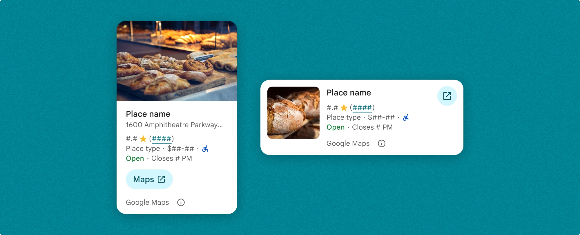
Yer ayrıntıları kompakt görünümü
Yer ayrıntıları kompakt parçası (PlaceDetailsCompactFragment), seçilen bir yerin ayrıntılarını en az yer kullanarak oluşturur. Bu, bir haritada bir yeri vurgulayan bilgi penceresinde, bir sohbette konum paylaşma gibi bir sosyal medya deneyiminde, mevcut konumunuzu seçme önerisi olarak veya Google Haritalar'daki yere referans vermek için bir medya makalesinde yararlı olabilir.
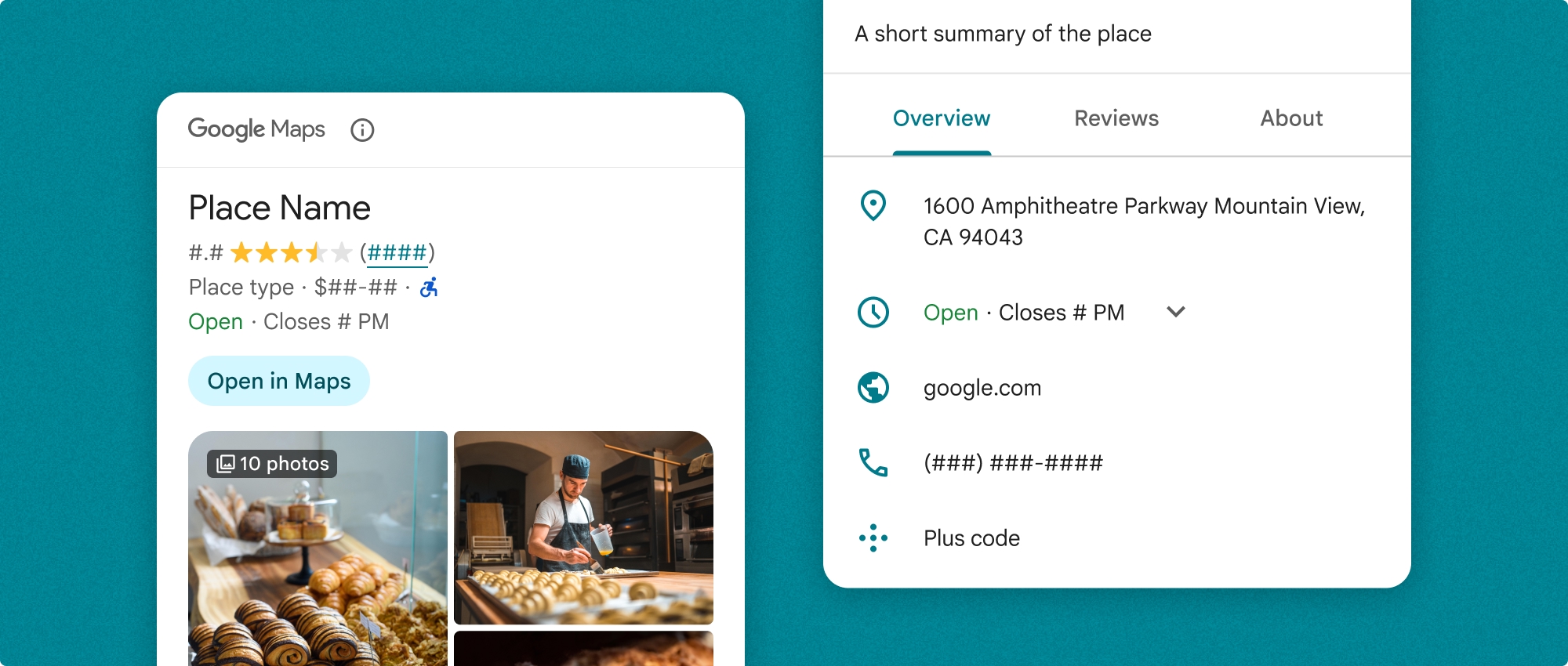
Yer ayrıntılarının tam görünümü
Yer ayrıntılarının tam görünümü (PlaceDetailsFragment), yer ayrıntıları bilgilerini göstermek için daha büyük bir alan sunar ve daha fazla bilgi türü göstermenize olanak tanır.
İçerik görüntüleme seçenekleri
PlaceDetailsCompactFragment.Content veya PlaceDetailsFragment.Content içindeki numaralandırmaları kullanarak hangi içeriğin gösterileceğini belirtebilirsiniz.
| Kompakt görünüm | Tam görünüm |
|---|---|
|
|
Faturalandırma
Yer Ayrıntıları UI Kit'i kullanılırken .loadWithPlaceId(), .loadWithResourceName() veya loadWithCoordinates() yöntemi her çağrıldığında faturalandırılırsınız. Aynı yeri birden fazla kez yüklerseniz her istek için faturalandırılırsınız.
Birden fazla kez ödeme alınmaması için .loadWithPlaceId() veya .loadWithResourceName() öğelerini doğrudan Android yaşam döngüsü yöntemlerine eklemeyin. Örneğin, onResume() yönteminde .loadWithPlaceId() veya .loadWithResourceName()'i doğrudan çağırmayın.
Uygulamanıza yer ayrıntıları ekleme
Bir düzene parça ekleyerek uygulamanıza yer ayrıntıları ekleyebilirsiniz. Parçayı oluşturduğunuzda, yer ayrıntıları bilgilerinin görünümünü ve tarzını ihtiyaçlarınıza ve uygulamanızın görünümüne uygun şekilde özelleştirebilirsiniz. Özelleştirme hakkında daha fazla bilgi edinin.
Hem Kotlin hem de Java'da kullanabileceğiniz üç yöntem vardır: biri parçayı yer kimliğiyle (loadWithPlaceId()), biri parçayı kaynak adıyla (loadWithResourceName()), diğeri ise parçayı enlem/boylam koordinatlarıyla (loadWithCoordinates()) yüklemek için kullanılır. Bu yöntemlerden herhangi birini veya birden fazlasını seçebilirsiniz.
Küçük görünümün varsayılan konumu dikey moddur. Yatay düzen istiyorsanız Orientation.HORIZONTAL simgesini belirtin. Dilerseniz netlik için Orientation.VERTICAL de belirtebilirsiniz. Tam görünüm yalnızca dikey olarak görüntülenebilir.
Örnekleri Yer Ayrıntıları bileşeni örnekleri bölümünde bulabilirsiniz.
Görsel görünümü özelleştirme
Özel stil
Yer Ayrıntıları bileşeninizin renklerini, tipografisini, aralığını, kenarlıklarını ve köşelerini özelleştirebilirsiniz.
Places UI Kit, görsel özelleştirme için kabaca Materyal Tasarım'a dayalı (Google Haritalar'a özgü bazı değişikliklerle) bir tasarım sistemi yaklaşımı sunar. Renk ve Yazı Biçimi ile ilgili Materyal Tasarım referansına bakın. Varsayılan olarak stil, Google Haritalar'ın görsel tasarım diline uygundur.
Places UI Kit, varsayılan olarak koyu tema sunar. Bu nedenle, hem koyu hem de açık temaları özelleştirmeniz gerekebilir. Koyu temayı özelleştirmek için values-night/colors.xml bölümüne renk girişi ekleyin.
Stil oluşturma hakkında daha fazla bilgi için Özel stil bölümüne bakın.
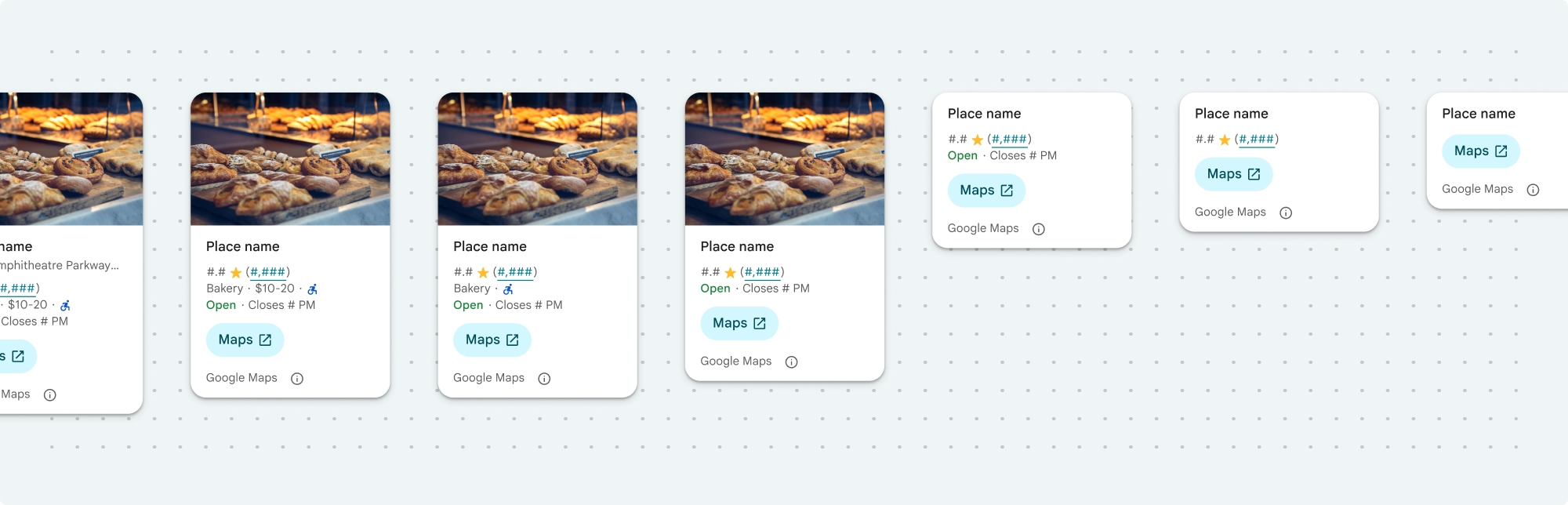
Genişlik ve yükseklik özelleştirme
Kompakt görünümler
Önerilen genişlikler:
- Dikey yön: 180 dp ile 300 dp arasında.
- Yatay yön: 180 dp ile 500 dp arasında.
160 dp'den küçük genişlikler doğru şekilde görüntülenmeyebilir.
En iyi uygulama, kompakt görünümler için yükseklik ayarlamamaktır. Bu sayede penceredeki içerik yüksekliği ayarlayabilir ve tüm bilgilerin gösterilmesini sağlayabilirsiniz.
Tam görüntüleme sayısı
Tam görünümler için önerilen genişlik 250 dp ile 450 dp arasındadır. 250 dp'den küçük bir genişlik doğru şekilde görüntülenmeyebilir.
Bileşenin yüksekliğini ayarlayabilirsiniz: Dikey yer ayrıntıları görünümü, ayrılan alan içinde dikey olarak kaydırılır.
En iyi uygulama, tam görünümler için bir yükseklik belirlemektir. Bu sayede penceredeki içerik düzgün şekilde kaydırılabilir.
Yer ayrıntıları bileşeni örnekleri
Kompakt veya tam görünüm oluşturma
Kotlin
        // We create a new instance of the fragment using its factory method.
        // We can specify which content to show, the orientation, and a custom theme.
        val fragment = PlaceDetailsCompactFragment.newInstance(
            PlaceDetailsCompactFragment.ALL_CONTENT, // Show all available content.
            orientation,
            R.style.CustomizedPlaceDetailsTheme,
        ).apply {
            // The PlaceLoadListener provides callbacks for when the place data is successfully
            // loaded or when an error occurs. This is where we update our UI state.
            setPlaceLoadListener(object : PlaceLoadListener {
                override fun onSuccess(place: Place) {
                    Log.d(TAG, "Place loaded: ${place.id}")
                    // Once the data is loaded, we hide the loading indicator and show the fragment.
                    binding.loadingIndicatorMain.visibility = View.GONE
                    binding.placeDetailsContainer.visibility = View.VISIBLE
                    binding.dismissButton.visibility = View.VISIBLE
                }

                override fun onFailure(e: Exception) {
                    Log.e(TAG, "Place failed to load", e)
                    // On failure, we hide the UI and notify the user.
                    dismissPlaceDetails()
                    Toast.makeText(this@MainActivity, "Failed to load place details.", Toast.LENGTH_SHORT).show()
                }
            })
        }

        // We add the fragment to our layout's container view.
        // `commitNow()` is used to ensure the fragment is immediately added and available,
        // which is important because we need to call a method on it right after.
        supportFragmentManager
            .beginTransaction()
            .replace(binding.placeDetailsContainer.id, fragment)
            .commitNow()

        // **This is the key step**: After adding the fragment, we call `loadWithPlaceId`
        // to trigger the data loading process for the selected place.
        // We use `post` to ensure this runs after the layout has been measured,
        // which can prevent potential timing issues.
        binding.root.post {
            fragment.loadWithPlaceId(placeId)
        }
    }
Java
PlaceDetailsCompactFragment fragment =
  PlaceDetailsCompactFragment.newInstance(
        Orientation.HORIZONTAL,
        Arrays.asList(Content.ADDRESS, Content.TYPE, Content.RATING, Content.ACCESSIBLE_ENTRANCE_ICON),
        R.style.CustomizedPlaceDetailsTheme);

fragment.setPlaceLoadListener(
  new PlaceLoadListener() {
        @Override public void onSuccess(Place place) { ... }

        @Override public void onFailure(Exception e) { ... }
});

getSupportFragmentManager()
      .beginTransaction()
      .add(R.id.fragment_container, fragment)
      .commitNow();

// Load the fragment with a Place ID.
fragment.loadWithPlaceId(placeId);

// Load the fragment with a resource name.
fragment.loadWithResourceName(resourceName);
Bu tam kod örneği, kullanıcının cihazının yapılandırmasına göre kompakt görünümün yönünü programatik olarak belirler.
Kotlin
package com.example.placedetailsuikit

import android.Manifest
import android.annotation.SuppressLint
import android.content.pm.PackageManager
import android.content.res.Configuration
import android.location.Location
import android.os.Bundle
import android.util.Log
import android.view.View
import android.widget.Toast
import androidx.activity.enableEdgeToEdge
import androidx.activity.result.ActivityResultLauncher
import androidx.activity.result.contract.ActivityResultContracts
import androidx.activity.viewModels
import androidx.appcompat.app.AppCompatActivity
import androidx.core.app.ActivityCompat
import androidx.lifecycle.ViewModel
import com.example.placedetailsuikit.databinding.ActivityMainBinding
import com.google.android.gms.location.FusedLocationProviderClient
import com.google.android.gms.location.LocationServices
import com.google.android.gms.maps.CameraUpdateFactory
import com.google.android.gms.maps.GoogleMap
import com.google.android.gms.maps.OnMapReadyCallback
import com.google.android.gms.maps.SupportMapFragment
import com.google.android.gms.maps.model.LatLng
import com.google.android.gms.maps.model.PointOfInterest
import com.google.android.libraries.places.api.Places
import com.google.android.libraries.places.api.model.Place
import com.google.android.libraries.places.widget.PlaceDetailsCompactFragment
import com.google.android.libraries.places.widget.PlaceLoadListener
import com.google.android.libraries.places.widget.model.Orientation

private const val TAG = "PlacesUiKit"

/**
 * A simple ViewModel to store UI state that needs to survive configuration changes.
 * In this case, it holds the ID of the selected place. Using a ViewModel is good practice
 * as it prevents data loss during events like screen rotation, ensuring a
 * seamless user experience.
 */
class MainViewModel : ViewModel() {
    var selectedPlaceId: String? = null
}

/**
 * This activity serves as a basic example of integrating the Place Details UI Kit.
 * It demonstrates the fundamental steps required:
 * 1. Setting up a Google Map.
 * 2. Requesting location permissions to center the map.
 * 3. Handling clicks on Points of Interest (POIs) to get a Place ID.
 * 4. Using the Place ID to load and display place details in a [PlaceDetailsCompactFragment].
 */
class MainActivity : AppCompatActivity(), OnMapReadyCallback, GoogleMap.OnPoiClickListener {
    // ViewBinding provides type-safe access to views defined in the XML layout,
    // eliminating the need for `findViewById` and preventing null pointer exceptions.
    private lateinit var binding: ActivityMainBinding
    private var googleMap: GoogleMap? = null

    // The FusedLocationProviderClient is the main entry point for interacting with the
    // fused location provider, which intelligently manages the underlying location technologies.
    private lateinit var fusedLocationClient: FusedLocationProviderClient

    // Using registerForActivityResult is the modern, recommended approach for handling
    // permission requests. It decouples the request from the handling logic, making the
    // code cleaner and easier to manage compared to the older `onRequestPermissionsResult` callback.
    private lateinit var requestPermissionLauncher: ActivityResultLauncher<Array<String>>

    // The `by viewModels()` delegate provides a lazy-initialized ViewModel scoped to this Activity.
    // This ensures that we get the same ViewModel instance across configuration changes.
    private val viewModel: MainViewModel by viewModels()

    override fun onCreate(savedInstanceState: Bundle?) {
        super.onCreate(savedInstanceState)

        // The ActivityResultLauncher is initialized here. The lambda defines the callback
        // that will be executed once the user responds to the permission dialog.
        requestPermissionLauncher =
            registerForActivityResult(ActivityResultContracts.RequestMultiplePermissions()) { permissions ->
                // We check if either fine or coarse location permission was granted.
                if (permissions[Manifest.permission.ACCESS_FINE_LOCATION] == true || permissions[Manifest.permission.ACCESS_COARSE_LOCATION] == true) {
                    Log.d(TAG, "Location permission granted by user.")
                    fetchLastLocation()
                } else {
                    // If permission is denied, we inform the user and default to a known location.
                    // This ensures the app remains functional even without location access.
                    Log.d(TAG, "Location permission denied by user.")
                    Toast.makeText(
                        this,
                        "Location permission denied. Showing default location.",
                        Toast.LENGTH_LONG
                    ).show()
                    moveToSydney()
                }
            }

        // enableEdgeToEdge() allows the app to draw behind the system bars for a more immersive experience.
        enableEdgeToEdge()
        binding = ActivityMainBinding.inflate(layoutInflater)
        setContentView(binding.root)

        binding.dismissButton.setOnClickListener {
            dismissPlaceDetails()
        }

        // --- Crucial: Initialize Places SDK ---
        // It's essential to initialize the Places SDK before making any other Places API calls.
        // This should ideally be done once, for example, in the Application's `onCreate`.
        val apiKey = BuildConfig.PLACES_API_KEY
        if (apiKey.isEmpty() || apiKey == "YOUR_API_KEY") {
            // A valid API key is required for the Places SDK to function.
            Log.e(TAG, "No api key")
            Toast.makeText(
                this,
                "Add your own API_KEY in local.properties",
                Toast.LENGTH_LONG
            ).show()
            finish()
            return
        }

        // `initializeWithNewPlacesApiEnabled` is used to opt-in to the new SDK version.
        Places.initializeWithNewPlacesApiEnabled(applicationContext, apiKey)

        fusedLocationClient = LocationServices.getFusedLocationProviderClient(this)
        // ------------------------------------

        // The SupportMapFragment is the container for the map. `getMapAsync` allows us to
        // work with the GoogleMap object via a callback once it's fully initialized.
        val mapFragment =
            supportFragmentManager.findFragmentById(R.id.map_fragment) as SupportMapFragment?
        mapFragment?.getMapAsync(this)

        // This block handles restoration after a configuration change (e.g., screen rotation).
        // If a place was selected before the rotation, its ID is stored in the ViewModel.
        // We use this ID to immediately show the details fragment again.
        if (viewModel.selectedPlaceId != null) {
            viewModel.selectedPlaceId?.let { placeId ->
                Log.d(TAG, "Restoring PlaceDetailsFragment for place ID: $placeId")
                showPlaceDetailsFragment(placeId)
            }
        }
    }

    /**
     * This callback is triggered when the GoogleMap object is ready to be used.
     * All map setup logic should be placed here.
     */
    override fun onMapReady(map: GoogleMap) {
        Log.d(TAG, "Map is ready")
        googleMap = map
        // Setting the OnPoiClickListener allows us to capture user taps on points of interest.
        googleMap?.setOnPoiClickListener(this)

        // After the map is ready, we determine the initial camera position based on location permissions.
        if (isLocationPermissionGranted()) {
            fetchLastLocation()
        } else {
            requestLocationPermissions()
        }
    }

    /**
     * A helper function to centralize the check for location permissions.
     */
    private fun isLocationPermissionGranted(): Boolean {
        return ActivityCompat.checkSelfPermission(
            this,
            Manifest.permission.ACCESS_FINE_LOCATION
        ) == PackageManager.PERMISSION_GRANTED ||
                ActivityCompat.checkSelfPermission(
                    this,
                    Manifest.permission.ACCESS_COARSE_LOCATION
                ) == PackageManager.PERMISSION_GRANTED
    }

    /**
     * This function triggers the permission request flow. The result is handled by the
     * ActivityResultLauncher defined in `onCreate`.
     */
    private fun requestLocationPermissions() {
        Log.d(TAG, "Requesting location permissions.")
        requestPermissionLauncher.launch(
            arrayOf(
                Manifest.permission.ACCESS_FINE_LOCATION,
                Manifest.permission.ACCESS_COARSE_LOCATION
            )
        )
    }

    /**
     * Fetches the device's last known location. This is a fast and battery-efficient way
     * to get a location fix. It should only be called after verifying permissions.
     */
    @SuppressLint("MissingPermission")
    private fun fetchLastLocation() {
        // Double-checking permissions here is a good practice, although the call sites are already guarded.
        if (isLocationPermissionGranted()) {
            fusedLocationClient.lastLocation
                .addOnSuccessListener { location: Location? ->
                    if (location != null) {
                        val userLocation = LatLng(location.latitude, location.longitude)
                        googleMap?.moveCamera(CameraUpdateFactory.newLatLngZoom(userLocation, 13f))
                        Log.d(TAG, "Moved to user's last known location.")
                    } else {
                        // `lastLocation` can be null if the location has never been recorded.
                        // In this case, we fall back to a default location.
                        Log.d(TAG, "Last known location is null. Falling back to Sydney.")
                        moveToSydney()
                    }
                }
                .addOnFailureListener {
                    // This listener handles errors in the location fetching process.
                    Log.e(TAG, "Failed to get location.", it)
                    moveToSydney()
                }
        }
    }

    /**
     * Moves the map camera to a default, hardcoded location (Sydney).
     * This serves as a reliable fallback.
     */
    private fun moveToSydney() {
        val sydney = LatLng(-33.8688, 151.2093)
        googleMap?.moveCamera(CameraUpdateFactory.newLatLngZoom(sydney, 13f))
        Log.d(TAG, "Moved to Sydney")
    }

    /**
     * This is the callback for the `OnPoiClickListener`. It's triggered when a user
     * taps a POI on the map.
     */
    override fun onPoiClick(poi: PointOfInterest) {
        val placeId = poi.placeId
        Log.d(TAG, "Place ID: $placeId")

        // We save the selected place ID to the ViewModel. This is critical for surviving
        // configuration changes. If the user rotates the screen now, the `onCreate`
        // method will be able to restore the place details view.
        viewModel.selectedPlaceId = placeId
        showPlaceDetailsFragment(placeId)
    }

    /**
     * This function is the core of the integration. It creates, configures, and displays
     * the [PlaceDetailsCompactFragment].
     * @param placeId The unique identifier for the place to be displayed.
     */
    private fun showPlaceDetailsFragment(placeId: String) {
        Log.d(TAG, "Showing PlaceDetailsFragment for place ID: $placeId")

        // We manage the visibility of UI elements to provide feedback to the user.
        // The wrapper is shown, and a loading indicator is displayed while the data is fetched.
        binding.placeDetailsWrapper.visibility = View.VISIBLE
        binding.dismissButton.visibility = View.GONE
        binding.placeDetailsContainer.visibility = View.GONE
        binding.loadingIndicatorMain.visibility = View.VISIBLE

        // The Place Details widget can be displayed vertically or horizontally.
        // We dynamically choose the orientation based on the device's current configuration.
        val orientation =
            if (resources.configuration.orientation == Configuration.ORIENTATION_LANDSCAPE) {
                Orientation.HORIZONTAL
            } else {
                Orientation.VERTICAL
            }


        // We create a new instance of the fragment using its factory method.
        // We can specify which content to show, the orientation, and a custom theme.
        val fragment = PlaceDetailsCompactFragment.newInstance(
            PlaceDetailsCompactFragment.ALL_CONTENT, // Show all available content.
            orientation,
            R.style.CustomizedPlaceDetailsTheme,
        ).apply {
            // The PlaceLoadListener provides callbacks for when the place data is successfully
            // loaded or when an error occurs. This is where we update our UI state.
            setPlaceLoadListener(object : PlaceLoadListener {
                override fun onSuccess(place: Place) {
                    Log.d(TAG, "Place loaded: ${place.id}")
                    // Once the data is loaded, we hide the loading indicator and show the fragment.
                    binding.loadingIndicatorMain.visibility = View.GONE
                    binding.placeDetailsContainer.visibility = View.VISIBLE
                    binding.dismissButton.visibility = View.VISIBLE
                }

                override fun onFailure(e: Exception) {
                    Log.e(TAG, "Place failed to load", e)
                    // On failure, we hide the UI and notify the user.
                    dismissPlaceDetails()
                    Toast.makeText(this@MainActivity, "Failed to load place details.", Toast.LENGTH_SHORT).show()
                }
            })
        }

        // We add the fragment to our layout's container view.
        // `commitNow()` is used to ensure the fragment is immediately added and available,
        // which is important because we need to call a method on it right after.
        supportFragmentManager
            .beginTransaction()
            .replace(binding.placeDetailsContainer.id, fragment)
            .commitNow()

        // **This is the key step**: After adding the fragment, we call `loadWithPlaceId`
        // to trigger the data loading process for the selected place.
        // We use `post` to ensure this runs after the layout has been measured,
        // which can prevent potential timing issues.
        binding.root.post {
            fragment.loadWithPlaceId(placeId)
        }
    }


    /**
     * Hides the place details view and clears the selected place ID from the ViewModel.
     */
    private fun dismissPlaceDetails() {
        binding.placeDetailsWrapper.visibility = View.GONE
        // Clearing the ID in the ViewModel is important so that if the user rotates the
        // screen after dismissing, the details view doesn't reappear.
        viewModel.selectedPlaceId = null
    }

    override fun onDestroy() {
        super.onDestroy()
        // It's a good practice to nullify references to objects that have a lifecycle
        // tied to the activity, like the GoogleMap object, to prevent potential memory leaks.
        googleMap = null
    }
}
Tema oluşturma
Bir parçayı örneklendirirken varsayılan stil özelliklerinden herhangi birini geçersiz kılan bir tema belirtebilirsiniz. Geçersiz kılınmayan tüm tema özellikleri varsayılan stilleri kullanır. Koyu temayı desteklemek istiyorsanız values-night/colors.xml içinde renk için bir giriş ekleyebilirsiniz.
Places UI Kit, varsayılan olarak koyu tema sunar. Bu nedenle, hem koyu hem de açık temaları özelleştirmeniz gerekebilir. Koyu temayı özelleştirmek için values-night/colors.xml bölümüne renk girişi ekleyin.
  <style name="CustomizedPlaceDetailsTheme" parent="PlacesMaterialTheme">
    <item name="placesColorPrimary">@color/app_primary_color</item>
    <item name="placesColorOnSurface">@color/app_color_on_surface</item>
    <item name="placesColorOnSurfaceVariant">@color/app_color_on_surface</item>

    <item name="placesTextAppearanceBodySmall">@style/app_text_appearence_small</item>

    <item name="placesCornerRadius">20dp</item>
  </style>
Standart içerik kullanma
Bu örnekte standart içerik kullanılmaktadır.
  val fragmentStandardContent = PlaceDetailsCompactFragment.newInstance(
    PlaceDetailsCompactFragment.STANDARD_CONTENT,
    orientation,
    R.style.CustomizedPlaceDetailsTheme
  )
Belirli içerikleri özelleştirme
Bu örnekte, kompakt bir görünüm için yalnızca adres, erişilebilir giriş ve medya Content seçenekleri belirlenir ve bunlar CustomizedPlaceDetailsTheme ile oluşturulur.
  val placeDetailsFragment = PlaceDetailsCompactFragment.newInstance(
    orientation,
    listOf(
        Content.ADDRESS,
        Content.ACCESSIBLE_ENTRANCE,
        Content.MEDIA
    ),
    R.style.CustomizedPlaceDetailsTheme
)
Tüm içeriği kullanma
Bu örnekte, kompakt görünümün tüm Content seçenekleri kullanılmaktadır.
  val fragmentAllContent = PlaceDetailsCompactFragment.newInstance(
    orientation,
    PlaceDetailsCompactFragment.ALL_CONTENT,
    R.style.CustomizedPlaceDetailsTheme
  )