
„Place Details“-Komponente
Mit der Komponente „Place Details“ des Places UI Kits können Sie eine einzelne UI-Komponente hinzufügen, in der Ortsdetails in Ihrer App angezeigt werden. Diese Komponente ist anpassbar.
Die Komponente „Ortsdetails“ kann unabhängig oder in Verbindung mit anderen APIs und Diensten der Google Maps Platform verwendet werden. Die Komponente akzeptiert entweder eine Orts-ID, einen Ressourcennamen oder Breiten-/Längenkoordinaten und gibt gerenderte Ortsdetails zurück.
Die Komponente „Place Details“ ist vollständig thematisierbar. Sie können Schriftarten, Farben und Eckenradien an Ihren Anwendungsfall und Ihre visuellen Markenrichtlinien anpassen. Sie können die Darstellung der Ortsdetails anpassen, indem Sie ein Design erstellen, das PlacesMaterialTheme erweitert und Überschreibungen für die Designattribute bereitstellt. Sie können auch anpassen, welche Felder mit Ortsdetails enthalten sind, indem Sie eine Liste mit Inhaltseinträgen angeben, die jeweils einer Information entsprechen, die zum Ort angezeigt wird.
Layoutvarianten
Die Komponente „Ortsdetails“ unterstützt zwei Hauptlayoutvarianten:
- Kompakt:Ein Layout zur Vorschau wichtiger Informationen.
- Vollständig:Ein umfassendes Layout mit allen verfügbaren Ortsdetails.
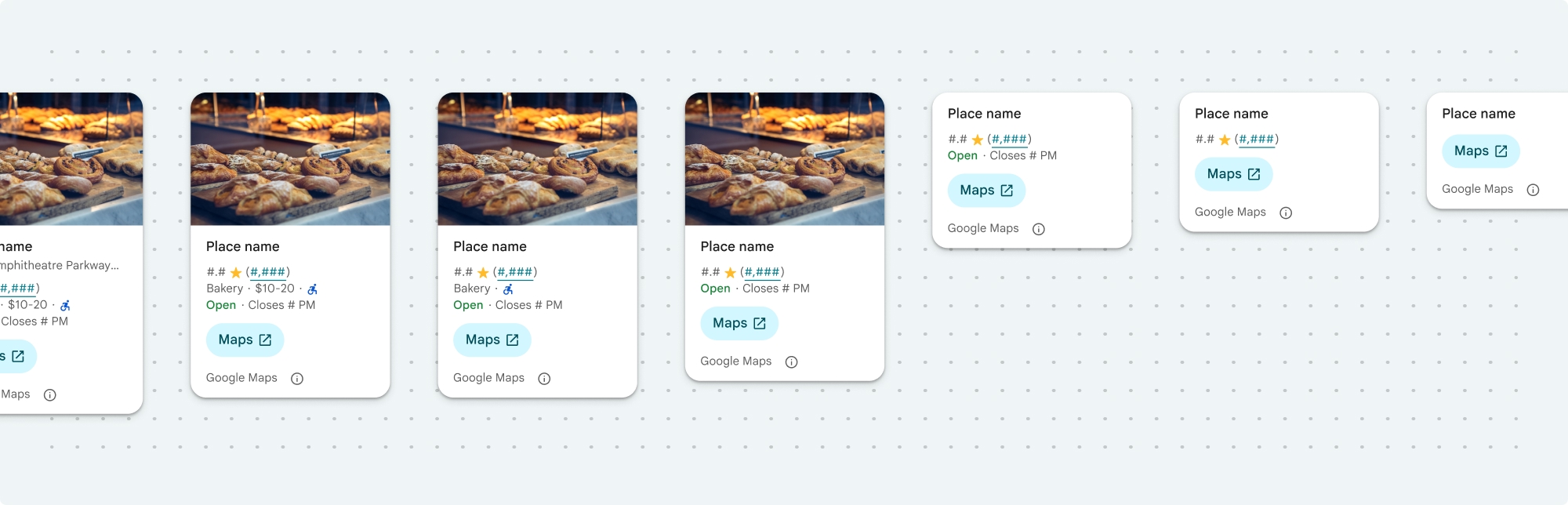
Das kompakte Layout kann entweder vertikal oder horizontal angezeigt werden. So können Sie die Komponente in verschiedene Designlayouts und Bildschirmgrößen einfügen. Das vollständige Layout kann nur vertikal angezeigt werden.
Mit der Komponente „Ortsdetails“ haben Sie detaillierte Kontrolle über die in der Komponente angezeigten Inhalte. Jedes Element (z. B. Fotos, Rezensionen und Kontaktdaten) kann einzeln ein- oder ausgeblendet werden. So lässt sich das Erscheinungsbild der Komponenten und die Informationsdichte genau anpassen.
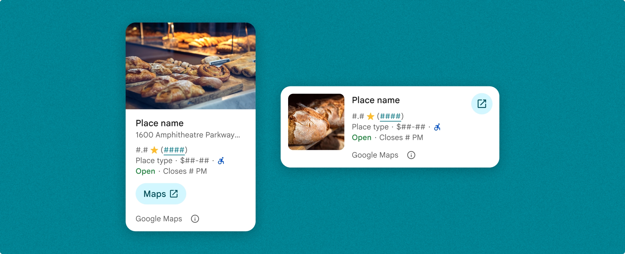
Kompaktansicht für Ortsdetails
Mit dem kompakten Fragment „Place Details“ (PlaceDetailsCompactFragment) werden Details für einen ausgewählten Ort auf minimalem Raum gerendert. Das kann in einem Infofenster nützlich sein, in dem ein Ort auf einer Karte hervorgehoben wird, in einem sozialen Medium wie dem Teilen eines Standorts in einem Chat, als Vorschlag für die Auswahl Ihres aktuellen Standorts oder in einem Medienartikel, um auf den Ort in Google Maps zu verweisen.
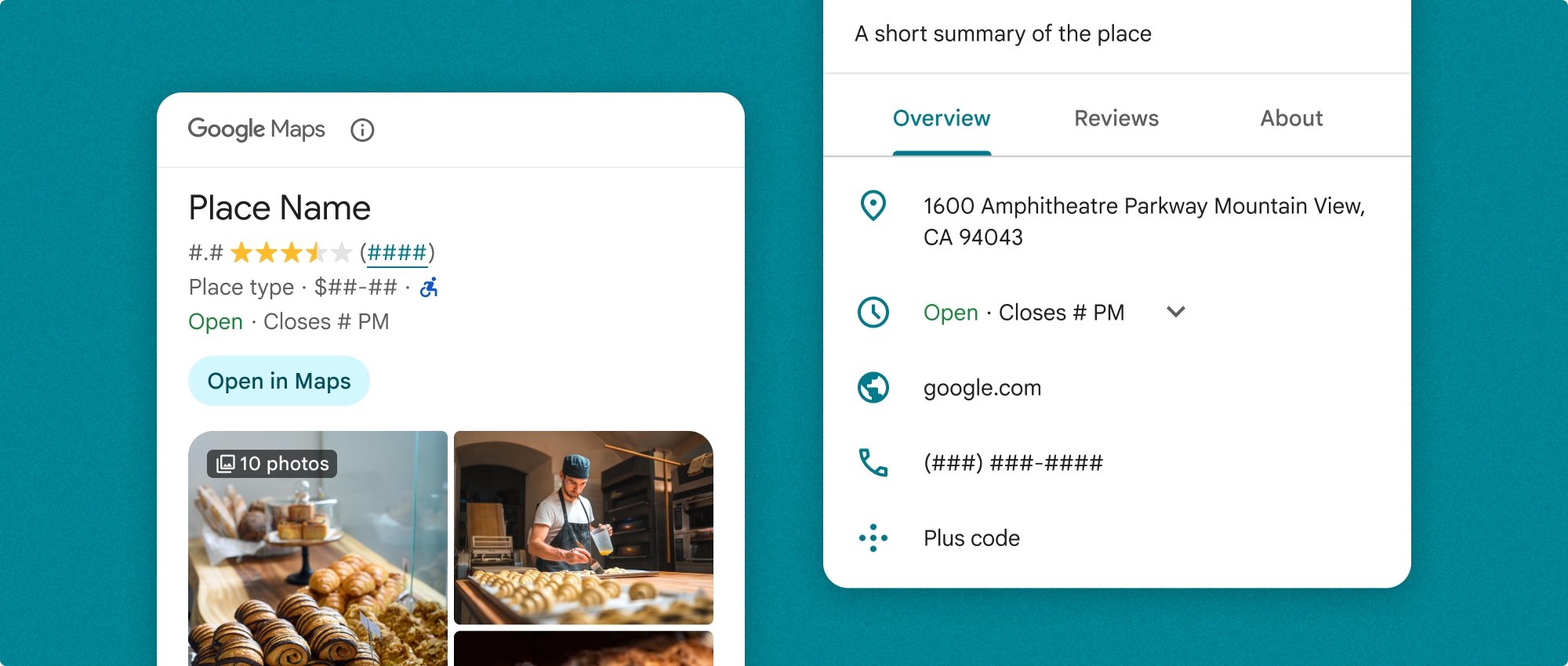
Vollständige Ansicht der Ortsdetails
Die vollständige Ansicht von Ortsdetails (PlaceDetailsFragment) bietet mehr Platz für die Anzeige von Ortsdetails und ermöglicht es Ihnen, mehr Arten von Informationen zu präsentieren.
Optionen für die Inhaltsanzeige
Mit den Enums in PlaceDetailsCompactFragment.Content oder PlaceDetailsFragment.Content können Sie angeben, welche Inhalte angezeigt werden sollen.
| Kompaktansicht | Vollansicht |
|---|---|
|
|
Abrechnung
Wenn Sie das Place Details UI Kit verwenden, wird Ihnen jeder Aufruf der Methode .loadWithPlaceId(), .loadWithResourceName() oder loadWithCoordinates() in Rechnung gestellt. Wenn Sie denselben Ort mehrmals laden, wird Ihnen jede Anfrage in Rechnung gestellt.
Damit Ihnen keine doppelten Gebühren berechnet werden, sollten Sie .loadWithPlaceId() oder .loadWithResourceName() nicht direkt in Android-Lebenszyklusmethoden hinzufügen. Rufen Sie beispielsweise .loadWithPlaceId() oder .loadWithResourceName() nicht direkt in der Methode onResume() auf.
Ortsdetails in Ihre App einfügen
Sie können Ihrer App Ortsdetails hinzufügen, indem Sie einem Layout ein Fragment hinzufügen. Wenn Sie das Fragment instanziieren, können Sie das Aussehen und Verhalten der Ortsdetails an Ihre Bedürfnisse und das Erscheinungsbild Ihrer App anpassen. Weitere Informationen zur Anpassung
Sowohl in Kotlin als auch in Java stehen drei Methoden zur Verfügung: eine zum Laden des Fragments mit einer Orts-ID (loadWithPlaceId()), eine zum Laden des Fragments mit einem Ressourcennamen (loadWithResourceName()) und eine zum Laden des Fragments mit Breiten-/Längengradkoordinaten (loadWithCoordinates()). Sie können eine oder mehrere Methoden auswählen.
Die Standardposition für die kompakte Ansicht ist vertikal. Wenn Sie ein horizontales Layout wünschen, geben Sie Orientation.HORIZONTAL an. Optional können Sie auch Orientation.VERTICAL angeben, um die Lesbarkeit zu verbessern. Die Vollansicht kann nur vertikal angezeigt werden.
Beispiele finden Sie im Abschnitt Beispiele für die Komponente „Ortsdetails“.
Visuelle Darstellung anpassen
Benutzerdefinierte Stile
Sie können die Farben, Typografie, Abstände, Rahmen und Ecken der Komponente „Ortsdetails“ anpassen.
Das Places UI Kit bietet einen Designsystemansatz für die visuelle Anpassung, der in etwa auf Material Design basiert (mit einigen Google Maps-spezifischen Änderungen). Weitere Informationen finden Sie in den Material Design-Referenzen zu Farbe und Typografie. Standardmäßig entspricht der Stil der visuellen Designsprache von Google Maps.
Das Places UI Kit bietet standardmäßig ein dunkles Design. Möglicherweise müssen Sie also sowohl das dunkle als auch das helle Design anpassen. Wenn Sie das dunkle Design anpassen möchten, fügen Sie in values-night/colors.xml einen Eintrag für die Farbe hinzu.
Weitere Informationen zum Formatieren finden Sie im Abschnitt Benutzerdefinierte Formatierung.
Breite und Höhe anpassen
Kompaktansichten
Empfohlene Breiten:
- Vertikale Ausrichtung: Zwischen 180 und 300 dp.
- Horizontale Ausrichtung: Zwischen 180 und 500 dp.
Breiten unter 160 dp werden möglicherweise nicht richtig angezeigt.
Es wird empfohlen, keine Höhe für kompakte Ansichten festzulegen. So kann die Höhe des Fensters an den Inhalt angepasst werden, damit alle Informationen angezeigt werden.
Vollständige Wiedergaben
Für vollständige Ansichten wird eine Breite zwischen 250 dp und 450 dp empfohlen. Eine Breite von weniger als 250 dp wird möglicherweise nicht richtig angezeigt.
Sie können die Höhe der Komponente festlegen. Die vertikale Ansicht mit den Ortsdetails wird innerhalb des zugewiesenen Bereichs vertikal gescrollt.
Es empfiehlt sich, eine Höhe für die Vollansicht festzulegen. So können die Inhalte im Fenster richtig gescrollt werden.
Beispiele für die „Place Details“-Komponente
Kompakte oder vollständige Ansicht erstellen
Kotlin
        // We create a new instance of the fragment using its factory method.
        // We can specify which content to show, the orientation, and a custom theme.
        val fragment = PlaceDetailsCompactFragment.newInstance(
            PlaceDetailsCompactFragment.ALL_CONTENT, // Show all available content.
            orientation,
            R.style.CustomizedPlaceDetailsTheme,
        ).apply {
            // The PlaceLoadListener provides callbacks for when the place data is successfully
            // loaded or when an error occurs. This is where we update our UI state.
            setPlaceLoadListener(object : PlaceLoadListener {
                override fun onSuccess(place: Place) {
                    Log.d(TAG, "Place loaded: ${place.id}")
                    // Once the data is loaded, we hide the loading indicator and show the fragment.
                    binding.loadingIndicatorMain.visibility = View.GONE
                    binding.placeDetailsContainer.visibility = View.VISIBLE
                    binding.dismissButton.visibility = View.VISIBLE
                }

                override fun onFailure(e: Exception) {
                    Log.e(TAG, "Place failed to load", e)
                    // On failure, we hide the UI and notify the user.
                    dismissPlaceDetails()
                    Toast.makeText(this@MainActivity, "Failed to load place details.", Toast.LENGTH_SHORT).show()
                }
            })
        }

        // We add the fragment to our layout's container view.
        // `commitNow()` is used to ensure the fragment is immediately added and available,
        // which is important because we need to call a method on it right after.
        supportFragmentManager
            .beginTransaction()
            .replace(binding.placeDetailsContainer.id, fragment)
            .commitNow()

        // **This is the key step**: After adding the fragment, we call `loadWithPlaceId`
        // to trigger the data loading process for the selected place.
        // We use `post` to ensure this runs after the layout has been measured,
        // which can prevent potential timing issues.
        binding.root.post {
            fragment.loadWithPlaceId(placeId)
        }
    }
Java
PlaceDetailsCompactFragment fragment =
  PlaceDetailsCompactFragment.newInstance(
        Orientation.HORIZONTAL,
        Arrays.asList(Content.ADDRESS, Content.TYPE, Content.RATING, Content.ACCESSIBLE_ENTRANCE_ICON),
        R.style.CustomizedPlaceDetailsTheme);

fragment.setPlaceLoadListener(
  new PlaceLoadListener() {
        @Override public void onSuccess(Place place) { ... }

        @Override public void onFailure(Exception e) { ... }
});

getSupportFragmentManager()
      .beginTransaction()
      .add(R.id.fragment_container, fragment)
      .commitNow();

// Load the fragment with a Place ID.
fragment.loadWithPlaceId(placeId);

// Load the fragment with a resource name.
fragment.loadWithResourceName(resourceName);
In diesem vollständigen Codebeispiel wird die Ausrichtung der kompakten Ansicht programmatisch anhand der Konfiguration des Geräts des Nutzers bestimmt.
Kotlin
package com.example.placedetailsuikit

import android.Manifest
import android.annotation.SuppressLint
import android.content.pm.PackageManager
import android.content.res.Configuration
import android.location.Location
import android.os.Bundle
import android.util.Log
import android.view.View
import android.widget.Toast
import androidx.activity.enableEdgeToEdge
import androidx.activity.result.ActivityResultLauncher
import androidx.activity.result.contract.ActivityResultContracts
import androidx.activity.viewModels
import androidx.appcompat.app.AppCompatActivity
import androidx.core.app.ActivityCompat
import androidx.lifecycle.ViewModel
import com.example.placedetailsuikit.databinding.ActivityMainBinding
import com.google.android.gms.location.FusedLocationProviderClient
import com.google.android.gms.location.LocationServices
import com.google.android.gms.maps.CameraUpdateFactory
import com.google.android.gms.maps.GoogleMap
import com.google.android.gms.maps.OnMapReadyCallback
import com.google.android.gms.maps.SupportMapFragment
import com.google.android.gms.maps.model.LatLng
import com.google.android.gms.maps.model.PointOfInterest
import com.google.android.libraries.places.api.Places
import com.google.android.libraries.places.api.model.Place
import com.google.android.libraries.places.widget.PlaceDetailsCompactFragment
import com.google.android.libraries.places.widget.PlaceLoadListener
import com.google.android.libraries.places.widget.model.Orientation

private const val TAG = "PlacesUiKit"

/**
 * A simple ViewModel to store UI state that needs to survive configuration changes.
 * In this case, it holds the ID of the selected place. Using a ViewModel is good practice
 * as it prevents data loss during events like screen rotation, ensuring a
 * seamless user experience.
 */
class MainViewModel : ViewModel() {
    var selectedPlaceId: String? = null
}

/**
 * This activity serves as a basic example of integrating the Place Details UI Kit.
 * It demonstrates the fundamental steps required:
 * 1. Setting up a Google Map.
 * 2. Requesting location permissions to center the map.
 * 3. Handling clicks on Points of Interest (POIs) to get a Place ID.
 * 4. Using the Place ID to load and display place details in a [PlaceDetailsCompactFragment].
 */
class MainActivity : AppCompatActivity(), OnMapReadyCallback, GoogleMap.OnPoiClickListener {
    // ViewBinding provides type-safe access to views defined in the XML layout,
    // eliminating the need for `findViewById` and preventing null pointer exceptions.
    private lateinit var binding: ActivityMainBinding
    private var googleMap: GoogleMap? = null

    // The FusedLocationProviderClient is the main entry point for interacting with the
    // fused location provider, which intelligently manages the underlying location technologies.
    private lateinit var fusedLocationClient: FusedLocationProviderClient

    // Using registerForActivityResult is the modern, recommended approach for handling
    // permission requests. It decouples the request from the handling logic, making the
    // code cleaner and easier to manage compared to the older `onRequestPermissionsResult` callback.
    private lateinit var requestPermissionLauncher: ActivityResultLauncher<Array<String>>

    // The `by viewModels()` delegate provides a lazy-initialized ViewModel scoped to this Activity.
    // This ensures that we get the same ViewModel instance across configuration changes.
    private val viewModel: MainViewModel by viewModels()

    override fun onCreate(savedInstanceState: Bundle?) {
        super.onCreate(savedInstanceState)

        // The ActivityResultLauncher is initialized here. The lambda defines the callback
        // that will be executed once the user responds to the permission dialog.
        requestPermissionLauncher =
            registerForActivityResult(ActivityResultContracts.RequestMultiplePermissions()) { permissions ->
                // We check if either fine or coarse location permission was granted.
                if (permissions[Manifest.permission.ACCESS_FINE_LOCATION] == true || permissions[Manifest.permission.ACCESS_COARSE_LOCATION] == true) {
                    Log.d(TAG, "Location permission granted by user.")
                    fetchLastLocation()
                } else {
                    // If permission is denied, we inform the user and default to a known location.
                    // This ensures the app remains functional even without location access.
                    Log.d(TAG, "Location permission denied by user.")
                    Toast.makeText(
                        this,
                        "Location permission denied. Showing default location.",
                        Toast.LENGTH_LONG
                    ).show()
                    moveToSydney()
                }
            }

        // enableEdgeToEdge() allows the app to draw behind the system bars for a more immersive experience.
        enableEdgeToEdge()
        binding = ActivityMainBinding.inflate(layoutInflater)
        setContentView(binding.root)

        binding.dismissButton.setOnClickListener {
            dismissPlaceDetails()
        }

        // --- Crucial: Initialize Places SDK ---
        // It's essential to initialize the Places SDK before making any other Places API calls.
        // This should ideally be done once, for example, in the Application's `onCreate`.
        val apiKey = BuildConfig.PLACES_API_KEY
        if (apiKey.isEmpty() || apiKey == "YOUR_API_KEY") {
            // A valid API key is required for the Places SDK to function.
            Log.e(TAG, "No api key")
            Toast.makeText(
                this,
                "Add your own API_KEY in local.properties",
                Toast.LENGTH_LONG
            ).show()
            finish()
            return
        }

        // `initializeWithNewPlacesApiEnabled` is used to opt-in to the new SDK version.
        Places.initializeWithNewPlacesApiEnabled(applicationContext, apiKey)

        fusedLocationClient = LocationServices.getFusedLocationProviderClient(this)
        // ------------------------------------

        // The SupportMapFragment is the container for the map. `getMapAsync` allows us to
        // work with the GoogleMap object via a callback once it's fully initialized.
        val mapFragment =
            supportFragmentManager.findFragmentById(R.id.map_fragment) as SupportMapFragment?
        mapFragment?.getMapAsync(this)

        // This block handles restoration after a configuration change (e.g., screen rotation).
        // If a place was selected before the rotation, its ID is stored in the ViewModel.
        // We use this ID to immediately show the details fragment again.
        if (viewModel.selectedPlaceId != null) {
            viewModel.selectedPlaceId?.let { placeId ->
                Log.d(TAG, "Restoring PlaceDetailsFragment for place ID: $placeId")
                showPlaceDetailsFragment(placeId)
            }
        }
    }

    /**
     * This callback is triggered when the GoogleMap object is ready to be used.
     * All map setup logic should be placed here.
     */
    override fun onMapReady(map: GoogleMap) {
        Log.d(TAG, "Map is ready")
        googleMap = map
        // Setting the OnPoiClickListener allows us to capture user taps on points of interest.
        googleMap?.setOnPoiClickListener(this)

        // After the map is ready, we determine the initial camera position based on location permissions.
        if (isLocationPermissionGranted()) {
            fetchLastLocation()
        } else {
            requestLocationPermissions()
        }
    }

    /**
     * A helper function to centralize the check for location permissions.
     */
    private fun isLocationPermissionGranted(): Boolean {
        return ActivityCompat.checkSelfPermission(
            this,
            Manifest.permission.ACCESS_FINE_LOCATION
        ) == PackageManager.PERMISSION_GRANTED ||
                ActivityCompat.checkSelfPermission(
                    this,
                    Manifest.permission.ACCESS_COARSE_LOCATION
                ) == PackageManager.PERMISSION_GRANTED
    }

    /**
     * This function triggers the permission request flow. The result is handled by the
     * ActivityResultLauncher defined in `onCreate`.
     */
    private fun requestLocationPermissions() {
        Log.d(TAG, "Requesting location permissions.")
        requestPermissionLauncher.launch(
            arrayOf(
                Manifest.permission.ACCESS_FINE_LOCATION,
                Manifest.permission.ACCESS_COARSE_LOCATION
            )
        )
    }

    /**
     * Fetches the device's last known location. This is a fast and battery-efficient way
     * to get a location fix. It should only be called after verifying permissions.
     */
    @SuppressLint("MissingPermission")
    private fun fetchLastLocation() {
        // Double-checking permissions here is a good practice, although the call sites are already guarded.
        if (isLocationPermissionGranted()) {
            fusedLocationClient.lastLocation
                .addOnSuccessListener { location: Location? ->
                    if (location != null) {
                        val userLocation = LatLng(location.latitude, location.longitude)
                        googleMap?.moveCamera(CameraUpdateFactory.newLatLngZoom(userLocation, 13f))
                        Log.d(TAG, "Moved to user's last known location.")
                    } else {
                        // `lastLocation` can be null if the location has never been recorded.
                        // In this case, we fall back to a default location.
                        Log.d(TAG, "Last known location is null. Falling back to Sydney.")
                        moveToSydney()
                    }
                }
                .addOnFailureListener {
                    // This listener handles errors in the location fetching process.
                    Log.e(TAG, "Failed to get location.", it)
                    moveToSydney()
                }
        }
    }

    /**
     * Moves the map camera to a default, hardcoded location (Sydney).
     * This serves as a reliable fallback.
     */
    private fun moveToSydney() {
        val sydney = LatLng(-33.8688, 151.2093)
        googleMap?.moveCamera(CameraUpdateFactory.newLatLngZoom(sydney, 13f))
        Log.d(TAG, "Moved to Sydney")
    }

    /**
     * This is the callback for the `OnPoiClickListener`. It's triggered when a user
     * taps a POI on the map.
     */
    override fun onPoiClick(poi: PointOfInterest) {
        val placeId = poi.placeId
        Log.d(TAG, "Place ID: $placeId")

        // We save the selected place ID to the ViewModel. This is critical for surviving
        // configuration changes. If the user rotates the screen now, the `onCreate`
        // method will be able to restore the place details view.
        viewModel.selectedPlaceId = placeId
        showPlaceDetailsFragment(placeId)
    }

    /**
     * This function is the core of the integration. It creates, configures, and displays
     * the [PlaceDetailsCompactFragment].
     * @param placeId The unique identifier for the place to be displayed.
     */
    private fun showPlaceDetailsFragment(placeId: String) {
        Log.d(TAG, "Showing PlaceDetailsFragment for place ID: $placeId")

        // We manage the visibility of UI elements to provide feedback to the user.
        // The wrapper is shown, and a loading indicator is displayed while the data is fetched.
        binding.placeDetailsWrapper.visibility = View.VISIBLE
        binding.dismissButton.visibility = View.GONE
        binding.placeDetailsContainer.visibility = View.GONE
        binding.loadingIndicatorMain.visibility = View.VISIBLE

        // The Place Details widget can be displayed vertically or horizontally.
        // We dynamically choose the orientation based on the device's current configuration.
        val orientation =
            if (resources.configuration.orientation == Configuration.ORIENTATION_LANDSCAPE) {
                Orientation.HORIZONTAL
            } else {
                Orientation.VERTICAL
            }


        // We create a new instance of the fragment using its factory method.
        // We can specify which content to show, the orientation, and a custom theme.
        val fragment = PlaceDetailsCompactFragment.newInstance(
            PlaceDetailsCompactFragment.ALL_CONTENT, // Show all available content.
            orientation,
            R.style.CustomizedPlaceDetailsTheme,
        ).apply {
            // The PlaceLoadListener provides callbacks for when the place data is successfully
            // loaded or when an error occurs. This is where we update our UI state.
            setPlaceLoadListener(object : PlaceLoadListener {
                override fun onSuccess(place: Place) {
                    Log.d(TAG, "Place loaded: ${place.id}")
                    // Once the data is loaded, we hide the loading indicator and show the fragment.
                    binding.loadingIndicatorMain.visibility = View.GONE
                    binding.placeDetailsContainer.visibility = View.VISIBLE
                    binding.dismissButton.visibility = View.VISIBLE
                }

                override fun onFailure(e: Exception) {
                    Log.e(TAG, "Place failed to load", e)
                    // On failure, we hide the UI and notify the user.
                    dismissPlaceDetails()
                    Toast.makeText(this@MainActivity, "Failed to load place details.", Toast.LENGTH_SHORT).show()
                }
            })
        }

        // We add the fragment to our layout's container view.
        // `commitNow()` is used to ensure the fragment is immediately added and available,
        // which is important because we need to call a method on it right after.
        supportFragmentManager
            .beginTransaction()
            .replace(binding.placeDetailsContainer.id, fragment)
            .commitNow()

        // **This is the key step**: After adding the fragment, we call `loadWithPlaceId`
        // to trigger the data loading process for the selected place.
        // We use `post` to ensure this runs after the layout has been measured,
        // which can prevent potential timing issues.
        binding.root.post {
            fragment.loadWithPlaceId(placeId)
        }
    }


    /**
     * Hides the place details view and clears the selected place ID from the ViewModel.
     */
    private fun dismissPlaceDetails() {
        binding.placeDetailsWrapper.visibility = View.GONE
        // Clearing the ID in the ViewModel is important so that if the user rotates the
        // screen after dismissing, the details view doesn't reappear.
        viewModel.selectedPlaceId = null
    }

    override fun onDestroy() {
        super.onDestroy()
        // It's a good practice to nullify references to objects that have a lifecycle
        // tied to the activity, like the GoogleMap object, to prevent potential memory leaks.
        googleMap = null
    }
}
Design erstellen
Beim Instanziieren eines Fragments können Sie ein Design angeben, das alle Standardstilattribute überschreibt. Für alle Designattribute, die nicht überschrieben werden, werden die Standardstile verwendet. Wenn Sie das dunkle Design unterstützen möchten, können Sie einen Eintrag für die Farbe in values-night/colors.xml hinzufügen.
Das Places UI Kit bietet standardmäßig ein dunkles Design. Möglicherweise müssen Sie also sowohl das dunkle als auch das helle Design anpassen. Wenn Sie das dunkle Design anpassen möchten, fügen Sie in values-night/colors.xml einen Eintrag für die Farbe hinzu.
  <style name="CustomizedPlaceDetailsTheme" parent="PlacesMaterialTheme">
    <item name="placesColorPrimary">@color/app_primary_color</item>
    <item name="placesColorOnSurface">@color/app_color_on_surface</item>
    <item name="placesColorOnSurfaceVariant">@color/app_color_on_surface</item>

    <item name="placesTextAppearanceBodySmall">@style/app_text_appearence_small</item>

    <item name="placesCornerRadius">20dp</item>
  </style>
Standardinhalte verwenden
In diesem Beispiel werden Standardinhalte verwendet.
  val fragmentStandardContent = PlaceDetailsCompactFragment.newInstance(
    PlaceDetailsCompactFragment.STANDARD_CONTENT,
    orientation,
    R.style.CustomizedPlaceDetailsTheme
  )
Bestimmte Inhalte anpassen
In diesem Beispiel werden nur die Optionen für Adresse, barrierefreier Eingang und Media Content für eine kompakte Ansicht ausgewählt und mit CustomizedPlaceDetailsTheme gerendert.
  val placeDetailsFragment = PlaceDetailsCompactFragment.newInstance(
    orientation,
    listOf(
        Content.ADDRESS,
        Content.ACCESSIBLE_ENTRANCE,
        Content.MEDIA
    ),
    R.style.CustomizedPlaceDetailsTheme
)
Alle Inhalte verwenden
In diesem Beispiel werden alle Content-Optionen einer kompakten Ansicht verwendet.
  val fragmentAllContent = PlaceDetailsCompactFragment.newInstance(
    orientation,
    PlaceDetailsCompactFragment.ALL_CONTENT,
    R.style.CustomizedPlaceDetailsTheme
  )