
คอมโพเนนต์รายละเอียดสถานที่
คอมโพเนนต์รายละเอียดสถานที่ของ Places UI Kit ช่วยให้คุณเพิ่มคอมโพเนนต์ UI แต่ละรายการที่แสดงรายละเอียดสถานที่ในแอปได้ โดยคอมโพเนนต์นี้ปรับแต่งได้
คุณสามารถใช้คอมโพเนนต์รายละเอียดสถานที่แบบอิสระหรือใช้ร่วมกับ Google Maps Platform API และบริการอื่นๆ ก็ได้ คอมโพเนนต์จะใช้รหัสสถานที่ ชื่อทรัพยากร หรือพิกัดละติจูด/ลองจิจูด แล้วแสดงข้อมูลรายละเอียดสถานที่ที่แสดงผลแล้ว
คอมโพเนนต์รายละเอียดสถานที่สามารถใช้ธีมได้อย่างเต็มรูปแบบ ซึ่งช่วยให้คุณปรับแต่งแบบอักษร สี และรัศมีมุมให้ตรงกับกรณีการใช้งานและหลักเกณฑ์เกี่ยวกับแบรนด์ที่เป็นภาพได้ คุณปรับแต่งลักษณะที่ปรากฏของรายละเอียดสถานที่ได้โดยสร้างธีมที่ขยาย PlacesMaterialTheme และระบุการลบล้างแอตทริบิวต์ของธีม นอกจากนี้ คุณยังปรับแต่งช่องรายละเอียดสถานที่ที่จะรวมไว้ได้ด้วยการระบุรายการรายการเนื้อหา ซึ่งแต่ละรายการจะสอดคล้องกับข้อมูลที่แสดงเกี่ยวกับสถานที่
รูปแบบเลย์เอาต์
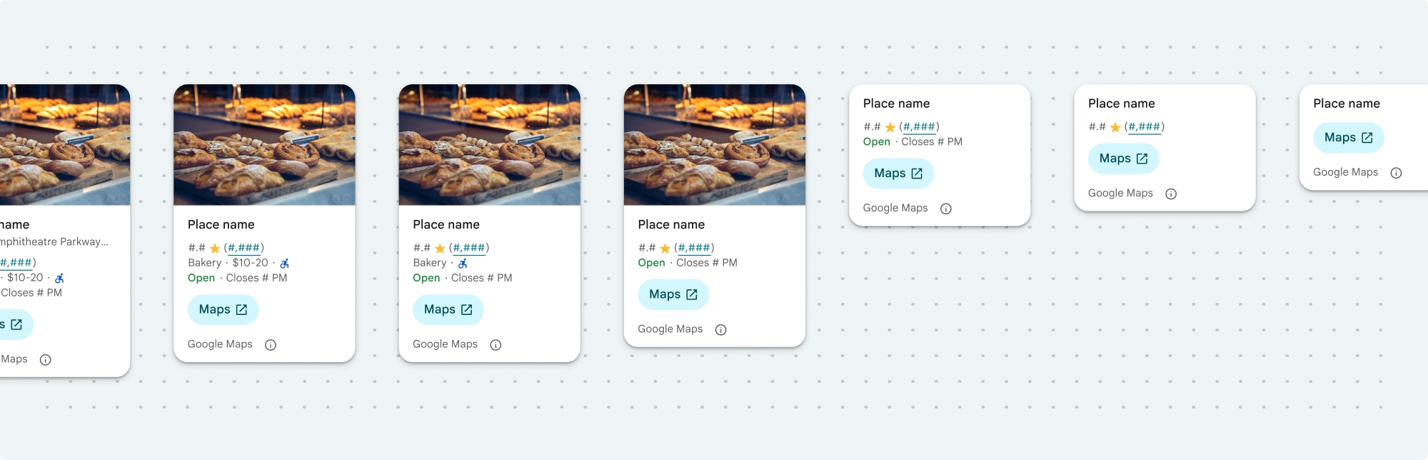
คอมโพเนนต์รายละเอียดสถานที่รองรับรูปแบบเลย์เอาต์หลัก 2 รูปแบบ ได้แก่
- กะทัดรัด: เลย์เอาต์สำหรับแสดงตัวอย่างข้อมูลสำคัญ
- เต็ม: เลย์เอาต์ที่ครอบคลุมซึ่งแสดงรายละเอียดสถานที่ทั้งหมดที่พร้อมใช้งาน
คุณสามารถแสดงเลย์เอาต์แบบกะทัดรัดในแนวตั้งหรือแนวนอนก็ได้ ซึ่งจะช่วยให้คุณผสานรวมคอมโพเนนต์เข้ากับเลย์เอาต์การออกแบบและขนาดหน้าจอต่างๆ ได้ ส่วนเลย์เอาต์แบบเต็มจะแสดงได้ในแนวตั้งเท่านั้น
คอมโพเนนต์รายละเอียดสถานที่ช่วยให้คุณควบคุมเนื้อหาที่แสดงในคอมโพเนนต์ได้อย่างละเอียด คุณสามารถแสดงหรือซ่อนแต่ละองค์ประกอบ (เช่น รูปภาพ รีวิว และข้อมูลติดต่อ) ได้เป็นรายบุคคล ซึ่งช่วยให้ปรับแต่งลักษณะที่ปรากฏและความหนาแน่นของข้อมูลของคอมโพเนนต์ได้อย่างแม่นยำ
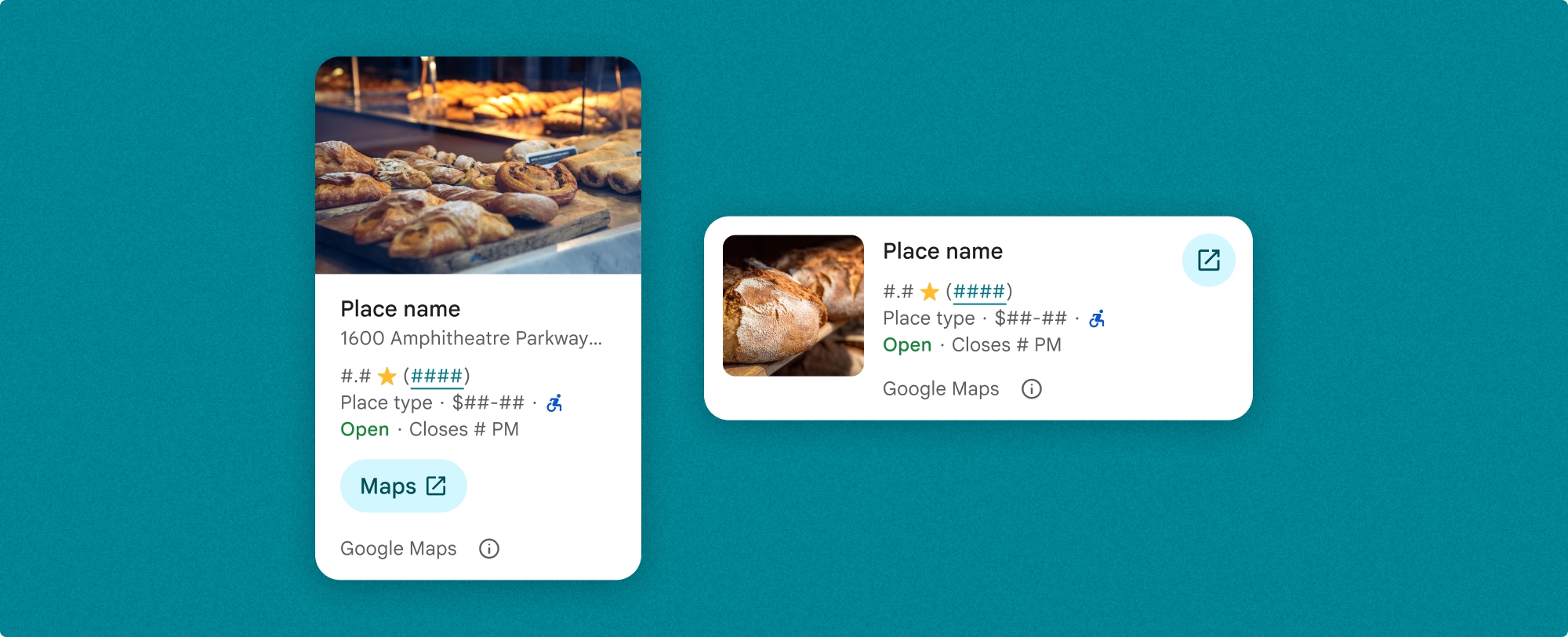
มุมมองแบบกะทัดรัดของรายละเอียดสถานที่
ข้อมูลย่อยแบบกะทัดรัดของรายละเอียดสถานที่ (PlaceDetailsCompactFragment) จะแสดงรายละเอียดของสถานที่ที่เลือกโดยใช้พื้นที่น้อยที่สุด ซึ่งอาจมีประโยชน์ในหน้าต่างข้อมูลที่ไฮไลต์สถานที่ในแผนที่ ในประสบการณ์การใช้งานโซเชียลมีเดีย เช่น การแชร์สถานที่ในแชท เป็นคำแนะนำสำหรับการเลือกตำแหน่งปัจจุบัน หรือภายในบทความสื่อเพื่ออ้างอิงสถานที่ใน Google Maps
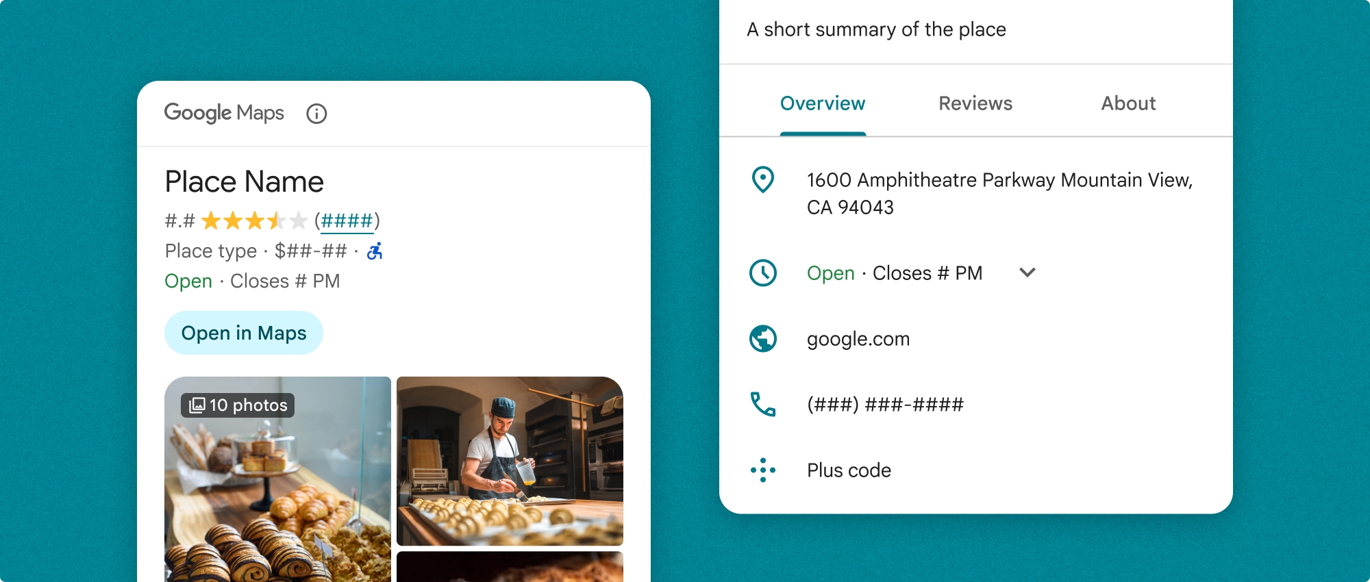
มุมมองแบบเต็มของรายละเอียดสถานที่
มุมมองแบบเต็มของรายละเอียดสถานที่ (PlaceDetailsFragment) มีพื้นที่ผิวที่ใหญ่ขึ้นเพื่อแสดงข้อมูลรายละเอียดสถานที่ และช่วยให้คุณแสดงข้อมูลได้หลายประเภทมากขึ้น
ตัวเลือกการแสดงเนื้อหา
คุณสามารถระบุเนื้อหาที่จะแสดงได้โดยใช้ Enum ใน PlaceDetailsCompactFragment.Content หรือ PlaceDetailsFragment.Content
| มุมมองแบบกะทัดรัด | มุมมองแบบเต็ม |
|---|---|
|
|
การเรียกเก็บเงิน
เมื่อใช้ Place Details UI Kit ระบบจะเรียกเก็บเงินทุกครั้งที่คุณเรียกใช้เมธอด .loadWithPlaceId(), .loadWithResourceName() หรือ loadWithCoordinates() หากคุณโหลดสถานที่เดียวกันหลายครั้ง ระบบจะเรียกเก็บเงินสำหรับการขอแต่ละครั้ง
หากต้องการหลีกเลี่ยงการถูกเรียกเก็บเงินหลายครั้ง อย่าเพิ่ม .loadWithPlaceId() หรือ .loadWithResourceName() ในเมธอดวงจรการทำงานของ Android โดยตรง เช่น อย่าเรียกใช้ .loadWithPlaceId() หรือ .loadWithResourceName() ในเมธอด onResume() โดยตรง
เพิ่มรายละเอียดสถานที่ลงในแอป
คุณเพิ่มรายละเอียดสถานที่ลงในแอปได้โดยเพิ่มข้อมูลย่อยลงในเลย์เอาต์ เมื่อสร้างอินสแตนซ์ข้อมูลย่อย คุณสามารถปรับแต่งรูปลักษณ์ของข้อมูลรายละเอียดสถานที่ให้เหมาะกับความต้องการและลักษณะที่ปรากฏของแอปได้ ดูข้อมูลเพิ่มเติมเกี่ยวกับการปรับแต่ง
คุณมี 3 เมธอดที่พร้อมใช้งานในทั้ง Kotlin และ Java ได้แก่ เมธอดหนึ่งสำหรับโหลดข้อมูลย่อยด้วยรหัสสถานที่ (loadWithPlaceId()), เมธอดหนึ่งสำหรับโหลดข้อมูลย่อยด้วยชื่อทรัพยากร (loadWithResourceName()) และเมธอดหนึ่งสำหรับโหลดข้อมูลย่อยด้วยพิกัดละติจูด/ลองจิจูด (loadWithCoordinates()) คุณสามารถเลือกเมธอดใดก็ได้หรือหลายเมธอด
ตำแหน่งเริ่มต้นสำหรับมุมมองแบบกะทัดรัดคือแนวตั้ง หากต้องการเลย์เอาต์แนวนอน ให้ระบุ Orientation.HORIZONTAL นอกจากนี้ คุณยังระบุ Orientation.VERTICAL เพื่อความชัดเจนได้ด้วย ส่วนมุมมองแบบเต็มจะแสดงได้ในแนวตั้งเท่านั้น
ดูตัวอย่างในส่วนตัวอย่างคอมโพเนนต์รายละเอียดสถานที่
ปรับแต่งลักษณะที่ปรากฏ
การจัดรูปแบบที่กำหนดเอง
คุณสามารถปรับแต่งสี การจัดตัวอักษร ระยะห่าง ขอบ และมุมของคอมโพเนนต์รายละเอียดสถานที่ได้
Places UI Kit มีแนวทางการออกแบบระบบสำหรับการปรับแต่งภาพโดยอิงตาม Material Design (มีการปรับเปลี่ยนบางอย่างที่เฉพาะเจาะจงสำหรับ Google Maps) ดูข้อมูลอ้างอิงสำหรับสีและการจัดตัวอักษรของ Material Design โดยค่าเริ่มต้น สไตล์จะเป็นไปตามภาษาการออกแบบภาพของ Google Maps
Places UI Kit มีธีมมืดให้โดยค่าเริ่มต้น ดังนั้นคุณอาจต้องปรับแต่งทั้งธีมมืดและธีมสว่าง หากต้องการปรับแต่งธีมมืด ให้เพิ่มรายการสำหรับสีใน values-night/colors.xml
ดูข้อมูลเพิ่มเติมเกี่ยวกับการจัดรูปแบบได้ในส่วนการจัดรูปแบบที่กำหนดเอง
การปรับแต่งความกว้างและความสูง
มุมมองแบบกะทัดรัด
ความกว้างที่แนะนำ
- การวางแนวแนวตั้ง: ระหว่าง 180dp ถึง 300dp
- การวางแนวแนวนอน: ระหว่าง 180dp ถึง 500dp
ความกว้างที่น้อยกว่า 160dp อาจแสดงผลไม่ถูกต้อง
แนวทางปฏิบัติแนะนำคือไม่ตั้งค่าความสูงสำหรับมุมมองแบบกะทัดรัด ซึ่งจะช่วยให้เนื้อหาในหน้าต่างกำหนดความสูงได้ ทำให้ข้อมูลทั้งหมดแสดงผลได้
มุมมองแบบเต็ม
สำหรับมุมมองแบบเต็ม ความกว้างที่แนะนำคือระหว่าง 250dp ถึง 450dp ความกว้างที่น้อยกว่า 250dp อาจแสดงผลไม่ถูกต้อง
คุณสามารถตั้งค่าความสูงของคอมโพเนนต์ได้ โดยมุมมองรายละเอียดสถานที่แนวตั้งจะเลื่อนในแนวตั้งภายในพื้นที่ที่จัดสรร
แนวทางปฏิบัติแนะนำคือตั้งค่าความสูงสำหรับมุมมองแบบเต็ม ซึ่งจะช่วยให้เนื้อหาในหน้าต่างเลื่อนได้อย่างถูกต้อง
ตัวอย่างคอมโพเนนต์รายละเอียดสถานที่
สร้างมุมมองแบบกะทัดรัดหรือแบบเต็ม
Kotlin
        // We create a new instance of the fragment using its factory method.
        // We can specify which content to show, the orientation, and a custom theme.
        val fragment = PlaceDetailsCompactFragment.newInstance(
            PlaceDetailsCompactFragment.ALL_CONTENT, // Show all available content.
            orientation,
            R.style.CustomizedPlaceDetailsTheme,
        ).apply {
            // The PlaceLoadListener provides callbacks for when the place data is successfully
            // loaded or when an error occurs. This is where we update our UI state.
            setPlaceLoadListener(object : PlaceLoadListener {
                override fun onSuccess(place: Place) {
                    Log.d(TAG, "Place loaded: ${place.id}")
                    // Once the data is loaded, we hide the loading indicator and show the fragment.
                    binding.loadingIndicatorMain.visibility = View.GONE
                    binding.placeDetailsContainer.visibility = View.VISIBLE
                    binding.dismissButton.visibility = View.VISIBLE
                }

                override fun onFailure(e: Exception) {
                    Log.e(TAG, "Place failed to load", e)
                    // On failure, we hide the UI and notify the user.
                    dismissPlaceDetails()
                    Toast.makeText(this@MainActivity, "Failed to load place details.", Toast.LENGTH_SHORT).show()
                }
            })
        }

        // We add the fragment to our layout's container view.
        // `commitNow()` is used to ensure the fragment is immediately added and available,
        // which is important because we need to call a method on it right after.
        supportFragmentManager
            .beginTransaction()
            .replace(binding.placeDetailsContainer.id, fragment)
            .commitNow()

        // **This is the key step**: After adding the fragment, we call `loadWithPlaceId`
        // to trigger the data loading process for the selected place.
        // We use `post` to ensure this runs after the layout has been measured,
        // which can prevent potential timing issues.
        binding.root.post {
            fragment.loadWithPlaceId(placeId)
        }
    }
Java
PlaceDetailsCompactFragment fragment =
  PlaceDetailsCompactFragment.newInstance(
        Orientation.HORIZONTAL,
        Arrays.asList(Content.ADDRESS, Content.TYPE, Content.RATING, Content.ACCESSIBLE_ENTRANCE_ICON),
        R.style.CustomizedPlaceDetailsTheme);

fragment.setPlaceLoadListener(
  new PlaceLoadListener() {
        @Override public void onSuccess(Place place) { ... }

        @Override public void onFailure(Exception e) { ... }
});

getSupportFragmentManager()
      .beginTransaction()
      .add(R.id.fragment_container, fragment)
      .commitNow();

// Load the fragment with a Place ID.
fragment.loadWithPlaceId(placeId);

// Load the fragment with a resource name.
fragment.loadWithResourceName(resourceName);
ตัวอย่างโค้ดแบบเต็มนี้จะกำหนดการวางแนวของมุมมองแบบกะทัดรัดโดยโปรแกรมตามการกำหนดค่าของอุปกรณ์ผู้ใช้
Kotlin
package com.example.placedetailsuikit

import android.Manifest
import android.annotation.SuppressLint
import android.content.pm.PackageManager
import android.content.res.Configuration
import android.location.Location
import android.os.Bundle
import android.util.Log
import android.view.View
import android.widget.Toast
import androidx.activity.enableEdgeToEdge
import androidx.activity.result.ActivityResultLauncher
import androidx.activity.result.contract.ActivityResultContracts
import androidx.activity.viewModels
import androidx.appcompat.app.AppCompatActivity
import androidx.core.app.ActivityCompat
import androidx.lifecycle.ViewModel
import com.example.placedetailsuikit.databinding.ActivityMainBinding
import com.google.android.gms.location.FusedLocationProviderClient
import com.google.android.gms.location.LocationServices
import com.google.android.gms.maps.CameraUpdateFactory
import com.google.android.gms.maps.GoogleMap
import com.google.android.gms.maps.OnMapReadyCallback
import com.google.android.gms.maps.SupportMapFragment
import com.google.android.gms.maps.model.LatLng
import com.google.android.gms.maps.model.PointOfInterest
import com.google.android.libraries.places.api.Places
import com.google.android.libraries.places.api.model.Place
import com.google.android.libraries.places.widget.PlaceDetailsCompactFragment
import com.google.android.libraries.places.widget.PlaceLoadListener
import com.google.android.libraries.places.widget.model.Orientation

private const val TAG = "PlacesUiKit"

/**
 * A simple ViewModel to store UI state that needs to survive configuration changes.
 * In this case, it holds the ID of the selected place. Using a ViewModel is good practice
 * as it prevents data loss during events like screen rotation, ensuring a
 * seamless user experience.
 */
class MainViewModel : ViewModel() {
    var selectedPlaceId: String? = null
}

/**
 * This activity serves as a basic example of integrating the Place Details UI Kit.
 * It demonstrates the fundamental steps required:
 * 1. Setting up a Google Map.
 * 2. Requesting location permissions to center the map.
 * 3. Handling clicks on Points of Interest (POIs) to get a Place ID.
 * 4. Using the Place ID to load and display place details in a [PlaceDetailsCompactFragment].
 */
class MainActivity : AppCompatActivity(), OnMapReadyCallback, GoogleMap.OnPoiClickListener {
    // ViewBinding provides type-safe access to views defined in the XML layout,
    // eliminating the need for `findViewById` and preventing null pointer exceptions.
    private lateinit var binding: ActivityMainBinding
    private var googleMap: GoogleMap? = null

    // The FusedLocationProviderClient is the main entry point for interacting with the
    // fused location provider, which intelligently manages the underlying location technologies.
    private lateinit var fusedLocationClient: FusedLocationProviderClient

    // Using registerForActivityResult is the modern, recommended approach for handling
    // permission requests. It decouples the request from the handling logic, making the
    // code cleaner and easier to manage compared to the older `onRequestPermissionsResult` callback.
    private lateinit var requestPermissionLauncher: ActivityResultLauncher<Array<String>>

    // The `by viewModels()` delegate provides a lazy-initialized ViewModel scoped to this Activity.
    // This ensures that we get the same ViewModel instance across configuration changes.
    private val viewModel: MainViewModel by viewModels()

    override fun onCreate(savedInstanceState: Bundle?) {
        super.onCreate(savedInstanceState)

        // The ActivityResultLauncher is initialized here. The lambda defines the callback
        // that will be executed once the user responds to the permission dialog.
        requestPermissionLauncher =
            registerForActivityResult(ActivityResultContracts.RequestMultiplePermissions()) { permissions ->
                // We check if either fine or coarse location permission was granted.
                if (permissions[Manifest.permission.ACCESS_FINE_LOCATION] == true || permissions[Manifest.permission.ACCESS_COARSE_LOCATION] == true) {
                    Log.d(TAG, "Location permission granted by user.")
                    fetchLastLocation()
                } else {
                    // If permission is denied, we inform the user and default to a known location.
                    // This ensures the app remains functional even without location access.
                    Log.d(TAG, "Location permission denied by user.")
                    Toast.makeText(
                        this,
                        "Location permission denied. Showing default location.",
                        Toast.LENGTH_LONG
                    ).show()
                    moveToSydney()
                }
            }

        // enableEdgeToEdge() allows the app to draw behind the system bars for a more immersive experience.
        enableEdgeToEdge()
        binding = ActivityMainBinding.inflate(layoutInflater)
        setContentView(binding.root)

        binding.dismissButton.setOnClickListener {
            dismissPlaceDetails()
        }

        // --- Crucial: Initialize Places SDK ---
        // It's essential to initialize the Places SDK before making any other Places API calls.
        // This should ideally be done once, for example, in the Application's `onCreate`.
        val apiKey = BuildConfig.PLACES_API_KEY
        if (apiKey.isEmpty() || apiKey == "YOUR_API_KEY") {
            // A valid API key is required for the Places SDK to function.
            Log.e(TAG, "No api key")
            Toast.makeText(
                this,
                "Add your own API_KEY in local.properties",
                Toast.LENGTH_LONG
            ).show()
            finish()
            return
        }

        // `initializeWithNewPlacesApiEnabled` is used to opt-in to the new SDK version.
        Places.initializeWithNewPlacesApiEnabled(applicationContext, apiKey)

        fusedLocationClient = LocationServices.getFusedLocationProviderClient(this)
        // ------------------------------------

        // The SupportMapFragment is the container for the map. `getMapAsync` allows us to
        // work with the GoogleMap object via a callback once it's fully initialized.
        val mapFragment =
            supportFragmentManager.findFragmentById(R.id.map_fragment) as SupportMapFragment?
        mapFragment?.getMapAsync(this)

        // This block handles restoration after a configuration change (e.g., screen rotation).
        // If a place was selected before the rotation, its ID is stored in the ViewModel.
        // We use this ID to immediately show the details fragment again.
        if (viewModel.selectedPlaceId != null) {
            viewModel.selectedPlaceId?.let { placeId ->
                Log.d(TAG, "Restoring PlaceDetailsFragment for place ID: $placeId")
                showPlaceDetailsFragment(placeId)
            }
        }
    }

    /**
     * This callback is triggered when the GoogleMap object is ready to be used.
     * All map setup logic should be placed here.
     */
    override fun onMapReady(map: GoogleMap) {
        Log.d(TAG, "Map is ready")
        googleMap = map
        // Setting the OnPoiClickListener allows us to capture user taps on points of interest.
        googleMap?.setOnPoiClickListener(this)

        // After the map is ready, we determine the initial camera position based on location permissions.
        if (isLocationPermissionGranted()) {
            fetchLastLocation()
        } else {
            requestLocationPermissions()
        }
    }

    /**
     * A helper function to centralize the check for location permissions.
     */
    private fun isLocationPermissionGranted(): Boolean {
        return ActivityCompat.checkSelfPermission(
            this,
            Manifest.permission.ACCESS_FINE_LOCATION
        ) == PackageManager.PERMISSION_GRANTED ||
                ActivityCompat.checkSelfPermission(
                    this,
                    Manifest.permission.ACCESS_COARSE_LOCATION
                ) == PackageManager.PERMISSION_GRANTED
    }

    /**
     * This function triggers the permission request flow. The result is handled by the
     * ActivityResultLauncher defined in `onCreate`.
     */
    private fun requestLocationPermissions() {
        Log.d(TAG, "Requesting location permissions.")
        requestPermissionLauncher.launch(
            arrayOf(
                Manifest.permission.ACCESS_FINE_LOCATION,
                Manifest.permission.ACCESS_COARSE_LOCATION
            )
        )
    }

    /**
     * Fetches the device's last known location. This is a fast and battery-efficient way
     * to get a location fix. It should only be called after verifying permissions.
     */
    @SuppressLint("MissingPermission")
    private fun fetchLastLocation() {
        // Double-checking permissions here is a good practice, although the call sites are already guarded.
        if (isLocationPermissionGranted()) {
            fusedLocationClient.lastLocation
                .addOnSuccessListener { location: Location? ->
                    if (location != null) {
                        val userLocation = LatLng(location.latitude, location.longitude)
                        googleMap?.moveCamera(CameraUpdateFactory.newLatLngZoom(userLocation, 13f))
                        Log.d(TAG, "Moved to user's last known location.")
                    } else {
                        // `lastLocation` can be null if the location has never been recorded.
                        // In this case, we fall back to a default location.
                        Log.d(TAG, "Last known location is null. Falling back to Sydney.")
                        moveToSydney()
                    }
                }
                .addOnFailureListener {
                    // This listener handles errors in the location fetching process.
                    Log.e(TAG, "Failed to get location.", it)
                    moveToSydney()
                }
        }
    }

    /**
     * Moves the map camera to a default, hardcoded location (Sydney).
     * This serves as a reliable fallback.
     */
    private fun moveToSydney() {
        val sydney = LatLng(-33.8688, 151.2093)
        googleMap?.moveCamera(CameraUpdateFactory.newLatLngZoom(sydney, 13f))
        Log.d(TAG, "Moved to Sydney")
    }

    /**
     * This is the callback for the `OnPoiClickListener`. It's triggered when a user
     * taps a POI on the map.
     */
    override fun onPoiClick(poi: PointOfInterest) {
        val placeId = poi.placeId
        Log.d(TAG, "Place ID: $placeId")

        // We save the selected place ID to the ViewModel. This is critical for surviving
        // configuration changes. If the user rotates the screen now, the `onCreate`
        // method will be able to restore the place details view.
        viewModel.selectedPlaceId = placeId
        showPlaceDetailsFragment(placeId)
    }

    /**
     * This function is the core of the integration. It creates, configures, and displays
     * the [PlaceDetailsCompactFragment].
     * @param placeId The unique identifier for the place to be displayed.
     */
    private fun showPlaceDetailsFragment(placeId: String) {
        Log.d(TAG, "Showing PlaceDetailsFragment for place ID: $placeId")

        // We manage the visibility of UI elements to provide feedback to the user.
        // The wrapper is shown, and a loading indicator is displayed while the data is fetched.
        binding.placeDetailsWrapper.visibility = View.VISIBLE
        binding.dismissButton.visibility = View.GONE
        binding.placeDetailsContainer.visibility = View.GONE
        binding.loadingIndicatorMain.visibility = View.VISIBLE

        // The Place Details widget can be displayed vertically or horizontally.
        // We dynamically choose the orientation based on the device's current configuration.
        val orientation =
            if (resources.configuration.orientation == Configuration.ORIENTATION_LANDSCAPE) {
                Orientation.HORIZONTAL
            } else {
                Orientation.VERTICAL
            }


        // We create a new instance of the fragment using its factory method.
        // We can specify which content to show, the orientation, and a custom theme.
        val fragment = PlaceDetailsCompactFragment.newInstance(
            PlaceDetailsCompactFragment.ALL_CONTENT, // Show all available content.
            orientation,
            R.style.CustomizedPlaceDetailsTheme,
        ).apply {
            // The PlaceLoadListener provides callbacks for when the place data is successfully
            // loaded or when an error occurs. This is where we update our UI state.
            setPlaceLoadListener(object : PlaceLoadListener {
                override fun onSuccess(place: Place) {
                    Log.d(TAG, "Place loaded: ${place.id}")
                    // Once the data is loaded, we hide the loading indicator and show the fragment.
                    binding.loadingIndicatorMain.visibility = View.GONE
                    binding.placeDetailsContainer.visibility = View.VISIBLE
                    binding.dismissButton.visibility = View.VISIBLE
                }

                override fun onFailure(e: Exception) {
                    Log.e(TAG, "Place failed to load", e)
                    // On failure, we hide the UI and notify the user.
                    dismissPlaceDetails()
                    Toast.makeText(this@MainActivity, "Failed to load place details.", Toast.LENGTH_SHORT).show()
                }
            })
        }

        // We add the fragment to our layout's container view.
        // `commitNow()` is used to ensure the fragment is immediately added and available,
        // which is important because we need to call a method on it right after.
        supportFragmentManager
            .beginTransaction()
            .replace(binding.placeDetailsContainer.id, fragment)
            .commitNow()

        // **This is the key step**: After adding the fragment, we call `loadWithPlaceId`
        // to trigger the data loading process for the selected place.
        // We use `post` to ensure this runs after the layout has been measured,
        // which can prevent potential timing issues.
        binding.root.post {
            fragment.loadWithPlaceId(placeId)
        }
    }


    /**
     * Hides the place details view and clears the selected place ID from the ViewModel.
     */
    private fun dismissPlaceDetails() {
        binding.placeDetailsWrapper.visibility = View.GONE
        // Clearing the ID in the ViewModel is important so that if the user rotates the
        // screen after dismissing, the details view doesn't reappear.
        viewModel.selectedPlaceId = null
    }

    override fun onDestroy() {
        super.onDestroy()
        // It's a good practice to nullify references to objects that have a lifecycle
        // tied to the activity, like the GoogleMap object, to prevent potential memory leaks.
        googleMap = null
    }
}
สร้างธีม
เมื่อสร้างอินสแตนซ์ข้อมูลย่อย คุณสามารถระบุธีมที่จะลบล้างแอตทริบิวต์สไตล์เริ่มต้นได้ แอตทริบิวต์ของธีมที่ไม่ได้ลบล้างจะใช้สไตล์เริ่มต้น หากต้องการรองรับธีมมืด คุณสามารถเพิ่มรายการสำหรับสีใน values-night/colors.xml
Places UI Kit มีธีมมืดให้โดยค่าเริ่มต้น ดังนั้นคุณอาจต้องปรับแต่งทั้งธีมมืดและธีมสว่าง หากต้องการปรับแต่งธีมมืด ให้เพิ่มรายการสำหรับสีใน values-night/colors.xml
  <style name="CustomizedPlaceDetailsTheme" parent="PlacesMaterialTheme">
    <item name="placesColorPrimary">@color/app_primary_color</item>
    <item name="placesColorOnSurface">@color/app_color_on_surface</item>
    <item name="placesColorOnSurfaceVariant">@color/app_color_on_surface</item>

    <item name="placesTextAppearanceBodySmall">@style/app_text_appearence_small</item>

    <item name="placesCornerRadius">20dp</item>
  </style>
ใช้เนื้อหามาตรฐาน
ตัวอย่างนี้ใช้เนื้อหามาตรฐาน
  val fragmentStandardContent = PlaceDetailsCompactFragment.newInstance(
    PlaceDetailsCompactFragment.STANDARD_CONTENT,
    orientation,
    R.style.CustomizedPlaceDetailsTheme
  )
ปรับแต่งเนื้อหาที่เฉพาะเจาะจง
ตัวอย่างนี้เลือกเฉพาะตัวเลือก Content ที่อยู่ ทางเข้าที่รองรับเก้าอี้รถเข็น และสื่อสำหรับมุมมองแบบกะทัดรัด แล้วแสดงผลด้วย CustomizedPlaceDetailsTheme
  val placeDetailsFragment = PlaceDetailsCompactFragment.newInstance(
    orientation,
    listOf(
        Content.ADDRESS,
        Content.ACCESSIBLE_ENTRANCE,
        Content.MEDIA
    ),
    R.style.CustomizedPlaceDetailsTheme
)
ใช้เนื้อหาทั้งหมด
ตัวอย่างนี้ใช้ตัวเลือก Content ทั้งหมดของมุมมองแบบกะทัดรัด
  val fragmentAllContent = PlaceDetailsCompactFragment.newInstance(
    orientation,
    PlaceDetailsCompactFragment.ALL_CONTENT,
    R.style.CustomizedPlaceDetailsTheme
  )