
自訂樣式
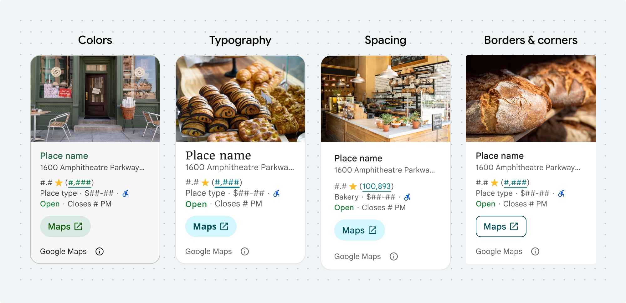
您可以自訂這些 Places UI Kit 元件和非 UI Kit 功能的顏色、字體、間距、邊框和圓角:
Places UI Kit 採用設計系統方法,以 Material Design 為基礎 (並進行一些 Google 地圖專屬的修改),提供視覺自訂功能。請參閱 Material Design 的顏色和字體排版參考資料。樣式預設會採用 Google 地圖的視覺設計語言。

元件的外觀和風格是透過 placesMaterialColor、placesMaterialFont、placesMaterialShape 和 placesMaterialTheme 結構體自訂。
你可以自訂下列樣式:
| 主題屬性 | 用量 |
|---|---|
| 顏色 | |
theme.color.surface |
容器和對話方塊背景 |
theme.color.outlineDecorative |
容器邊框 |
theme.color.primary |
連結、載入指標、總覽圖示 |
theme.color.onSurface |
標題、對話內容 |
theme.color.onSurfaceVariant |
地點資訊 |
theme.color.secondaryContainer |
按鈕背景 |
theme.color.onSecondaryContainer |
按鈕文字和圖示 |
theme.color.neutralContainer |
查看日期徽章、載入預留位置形狀 |
theme.color.onNeutralContainer |
審查日期、載入錯誤 |
theme.color.positiveContainer |
電動車充電器徽章 |
theme.color.onPositiveContainer |
電動車充電器徽章內容 |
theme.color.positive |
放置「營業中」標籤 |
theme.color.negative |
地點現在標示為「已關閉」 |
theme.color.info |
無障礙入口圖示 |
theme.measurement.borderWidthButton |
「在地圖中開啟」和「確定」按鈕 |
| Typography | |
theme.font.bodySmall |
地點資訊 |
theme.font.bodyMedium |
地點資訊、對話內容 |
theme.font.labelMedium |
徽章內容 |
theme.font.labelLarge |
按鈕內容 |
theme.font.headlineMedium |
對話方塊標題 |
theme.font.displaySmall |
地點名稱 |
theme.font.titleSmall |
地點名稱 |
| 間距 | |
theme.measurement.spacingExtraSmall |
|
theme.measurement.spacingSmall |
|
theme.measurement.spacingMedium |
|
theme.measurement.spacinglarge |
|
theme.measurement.spacingExtraLarge |
|
theme.measurement.spacingTwoExtraLarge |
|
| 成效評估 | |
borderWidth |
容器 |
theme.measurement.borderWidthButton |
|
| 形狀 | |
theme.shape.cornerRadius |
容器 |
theme.shape.cornerRadiusButton |
「在 Google 地圖中開啟」和「確定」按鈕 (圓形圖示按鈕除外) |
theme.shape.cornerRadiusThumbnail |
放置縮圖圖片 |
theme.shape.cornerRadiusCollageOuter |
媒體美術拼貼 |
theme.shape.cornerRadiusCard |
地點資訊卡、使用者評論資訊卡 |
theme.shape.cornerRadiusDialog |
Google 地圖揭露事項對話方塊 |
| Google 地圖品牌出處資訊 | |
attribution.lightModeColor |
淺色主題 Google 地圖出處和揭露資訊按鈕 (白色、灰色和黑色列舉) |
attribution.darkModeColor |
Google 地圖深色主題的姓名標示和揭露資訊按鈕 (白色、灰色和黑色列舉) |
歸因顏色
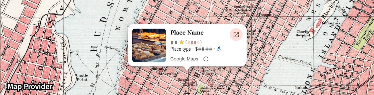
根據 Google 地圖服務條款,您必須使用三種品牌顏色之一,標示 Google 地圖出處。進行自訂變更後,必須顯示並提供存取這個出處資訊的管道。
我們提供 3 種品牌顏色供您選擇,淺色和深色主題可分別設定:
- 淺色主題:
attributionColorLight,其中包含白色、灰色和黑色的列舉。 - 深色主題:
attributionColorDark,其中包含白色、灰色和黑色的列舉。
範例
這個函式會建立主題,覆寫預設樣式屬性。未覆寫的主題屬性會使用預設樣式。Swift
  // Same for compact and full
func makeTemplateTheme(colorScheme: ColorScheme) -> PlacesMaterialTheme {
  var theme = PlacesMaterialTheme()
  var color = PlacesMaterialColor()
  color.surface = (colorScheme == .dark ? .blue : .gray)
  color.buttonBorder = (colorScheme == .dark ? .pink : .orange)
  color.outlineDecorative = (colorScheme == .dark ? .white : .black)
  color.onSurface = (colorScheme == .dark ? .yellow : .red)
  color.onSurfaceVariant = (colorScheme == .dark ? .white : .blue)
  color.onSecondaryContainer = (colorScheme == .dark ? .white : .red)
  color.secondaryContainer = (colorScheme == .dark ? .green : .purple)
  color.positive = (colorScheme == .dark ? .yellow : .red)
  color.primary = (colorScheme == .dark ? .yellow : .purple)
  color.info = (colorScheme == .dark ? .yellow : .purple)
  var shape = PlacesMaterialShape()
  shape.cornerRadius = 10
  var font = PlacesMaterialFont()
  font.labelLarge = .system(size: UIFontMetrics.default.scaledValue(for: 18))
  font.headlineMedium = .system(size: UIFontMetrics.default.scaledValue(for: 15))
  font.bodyLarge = .system(size: UIFontMetrics.default.scaledValue(for: 15))
  font.bodyMedium = .system(size: UIFontMetrics.default.scaledValue(for: 12))
  font.bodySmall = .system(size: UIFontMetrics.default.scaledValue(for: 11))
  var attribution = PlacesMaterialAttribution()
  attribution.lightModeColor = .black
  attribution.darkModeColor = .white
  theme.measurement.borderWidthButton = 1
  theme.color = color
  theme.shape = shape
  theme.font = font
  theme.attribution = attribution
  return theme
}