จัดทุกอย่างให้เป็นระเบียบอยู่เสมอด้วยคอลเล็กชัน
บันทึกและจัดหมวดหมู่เนื้อหาตามค่ากำหนดของคุณ
การปรับปรุง SEO ด้วยแผนภูมิฟองอากาศของ Search Console
การวิเคราะห์ข้อมูลประสิทธิภาพใน Search นั้นเป็นเรื่องที่ท้าทาย แต่จะยิ่งท้าทายขึ้นเมื่อคุณมีคำค้นหาเฉพาะเจาะจงจำนวนมากซึ่งมองเห็นภาพและเข้าใจได้ยาก แผนภูมิฟองอากาศจะช่วยให้คุณเข้าใจว่าคำค้นหาใดทำงานได้ดีสำหรับเว็บไซต์และคำค้นหาใดควรปรับปรุง
หากต้องการทดสอบเทคนิคที่กล่าวถึงในที่นี้ คุณเชื่อมต่อข้อมูลกับ Looker Studio และลองเล่นกับการตั้งค่าแผนภูมิได้
หากคุณยังไม่ได้อ่านการเชื่อมต่อ Search Console กับ Looker Studio และการตรวจสอบการเข้าชมจาก Search ด้วย Looker Studio ให้ลองอ่านเพื่อทําความเข้าใจเพิ่มเติมเกี่ยวกับสิ่งที่คุณทำได้ด้วย Search Console ใน Looker Studio
การทำความเข้าใจแผนภูมิ
แผนภูมิฟองอากาศเป็นการแสดงภาพที่ยอดเยี่ยมเมื่อคุณมีเมตริกและมิติข้อมูลหลายรายการ เนื่องจากช่วยให้ดูความสัมพันธ์และรูปแบบในข้อมูลได้อย่างมีประสิทธิภาพมากขึ้น ในตัวอย่างที่แสดงที่นี่ คุณจะเห็นอัตราการคลิกผ่าน (CTR), อันดับเฉลี่ย และจำนวนคลิกของคำค้นหาและมิติข้อมูลอุปกรณ์ในมุมมองเดียว
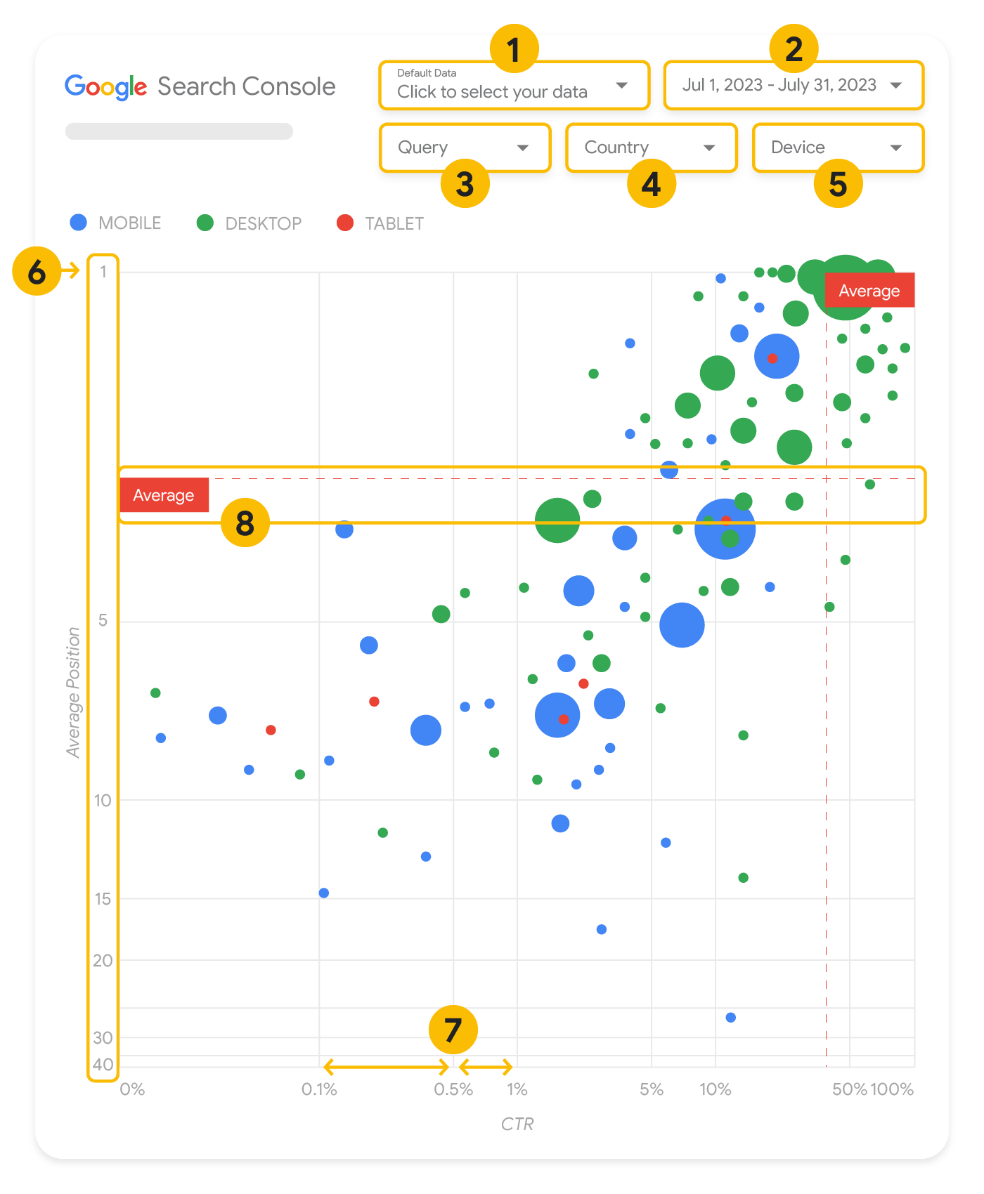
ส่วนนี้จะลงรายละเอียดเกี่ยวกับองค์ประกอบบางอย่างของแผนภูมิ เพื่อชี้แจงสิ่งที่แผนภูมิแสดงและสิ่งที่ไม่ได้แสดง
แหล่งข้อมูล
แผนภูมิฟองอากาศที่แสดงในหน้านี้ใช้ตารางการแสดงผลเว็บไซต์ที่มีให้ผ่านแหล่งข้อมูลของ Search Console ซึ่งรวมถึงข้อมูลประสิทธิภาพใน Search ที่รวบรวมแยกตามเว็บไซต์และคำค้นหา
ตัวกรองและการควบคุมข้อมูล
แผนภูมิมีตัวเลือกการปรับแต่ง 5 ตัวเลือกเพื่อช่วยให้คุณควบคุมข้อมูลได้อย่างมีประสิทธิภาพ ดังนี้
- การควบคุมข้อมูล: เลือกพร็อพเพอร์ตี้ Search Console ที่ต้องการวิเคราะห์
- ช่วงวันที่: เลือกช่วงวันที่ที่ต้องการดูในรายงาน คุณจะเห็นข้อมูลในช่วง 28 วันที่ผ่านมาโดยค่าเริ่มต้น
- คำค้นหา: รวมหรือยกเว้นคำค้นหาที่ต้องการมุ่งเน้น คุณกรองข้อมูลได้เหมือนกับที่ทำใน Search Console
- ประเทศ: รวมหรือยกเว้นประเทศ
- อุปกรณ์: รวมหรือยกเว้นหมวดหมู่อุปกรณ์
แกน
แกนในแผนภูมิคืออันดับเฉลี่ย (แกน y) และ CTR ของเว็บไซต์ (แกน x) การเปลี่ยนแปลงที่สำคัญในแกนมี 3 ประการดังนี้
- กลับทิศทางของแกน Y: เนื่องจากแกน Y แสดงอันดับเฉลี่ย การกลับทิศทางจึงทำให้เลข 1 อยู่ด้านบน
สำหรับแผนภูมิธส่วนใหญ่ ตำแหน่งที่ดีที่สุดจะอยู่ในมุมขวาบน การกลับทิศทางของแกน Y จึงทำให้ดูได้ง่ายขึ้นเมื่อใช้แสดงอันดับเฉลี่ย
- สเกล Log: การใช้สเกลลอการิทึม สำหรับทั้ง 2 แกนช่วยให้คุณเข้าใจคำค้นหาซึ่งอยู่ที่ปลายสุดของแผนภูมิ (CTR หรืออันดับเฉลี่ยที่ต่ำมาก หรือทั้งสองอย่าง) ได้ดีขึ้น
- เส้นอ้างอิง: เส้นอ้างอิงมีประโยชน์อย่างยิ่งในการไฮไลต์ค่าที่สูงหรือต่ำกว่าเกณฑ์หนึ่งๆ
การดูค่าเฉลี่ย ค่ามัธยฐาน หรือเปอร์เซ็นไทล์หนึ่งๆ จะช่วยให้เห็นค่าที่เบี่ยงเบนไปจากรูปแบบได้ชัดเจน
ฟองอากาศ
ลูกโป่งแต่ละอันในแผนภูมิแสดงถึงคำค้นหาเดียว พร้อมด้วยพร็อพเพอร์ตี้สไตล์ต่อไปนี้
- ขนาด: การแสดงจำนวนคลิกโดยใช้ขนาดฟองอากาศช่วยให้คุณเห็นได้อย่างรวดเร็วว่าคำค้นหาใดกระตุ้นการเข้าชมจำนวนมาก ยิ่งฟองอากาศมีขนาดใหญ่ก็แสดงว่าคำค้นหาสร้างการเข้าชมได้มาก
- สี: การแสดงหมวดหมู่อุปกรณ์โดยใช้สีฟองอากาศช่วยให้คุณทราบความแตกต่างระหว่างประสิทธิภาพใน Search บนอุปกรณ์เคลื่อนที่กับเดสก์ท็อป คุณใช้สีแทนมิติข้อมูลใดก็ได้ แต่เมื่อมีหลายค่ามากขึ้น ก็จะทำให้เห็นรูปแบบไม่ชัดเจน
การวิเคราะห์ข้อมูล
เป้าหมายของการแสดงภาพนี้คือช่วยให้เห็นโอกาสในการเพิ่มประสิทธิภาพการค้นหา แผนภูมิประเภทนี้แสดงประสิทธิภาพของคำค้นหา โดยแกน Y แสดงอันดับเฉลี่ย แกน X แสดง CTR ขนาดฟองอากาศแสดงจำนวนการคลิกทั้งหมด และสีฟองอากาศแสดงหมวดหมู่อุปกรณ์
เส้นอ้างอิงที่เป็นเส้นประสีแดงแสดงค่าเฉลี่ยของแต่ละแกน ซึ่งแยกแผนภูมิออกเป็น 4 ส่วนที่แทนประสิทธิภาพ 4 ประเภทของคำค้นหา ส่วนเหล่านี้ในแผนภูมิของคุณอาจดูแตกต่างจากที่แชร์ในโพสต์นี้ เนื่องจากจะขึ้นอยู่กับลักษณะการกระจายการค้นหาของเว็บไซต์
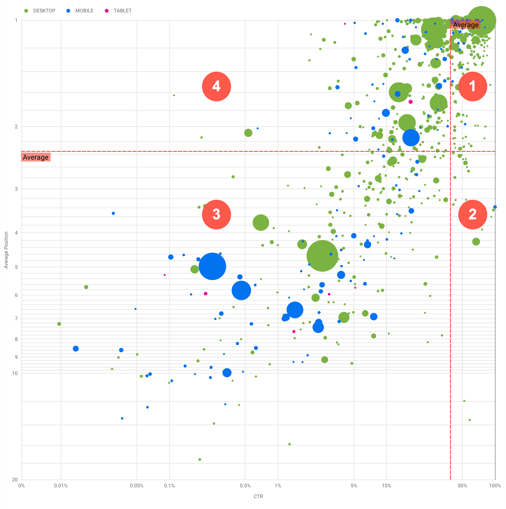
แผนภูมิแสดงกลุ่มการค้นหา 4 กลุ่มซึ่งคุณนำไปวิเคราะห์เพื่อช่วยให้ตัดสินใจได้ว่าควรลงทุนตอนไหนและลงทุนกับส่วนใดในการเพิ่มประสิทธิภาพการทำงานของ Google Search
- อันดับสูงสุด, CTR สูง: คุณไม่จำเป็นต้องดำเนินการใดมากนักเนื่องจากประสิทธิภาพดีมากอยู่แล้ว
- อันดับต่ำ, CTR สูง: ดูเหมือนว่าคำค้นหาเกี่ยวข้องกับผู้ใช้ คำค้นหาเหล่านี้ได้รับ CTR สูงแม้ว่าจะอยู่ในอันดับต่ำกว่าคำค้นหาโดยเฉลี่ยในเว็บไซต์ หากอันดับเฉลี่ยของคำค้นหาเพิ่มขึ้น อาจส่งผลกระทบอย่างมากต่อประสิทธิภาพของคุณ โดยให้เน้นที่การปรับปรุง SEO สำหรับการค้นหาเหล่านี้ ตัวอย่างเช่น ข้อความค้นหายอดนิยมในควอแดรนท์ 2 สำหรับเว็บไซต์ด้านการทำสวนอาจเป็น "วิธีสร้างโรงไม้เก็บของ"
ตรวจสอบว่าคุณมีหน้าเว็บเกี่ยวกับเรื่องนี้แล้วหรือไม่ และดำเนินการด้วย 2 วิธีดังนี้
- หากคุณไม่มีหน้าเว็บ ให้พิจารณาสร้างหน้าเพื่อรวมข้อมูลทั้งหมดที่มีในเว็บไซต์เกี่ยวกับหัวข้อนั้นไว้ในที่เดียว
- หากคุณมีหน้าเว็บอยู่แล้ว ให้พิจารณาเพิ่มเนื้อหาเพื่อให้รองรับความต้องการของผู้ใช้ได้ดียิ่งขึ้น
- อันดับต่ำ CTR ต่ำ: เมื่อดูคำค้นหาที่มี CTR ต่ำ (ทั้งที่มีอันดับต่ำและอยู่ในตำแหน่งบนสุด) คุณควรดูที่ขนาดของฟองอากาศเพื่อให้ทราบว่าคำค้นหาใดมี CTR ต่ำแต่ยังคงกระตุ้นการเข้าชมที่สำคัญอยู่ แม้ว่าคำค้นหาในส่วนนี้อาจดูเหมือนจะไม่คุ้มกับความพยายามเพิ่มประสิทธิภาพ แต่ก็แบ่งออกได้เป็น 2 กลุ่มหลักๆ ได้แก่
- คำค้นหาที่เกี่ยวข้อง: หากคำค้นหานี้สำคัญกับคุณ การปรากฏใน Search อยู่แล้วเป็นจุดเริ่มต้นที่ดี จัดลําดับความสำคัญของคำค้นหาเหล่านี้ก่อนคำค้นหาที่ไม่ปรากฏในผลการค้นหาเลย เนื่องจากจะเพิ่มประสิทธิภาพได้ง่ายกว่า
- คำค้นหาที่ไม่เกี่ยวข้อง: หากเว็บไซต์ไม่ครอบคลุมเนื้อหาที่เกี่ยวข้องกับคำค้นหานี้ ก็อาจเป็นโอกาสดีที่จะปรับแต่งเนื้อหาหรือมุ่งเน้นที่คำค้นหาที่จะนำการเข้าชมที่เกี่ยวข้องมาให้
- อันดับสูงสุด, CTR ต่ำ: คำค้นหานี้อาจมี CTR ต่ำด้วยเหตุผลหลายประการ ตรวจสอบฟองอากาศที่ใหญ่ที่สุดเพื่อหาสัญญาณของสิ่งต่อไปนี้
- คู่แข่งอาจมีมาร์กอัป Structured Data ซึ่งแสดงพร้อมกับผลการค้นหาที่เป็นริชมีเดีย ซึ่งอาจดึงดูดให้ผู้ใช้คลิกผลการค้นหานั้นแทนที่จะเป็นผลการค้นหาของคุณ ลองเพิ่มประสิทธิภาพให้องค์ประกอบภาพทั่วไปใน Google Search
- คุณอาจได้เพิ่มประสิทธิภาพหรือมีการจัดอันดับ "โดยไม่ตั้งใจ" สำหรับคำค้นหาที่ผู้ใช้ไม่สนใจซึ่งเกี่ยวข้องกับเว็บไซต์ของคุณ กรณีนี้อาจไม่เป็นปัญหาสำหรับคุณ ซึ่งคุณไม่จำเป็นต้องสนใจคำค้นหาเหล่านั้น หากไม่ต้องการให้ผู้ใช้ค้นพบคุณผ่านคำค้นหาเหล่านั้น (เช่น การค้นหาที่มีคำที่ไม่เหมาะสม) ให้ลองปรับแต่งเนื้อหาของคุณเพื่อนำการพูดถึงที่อาจมองว่าเป็นคำพ้องความหมายหรือคำค้นหาที่เกี่ยวข้องกับคำที่นำการเข้าชมมาออกไป
- ผู้ใช้อาจพบข้อมูลที่ต้องการแล้ว เช่น เวลาทำการ ที่อยู่ หรือหมายเลขโทรศัพท์ของบริษัท ตรวจสอบการค้นหาที่ใช้และ URL ที่มีข้อมูล หากเป้าหมายหนึ่งของเว็บไซต์คือการกระตุ้นให้ผู้คนไปที่ร้านค้า ก็จะเป็นการทำงานได้ตามที่ตั้งใจไว้ หากคุณเชื่อว่าผู้คนควรเข้าชมเว็บไซต์ของคุณเพื่อดูข้อมูลเพิ่มเติม ให้ลองเพิ่มประสิทธิภาพชื่อและคำอธิบายให้ชัดเจน ดูรายละเอียดเพิ่มเติมได้ที่หัวข้อถัดไป
เรายังไม่ได้พูดถึงหมวดหมู่อุปกรณ์ เนื่องจากสามารถใช้เป็นสัญญาณเพิ่มเติมของประสิทธิภาพการค้นหาได้ ตัวอย่างเช่น สมมติว่าการค้นหาบางรายการมีความเกี่ยวข้องมากขึ้นเมื่อผู้ใช้ใช้การกำลังนำทางบนถนน พยายามหาตำแหน่ง ในกรณีนั้น คำค้นหาอาจมีประสิทธิภาพสูงในอุปกรณ์เคลื่อนที่ แต่ประสิทธิภาพต่ำในเดสก์ท็อป
การปรับปรุง SEO สำหรับคำค้นหาที่เฉพาะเจาะจง
เมื่อคุณพบข้อความค้นหาที่คุ้มค่ากับเวลาและความพยายามแล้ว ให้เพิ่มประสิทธิภาพหรือสร้างหน้าเว็บที่เกี่ยวข้องกับข้อความค้นหาเหล่านั้น
หลังจากพบการค้นหาโดยใช้การแสดงภาพที่แสดงในหน้านี้แล้ว คุณจะสร้างตัวกรองการค้นหาสำหรับคำค้นหาที่เจาะจงโดยใช้อินเทอร์เฟซผู้ใช้ของ Search Console หรือสร้างตาราง Pivot ได้ โดยใช้ Looker Studio จากทั้ง 2 วิธี คุณสามารถตรวจสอบหน้าเว็บทุกหน้าที่ได้รับการเข้าชมสำหรับข้อความค้นหาหนึ่งๆ หลังจากทราบคำค้นหาที่ต้องการเพิ่มประสิทธิภาพและ URL ที่เกี่ยวข้องแล้ว ให้ใช้คู่มือ SEO สำหรับมือใหม่เพื่อเพิ่มประสิทธิภาพเนื้อหา มาดูเคล็ดลับบางส่วนกัน
- ตรวจสอบว่าองค์ประกอบชื่อ เมตาแท็กคำอธิบาย และแอตทริบิวต์ Alt นั้นสื่อความหมาย มีความเจาะจง และถูกต้อง
- ใช้องค์ประกอบส่วนหัวเพื่อเน้นข้อความสำคัญและช่วยให้เนื้อหามีโครงสร้างตามลำดับชั้น เพื่อให้ผู้ใช้และเครื่องมือค้นหาไปยังส่วนต่างๆ ในเอกสารได้ง่ายขึ้น
- ลองนึกถึงคำอื่นๆ ที่ผู้ใช้อาจใช้ค้นหาเนื้อหาของคุณ เช่น คำพ้องความหมายและคำค้นหาที่เกี่ยวข้อง ขอแนะนำให้ใช้เครื่องมือวางแผนคีย์เวิร์ดของ Google Ads เพื่อช่วยค้นหาคีย์เวิร์ดรูปแบบใหม่ๆ และดูปริมาณการค้นหาโดยประมาณของคีย์เวิร์ดแต่ละรายการ คุณยังใช้ Google เทรนด์เพื่อหาไอเดียจากหัวข้อที่กําลังเป็นที่นิยมและคำค้นหาที่เกี่ยวข้องกับเว็บไซต์ของคุณได้อีกด้วย
เนื้อหาของหน้าเว็บนี้ได้รับอนุญาตภายใต้ใบอนุญาตที่ต้องระบุที่มาของครีเอทีฟคอมมอนส์ 4.0 และตัวอย่างโค้ดได้รับอนุญาตภายใต้ใบอนุญาต Apache 2.0 เว้นแต่จะระบุไว้เป็นอย่างอื่น โปรดดูรายละเอียดที่นโยบายเว็บไซต์ Google Developers Java เป็นเครื่องหมายการค้าจดทะเบียนของ Oracle และ/หรือบริษัทในเครือ
อัปเดตล่าสุด 2025-08-04 UTC
[null,null,["อัปเดตล่าสุด 2025-08-04 UTC"],[[["\u003cp\u003eVisualize Search Console data with a bubble chart to reveal query optimization opportunities by analyzing click-through rate, average position, and clicks.\u003c/p\u003e\n"],["\u003cp\u003eIdentify high-potential queries by focusing on those with low positions but high click-through rates, indicating relevance and potential for increased traffic with improved ranking.\u003c/p\u003e\n"],["\u003cp\u003eInvestigate queries with low click-through rates and high positions to determine if they are unrelated to your site or require optimization for better user engagement.\u003c/p\u003e\n"],["\u003cp\u003eOptimize content for identified queries by refining titles, meta descriptions, headings, and incorporating relevant keywords to enhance search visibility and user experience.\u003c/p\u003e\n"]]],["A bubble chart visualizes query performance using Search Console data. It displays click-through rate (CTR) on the x-axis, average position on the y-axis, click volume as bubble size, and device category as bubble color. Customization options include data control, date range, query, country, and device filters. Analyzing the quadrants formed by average CTR and position helps identify optimization opportunities. Focus on queries with low position but high CTR, and address top-position, low-CTR queries by improving content or structured data.\n"],null,["# How to Create a Search Console Bubble Chart | Google Search Central\n\nImproving SEO with a Search Console bubble chart\n================================================\n\n\nAnalyzing Search performance data is always a challenge, but even more so when you have plenty of\nlong-tail queries, which are harder to visualize and understand. A\n[bubble chart](https://support.google.com/datastudio/answer/7207785)\ncan help you understand which queries are performing well for your site, and which could be improved.\n\n\nIf you'd like to test the techniques discussed here, you can\n[connect your data to Looker Studio](https://datastudio.google.com/reporting/1e5b5f6a-38d7-4547-a54b-69594681a09b/page/xFbeC/preview) and play with the chart settings. \n\n\nIf you haven't read [connecting Search Console to Looker Studio](/search/blog/2022/03/connecting-data-studio) and\n[monitoring Search traffic with Looker Studio](/search/blog/2022/03/monitoring-dashboard),\nconsider checking them out to understand more about what you can do with Search Console in Looker\nStudio.\n\nUnderstanding the chart\n-----------------------\n\n\nA bubble chart is a great visualization when you have multiple metrics and dimensions because it\nlets you to see relationships and patterns in your\ndata more effectively. In the example shown here, you can see\n[click-through rate](https://support.google.com/webmasters/answer/7576553#choosingmetrics)\n(CTR), average position, and clicks for the query and device dimensions in one view.\n\n\nThis section goes into detail on some of the chart elements to clarify what the chart shows, and what it doesn't.\n\n### Data source\n\n\nThe bubble chart shown in this page uses the Site Impression table available through the\n[Search Console data source](https://support.google.com/datastudio/answer/7314895),\nwhich includes [Search performance data](https://support.google.com/webmasters/answer/7576553)\naggregated by site and queries.\n\n### Filters and data controls\n\n\nThere are five customization options in the chart to help you control your data effectively:\n\n1. **[Data control](https://support.google.com/datastudio/answer/7415591)**: Choose the Search Console property you'd like to analyze.\n2. **Date range**: Choose the date range you'd like to see in the report; by default you'll see the last 28 days.\n3. **Query** : Include or exclude queries to focus on. You can [filter your data](/search/blog/2021/06/regex-negative-match) similar to how you do it in Search Console.\n4. **Country**: Include or exclude countries.\n5. **Device**: Include or exclude device categories.\n\n### Axes\n\n\nThe axes in the chart are average position (y-axis) and site CTR (x-axis). There are three\nsignificant transformations in the axes:\n\n6. **Reverse y-axis direction**: Since the y-axis shows average position, inverting it means that 1 is at the top. For most charts, the best position is in the top right corner, so it is more intuitive to invert the y-axis when using it to display average position.\n7. **Log scale** : Using a [logarithmic scale](https://en.wikipedia.org/wiki/Logarithmic_scale) for both axes lets you to have a better understanding of queries that are in the extremities of the chart (very low CTR, average position, or both).\n8. **[Reference lines](https://support.google.com/datastudio/answer/9921462)**: The reference line is very helpful to highlight values that are above or below a certain threshold. Looking at the average, median, or a certain percentile can call attention to deviations from the pattern.\n\n### Bubbles\n\n\nEach bubble in the chart represents a single query, with the following\n[style properties](https://support.google.com/datastudio/answer/7207785#style-properties):\n\n- **Size**: Using the number of clicks as the bubble size helps you see in a glance which queries are driving the bulk of the traffic---the larger the bubble the more traffic the query generates.\n- **Color**: Using the device category as the bubble color helps you understand the differences between mobile and desktop Search performance. You can use any dimension as the color, but as the number of values increases, the harder it is to recognize patterns.\n\nAnalyzing the data\n------------------\n\n\nThe goal of this visualization is to help surface query optimization opportunities. The chart\nshows query performance, where the y-axis represents average position, the x-axis represents CTR\nthe bubble size represents total number of clicks, and the bubble color represents\ndevice category.\n\n\nThe red Average dashed reference lines show the average for each of the axes, which split the chart\ninto quadrants, showing four types of query performance. Your quadrants are likely to look\ndifferent than the one shared in this post; they'll depend on how your site queries\nare distributed.\n\n\nThe chart shows four groups of queries, which you can analyze to help you decide where to invest\nyour time when optimizing your Google Search performance.\n\n1. **Top position, high CTR**: There's not much you need to do for those; you're doing a great job already.\n2. **Low position, high CTR** : Those queries seem relevant to users; the queries get a high CTR even when ranking lower than the average query on your website. If the query average position moves up, it could have a significant impact on your performance---focus on improving SEO for these queries. For example, a top query in quadrant 2 for a gardening website could be \"how to build a wooden shed.\" Check if you have a page about this already, and proceed in two ways:\n - If you don't have a page, consider creating one to centralize all the info you have in the website about the subject.\n - If you do have a page, consider adding content to better address that user need.\n3. **Low position, low CTR** : When looking at queries with low CTR (both with low and top position), it's especially interesting to look at the bubble sizes to understand which queries have a low CTR but are still driving significant traffic. While the queries in this quadrant might seem unworthy of your effort, they can be divided into two main groups:\n - **Related queries**: If the query in question is important to you, it's a good start to have it appearing in Search already. Prioritize these queries over queries that are not appearing in Search results at all, as they'll be easier to optimize.\n - **Unrelated queries**: If your site doesn't cover content related to this query, maybe it's a good opportunity to fine tune your content or focus on queries that will bring relevant traffic.\n4. **Top position, low CTR** : Those queries might have a low CTR for various reasons. Check the largest bubbles to find signs of the following:\n - Your competitors may have [structured data markup](/search/docs/appearance/search-result-features) and are showing up with rich results, which might attract users to click their results instead of yours. Consider optimizing for the most common [visual elements in Google Search](/search/docs/appearance/visual-elements-gallery).\n - You may have optimized, or be \"accidentally\" ranking, for a query that users are not interested in relation to your site. This might not be an issue for you, in which case you can ignore those queries. If you prefer people not to find you through those queries (for example, they contain offensive words), try to fine-tune your content to remove mentions that could be seen as synonyms or related queries to the one bringing traffic.\n - People may have already found the information they needed, for example your company's opening hours, address, or phone number. Check the queries that were used and the URLs that contained the information. If one of your website goals is to drive people to your stores, this is working as intended; if you believe that people should visit your website for extra information, you could try to optimize your titles and description to make that clear. See next section for more details.\n\n\nWe haven't mentioned the device categories because they can be used as additional signs of query\nperformance. For example, suppose some queries are more relevant when people are navigating in the\nstreet, trying to find a location; in that case, the query might have a high performance\non mobile devices, but a low performance on desktop.\n\nImproving SEO for specific queries\n----------------------------------\n\n\nOnce you find queries that are worth the time and effort, make sure to optimize or create pages\nrelated to those queries.\n\n\nAfter you find the queries using the visualization shown in this page, you can\n[create a query filter](https://support.google.com/webmasters/answer/7576553#filteringdata)\nfor specific queries using the Search Console user interface, or create a\n[pivot table](https://support.google.com/looker-studio/answer/7516660)\nusing Looker Studio; in both ways, you can check all the pages that are receiving\ntraffic for a specific query. After you know the queries you want to optimize and their related\nURLs, use the [SEO starter guide](/search/docs/fundamentals/seo-starter-guide)\nto optimize your content. Here are some tips:\n\n- Ensure that your [title](/search/docs/appearance/title-link#page-titles) elements, [description meta tags](/search/docs/appearance/snippet#meta-descriptions), and alt attributes are descriptive, specific, and accurate.\n- Use heading elements to emphasize important text and help create a hierarchical structure for your content, making it easier for users and search engines to navigate through your document.\n- Think about other words that a user might search for to find a piece of your content, for example, synonyms and related queries. You can use the [Keyword Planner](https://ads.google.com/home/tools/keyword-planner/) provided by Google Ads to help you discover new keyword variations and see the approximate search volume for each keyword. You can also [use Google Trends](/search/docs/monitor-debug/google-trends) to find ideas from rising topics and queries related to your website."]]