コレクションでコンテンツを整理
必要に応じて、コンテンツの保存と分類を行います。
Search Console のバブルチャートで SEO を改善する
検索パフォーマンス データの分析は常に困難なものですが、視覚化や解釈が難しいロングテール クエリが多い場合には、さらに分析が困難になります。サイトのパフォーマンスが高いクエリや改善の余地があるクエリを把握するのには、バブルチャートが役立ちます。
ここで説明した手法を試す場合には、Looker Studio にデータを接続し、チャートの設定を調節できます。
Search Console と Looker Studio を接続するおよび Looker Studio を使用して検索トラフィックをモニタリングするをご覧になっていない場合は、まずそちらをご確認ください。Looker Studio の Search Console で何ができるのか、理解が深まります。
チャートの見方
バブルチャートは、データの関係性とパターンをより効果的に確認できるため、指標とディメンションが複数ある場合には優れた視覚化方法です。この例では、クエリとデバイスのディメンションに対するクリック率(CTR)、平均掲載順位、クリック数を 1 つのビューで表示しています。
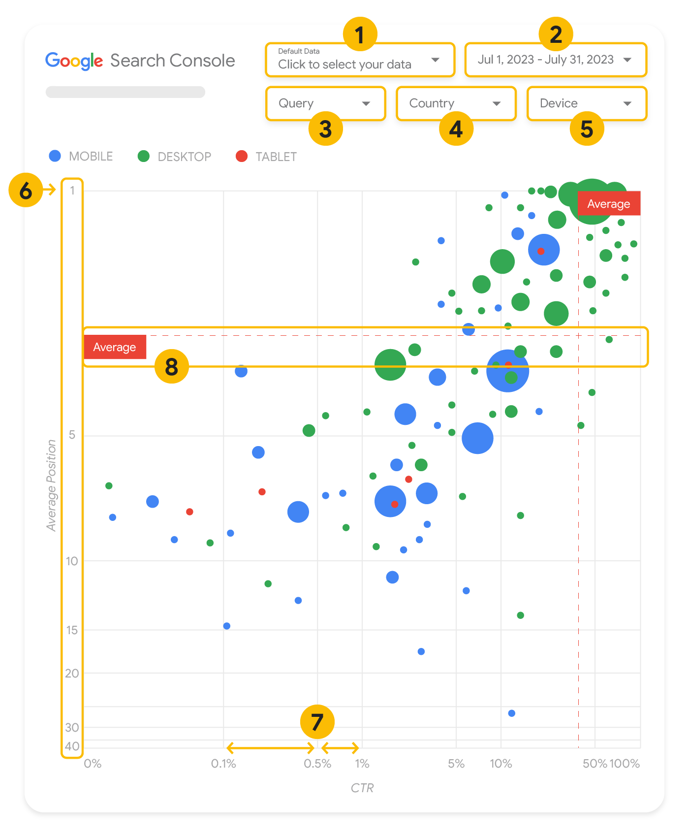
このセクションでは、チャートに表示されるものと表示されないものを明確にするために、チャートの一部の要素を詳しく説明します。
データソース
このページのバブルチャートには、Search Console のデータソースから入手できるサイトのインプレッション テーブルが使用されており、サイトとクエリごとに集計された検索パフォーマンスのデータが含まれています。
フィルタとデータ管理
このチャートには、データを効果的に管理するための 5 つのカスタマイズ オプションがあります。
- データ管理: 分析する Search Console プロパティを選択します。
- 期間: レポートに含める期間を選択します。デフォルトでは過去 28 日間に設定されています。
- クエリ: 注目したいクエリを追加または除外できます。Search Console で行うのと同様にデータをフィルタできます。
- 国: 国を追加または除外できます。
- デバイス: デバイス カテゴリを追加または除外できます。
軸
このチャートで軸となるのは、平均掲載順位(y 軸)とサイトのクリック率(x 軸)です。軸には重要な調整を 3 つ加えています。
- y 軸を反転する: y 軸は平均掲載順位を示すため、反転することで 1 が上になります。ほとんどのチャートでは最も良好な状態が右上に来るため、平均掲載順位を表示する場合は y 軸を反転したほうが理解しやすくなります。
- 対数目盛: 両軸で対数目盛を使用すると、チャートの端に位置するクエリ(クリック率と平均掲載順位のどちらかが、または両方が非常に低い)が把握しやすくなります。
- 基準線: 基準線は、特定のしきい値を上回る値、または下回る値を目立たせるのに役立ちます。平均、中央値、または特定のパーセンタイルを確認することで、パターンからの逸脱に注目できます。
バブル
チャートの各バブルは、次のスタイル プロパティに基づいて 1 つのクエリを表しています。
- サイズ: クリック数をバブルのサイズとして使用することで、大量のトラフィックの発生源となっているクエリを一目で確認できます。バブルが大きいほど、クエリで生成されるトラフィックが多くなります。
- 色: デバイス カテゴリによってバブルの色を変えることで、モバイルとパソコンにおける検索のパフォーマンスの違いを把握しやすくなります。どのディメンションにも色を設定できますが、値の数が増えると、パターンを認識するのが難しくなります。
データの分析
こういった可視化を行う目的は、クエリを最適化するためのチャンスを見つけることにあります。チャートはクエリのパフォーマンスを示しています。y 軸は平均掲載順位、x 軸はクリック率、バブルのサイズはクリック数の合計、バブルの色はデバイス カテゴリを表しています。
赤い破線で示した「平均」基準線は各軸の平均値を示しています。これによりチャートが 4 つの領域に分割され、4 種類のクエリのパフォーマンスが示されます。実際の 4 つの領域は、サイトクエリの分布によって異なるため、この投稿で紹介しているものと同じように分割されるとは限りません。
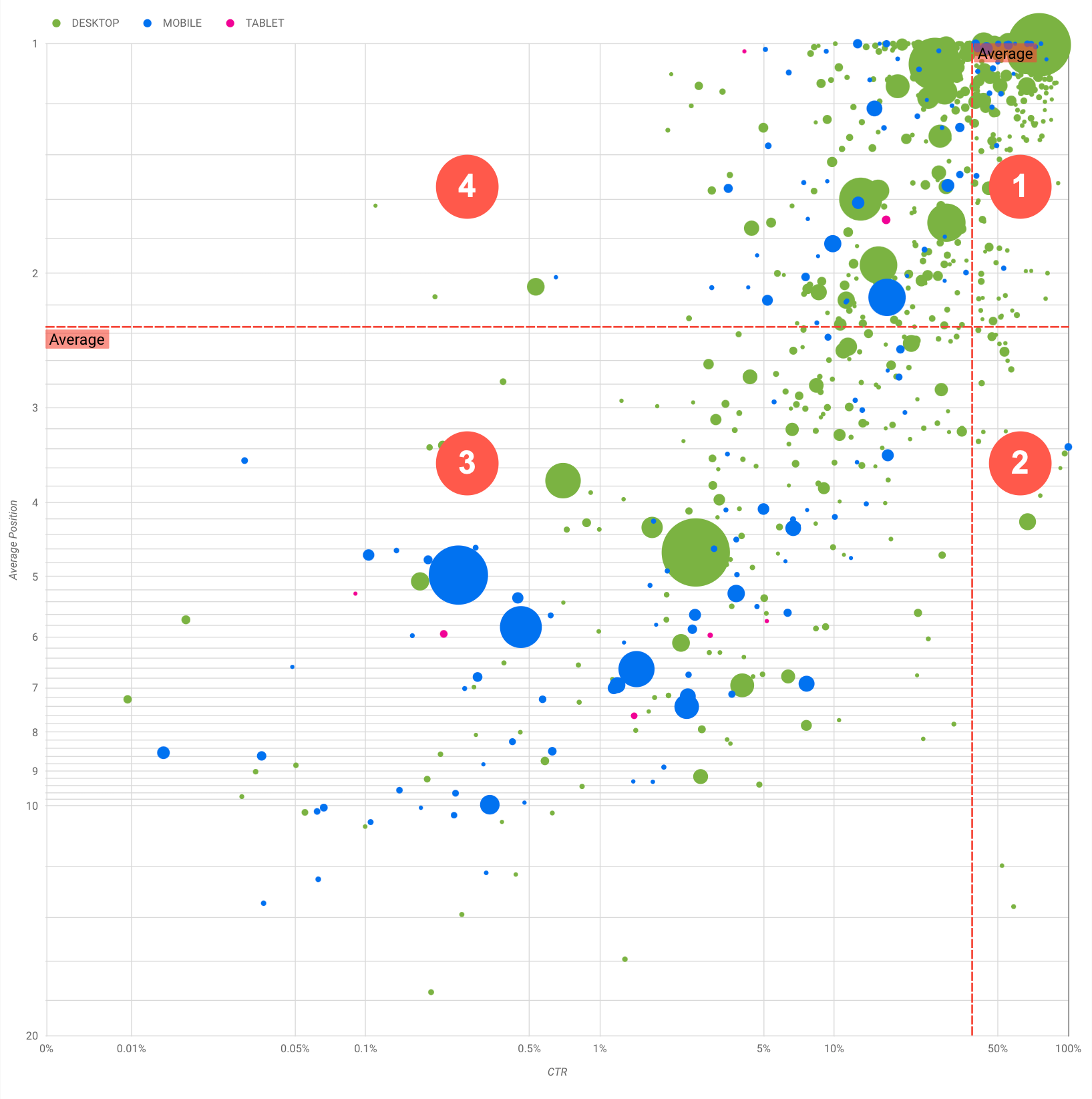
このチャートには 4 つのクエリグループが示されており、これを分析することで、Google 検索のパフォーマンスを最適化する際にどこに重点を置くべきか判断できます。
- 掲載順位とクリック率の両方が高い: すでにパフォーマンスは良好です。必要な作業は特にありません。
- 掲載順位が低くクリック率が高い: ユーザーとの関連性が高いクエリであると考えられます。ウェブサイトの平均的なクエリより掲載順位が低くても、高いクリック率が得られます。クエリの平均掲載順位が上がるとパフォーマンスに大きく影響する可能性があるため、SEO の改善に注力してください。たとえば、ガーデニングについてのウェブサイトの第 2 領域で「木造小屋の作り方」が最上位のクエリだったとします。これに関するページがすでに存在するかどうかを確認し、次のように進めてください。
- ページが存在しない場合は、そのテーマに関するウェブサイト内の情報をすべて集約し、新たなページを作成することを検討してください。
- ページが存在する場合は、より柔軟にユーザーのニーズに対応できるよう、コンテンツを追加することを検討してください。
- 掲載順位とクリック率の両方が低い: クリック率が低いクエリ(掲載順位の高低にかかわらず)を調べる場合、バブルのサイズを見て、クリック率が低いにもかかわらず大量のトラフィックの発生源となっているクエリに注目してください。この領域に分布するクエリに労力を割くのは無駄のように思えるかもしれませんが、このクエリは 2 つのグループに分けることができます。
- 関連クエリ: 問題のクエリがサイトにとって重要である場合、そのクエリがすでに検索結果に表示されているのは有利です。検索結果にまったく表示されないクエリと比べて最適化は容易なので、これらのクエリの最適化を優先しましょう。
- 無関係なクエリ: サイトがクエリに関連するコンテンツを掲載していない場合、コンテンツを微調整したり、関連性の高いトラフィックをもたらすクエリに焦点を当てたりするチャンスかもしれません。
- 掲載順位が高くクリック率が低い: この手のクエリのクリック率が低くなる理由はさまざまです。特にサイズが大きなバブルを確認し、以下の傾向がないかを調べます。
- 競合相手のサイトが構造化データのマークアップやリッチリザルトの表示を取り入れて、よりユーザーを引き付けてクリックを促すものになっている可能性があります。Google 検索の視覚要素を最も一般的なものに最適化することを検討してください。
- サイトに関心のないユーザーのクエリに対して最適化してしまったか、「意図せずに」順位が上がった可能性があります。必ずしもサイトにとって問題があるわけではないので、このようなクエリは無視することもできます。このようなクエリで検索されることを望まない場合(不適切なワードが含まれているなど)は、コンテンツを微調整し、トラフィックをもたらすクエリの類義語や関連クエリと見なされる表現を削除してみてください。
- ユーザーが、会社の営業時間、住所、電話番号など必要な情報をすでに入手していたことが考えられます。使用されていたクエリ、情報が含まれている URL を確認してください。ウェブサイトの目的の一つが集客であるのなら狙いどおりに機能していることになりますが、その他の情報提供に力を入れたい場合は、タイトルや説明を最適化して目的を明確にしましょう。詳しくは、次のセクションをご覧ください。
デバイスのカテゴリについては、クエリ パフォーマンスの付加的な傾向として使用されることがあるため、言及してきませんでした。たとえば、移動中の人が路上で場所を検索する際に関連性の深いクエリがあるとします。そのような場合、モバイル デバイスでは高いパフォーマンスを発揮するクエリでも、パソコンではパフォーマンスが下がることがあります。
特定のクエリに対する SEO を改善する
時間と労力をかけるのに値するクエリを見つけたら、そのクエリに関連するページを最適化するか作成してください。
このページに掲載した可視化手法を使用してクエリを見つけたら、Search Console のユーザー インターフェースを使用して特定のクエリに対するクエリフィルタを作成できます。または、Looker Studio を使用してピボット テーブルを作成することもできます。どちらの方法でも、特定のクエリに対するトラフィックを獲得しているすべてのページを確認することが可能です。最適化の対象となるクエリと関連 URL を確認したら、SEO スターター ガイドを使用してコンテンツを最適化します。以下にいくつかのヒントをご紹介します。
- title 要素、description メタタグ、および alt 属性が、わかりやすく具体的で正確であることを確認してください。
- 見出し要素を使用して重要なテキストを強調し、コンテンツの階層構造を作成すると、ユーザーと検索エンジンがドキュメント内を移動しやすくなります。
- ユーザーがコンテンツを探すときに、他にも検索しそうなキーワード(類義語や関連クエリなど)がないか考えてみましょう。Google 広告が提供しているキーワード プランナーを使用すると、新しいキーワードのバリエーションを見つけたり、各キーワードのおおよその検索ボリュームを確認したりできます。Google トレンドを使用して、急上昇のトピックやウェブサイトに関連するクエリからアイデアを見つけることもできます。
特に記載のない限り、このページのコンテンツはクリエイティブ・コモンズの表示 4.0 ライセンスにより使用許諾されます。コードサンプルは Apache 2.0 ライセンスにより使用許諾されます。詳しくは、Google Developers サイトのポリシーをご覧ください。Java は Oracle および関連会社の登録商標です。
最終更新日 2025-08-04 UTC。
[null,null,["最終更新日 2025-08-04 UTC。"],[[["\u003cp\u003eVisualize Search Console data with a bubble chart to reveal query optimization opportunities by analyzing click-through rate, average position, and clicks.\u003c/p\u003e\n"],["\u003cp\u003eIdentify high-potential queries by focusing on those with low positions but high click-through rates, indicating relevance and potential for increased traffic with improved ranking.\u003c/p\u003e\n"],["\u003cp\u003eInvestigate queries with low click-through rates and high positions to determine if they are unrelated to your site or require optimization for better user engagement.\u003c/p\u003e\n"],["\u003cp\u003eOptimize content for identified queries by refining titles, meta descriptions, headings, and incorporating relevant keywords to enhance search visibility and user experience.\u003c/p\u003e\n"]]],["A bubble chart visualizes query performance using Search Console data. It displays click-through rate (CTR) on the x-axis, average position on the y-axis, click volume as bubble size, and device category as bubble color. Customization options include data control, date range, query, country, and device filters. Analyzing the quadrants formed by average CTR and position helps identify optimization opportunities. Focus on queries with low position but high CTR, and address top-position, low-CTR queries by improving content or structured data.\n"],null,["# How to Create a Search Console Bubble Chart | Google Search Central\n\nImproving SEO with a Search Console bubble chart\n================================================\n\n\nAnalyzing Search performance data is always a challenge, but even more so when you have plenty of\nlong-tail queries, which are harder to visualize and understand. A\n[bubble chart](https://support.google.com/datastudio/answer/7207785)\ncan help you understand which queries are performing well for your site, and which could be improved.\n\n\nIf you'd like to test the techniques discussed here, you can\n[connect your data to Looker Studio](https://datastudio.google.com/reporting/1e5b5f6a-38d7-4547-a54b-69594681a09b/page/xFbeC/preview) and play with the chart settings. \n\n\nIf you haven't read [connecting Search Console to Looker Studio](/search/blog/2022/03/connecting-data-studio) and\n[monitoring Search traffic with Looker Studio](/search/blog/2022/03/monitoring-dashboard),\nconsider checking them out to understand more about what you can do with Search Console in Looker\nStudio.\n\nUnderstanding the chart\n-----------------------\n\n\nA bubble chart is a great visualization when you have multiple metrics and dimensions because it\nlets you to see relationships and patterns in your\ndata more effectively. In the example shown here, you can see\n[click-through rate](https://support.google.com/webmasters/answer/7576553#choosingmetrics)\n(CTR), average position, and clicks for the query and device dimensions in one view.\n\n\nThis section goes into detail on some of the chart elements to clarify what the chart shows, and what it doesn't.\n\n### Data source\n\n\nThe bubble chart shown in this page uses the Site Impression table available through the\n[Search Console data source](https://support.google.com/datastudio/answer/7314895),\nwhich includes [Search performance data](https://support.google.com/webmasters/answer/7576553)\naggregated by site and queries.\n\n### Filters and data controls\n\n\nThere are five customization options in the chart to help you control your data effectively:\n\n1. **[Data control](https://support.google.com/datastudio/answer/7415591)**: Choose the Search Console property you'd like to analyze.\n2. **Date range**: Choose the date range you'd like to see in the report; by default you'll see the last 28 days.\n3. **Query** : Include or exclude queries to focus on. You can [filter your data](/search/blog/2021/06/regex-negative-match) similar to how you do it in Search Console.\n4. **Country**: Include or exclude countries.\n5. **Device**: Include or exclude device categories.\n\n### Axes\n\n\nThe axes in the chart are average position (y-axis) and site CTR (x-axis). There are three\nsignificant transformations in the axes:\n\n6. **Reverse y-axis direction**: Since the y-axis shows average position, inverting it means that 1 is at the top. For most charts, the best position is in the top right corner, so it is more intuitive to invert the y-axis when using it to display average position.\n7. **Log scale** : Using a [logarithmic scale](https://en.wikipedia.org/wiki/Logarithmic_scale) for both axes lets you to have a better understanding of queries that are in the extremities of the chart (very low CTR, average position, or both).\n8. **[Reference lines](https://support.google.com/datastudio/answer/9921462)**: The reference line is very helpful to highlight values that are above or below a certain threshold. Looking at the average, median, or a certain percentile can call attention to deviations from the pattern.\n\n### Bubbles\n\n\nEach bubble in the chart represents a single query, with the following\n[style properties](https://support.google.com/datastudio/answer/7207785#style-properties):\n\n- **Size**: Using the number of clicks as the bubble size helps you see in a glance which queries are driving the bulk of the traffic---the larger the bubble the more traffic the query generates.\n- **Color**: Using the device category as the bubble color helps you understand the differences between mobile and desktop Search performance. You can use any dimension as the color, but as the number of values increases, the harder it is to recognize patterns.\n\nAnalyzing the data\n------------------\n\n\nThe goal of this visualization is to help surface query optimization opportunities. The chart\nshows query performance, where the y-axis represents average position, the x-axis represents CTR\nthe bubble size represents total number of clicks, and the bubble color represents\ndevice category.\n\n\nThe red Average dashed reference lines show the average for each of the axes, which split the chart\ninto quadrants, showing four types of query performance. Your quadrants are likely to look\ndifferent than the one shared in this post; they'll depend on how your site queries\nare distributed.\n\n\nThe chart shows four groups of queries, which you can analyze to help you decide where to invest\nyour time when optimizing your Google Search performance.\n\n1. **Top position, high CTR**: There's not much you need to do for those; you're doing a great job already.\n2. **Low position, high CTR** : Those queries seem relevant to users; the queries get a high CTR even when ranking lower than the average query on your website. If the query average position moves up, it could have a significant impact on your performance---focus on improving SEO for these queries. For example, a top query in quadrant 2 for a gardening website could be \"how to build a wooden shed.\" Check if you have a page about this already, and proceed in two ways:\n - If you don't have a page, consider creating one to centralize all the info you have in the website about the subject.\n - If you do have a page, consider adding content to better address that user need.\n3. **Low position, low CTR** : When looking at queries with low CTR (both with low and top position), it's especially interesting to look at the bubble sizes to understand which queries have a low CTR but are still driving significant traffic. While the queries in this quadrant might seem unworthy of your effort, they can be divided into two main groups:\n - **Related queries**: If the query in question is important to you, it's a good start to have it appearing in Search already. Prioritize these queries over queries that are not appearing in Search results at all, as they'll be easier to optimize.\n - **Unrelated queries**: If your site doesn't cover content related to this query, maybe it's a good opportunity to fine tune your content or focus on queries that will bring relevant traffic.\n4. **Top position, low CTR** : Those queries might have a low CTR for various reasons. Check the largest bubbles to find signs of the following:\n - Your competitors may have [structured data markup](/search/docs/appearance/search-result-features) and are showing up with rich results, which might attract users to click their results instead of yours. Consider optimizing for the most common [visual elements in Google Search](/search/docs/appearance/visual-elements-gallery).\n - You may have optimized, or be \"accidentally\" ranking, for a query that users are not interested in relation to your site. This might not be an issue for you, in which case you can ignore those queries. If you prefer people not to find you through those queries (for example, they contain offensive words), try to fine-tune your content to remove mentions that could be seen as synonyms or related queries to the one bringing traffic.\n - People may have already found the information they needed, for example your company's opening hours, address, or phone number. Check the queries that were used and the URLs that contained the information. If one of your website goals is to drive people to your stores, this is working as intended; if you believe that people should visit your website for extra information, you could try to optimize your titles and description to make that clear. See next section for more details.\n\n\nWe haven't mentioned the device categories because they can be used as additional signs of query\nperformance. For example, suppose some queries are more relevant when people are navigating in the\nstreet, trying to find a location; in that case, the query might have a high performance\non mobile devices, but a low performance on desktop.\n\nImproving SEO for specific queries\n----------------------------------\n\n\nOnce you find queries that are worth the time and effort, make sure to optimize or create pages\nrelated to those queries.\n\n\nAfter you find the queries using the visualization shown in this page, you can\n[create a query filter](https://support.google.com/webmasters/answer/7576553#filteringdata)\nfor specific queries using the Search Console user interface, or create a\n[pivot table](https://support.google.com/looker-studio/answer/7516660)\nusing Looker Studio; in both ways, you can check all the pages that are receiving\ntraffic for a specific query. After you know the queries you want to optimize and their related\nURLs, use the [SEO starter guide](/search/docs/fundamentals/seo-starter-guide)\nto optimize your content. Here are some tips:\n\n- Ensure that your [title](/search/docs/appearance/title-link#page-titles) elements, [description meta tags](/search/docs/appearance/snippet#meta-descriptions), and alt attributes are descriptive, specific, and accurate.\n- Use heading elements to emphasize important text and help create a hierarchical structure for your content, making it easier for users and search engines to navigate through your document.\n- Think about other words that a user might search for to find a piece of your content, for example, synonyms and related queries. You can use the [Keyword Planner](https://ads.google.com/home/tools/keyword-planner/) provided by Google Ads to help you discover new keyword variations and see the approximate search volume for each keyword. You can also [use Google Trends](/search/docs/monitor-debug/google-trends) to find ideas from rising topics and queries related to your website."]]