컬렉션을 사용해 정리하기
내 환경설정을 기준으로 콘텐츠를 저장하고 분류하세요.
Search Console 풍선형 차트로 검색엔진 최적화 개선하기
Google 검색 실적 데이터를 분석하는 작업은 쉽지 않지만, 시각화하고 이해하기 어려운 롱테일 검색어가 많으면 훨씬 더 까다롭습니다. 풍선형 차트를 사용하면 사이트에서 어떤 검색어가 실적이 좋은지, 어떤 검색어를 개선할 수 있는지 파악하는 데 도움이 됩니다.
여기에 설명된 기법을 테스트하려면 데이터를 Looker Studio에 연결하고 차트 설정을 다양한 방법으로 실험해 보세요.
Search Console을 Looker Studio에 연결하기 및 Looker Studio로 검색 트래픽 모니터링하기를 아직 읽어 보지 않으셨나요? Looker Studio에서 Search Console로 어떤 작업을 할 수 있는지 자세히 알아보려면 이 두 도움말을 확인해 보세요.
차트 이해하기
풍선형 차트는 측정항목과 측정기준이 여러 개일 때 유용한 시각화 도구입니다. 데이터의 관계와 패턴을 더 효과적으로 확인할 수 있기 때문입니다. 여기에 나온 예에서는 검색어 및 기기 측정기준에 대한 클릭률(CTR), 평균 게재순위, 클릭수를 한번에 전부 확인할 수 있습니다.
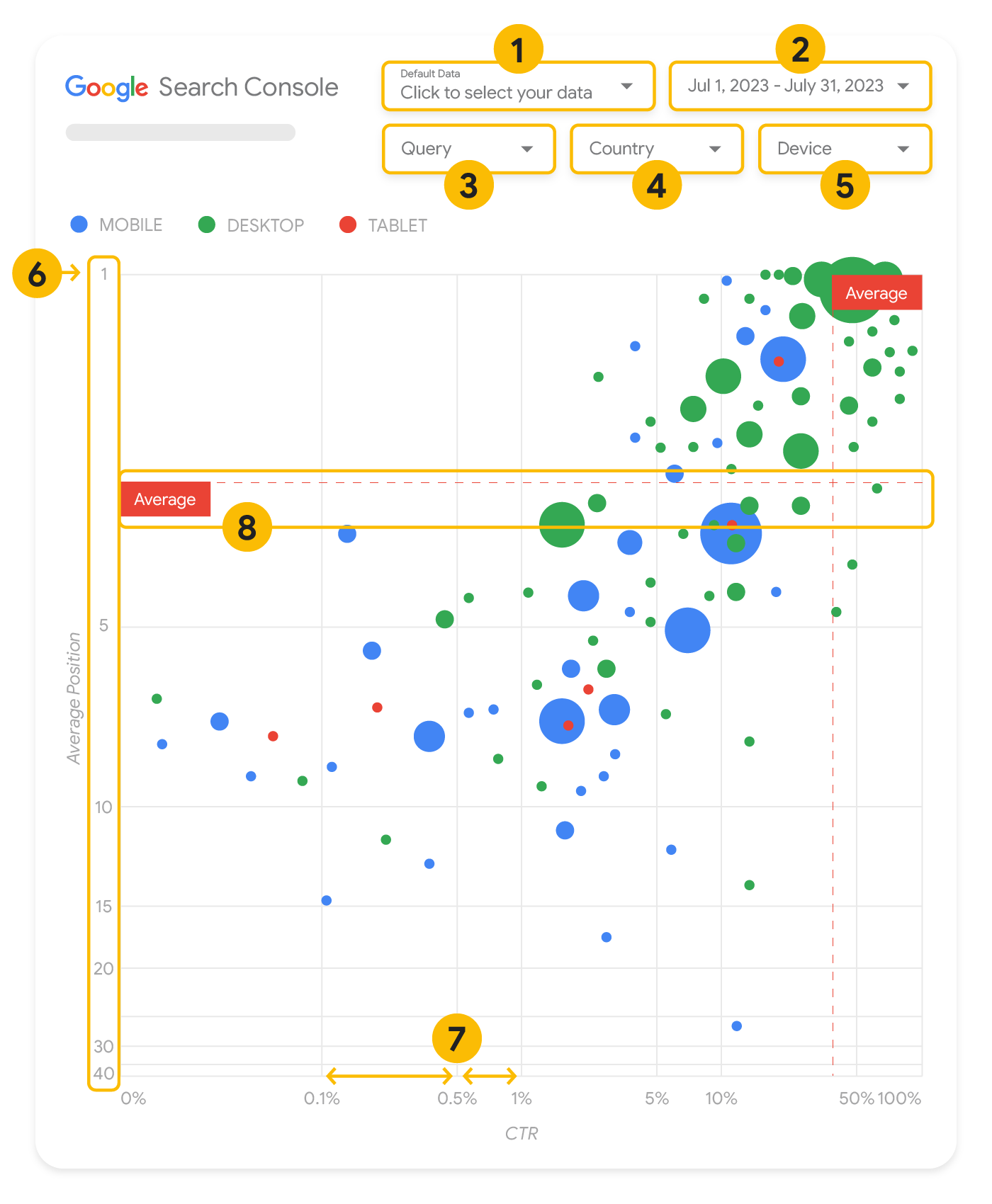
이 섹션에서는 일부 차트 요소에 대해 자세히 살펴보면서 차트에 어떤 내용이 표시되고, 어떤 내용은 표시되지 않는지 확인합니다.
데이터 소스
이 페이지에 표시된 풍선형 차트는 Search Console 데이터 소스를 통해 제공되는 사이트 노출수 표를 사용하며, 여기에는 사이트 및 검색어별로 집계된 Google 검색 실적 데이터가 포함되어 있습니다.
필터 및 데이터 관리
차트에는 데이터를 효과적으로 관리하는 데 도움이 되는 다섯 가지 맞춤설정 옵션이 있습니다.
- 데이터 관리: 분석하고자 하는 Search Console 속성을 선택합니다.
- 기간: 보고서에 표시할 기간을 선택합니다. 기본적으로 지난 28일 동안의 데이터가 표시됩니다.
- 검색어: 집중할 검색어를 포함하거나 제외합니다. Search Console에서와 비슷한 방법으로 데이터를 필터링할 수 있습니다.
- 국가: 국가를 포함하거나 제외합니다.
- 기기: 기기 카테고리를 포함하거나 제외합니다.
축
차트의 축은 평균 게재순위(y축)와 사이트 CTR(x축)이지만, 세 가지 중요한 변경사항이 있습니다.
- 역 y축 방향: y축은 평균 게재순위를 표시하므로 이를 반전하면 1이 맨 위에 옵니다.
대부분의 차트에서는 최고 게재순위가 오른쪽 상단에 있으므로 평균 게재순위를 표시할 때 y축을 반전시키는 것이 더 직관적입니다.
- 로그 스케일: 두 축 모두에 로그 스케일을 사용하면 차트의 맨 끝에 있는 검색어를 더 잘 파악할 수 있습니다(매우 낮은 CTR, 평균 게재순위 또는 둘 다).
- 참조선: 참조선은 특정 임계값을 초과하거나 임계값 미만인 값을 강조표시하는 데 매우 유용합니다.
평균이나 중앙값, 특정 백분위수를 살펴보면 패턴의 편차에 주목할 수 있습니다.
풍선
차트의 각 풍선은 다음의 스타일 속성을 가진 단일 검색어를 나타냅니다.
- 크기: 클릭수를 풍선 크기로 나타내면 많은 트래픽을 유도하는 검색어를 한눈에 확인할 수 있습니다. 풍선이 클수록 검색어에서 더 많은 트래픽이 생성된 것입니다.
- 색상: 풍선 색상을 사용하여 기기 카테고리를 구분하면 Google 검색의 모바일과 데스크톱 실적 간 차이를 파악하는 데 도움이 됩니다. 색상을 사용해 모든 측정기준을 구분할 수 있지만, 측정기준 개수가 늘어날수록 패턴을 인식하기가 어려워집니다.
데이터 분석
이 시각화의 목표는 검색어 최적화 기회를 확인하는 것입니다. 차트는 검색어 실적을 보여줍니다. 여기서 y축은 평균 게재순위를, x축은 CTR을, 풍선 크기는 총 클릭수를, 풍선 색상은 기기 카테고리를 나타냅니다.
빨간색 점선으로 표시되는 평균 참조선은 각 축의 평균을 보여줍니다. 이는 차트를 사분면으로 분할하여 4가지 유형의 검색어 실적을 보여줍니다. 사분면은 이 게시물에 공유된 사분면과 다르게 보일 수 있습니다. 사이트 검색어 분포 방식에 따라 달라집니다.
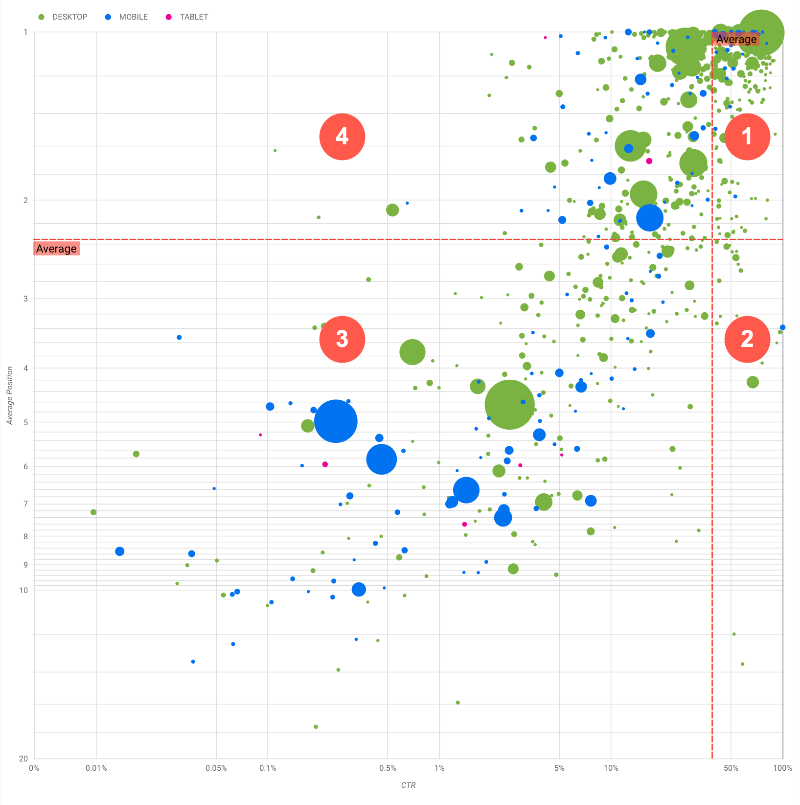
차트에는 4가지 검색어 그룹이 표시되며, 이를 분석하여 Google 검색 실적을 최적화할 때 어떤 영역에 시간을 투자해야 할지 결정할 수 있습니다.
- 최상위 게재순위, 높은 CTR: 이 경우에는 할 일이 별로 없습니다. 이미 잘하고 있습니다.
- 낮은 게재순위, 높은 CTR: 사용자와 관련이 있어 보이는 검색어입니다. 웹사이트의 평균 검색어보다 순위는 낮지만 CTR이 높습니다. 검색어의 평균 게재순위가 올라가면 실적에 상당한 영향을 미칠 수 있습니다. 이 그룹에 속하는 검색어의 검색엔진 최적화를 개선하는 데 집중하세요. 예를 들어 정원 가꾸기 웹사이트에서 '나무 창고를 만드는 방법'이라는 인기 검색어가 2사분면에 해당할 수 있습니다.
이미 관련 페이지가 있는지 확인한 후 다음의 두 가지 방법으로 진행하세요.
- 관련 페이지가 없다면 페이지를 만들고 웹사이트에서 이 주제와 관련된 모든 정보를 한곳에 모으는 것이 좋습니다.
- 관련 페이지가 있다면 콘텐츠를 추가하여 사용자의 요구를 좀 더 효과적으로 해결해 보세요.
- 낮은 게재순위, 낮은 CTR: CTR이 낮은 검색어(게재순위가 낮은 검색어와 높은 검색어 둘 다)를 살펴볼 때 특히 흥미로운 부분은, 풍선의 크기를 확인하여 CTR은 낮지만 상당한 트래픽을 유도하는 검색어가 있는지 확인하는 것입니다. 이 사분면의 검색어는 살펴볼 필요가 없어 보일 수 있지만 다음과 같은 두 가지 주요 그룹으로 나눌 수 있습니다.
- 관련 검색어: 문제의 검색어가 중요하다면 Google 검색에 이미 표시되어 있는 것이 좋습니다. Google 검색 결과에 전혀 표시되지 않는 검색어보다 이러한 검색어를 우선합니다. 더 쉽게 최적화할 수 있습니다.
- 관련 없는 검색어: 사이트에서 이 검색어와 관련된 콘텐츠를 다루지 않는다면 오히려 좋은 기회로 삼아 콘텐츠를 살짝 손보거나 관련 트래픽을 유도하는 검색어에 집중할 수 있습니다.
- 최상위 게재순위, 낮은 CTR: 여러 이유로 인해 이러한 검색어는 CTR이 낮을 수 있습니다. 가장 큰 풍선을 확인하여 다음 징후가 있는지 확인해야 합니다.
- 경쟁업체에 구조화된 데이터 마크업이 있을 수 있으며 리치 결과로 표시되어 내 검색결과가 아닌 경쟁업체의 검색결과를 클릭하도록 사용자를 유도할 수 있습니다. Google 검색에서 가장 일반적인 시각적 요소를 최적화해 보세요.
- 사용자가 사이트와 관련하여 관심을 보이지 않는 검색어의 순위를 최적화했거나 '실수로' 순위를 매겼을 수 있습니다. 별 문제가 되지 않는다면 해당 검색어를 무시해도 됩니다. 이러한 검색어가 사용된 결과로 사이트가 표시되지 않게 하려면(예: 불쾌감을 주는 단어가 포함된 경우) 콘텐츠를 살짝 조정하여 트래픽을 유도하는 검색어의 동의어나 관련 검색어로 생각될 수 있는 언급을 삭제해 보세요.
- 사람들이 회사의 영업시간이나 주소, 전화번호 등 필요한 정보를 이미 확인했을 수도 있습니다. 이때 어떤 검색어가 사용되었는지, 해당 정보가 포함된 URL은 무엇인지 확인하세요. 웹사이트 목표 중 하나가 고객을 매장으로 유도하는 것이라면 이는 의도한 대로 작동하는 것입니다. 사람들이 웹사이트를 방문하여 추가 정보를 확인해야 한다고 생각한다면, 제목과 설명을 최적화하여 이러한 메시지를 명확하게 전달할 수 있습니다. 자세한 내용은 다음 섹션을 참고하세요.
여기서는 기기 카테고리는 언급하지 않았습니다. 기기 카테고리는 검색어의 실적을 보여주는 추가적인 신호로 사용할 수 있기 때문입니다. 예를 들어 어떤 검색어는 사람들이 어떤 거리에서 어떤 장소를 찾으려고 할 때 좀 더 관련성이 높다고 생각해 봅시다. 이 경우 이 검색어가 휴대전화에서는 좋은 실적을 올리더라도 데스크톱에서는 실적이 저조할 수 있습니다.
특정 검색어의 검색엔진 최적화 개선
시간과 노력을 들일 가치가 있는 검색어를 찾으면 해당 검색어와 관련된 페이지를 최적화하거나 만들어 보세요.
이 페이지에 나온 시각화를 사용하여 쿼리를 찾은 후에는 Search Console 사용자 인터페이스에서 특정 쿼리에 대한 쿼리 필터를 만들거나 Looker Studio를 사용해 피벗 테이블을 만들 수 있습니다. 이 두 가지 방법을 사용하면 특정 검색어에 대해 트래픽이 발생하는 모든 페이지를 확인할 수 있습니다. 최적화할 검색어 및 관련 URL을 파악했다면 SEO 기본 가이드를 참고하여 콘텐츠를 최적화하세요. 이때 다음 도움말을 참고하세요.
- 제목 요소, 설명 메타 태그, Alt 속성이 구체적이고 정확한지 확인합니다.
- 제목 요소를 사용하여 중요한 텍스트를 강조하고 콘텐츠의 계층 구조를 만들어 사용자와 검색엔진이 문서를 더 쉽게 탐색할 수 있도록 합니다.
- 동의어, 관련 검색어 등 사용자가 내 콘텐츠를 찾을 때 다른 어떤 단어를 검색할 수 있을지 생각해 봅니다. Google Ads에서 제공하는 키워드 플래너를 사용하면 새로운 키워드 변형을 찾고 각 키워드의 대략적인 검색량을 확인할 수 있습니다. Google 트렌드를 사용하여 웹사이트와 관련된 상승 주제와 검색어를 통해 아이디어를 찾을 수도 있습니다.
달리 명시되지 않는 한 이 페이지의 콘텐츠에는 Creative Commons Attribution 4.0 라이선스에 따라 라이선스가 부여되며, 코드 샘플에는 Apache 2.0 라이선스에 따라 라이선스가 부여됩니다. 자세한 내용은 Google Developers 사이트 정책을 참조하세요. 자바는 Oracle 및/또는 Oracle 계열사의 등록 상표입니다.
최종 업데이트: 2025-08-04(UTC)
[null,null,["최종 업데이트: 2025-08-04(UTC)"],[[["\u003cp\u003eVisualize Search Console data with a bubble chart to reveal query optimization opportunities by analyzing click-through rate, average position, and clicks.\u003c/p\u003e\n"],["\u003cp\u003eIdentify high-potential queries by focusing on those with low positions but high click-through rates, indicating relevance and potential for increased traffic with improved ranking.\u003c/p\u003e\n"],["\u003cp\u003eInvestigate queries with low click-through rates and high positions to determine if they are unrelated to your site or require optimization for better user engagement.\u003c/p\u003e\n"],["\u003cp\u003eOptimize content for identified queries by refining titles, meta descriptions, headings, and incorporating relevant keywords to enhance search visibility and user experience.\u003c/p\u003e\n"]]],["A bubble chart visualizes query performance using Search Console data. It displays click-through rate (CTR) on the x-axis, average position on the y-axis, click volume as bubble size, and device category as bubble color. Customization options include data control, date range, query, country, and device filters. Analyzing the quadrants formed by average CTR and position helps identify optimization opportunities. Focus on queries with low position but high CTR, and address top-position, low-CTR queries by improving content or structured data.\n"],null,["# How to Create a Search Console Bubble Chart | Google Search Central\n\nImproving SEO with a Search Console bubble chart\n================================================\n\n\nAnalyzing Search performance data is always a challenge, but even more so when you have plenty of\nlong-tail queries, which are harder to visualize and understand. A\n[bubble chart](https://support.google.com/datastudio/answer/7207785)\ncan help you understand which queries are performing well for your site, and which could be improved.\n\n\nIf you'd like to test the techniques discussed here, you can\n[connect your data to Looker Studio](https://datastudio.google.com/reporting/1e5b5f6a-38d7-4547-a54b-69594681a09b/page/xFbeC/preview) and play with the chart settings. \n\n\nIf you haven't read [connecting Search Console to Looker Studio](/search/blog/2022/03/connecting-data-studio) and\n[monitoring Search traffic with Looker Studio](/search/blog/2022/03/monitoring-dashboard),\nconsider checking them out to understand more about what you can do with Search Console in Looker\nStudio.\n\nUnderstanding the chart\n-----------------------\n\n\nA bubble chart is a great visualization when you have multiple metrics and dimensions because it\nlets you to see relationships and patterns in your\ndata more effectively. In the example shown here, you can see\n[click-through rate](https://support.google.com/webmasters/answer/7576553#choosingmetrics)\n(CTR), average position, and clicks for the query and device dimensions in one view.\n\n\nThis section goes into detail on some of the chart elements to clarify what the chart shows, and what it doesn't.\n\n### Data source\n\n\nThe bubble chart shown in this page uses the Site Impression table available through the\n[Search Console data source](https://support.google.com/datastudio/answer/7314895),\nwhich includes [Search performance data](https://support.google.com/webmasters/answer/7576553)\naggregated by site and queries.\n\n### Filters and data controls\n\n\nThere are five customization options in the chart to help you control your data effectively:\n\n1. **[Data control](https://support.google.com/datastudio/answer/7415591)**: Choose the Search Console property you'd like to analyze.\n2. **Date range**: Choose the date range you'd like to see in the report; by default you'll see the last 28 days.\n3. **Query** : Include or exclude queries to focus on. You can [filter your data](/search/blog/2021/06/regex-negative-match) similar to how you do it in Search Console.\n4. **Country**: Include or exclude countries.\n5. **Device**: Include or exclude device categories.\n\n### Axes\n\n\nThe axes in the chart are average position (y-axis) and site CTR (x-axis). There are three\nsignificant transformations in the axes:\n\n6. **Reverse y-axis direction**: Since the y-axis shows average position, inverting it means that 1 is at the top. For most charts, the best position is in the top right corner, so it is more intuitive to invert the y-axis when using it to display average position.\n7. **Log scale** : Using a [logarithmic scale](https://en.wikipedia.org/wiki/Logarithmic_scale) for both axes lets you to have a better understanding of queries that are in the extremities of the chart (very low CTR, average position, or both).\n8. **[Reference lines](https://support.google.com/datastudio/answer/9921462)**: The reference line is very helpful to highlight values that are above or below a certain threshold. Looking at the average, median, or a certain percentile can call attention to deviations from the pattern.\n\n### Bubbles\n\n\nEach bubble in the chart represents a single query, with the following\n[style properties](https://support.google.com/datastudio/answer/7207785#style-properties):\n\n- **Size**: Using the number of clicks as the bubble size helps you see in a glance which queries are driving the bulk of the traffic---the larger the bubble the more traffic the query generates.\n- **Color**: Using the device category as the bubble color helps you understand the differences between mobile and desktop Search performance. You can use any dimension as the color, but as the number of values increases, the harder it is to recognize patterns.\n\nAnalyzing the data\n------------------\n\n\nThe goal of this visualization is to help surface query optimization opportunities. The chart\nshows query performance, where the y-axis represents average position, the x-axis represents CTR\nthe bubble size represents total number of clicks, and the bubble color represents\ndevice category.\n\n\nThe red Average dashed reference lines show the average for each of the axes, which split the chart\ninto quadrants, showing four types of query performance. Your quadrants are likely to look\ndifferent than the one shared in this post; they'll depend on how your site queries\nare distributed.\n\n\nThe chart shows four groups of queries, which you can analyze to help you decide where to invest\nyour time when optimizing your Google Search performance.\n\n1. **Top position, high CTR**: There's not much you need to do for those; you're doing a great job already.\n2. **Low position, high CTR** : Those queries seem relevant to users; the queries get a high CTR even when ranking lower than the average query on your website. If the query average position moves up, it could have a significant impact on your performance---focus on improving SEO for these queries. For example, a top query in quadrant 2 for a gardening website could be \"how to build a wooden shed.\" Check if you have a page about this already, and proceed in two ways:\n - If you don't have a page, consider creating one to centralize all the info you have in the website about the subject.\n - If you do have a page, consider adding content to better address that user need.\n3. **Low position, low CTR** : When looking at queries with low CTR (both with low and top position), it's especially interesting to look at the bubble sizes to understand which queries have a low CTR but are still driving significant traffic. While the queries in this quadrant might seem unworthy of your effort, they can be divided into two main groups:\n - **Related queries**: If the query in question is important to you, it's a good start to have it appearing in Search already. Prioritize these queries over queries that are not appearing in Search results at all, as they'll be easier to optimize.\n - **Unrelated queries**: If your site doesn't cover content related to this query, maybe it's a good opportunity to fine tune your content or focus on queries that will bring relevant traffic.\n4. **Top position, low CTR** : Those queries might have a low CTR for various reasons. Check the largest bubbles to find signs of the following:\n - Your competitors may have [structured data markup](/search/docs/appearance/search-result-features) and are showing up with rich results, which might attract users to click their results instead of yours. Consider optimizing for the most common [visual elements in Google Search](/search/docs/appearance/visual-elements-gallery).\n - You may have optimized, or be \"accidentally\" ranking, for a query that users are not interested in relation to your site. This might not be an issue for you, in which case you can ignore those queries. If you prefer people not to find you through those queries (for example, they contain offensive words), try to fine-tune your content to remove mentions that could be seen as synonyms or related queries to the one bringing traffic.\n - People may have already found the information they needed, for example your company's opening hours, address, or phone number. Check the queries that were used and the URLs that contained the information. If one of your website goals is to drive people to your stores, this is working as intended; if you believe that people should visit your website for extra information, you could try to optimize your titles and description to make that clear. See next section for more details.\n\n\nWe haven't mentioned the device categories because they can be used as additional signs of query\nperformance. For example, suppose some queries are more relevant when people are navigating in the\nstreet, trying to find a location; in that case, the query might have a high performance\non mobile devices, but a low performance on desktop.\n\nImproving SEO for specific queries\n----------------------------------\n\n\nOnce you find queries that are worth the time and effort, make sure to optimize or create pages\nrelated to those queries.\n\n\nAfter you find the queries using the visualization shown in this page, you can\n[create a query filter](https://support.google.com/webmasters/answer/7576553#filteringdata)\nfor specific queries using the Search Console user interface, or create a\n[pivot table](https://support.google.com/looker-studio/answer/7516660)\nusing Looker Studio; in both ways, you can check all the pages that are receiving\ntraffic for a specific query. After you know the queries you want to optimize and their related\nURLs, use the [SEO starter guide](/search/docs/fundamentals/seo-starter-guide)\nto optimize your content. Here are some tips:\n\n- Ensure that your [title](/search/docs/appearance/title-link#page-titles) elements, [description meta tags](/search/docs/appearance/snippet#meta-descriptions), and alt attributes are descriptive, specific, and accurate.\n- Use heading elements to emphasize important text and help create a hierarchical structure for your content, making it easier for users and search engines to navigate through your document.\n- Think about other words that a user might search for to find a piece of your content, for example, synonyms and related queries. You can use the [Keyword Planner](https://ads.google.com/home/tools/keyword-planner/) provided by Google Ads to help you discover new keyword variations and see the approximate search volume for each keyword. You can also [use Google Trends](/search/docs/monitor-debug/google-trends) to find ideas from rising topics and queries related to your website."]]