
কার্ড
গুগল চ্যাট মেসেজ বা গুগল ওয়ার্কস্পেস অ্যাড-অনে প্রদর্শিত একটি কার্ড ইন্টারফেস।
কার্ড একটি নির্দিষ্ট লেআউট, বাটনের মতো ইন্টারেক্টিভ UI এলিমেন্ট এবং ছবির মতো রিচ মিডিয়া সমর্থন করে। বিস্তারিত তথ্য উপস্থাপন করতে, ব্যবহারকারীদের কাছ থেকে তথ্য সংগ্রহ করতে এবং পরবর্তী পদক্ষেপ নিতে তাদের নির্দেশনা দিতে কার্ড ব্যবহার করুন।
কার্ড বিল্ডার ব্যবহার করে কার্ড ডিজাইন করুন এবং প্রিভিউ দেখুন।
কার্ড বিল্ডারটি খুলুনকার্ড তৈরি করার পদ্ধতি জানতে, নিম্নলিখিত ডকুমেন্টেশন দেখুন:
- গুগল চ্যাট অ্যাপের জন্য, একটি কার্ড বা ডায়ালগের উপাদানগুলির ডিজাইন দেখুন।
- Google Workspace অ্যাড-অনগুলির জন্য, কার্ড-ভিত্তিক ইন্টারফেস দেখুন।
দ্রষ্টব্য: আপনি প্রতি কার্ডে সর্বোচ্চ ১০০টি উইজেট যোগ করতে পারবেন। যদি কোনো সেকশনের উইজেটের সংখ্যা বেড়ে মোট সংখ্যা ১০০ ছাড়িয়ে যায়, তাহলে সেই সম্পূর্ণ সেকশন এবং তার পরবর্তী সমস্ত সেকশন উপেক্ষা করা হবে। এই সীমাটি গুগল চ্যাট অ্যাপের কার্ড মেসেজ ও ডায়ালগ এবং গুগল ওয়ার্কস্পেস অ্যাড-অনের কার্ড—উভয়ের ক্ষেত্রেই প্রযোজ্য।
উদাহরণ: গুগল চ্যাট অ্যাপের জন্য কার্ড বার্তা
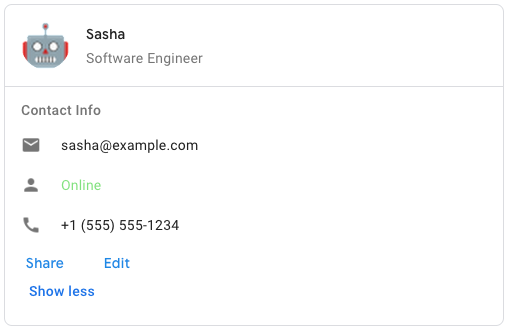
গুগল চ্যাটে নমুনা কার্ড বার্তা তৈরি করতে, নিম্নলিখিত JSON ব্যবহার করুন:
{
  "cardsV2": [
    {
      "cardId": "unique-card-id",
      "card": {
        "header": {
           "title": "Sasha",
           "subtitle": "Software Engineer",
           "imageUrl":
           "https://developers.google.com/workspace/chat/images/quickstart-app-avatar.png",
           "imageType": "CIRCLE",
           "imageAltText": "Avatar for Sasha"
         },
         "sections": [
           {
             "header": "Contact Info",
             "collapsible": true,
             "uncollapsibleWidgetsCount": 1,
             "widgets": [
               {
                 "decoratedText": {
                   "startIcon": {
                     "knownIcon": "EMAIL"
                   },
                   "text": "sasha@example.com"
                 }
               },
               {
                 "decoratedText": {
                   "startIcon": {
                     "knownIcon": "PERSON"
                   },
                   "text": "<font color=\"#80e27e\">Online</font>"
                 }
               },
               {
                 "decoratedText": {
                   "startIcon": {
                     "knownIcon": "PHONE"
                   },
                   "text": "+1 (555) 555-1234"
                 }
               },
               {
                 "buttonList": {
                   "buttons": [
                     {
                       "text": "Share",
                       "onClick": {
                        "openLink": {
                           "url": "https://example.com/share"
                         }
                       }
                     },
                     {
                       "text": "Edit",
                       "onClick": {
                         "action": {
                           "function": "goToView",
                           "parameters": [
                             {
                               "key": "viewType",
                               "value": "EDIT"
                             }
                           ]
                         }
                       }
                     }
                   ]
                 }
               }
             ]
           }
         ]
       }
    }
  ]
}
| JSON উপস্থাপনা |
|---|
{ "header": { object ( |
| ক্ষেত্র | |
|---|---|
header | কার্ডের হেডার। একটি হেডারে সাধারণত একটি প্রধান ছবি এবং একটি শিরোনাম থাকে। হেডার সবসময় কার্ডের শীর্ষে প্রদর্শিত হয়। |
sections[] | এতে উইজেটের একটি সংগ্রহ রয়েছে। প্রতিটি বিভাগের নিজস্ব, ঐচ্ছিক হেডার আছে। বিভাগগুলো একটি রেখা বিভাজক দ্বারা দৃশ্যত পৃথক করা থাকে। গুগল চ্যাট অ্যাপে একটি উদাহরণের জন্য, ‘একটি কার্ডের বিভাগ সংজ্ঞায়িত করুন ’ দেখুন। |
sectionDividerStyle | হেডার, সেকশন ও ফুটারের মধ্যবর্তী বিভাজক শৈলী। |
cardActions[] | কার্ডের কার্যকলাপসমূহ। কার্যকলাপগুলো কার্ডের টুলবার মেনুতে যোগ করা হয়।
উদাহরণস্বরূপ, নিম্নলিখিত JSON-টি |
name | কার্ডের নাম। কার্ড নেভিগেশনে কার্ড শনাক্তকারী হিসেবে ব্যবহৃত হয়।
|
fixedFooter | এই কার্ডের নীচে স্থির ফুটারটি দেখানো হয়েছে।
|
displayStyle | গুগল ওয়ার্কস্পেস অ্যাড-অন-এ, এটি
|
peekCardHeader | প্রাসঙ্গিক বিষয়বস্তু প্রদর্শন করার সময়, পিক কার্ড হেডারটি একটি প্লেসহোল্ডার হিসেবে কাজ করে, যাতে ব্যবহারকারী হোমপেজের কার্ডগুলো এবং প্রাসঙ্গিক কার্ডগুলোর মধ্যে সামনে এগিয়ে যেতে পারেন।
|
expressionData[] | কার্ডটির জন্য এক্সপ্রেশন ডেটা। Google Workspace Studio-এর কার্যকারিতা বর্ধনকারী Google Workspace অ্যাড-অনগুলির জন্য উপলব্ধ। Google Chat অ্যাপগুলির জন্য অনুপলব্ধ। |
কার্ডহেডার
এটি একটি কার্ড হেডার নির্দেশ করে। গুগল চ্যাট অ্যাপে এর একটি উদাহরণের জন্য, ‘হেডার যোগ করুন’ দেখুন।

 গুগল চ্যাট অ্যাপ এবং গুগল ওয়ার্কস্পেস অ্যাড-অনগুলির জন্য উপলব্ধ।
| JSON উপস্থাপনা |
|---|
{
"title": string,
"subtitle": string,
"imageType": enum ( |
| ক্ষেত্র | |
|---|---|
title | আবশ্যক। কার্ড হেডারের শিরোনাম। হেডারের একটি নির্দিষ্ট উচ্চতা রয়েছে: যদি শিরোনাম এবং উপ-শিরোনাম উভয়ই উল্লেখ করা হয়, তবে প্রতিটি এক লাইনে স্থান পাবে। যদি শুধু শিরোনাম উল্লেখ করা হয়, তবে সেটি উভয় লাইনেই স্থান পাবে। |
subtitle | কার্ড হেডারের উপশিরোনাম। নির্দিষ্ট করা থাকলে, এটি |
imageType | ছবিটি ক্রপ করতে ব্যবহৃত আকৃতি।
|
imageUrl | কার্ড হেডারে থাকা ছবিটির HTTPS URL। |
imageAltText | এই ছবিটির বিকল্প লেখাটি অ্যাক্সেসিবিলিটির জন্য ব্যবহৃত হয়। |
ছবির ধরন
ছবিটি ক্রপ করতে ব্যবহৃত আকৃতি।
গুগল চ্যাট অ্যাপ এবং গুগল ওয়ার্কস্পেস অ্যাড-অনগুলির জন্য উপলব্ধ।
| এনাম | |
|---|---|
SQUARE | ডিফল্ট মান। ছবির উপর একটি বর্গাকার মাস্ক প্রয়োগ করে। উদাহরণস্বরূপ, একটি ৪x৩ ছবি ৩x৩ হয়ে যায়। |
CIRCLE | ছবিতে একটি বৃত্তাকার মাস্ক প্রয়োগ করে। উদাহরণস্বরূপ, একটি ৪x৩ ছবি ৩ ব্যাসবিশিষ্ট একটি বৃত্তে পরিণত হয়। |
বিভাগ
একটি সেকশনে উইজেটগুলোর একটি সংগ্রহ থাকে, যেগুলো নির্দিষ্ট করার ক্রমানুসারে উল্লম্বভাবে রেন্ডার করা হয়।
গুগল চ্যাট অ্যাপ এবং গুগল ওয়ার্কস্পেস অ্যাড-অনগুলির জন্য উপলব্ধ।
| JSON উপস্থাপনা |
|---|
{ "header": string, "widgets": [ { object ( |
| ক্ষেত্র | |
|---|---|
header | সেকশনের শীর্ষে প্রদর্শিত টেক্সট। সাধারণ HTML ফরম্যাট করা টেক্সট সমর্থন করে। টেক্সট ফরম্যাটিং সম্পর্কে আরও তথ্যের জন্য, Google Chat অ্যাপে টেক্সট ফরম্যাটিং এবং Google Workspace অ্যাড-অনে টেক্সট ফরম্যাটিং দেখুন। |
widgets[] | সেকশনটির সমস্ত উইজেট। এতে অবশ্যই অন্তত একটি উইজেট থাকতে হবে। |
collapsible | এই অংশটি ভাঁজযোগ্য কিনা তা নির্দেশ করে। সংকুচিত করা যায় এমন বিভাগগুলো কিছু বা সমস্ত উইজেট লুকিয়ে রাখে, কিন্তু ব্যবহারকারীরা 'আরও দেখান' (Show more) এ ক্লিক করে বিভাগটি প্রসারিত করার মাধ্যমে লুকানো উইজেটগুলো আবার দেখতে পারেন। ব্যবহারকারীরা 'কম দেখান' (Show less) এ ক্লিক করে উইজেটগুলো পুনরায় লুকাতে পারেন। কোন উইজেটগুলো লুকানো থাকবে তা নির্ধারণ করতে, |
uncollapsibleWidgetsCount | যেসব উইজেট কোনো সেকশন সংকুচিত করার পরেও দৃশ্যমান থাকে, তাদের সংখ্যা। উদাহরণস্বরূপ, যখন একটি বিভাগে পাঁচটি উইজেট থাকে এবং |
id | যে সেকশনটি পরিবর্তন করা হবে, সেটিকে শনাক্ত করার জন্য নির্ধারিত একটি অনন্য আইডি। আইডিটির অক্ষর সংখ্যা ৬৪-এর মধ্যে সীমাবদ্ধ এবং এটি Google Workspace Studio-এর কার্যকারিতা বর্ধনকারী Google Workspace অ্যাড-অনগুলির জন্য উপলব্ধ। Google Chat অ্যাপগুলির জন্য অনুপলব্ধ। |
collapseControl | ঐচ্ছিক। সেকশনটির এক্সপ্যান্ড এবং কলাপস বাটন নির্ধারণ করুন। এই বাটনটি শুধুমাত্র তখনই দেখানো হবে যখন সেকশনটি কলাপসিবল হবে। এই ফিল্ডটি সেট করা না থাকলে, ডিফল্ট বাটনটি ব্যবহৃত হবে। |
উইজেট
প্রতিটি কার্ড উইজেট দিয়ে গঠিত।
উইজেট হলো একটি যৌগিক বস্তু যা টেক্সট, ছবি, বাটন এবং অন্যান্য ধরনের বস্তুকে উপস্থাপন করতে পারে।
| JSON উপস্থাপনা |
|---|
{ "horizontalAlignment": enum ( |
| ক্ষেত্র | |
|---|---|
horizontalAlignment | উইজেটগুলো কোনো কলামের বামে, ডানে, নাকি কেন্দ্রে সারিবদ্ধ হবে তা নির্দিষ্ট করে। |
id | যে উইজেটটি পরিবর্তন করা হবে, সেটিকে শনাক্ত করার জন্য উইজেটটিকে একটি অনন্য আইডি দেওয়া হয়। আইডিটির অক্ষর সংখ্যা ৬৪-এর মধ্যে সীমাবদ্ধ এবং Google Workspace Studio-এর কার্যকারিতা বর্ধনকারী Google Workspace অ্যাড-অনগুলির জন্য উপলব্ধ। Google Chat অ্যাপগুলির জন্য অনুপলব্ধ। |
visibility | উইজেটটি দৃশ্যমান হবে নাকি অদৃশ্য থাকবে তা নির্দিষ্ট করে। এর ডিফল্ট মান হলো Google Workspace Studio-এর কার্যকারিতা বর্ধনকারী Google Workspace অ্যাড-অনগুলির জন্য উপলব্ধ। Google Chat অ্যাপগুলির জন্য অনুপলব্ধ। |
eventActions[] | উইজেটটিতে যে ইভেন্ট অ্যাকশনগুলো সম্পাদন করা যেতে পারে, তা নির্দিষ্ট করে। Google Workspace Studio-এর কার্যকারিতা বর্ধনকারী Google Workspace অ্যাড-অনগুলির জন্য উপলব্ধ। Google Chat অ্যাপগুলির জন্য অনুপলব্ধ। |
ইউনিয়ন ফিল্ড data । একটি উইজেটে নিম্নলিখিত আইটেমগুলির মধ্যে কেবল একটিই থাকতে পারে। আরও আইটেম প্রদর্শন করতে আপনি একাধিক উইজেট ফিল্ড ব্যবহার করতে পারেন। data নিম্নলিখিতগুলির মধ্যে কেবল একটি হতে পারে: | |
textParagraph | একটি পাঠ্য অনুচ্ছেদ প্রদর্শন করে। সাধারণ HTML ফরম্যাট করা পাঠ্য সমর্থন করে। পাঠ্য ফরম্যাট করার বিষয়ে আরও তথ্যের জন্য, Google Chat অ্যাপে পাঠ্য ফরম্যাট করা এবং Google Workspace অ্যাড-অনগুলিতে পাঠ্য ফরম্যাট করা দেখুন। উদাহরণস্বরূপ, নিম্নলিখিত JSON একটি বোল্ড টেক্সট তৈরি করে: |
image | একটি ছবি প্রদর্শন করে। উদাহরণস্বরূপ, নিম্নলিখিত JSON-টি বিকল্প টেক্সট সহ একটি ছবি তৈরি করে: |
decoratedText | একটি সজ্জিত পাঠ্য আইটেম প্রদর্শন করে। উদাহরণস্বরূপ, নিম্নলিখিত JSON টি ইমেল ঠিকানা প্রদর্শনকারী একটি সজ্জিত টেক্সট উইজেট তৈরি করে: |
buttonList | বাটনগুলোর একটি তালিকা। উদাহরণস্বরূপ, নিম্নলিখিত JSON দুটি বাটন তৈরি করে। প্রথমটি একটি নীল রঙের টেক্সট বাটন এবং দ্বিতীয়টি একটি ইমেজ বাটন যা একটি লিঙ্ক খোলে: |
textInput | একটি টেক্সট বক্স প্রদর্শন করে যেখানে ব্যবহারকারীরা টাইপ করতে পারেন। উদাহরণস্বরূপ, নিম্নলিখিত JSON একটি ইমেল ঠিকানার জন্য একটি টেক্সট ইনপুট তৈরি করে: আরেকটি উদাহরণ হিসেবে, নিম্নলিখিত JSON-টি স্ট্যাটিক সাজেশন সহ একটি প্রোগ্রামিং ভাষার জন্য টেক্সট ইনপুট তৈরি করে: |
selectionInput | একটি সিলেকশন কন্ট্রোল প্রদর্শন করে যা ব্যবহারকারীদের আইটেম নির্বাচন করতে দেয়। সিলেকশন কন্ট্রোলগুলো চেকবক্স, রেডিও বাটন, সুইচ বা ড্রপডাউন মেনু হতে পারে। উদাহরণস্বরূপ, নিম্নলিখিত JSON একটি ড্রপডাউন মেনু তৈরি করে যা ব্যবহারকারীদের আকার বেছে নিতে দেয়: |
dateTimePicker | এমন একটি উইজেট প্রদর্শন করে, যা ব্যবহারকারীদের তারিখ, সময় অথবা তারিখ ও সময় ইনপুট করার সুযোগ দেয়। উদাহরণস্বরূপ, নিম্নলিখিত JSON একটি অ্যাপয়েন্টমেন্ট নির্ধারণ করার জন্য একটি ডেট টাইম পিকার তৈরি করে: |
divider | উইজেটগুলোর মধ্যে একটি আনুভূমিক রেখা বিভাজক প্রদর্শন করে। উদাহরণস্বরূপ, নিম্নলিখিত JSON একটি ডিভাইডার তৈরি করে: |
grid | আইটেমসমূহের একটি সংগ্রহসহ একটি গ্রিড প্রদর্শন করে। একটি গ্রিডে যেকোনো সংখ্যক কলাম এবং আইটেম থাকতে পারে। আইটেমের সংখ্যাকে কলামের সংখ্যা দিয়ে ভাগ করে প্রাপ্ত মান দ্বারা সারির সংখ্যা নির্ধারণ করা হয়। ১০টি আইটেম ও ২টি কলামের একটি গ্রিডে ৫টি সারি থাকে। ১১টি আইটেম ও ২টি কলামের একটি গ্রিডে ৬টি সারি থাকে।
উদাহরণস্বরূপ, নিম্নলিখিত JSON-টি একটি মাত্র আইটেম সহ একটি ২-কলামের গ্রিড তৈরি করে: |
columns | সর্বোচ্চ ২টি কলাম প্রদর্শন করে। দুইটির বেশি কলাম বা সারি অন্তর্ভুক্ত করতে উদাহরণস্বরূপ, নিম্নলিখিত JSON-টি ২টি কলাম তৈরি করে, যেগুলোর প্রতিটিতে টেক্সট প্যারাগ্রাফ থাকে: |
carousel | একটি ক্যারোসেলে একাধিক নেস্টেড উইজেট থাকে। উদাহরণস্বরূপ, এটি একটি ক্যারোসেলের JSON উপস্থাপনা, যাতে দুটি টেক্সট প্যারাগ্রাফ রয়েছে। |
chipList | চিপসের একটি তালিকা। উদাহরণস্বরূপ, নিম্নলিখিত JSON দুটি চিপ তৈরি করে। প্রথমটি একটি টেক্সট চিপ এবং দ্বিতীয়টি একটি আইকন চিপ যা একটি লিঙ্ক খোলে: |
পাঠ্য অনুচ্ছেদ
একটি টেক্সট প্যারাগ্রাফ যা ফরম্যাটিং সমর্থন করে। গুগল চ্যাট অ্যাপে একটি উদাহরণের জন্য, ‘ফরম্যাট করা টেক্সটের একটি প্যারাগ্রাফ যোগ করুন ’ দেখুন। টেক্সট ফরম্যাটিং সম্পর্কে আরও তথ্যের জন্য, ‘গুগল চ্যাট অ্যাপে টেক্সট ফরম্যাটিং’ এবং ‘গুগল ওয়ার্কস্পেস অ্যাড-অনগুলিতে টেক্সট ফরম্যাটিং’ দেখুন।
গুগল চ্যাট অ্যাপ এবং গুগল ওয়ার্কস্পেস অ্যাড-অনগুলির জন্য উপলব্ধ।
| JSON উপস্থাপনা |
|---|
{
"text": string,
"maxLines": integer,
"textSyntax": enum ( |
| ক্ষেত্র | |
|---|---|
text | উইজেটে যে লেখাটি দেখানো হয়। |
maxLines | উইজেটে প্রদর্শিত টেক্সটের সর্বোচ্চ লাইন সংখ্যা। যদি টেক্সট নির্দিষ্ট সর্বোচ্চ লাইন সংখ্যা অতিক্রম করে, তবে অতিরিক্ত অংশটি একটি 'আরও দেখান' বাটনের আড়ালে লুকিয়ে রাখা হয়। যদি টেক্সট নির্দিষ্ট সর্বোচ্চ লাইন সংখ্যার সমান বা তার চেয়ে ছোট হয়, তবে কোনো ' আরও দেখান ' বাটন প্রদর্শিত হয় না। ডিফল্ট মান হলো ০, সেক্ষেত্রে সমস্ত প্রাসঙ্গিক তথ্য প্রদর্শিত হয়। ঋণাত্মক মান উপেক্ষা করা হয়। |
textSyntax | টেক্সটের সিনট্যাক্স। এটি সেট করা না থাকলে, টেক্সটটি HTML হিসেবে রেন্ডার করা হয়।
|
টেক্সট সিনট্যাক্স
টেক্সট ফরম্যাট করার জন্য ব্যবহৃত সিনট্যাক্স।
গুগল চ্যাট অ্যাপের জন্য উপলব্ধ, কিন্তু গুগল ওয়ার্কস্পেস অ্যাড-অনের জন্য অনুপলব্ধ।
| এনাম | |
|---|---|
TEXT_SYNTAX_UNSPECIFIED | অনির্দিষ্ট থাকলে লেখাটি HTML হিসেবে প্রদর্শিত হয়। |
HTML | লেখাটি HTML হিসেবে রেন্ডার করা হয়। এটিই ডিফল্ট মান। |
MARKDOWN | লেখাটি মার্কডাউন হিসেবে রেন্ডার করা হয়েছে। |
ছবি
একটি ছবি যা একটি URL দ্বারা নির্দিষ্ট করা হয় এবং এতে একটি onClick অ্যাকশন থাকতে পারে। একটি উদাহরণের জন্য, 'একটি ছবি যোগ করুন' দেখুন।
গুগল চ্যাট অ্যাপ এবং গুগল ওয়ার্কস্পেস অ্যাড-অনগুলির জন্য উপলব্ধ।
| JSON উপস্থাপনা |
|---|
{
"imageUrl": string,
"onClick": {
object ( |
| ক্ষেত্র | |
|---|---|
imageUrl | যে HTTPS URL-টিতে ছবিটি রয়েছে। উদাহরণস্বরূপ: |
onClick | যখন কোনো ব্যবহারকারী ছবিটিতে ক্লিক করেন, তখন সেই ক্লিকের ফলে এই কাজটি সম্পন্ন হয়। |
altText | এই ছবিটির বিকল্প লেখাটি অ্যাক্সেসিবিলিটির জন্য ব্যবহৃত হয়। |
অনক্লিক
ব্যবহারকারীরা যখন কার্ডের কোনো ইন্টারেক্টিভ উপাদানে, যেমন একটি বোতামে, ক্লিক করেন তখন কীভাবে প্রতিক্রিয়া জানাতে হবে তা এটি নির্দেশ করে।
গুগল চ্যাট অ্যাপ এবং গুগল ওয়ার্কস্পেস অ্যাড-অনগুলির জন্য উপলব্ধ।
| JSON উপস্থাপনা |
|---|
{ "action": { object ( |
| ক্ষেত্র | |
|---|---|
ইউনিয়ন ফিল্ড | |
action | নির্দিষ্ট করা থাকলে, এই |
openLink | নির্দিষ্ট করা থাকলে, এই |
openDynamicLinkAction | যখন কোনো লিঙ্ক খোলার প্রয়োজন হয়, তখন একটি অ্যাড-অন এই কাজটি চালু করে। এটি উপরের
|
card | নির্দিষ্ট করা থাকলে, ক্লিক করার পর কার্ড স্ট্যাকে একটি নতুন কার্ড যুক্ত হয়।
|
overflowMenu | নির্দিষ্ট করা থাকলে, এই |
পদক্ষেপ
একটি অ্যাকশন যা ফর্ম সাবমিট করা হলে তার আচরণ বর্ণনা করে। উদাহরণস্বরূপ, ফর্মটি পরিচালনা করার জন্য আপনি একটি অ্যাপস স্ক্রিপ্ট কল করতে পারেন। অ্যাকশনটি ট্রিগার হলে, ফর্মের ভ্যালুগুলো সার্ভারে পাঠানো হয়।
গুগল চ্যাট অ্যাপ এবং গুগল ওয়ার্কস্পেস অ্যাড-অনগুলির জন্য উপলব্ধ।
| JSON উপস্থাপনা |
|---|
{ "function": string, "parameters": [ { object ( |
| ক্ষেত্র | |
|---|---|
function | একটি কাস্টম ফাংশন যা ধারণকারী এলিমেন্টটি ক্লিক করা হলে বা অন্য কোনোভাবে সক্রিয় হলে চালু হয়। ব্যবহারের উদাহরণের জন্য, 'ফর্ম ডেটা পড়ুন' দেখুন। |
parameters[] | কর্ম পরামিতিগুলির তালিকা। |
loadIndicator | অ্যাকশনটি কল করার সময় যে লোডিং ইন্ডিকেটরটি প্রদর্শিত হয়, তা নির্দিষ্ট করে। |
persistValues | কাজটি সম্পন্ন হওয়ার পর ফর্মের মানগুলো স্থায়ী থাকবে কিনা তা নির্দেশ করে। এর ডিফল্ট মান হলো যদি |
interaction | ঐচ্ছিক। ডায়ালগ খোলার সময় প্রয়োজন। ব্যবহারকারীর সাথে কোনো ইন্টারঅ্যাকশনের জবাবে কী করতে হবে, যেমন ব্যবহারকারী কার্ড মেসেজে কোনো বাটনে ক্লিক করলে। অনির্দিষ্ট থাকলে, অ্যাপটি স্বাভাবিকভাবে কোনো একটি একটি
|
requiredWidgets[] | ঐচ্ছিক। একটি বৈধ সাবমিশনের জন্য এই অ্যাকশনটির যে উইজেটগুলোর প্রয়োজন, সেগুলোর নাম দিয়ে এই তালিকাটি পূরণ করুন। এই অ্যাকশনটি চালু করার সময় এখানে তালিকাভুক্ত উইজেটগুলিতে কোনো মান না থাকলে, ফর্ম জমা দেওয়ার প্রক্রিয়াটি বাতিল হয়ে যায়।
|
allWidgetsAreRequired | ঐচ্ছিক। যদি এটি সত্য হয়, তাহলে এই পদক্ষেপের জন্য সমস্ত উইজেট আবশ্যক বলে বিবেচিত হবে।
|
অ্যাকশনপ্যারামিটার
অ্যাকশন মেথড কল করার সময় সরবরাহ করার জন্য স্ট্রিং প্যারামিটারগুলোর তালিকা। উদাহরণস্বরূপ, তিনটি স্নুজ বাটনের কথা ভাবুন: এখনই স্নুজ করুন, একদিনের জন্য স্নুজ করুন, অথবা আগামী সপ্তাহের জন্য স্নুজ করুন। আপনি স্ট্রিং প্যারামিটারগুলোর তালিকায় স্নুজের ধরন এবং স্নুজের সময় পাস করে action method = snooze() ব্যবহার করতে পারেন।
আরও জানতে CommonEventObject দেখুন।
গুগল চ্যাট অ্যাপ এবং গুগল ওয়ার্কস্পেস অ্যাড-অনগুলির জন্য উপলব্ধ।
| JSON উপস্থাপনা |
|---|
{ "key": string, "value": string } |
| ক্ষেত্র | |
|---|---|
key | অ্যাকশন স্ক্রিপ্টের প্যারামিটারের নাম। |
value | প্যারামিটারটির মান। |
লোড ইন্ডিকেটর
অ্যাকশনটি কল করার সময় যে লোডিং ইন্ডিকেটরটি প্রদর্শিত হয়, তা নির্দিষ্ট করে।
গুগল চ্যাট অ্যাপ এবং গুগল ওয়ার্কস্পেস অ্যাড-অনগুলির জন্য উপলব্ধ।
| এনাম | |
|---|---|
SPINNER | কন্টেন্ট লোড হচ্ছে বোঝাতে একটি স্পিনার প্রদর্শন করে। |
NONE | কিছুই প্রদর্শিত হচ্ছে না। |
মিথস্ক্রিয়া
ঐচ্ছিক। ডায়ালগ খোলার সময় প্রয়োজন।
ব্যবহারকারীর সাথে কোনো ইন্টারঅ্যাকশনের জবাবে কী করতে হবে, যেমন ব্যবহারকারী কার্ড মেসেজে কোনো বাটনে ক্লিক করলে।
অনির্দিষ্ট থাকলে, অ্যাপটি স্বাভাবিকভাবে কোনো একটি action সম্পাদন করে—যেমন কোনো লিঙ্ক খোলা বা কোনো ফাংশন চালানো।
একটি interaction নির্দিষ্ট করার মাধ্যমে, অ্যাপটি বিশেষ ইন্টারেক্টিভ উপায়ে সাড়া দিতে পারে। উদাহরণস্বরূপ, interaction OPEN_DIALOG এ সেট করলে, অ্যাপটি একটি ডায়ালগ খুলতে পারে।
নির্দিষ্ট করা থাকলে, লোডিং ইন্ডিকেটর দেখানো হয় না। কোনো অ্যাড-অনের জন্য নির্দিষ্ট করা হলে, সম্পূর্ণ কার্ডটি সরিয়ে ফেলা হয় এবং ক্লায়েন্টে কিছুই দেখানো হয় না।
গুগল চ্যাট অ্যাপের জন্য উপলব্ধ, কিন্তু গুগল ওয়ার্কস্পেস অ্যাড-অনের জন্য অনুপলব্ধ।
| এনাম | |
|---|---|
INTERACTION_UNSPECIFIED | পূর্বনির্ধারিত মান। action স্বাভাবিকভাবে সম্পাদিত হবে। |
OPEN_DIALOG | একটি ডায়ালগ খোলে, যা হলো একটি উইন্ডোযুক্ত, কার্ড-ভিত্তিক ইন্টারফেস এবং চ্যাট অ্যাপগুলো ব্যবহারকারীদের সাথে আলাপচারিতার জন্য এটি ব্যবহার করে। শুধুমাত্র কার্ড মেসেজের বাটন-ক্লিকের প্রতিক্রিয়ায় চ্যাট অ্যাপে এটি সমর্থিত। কোনো অ্যাড-অনের জন্য নির্দিষ্ট করা হলে, সম্পূর্ণ কার্ডটি মুছে ফেলা হয় এবং ক্লায়েন্টে কিছুই দেখানো হয় না।
|
ওপেনলিঙ্ক
এটি এমন একটি onClick ইভেন্টকে বোঝায় যা একটি হাইপারলিঙ্ক খোলে।
গুগল চ্যাট অ্যাপ এবং গুগল ওয়ার্কস্পেস অ্যাড-অনগুলির জন্য উপলব্ধ।
| JSON উপস্থাপনা |
|---|
{ "url": string, "openAs": enum ( |
| ক্ষেত্র | |
|---|---|
url | খোলার জন্য ইউআরএল। HTTP ইউআরএলগুলোকে HTTPS-এ রূপান্তর করা হয়। |
openAs | কীভাবে একটি লিঙ্ক খুলবেন।
|
onClose | ক্লায়েন্ট লিঙ্কটি খোলার পর তা ভুলে যায়, নাকি উইন্ডোটি বন্ধ না হওয়া পর্যন্ত সেটি পর্যবেক্ষণ করে।
|
ওপেনএএস
যখন একটি OnClick অ্যাকশন কোনো লিঙ্ক খোলে, তখন ক্লায়েন্ট সেটিকে একটি পূর্ণ-আকারের উইন্ডো হিসাবে (যদি ক্লায়েন্ট সেই ফ্রেমটি ব্যবহার করে থাকে) অথবা একটি ওভারলে (যেমন একটি পপ-আপ) হিসাবে খুলতে পারে। এর বাস্তবায়ন ক্লায়েন্ট প্ল্যাটফর্মের সক্ষমতার উপর নির্ভর করে, এবং ক্লায়েন্ট যদি নির্বাচিত মানটি সমর্থন না করে, তবে তা উপেক্ষা করা হতে পারে। FULL_SIZE সকল ক্লায়েন্ট দ্বারা সমর্থিত।
গুগল ওয়ার্কস্পেস অ্যাড-অনগুলির জন্য উপলব্ধ, কিন্তু গুগল চ্যাট অ্যাপগুলির জন্য অনুপলব্ধ।
| এনাম | |
|---|---|
FULL_SIZE | লিঙ্কটি একটি পূর্ণ আকারের উইন্ডো হিসাবে খোলে (যদি ক্লায়েন্ট সেই ফ্রেমটি ব্যবহার করে থাকে)। |
OVERLAY | লিঙ্কটি একটি ওভারলে হিসেবে খোলে, যেমন একটি পপ-আপ। |
বন্ধ করুন
OnClick অ্যাকশনের মাধ্যমে খোলা কোনো লিঙ্ক বন্ধ করা হলে ক্লায়েন্ট কী করে
বাস্তবায়ন ক্লায়েন্ট প্ল্যাটফর্মের সক্ষমতার উপর নির্ভর করে। উদাহরণস্বরূপ, একটি ওয়েব ব্রাউজার একটি OnClose হ্যান্ডলার সহ একটি পপ-আপ উইন্ডোতে লিঙ্কটি খুলতে পারে।
যদি OnOpen এবং OnClose উভয় হ্যান্ডলারই সেট করা থাকে এবং ক্লায়েন্ট প্ল্যাটফর্ম উভয় মান সমর্থন করতে না পারে, তবে OnClose অগ্রাধিকার পাবে।
গুগল ওয়ার্কস্পেস অ্যাড-অনগুলির জন্য উপলব্ধ, কিন্তু গুগল চ্যাট অ্যাপগুলির জন্য অনুপলব্ধ।
| এনাম | |
|---|---|
NOTHING | ডিফল্ট মান। কার্ডটি রিলোড হয় না; কিছুই ঘটে না। |
RELOAD | চাইল্ড উইন্ডোটি বন্ধ হওয়ার পর কার্ডটি পুনরায় লোড করে। |
ওভারফ্লো মেনু
একটি উইজেট যা একটি পপ-আপ মেনু উপস্থাপন করে, যেখানে ব্যবহারকারীরা এক বা একাধিক অ্যাকশন চালু করতে পারেন। উদাহরণস্বরূপ, একটি কার্ডে অপ্রধান অ্যাকশনগুলো দেখানো। যখন অ্যাকশনগুলো উপলব্ধ জায়গায় জায়গা পায় না, তখন আপনি এই উইজেটটি ব্যবহার করতে পারেন। এটি ব্যবহার করতে, যে উইজেটগুলো এটিকে সমর্থন করে, তাদের OnClick অ্যাকশনে এই উইজেটটি নির্দিষ্ট করে দিন। উদাহরণস্বরূপ, একটি Button এ।
গুগল চ্যাট অ্যাপ এবং গুগল ওয়ার্কস্পেস অ্যাড-অনগুলির জন্য উপলব্ধ।
| JSON উপস্থাপনা |
|---|
{
"items": [
{
object ( |
| ক্ষেত্র | |
|---|---|
items[] | প্রয়োজনীয়। মেনু বিকল্পগুলির তালিকা। |
ওভারফ্লো মেনু আইটেম
এমন একটি বিকল্প যা ব্যবহারকারীরা ওভারফ্লো মেনুতে চালু করতে পারেন।
গুগল চ্যাট অ্যাপ এবং গুগল ওয়ার্কস্পেস অ্যাড-অনগুলির জন্য উপলব্ধ।
| JSON উপস্থাপনা |
|---|
{ "startIcon": { object ( |
| ক্ষেত্র | |
|---|---|
startIcon | টেক্সটের সামনে প্রদর্শিত আইকনটি। |
text | আবশ্যক। যে লেখাটি ব্যবহারকারীদের কাছে পণ্যটিকে শনাক্ত বা বর্ণনা করে। |
onClick | আবশ্যক। কোনো মেনু অপশন নির্বাচন করা হলে যে অ্যাকশনটি কার্যকর হয়। এই |
disabled | মেনু বিকল্পটি নিষ্ক্রিয় কিনা। ডিফল্টরূপে এটি নিষ্ক্রিয় থাকে। |
আইকন
কার্ডের উইজেটে প্রদর্শিত একটি আইকন। গুগল চ্যাট অ্যাপে একটি উদাহরণের জন্য, ‘একটি আইকন যোগ করুন’ দেখুন।
অন্তর্নির্মিত এবং কাস্টম আইকন সমর্থন করে।
গুগল চ্যাট অ্যাপ এবং গুগল ওয়ার্কস্পেস অ্যাড-অনগুলির জন্য উপলব্ধ।
| JSON উপস্থাপনা |
|---|
{ "altText": string, "imageType": enum ( |
| ক্ষেত্র | |
|---|---|
altText | ঐচ্ছিক। অ্যাক্সেসিবিলিটির জন্য ব্যবহৃত আইকনের একটি বিবরণ। যদি নির্দিষ্ট না করা হয়, তাহলে ডিফল্ট মান ' যদি কোনো |
imageType | ছবিতে প্রয়োগ করা ক্রপ স্টাইল। কিছু ক্ষেত্রে, |
ইউনিয়ন ফিল্ড icons । কার্ডের উইজেটে প্রদর্শিত আইকন। icons নিম্নলিখিতগুলোর মধ্যে যেকোনো একটি হতে পারে: | |
knownIcon | গুগল ওয়ার্কস্পেস দ্বারা প্রদত্ত অন্তর্নির্মিত আইকনগুলোর মধ্যে একটি প্রদর্শন করুন। উদাহরণস্বরূপ, একটি বিমানের আইকন প্রদর্শন করতে সমর্থিত আইকনগুলির সম্পূর্ণ তালিকার জন্য, অন্তর্নির্মিত আইকনগুলি দেখুন। |
iconUrl | HTTPS URL-এ হোস্ট করা একটি কাস্টম আইকন প্রদর্শন করুন। উদাহরণস্বরূপ: সমর্থিত ফাইল টাইপগুলোর মধ্যে |
materialIcon | গুগল ম্যাটেরিয়াল আইকনগুলোর মধ্যে একটি প্রদর্শন করুন। উদাহরণস্বরূপ, একটি চেকবক্স আইকন প্রদর্শন করতে, ব্যবহার করুন
|
ম্যাটেরিয়ালআইকন
একটি গুগল ম্যাটেরিয়াল আইকন , যাতে ২৫০০-এরও বেশি অপশন রয়েছে।
উদাহরণস্বরূপ, কাস্টমাইজড ওজন এবং গ্রেড সহ একটি চেকবক্স আইকন প্রদর্শন করতে, নিম্নলিখিতটি লিখুন:
{
"name": "check_box",
"fill": true,
"weight": 300,
"grade": -25
}
গুগল চ্যাট অ্যাপের জন্য উপলব্ধ, কিন্তু গুগল ওয়ার্কস্পেস অ্যাড-অনের জন্য অনুপলব্ধ।
| JSON উপস্থাপনা |
|---|
{ "name": string, "fill": boolean, "weight": integer, "grade": integer } |
| ক্ষেত্র | |
|---|---|
name | গুগল ম্যাটেরিয়াল আইকনে আইকনের নাম হিসেবে |
fill | আইকনটি ভরাট অবস্থায় প্রদর্শিত হবে কিনা। এর ডিফল্ট মান হলো ফলস। বিভিন্ন আইকন সেটিংস প্রিভিউ করতে, Google Font Icons- এ যান এবং Customize-এর অধীনে সেটিংস অ্যাডজাস্ট করুন। |
weight | আইকনের স্ট্রোকের পুরুত্ব। {100, 200, 300, 400, 500, 600, 700} থেকে বেছে নিন। এটি না থাকলে, ডিফল্ট মান হবে 400। অন্য কোনো মান নির্দিষ্ট করা হলে, ডিফল্ট মানটি ব্যবহৃত হবে। বিভিন্ন আইকন সেটিংস প্রিভিউ করতে, Google Font Icons- এ যান এবং Customize-এর অধীনে সেটিংস অ্যাডজাস্ট করুন। |
grade | ওজন এবং গ্রেড একটি প্রতীকের পুরুত্বকে প্রভাবিত করে। ওজনের সমন্বয়ের চেয়ে গ্রেডের সমন্বয় আরও সূক্ষ্ম এবং প্রতীকের আকারের উপর এর প্রভাব সামান্য। {-২৫, ০, ২০০} থেকে বেছে নিন। এটি অনুপস্থিত থাকলে, ডিফল্ট মান ০ হবে। অন্য কোনো মান নির্দিষ্ট করা হলে, ডিফল্ট মানটি ব্যবহৃত হবে। বিভিন্ন আইকন সেটিংস প্রিভিউ করতে, Google Font Icons- এ যান এবং Customize-এর অধীনে সেটিংস অ্যাডজাস্ট করুন। |
সজ্জিত পাঠ্য
একটি উইজেট যা টেক্সটের সাথে ঐচ্ছিক অলঙ্করণ প্রদর্শন করে, যেমন টেক্সটের উপরে বা নীচে একটি লেবেল, টেক্সটের সামনে একটি আইকন, একটি সিলেকশন উইজেট, অথবা টেক্সটের পরে একটি বাটন। গুগল চ্যাট অ্যাপে একটি উদাহরণের জন্য, ‘অলঙ্করণমূলক টেক্সট সহ টেক্সট প্রদর্শন’ দেখুন।
গুগল চ্যাট অ্যাপ এবং গুগল ওয়ার্কস্পেস অ্যাড-অনগুলির জন্য উপলব্ধ।
| JSON উপস্থাপনা |
|---|
{ "icon": { object ( |
| ক্ষেত্র | |
|---|---|
icon | |
startIcon | টেক্সটের সামনে প্রদর্শিত আইকনটি। |
startIconVerticalAlignment | ঐচ্ছিক। স্টার্ট আইকনের উল্লম্ব বিন্যাস। সেট না করা হলে, আইকনটি উল্লম্বভাবে কেন্দ্রে থাকবে।
|
topLabel | |
topLabelText |
|
text | আবশ্যক। মূল পাঠ্য। সাধারণ ফরম্যাটিং সমর্থন করে। টেক্সট ফরম্যাটিং সম্পর্কে আরও তথ্যের জন্য, Google Chat অ্যাপে টেক্সট ফরম্যাটিং এবং Google Workspace অ্যাড-অনগুলিতে টেক্সট ফরম্যাটিং দেখুন। |
contentText |
|
wrapText | টেক্সট র্যাপ করার সেটিং। যদি শুধুমাত্র |
bottomLabel | যে লেখাটি |
bottomLabelText |
|
onClick | ব্যবহারকারীরা |
ইউনিয়ন ফিল্ড control । একটি বাটন, সুইচ, চেকবক্স বা ছবি যা decoratedText ' উইজেটের টেক্সটের ডানদিকে প্রদর্শিত হয়। control নিম্নলিখিতগুলির মধ্যে কেবল একটি হতে পারে: | |
button | এমন একটি বাটন, যেটিতে ক্লিক করে ব্যবহারকারী কোনো কাজ সম্পন্ন করতে পারেন। |
switchControl | একটি সুইচ উইজেট, যেটিতে ক্লিক করে ব্যবহারকারী এর অবস্থা পরিবর্তন করতে এবং কোনো একটি অ্যাকশন চালু করতে পারেন। |
endIcon | লেখাটির পরে একটি আইকন প্রদর্শিত হয়। অন্তর্নির্মিত এবং কাস্টম আইকন সমর্থন করে। |
উল্লম্ব সারিবদ্ধকরণ
উল্লম্ব সারিবদ্ধকরণ বৈশিষ্ট্যকে বোঝায়।
| এনাম | |
|---|---|
VERTICAL_ALIGNMENT_UNSPECIFIED | অনির্দিষ্ট প্রকার। ব্যবহার করবেন না। |
TOP | শীর্ষ অবস্থানে সারিবদ্ধকরণ। |
MIDDLE | মধ্যবর্তী অবস্থানে সারিবদ্ধকরণ। |
BOTTOM | সর্বনিম্ন অবস্থানে সারিবদ্ধকরণ। |
বোতাম
একটি টেক্সট, আইকন, অথবা টেক্সট ও আইকন সহ বাটন, যেটিতে ব্যবহারকারীরা ক্লিক করতে পারেন। গুগল চ্যাট অ্যাপে এর একটি উদাহরণের জন্য, ‘একটি বাটন যোগ করুন’ দেখুন।
একটি ইমেজকে ক্লিকযোগ্য বাটনে পরিণত করতে, একটি ImageImageComponentonClick অ্যাকশন সেট করুন।
গুগল চ্যাট অ্যাপ এবং গুগল ওয়ার্কস্পেস অ্যাড-অনগুলির জন্য উপলব্ধ।
| JSON উপস্থাপনা |
|---|
{ "text": string, "icon": { object ( |
| ক্ষেত্র | |
|---|---|
text | বাটনের ভিতরে লেখাটি প্রদর্শিত হয়েছে। |
icon | বাটনের ভিতরে একটি আইকন প্রদর্শিত হয়। যদি |
color | ঐচ্ছিক। বাটনের রঙ। এটি সেট করা হলে, বাটনের বাটনের রঙ সেট করতে, উদাহরণস্বরূপ, নিম্নলিখিতটি রঙটিকে তার সর্বোচ্চ তীব্রতায় লালে সেট করে: বাটনের রঙের জন্য |
onClick | আবশ্যক। ব্যবহারকারী বোতামে ক্লিক করলে যে কাজটি সম্পাদন করতে হবে, যেমন একটি হাইপারলিঙ্ক খোলা বা একটি কাস্টম ফাংশন চালানো। |
disabled | যদি |
altText | অ্যাক্সেসিবিলিটির জন্য ব্যবহৃত বিকল্প টেক্সট। বর্ণনামূলক টেক্সট সেট করুন যা ব্যবহারকারীদের জানিয়ে দেবে বাটনটি কী কাজ করে। উদাহরণস্বরূপ, যদি কোনো বাটন একটি হাইপারলিঙ্ক খোলে, তাহলে আপনি লিখতে পারেন: "একটি নতুন ব্রাউজার ট্যাব খোলে এবং https://developers.google.com/workspace/chat-এ থাকা গুগল চ্যাট ডেভেলপার ডকুমেন্টেশনে নিয়ে যায়" । |
type | ঐচ্ছিক। বাটনের ধরণ। সেট না করা থাকলে, বাটনের ধরণ ডিফল্টভাবে |
রঙ
এটি RGBA কালার স্পেসের একটি রঙকে উপস্থাপন করে। এই উপস্থাপনাটি সংক্ষিপ্ততার চেয়ে বিভিন্ন ভাষার রঙের উপস্থাপনায় সহজে রূপান্তর করার জন্য ডিজাইন করা হয়েছে। উদাহরণস্বরূপ, এই উপস্থাপনার ফিল্ডগুলি জাভাতে java.awt.Color এর কনস্ট্রাক্টরে সহজেই সরবরাহ করা যায়; এটি iOS-এ UIColor-এর +colorWithRed:green:blue:alpha মেথডেও সহজেই সরবরাহ করা যায়; এবং, সামান্য পরিশ্রমে, জাভাস্ক্রিপ্টে এটিকে সহজেই একটি CSS rgba() স্ট্রিং-এ ফরম্যাট করা যায়।
এই রেফারেন্স পৃষ্ঠায় RGB মান ব্যাখ্যা করার জন্য কোন নির্দিষ্ট কালার স্পেস ব্যবহার করা উচিত—যেমন, sRGB, Adobe RGB, DCI-P3, এবং BT.2020—সে সম্পর্কে কোনো তথ্য নেই। ডিফল্টরূপে, অ্যাপ্লিকেশনগুলো sRGB কালার স্পেস ধরে নেবে।
যখন রঙের সমতা নির্ধারণ করার প্রয়োজন হয়, তখন অন্যভাবে নথিভুক্ত না থাকলে, বাস্তবায়ন দুটি রঙকে সমান বলে গণ্য করে যদি তাদের লাল, সবুজ, নীল এবং আলফা মানের প্রত্যেকটির পার্থক্য সর্বাধিক 1e-5 হয়।
উদাহরণ (জাভা):
import com.google.type.Color;
// ...
public static java.awt.Color fromProto(Color protocolor) {
float alpha = protocolor.hasAlpha()
? protocolor.getAlpha().getValue()
: 1.0;
return new java.awt.Color(
protocolor.getRed(),
protocolor.getGreen(),
protocolor.getBlue(),
alpha);
}
public static Color toProto(java.awt.Color color) {
float red = (float) color.getRed();
float green = (float) color.getGreen();
float blue = (float) color.getBlue();
float denominator = 255.0;
Color.Builder resultBuilder =
Color
.newBuilder()
.setRed(red / denominator)
.setGreen(green / denominator)
.setBlue(blue / denominator);
int alpha = color.getAlpha();
if (alpha != 255) {
result.setAlpha(
FloatValue
.newBuilder()
.setValue(((float) alpha) / denominator)
.build());
}
return resultBuilder.build();
}
// ...
উদাহরণ (iOS / Obj-C):
// ...
static UIColor* fromProto(Color* protocolor) {
float red = [protocolor red];
float green = [protocolor green];
float blue = [protocolor blue];
FloatValue* alpha_wrapper = [protocolor alpha];
float alpha = 1.0;
if (alpha_wrapper != nil) {
alpha = [alpha_wrapper value];
}
return [UIColor colorWithRed:red green:green blue:blue alpha:alpha];
}
static Color* toProto(UIColor* color) {
CGFloat red, green, blue, alpha;
if (![color getRed:&red green:&green blue:&blue alpha:&alpha]) {
return nil;
}
Color* result = [[Color alloc] init];
[result setRed:red];
[result setGreen:green];
[result setBlue:blue];
if (alpha <= 0.9999) {
[result setAlpha:floatWrapperWithValue(alpha)];
}
[result autorelease];
return result;
}
// ...
উদাহরণ (জাভাস্ক্রিপ্ট):
// ...
var protoToCssColor = function(rgb_color) {
var redFrac = rgb_color.red || 0.0;
var greenFrac = rgb_color.green || 0.0;
var blueFrac = rgb_color.blue || 0.0;
var red = Math.floor(redFrac * 255);
var green = Math.floor(greenFrac * 255);
var blue = Math.floor(blueFrac * 255);
if (!('alpha' in rgb_color)) {
return rgbToCssColor(red, green, blue);
}
var alphaFrac = rgb_color.alpha.value || 0.0;
var rgbParams = [red, green, blue].join(',');
return ['rgba(', rgbParams, ',', alphaFrac, ')'].join('');
};
var rgbToCssColor = function(red, green, blue) {
var rgbNumber = new Number((red << 16) | (green << 8) | blue);
var hexString = rgbNumber.toString(16);
var missingZeros = 6 - hexString.length;
var resultBuilder = ['#'];
for (var i = 0; i < missingZeros; i++) {
resultBuilder.push('0');
}
resultBuilder.push(hexString);
return resultBuilder.join('');
};
// ...
| JSON উপস্থাপনা |
|---|
{ "red": number, "green": number, "blue": number, "alpha": number } |
| ক্ষেত্র | |
|---|---|
red | রঙে লালের পরিমাণ, যা [0, 1] ব্যবধির একটি মান। |
green | রঙে সবুজের পরিমাণ, যা [0, 1] ব্যবধির মধ্যে একটি মান। |
blue | রঙটিতে নীলের পরিমাণ, যা [0, 1] ব্যবধির একটি মান। |
alpha | এই রঙের যে অংশটুকু পিক্সেলে প্রয়োগ করা হবে। অর্থাৎ, চূড়ান্ত পিক্সেল রঙটি নিম্নলিখিত সমীকরণ দ্বারা সংজ্ঞায়িত করা হয়: এর মানে হলো, ১.০ মানটি একটি নিরেট রঙকে বোঝায়, যেখানে ০.০ মানটি একটি সম্পূর্ণ স্বচ্ছ রঙকে বোঝায়। এখানে একটি সাধারণ ফ্লোট স্কেলারের পরিবর্তে একটি র্যাপার মেসেজ ব্যবহার করা হয়, যাতে ডিফল্ট মান এবং সেট না করা মানের মধ্যে পার্থক্য করা সম্ভব হয়। যদি এটি বাদ দেওয়া হয়, তবে এই কালার অবজেক্টটি একটি নিরেট রঙ হিসাবে রেন্ডার করা হয় (যেন আলফা মানকে স্পষ্টভাবে ১.০ দেওয়া হয়েছে)। |
প্রকার
ঐচ্ছিক। বাটনের ধরণ । যদি color ক্ষেত্রটি সেট করা থাকে, তাহলে type বাধ্যতামূলকভাবে FILLED হবে।
গুগল চ্যাট অ্যাপের জন্য উপলব্ধ, কিন্তু গুগল ওয়ার্কস্পেস অ্যাড-অনের জন্য অনুপলব্ধ।
| এনাম | |
|---|---|
TYPE_UNSPECIFIED | ব্যবহার করবেন না। অনির্দিষ্ট। |
OUTLINED | আউটলাইন করা বাটনগুলো হলো মাঝারি গুরুত্বের বাটন। এগুলোতে সাধারণত এমন সব অ্যাকশন থাকে যা গুরুত্বপূর্ণ, কিন্তু কোনো চ্যাট অ্যাপ বা অ্যাড-অনের প্রধান অ্যাকশন নয়। |
FILLED | একটি ফিল্ড বাটনের কন্টেইনারটি একরঙা হয়। এর দৃশ্যমান প্রভাব সবচেয়ে বেশি এবং একটি চ্যাট অ্যাপ বা অ্যাড-অনের গুরুত্বপূর্ণ ও প্রধান কাজের জন্য এটি ব্যবহার করার পরামর্শ দেওয়া হয়। |
FILLED_TONAL | একটি ফিল্ড টোনাল বাটন হলো ফিল্ড এবং আউটলাইনড বাটনের মাঝামাঝি একটি বিকল্প ব্যবস্থা। যেসব ক্ষেত্রে একটি কম গুরুত্বপূর্ণ বাটনের ওপর আউটলাইন বাটনের চেয়ে কিছুটা বেশি জোর দেওয়ার প্রয়োজন হয়, সেখানে এগুলো উপযোগী। |
BORDERLESS | ডিফল্ট অবস্থায় একটি বাটনের কোনো অদৃশ্য কন্টেইনার থাকে না। এটি প্রায়শই সর্বনিম্ন অগ্রাধিকারের কাজগুলোর জন্য ব্যবহৃত হয়, বিশেষ করে যখন একাধিক অপশন দেখানো হয়। |
সুইচকন্ট্রোল
একটি টগল-স্টাইলের সুইচ অথবা একটি decoratedText উইজেটের ভিতরে থাকা একটি চেকবক্স।
গুগল চ্যাট অ্যাপ এবং গুগল ওয়ার্কস্পেস অ্যাড-অনগুলির জন্য উপলব্ধ।
শুধুমাত্র decoratedText উইজেটে সমর্থিত।
| JSON উপস্থাপনা |
|---|
{ "name": string, "value": string, "selected": boolean, "onChangeAction": { object ( |
| ক্ষেত্র | |
|---|---|
name | ফর্ম ইনপুট ইভেন্টে সুইচ উইজেটটি যে নামে শনাক্ত করা হয়। ফর্ম ইনপুট নিয়ে কাজ করার বিস্তারিত বিবরণের জন্য, ‘ফর্ম ডেটা গ্রহণ’ দেখুন। |
value | ব্যবহারকারীর প্রবেশ করানো মান, যা ফর্ম ইনপুট ইভেন্টের অংশ হিসেবে ফেরত আসে। ফর্ম ইনপুট নিয়ে কাজ করার বিস্তারিত বিবরণের জন্য, ‘ফর্ম ডেটা গ্রহণ’ দেখুন। |
selected | |
onChangeAction | সুইচের অবস্থা পরিবর্তিত হলে যে কাজটি সম্পাদন করতে হবে, যেমন কোন ফাংশনটি চালানো হবে। |
controlType | ইউজার ইন্টারফেসে সুইচটি যেভাবে প্রদর্শিত হয়।
|
নিয়ন্ত্রণ প্রকার
ইউজার ইন্টারফেসে সুইচটি যেভাবে প্রদর্শিত হয়।
গুগল চ্যাট অ্যাপ এবং গুগল ওয়ার্কস্পেস অ্যাড-অনগুলির জন্য উপলব্ধ।
| এনাম | |
|---|---|
SWITCH | একটি টগল-স্টাইলের সুইচ। |
CHECKBOX | CHECK_BOX এর প্রচলনের কারণে এটি অপ্রচলিত হয়ে গেছে। |
CHECK_BOX | একটি চেকবক্স। |
বাটনলিস্ট
আনুভূমিকভাবে সাজানো বাটনগুলির একটি তালিকা। গুগল চ্যাট অ্যাপে এর একটি উদাহরণের জন্য, ‘একটি বাটন যোগ করুন’ দেখুন।
গুগল চ্যাট অ্যাপ এবং গুগল ওয়ার্কস্পেস অ্যাড-অনগুলির জন্য উপলব্ধ।
| JSON উপস্থাপনা |
|---|
{
"buttons": [
{
object ( |
| ক্ষেত্র | |
|---|---|
buttons[] | বোতামের একটি সারি। |
টেক্সট ইনপুট
একটি ফিল্ড যেখানে ব্যবহারকারীরা টেক্সট লিখতে পারেন। এটি সাজেশন এবং অন-চেঞ্জ অ্যাকশন সমর্থন করে। এটি ফর্ম সাবমিশন ভ্যালিডেশন সমর্থন করে। যখন Action.all_widgets_are_required true সেট করা হয় অথবা এই উইজেটটি Action.required_widgets এ নির্দিষ্ট করা থাকে, তখন কোনো ভ্যালু প্রবেশ না করা পর্যন্ত সাবমিশন অ্যাকশনটি ব্লক করা থাকে। গুগল চ্যাট অ্যাপে একটি উদাহরণের জন্য, “Add a field in which a user can enter text” দেখুন।
চ্যাট অ্যাপগুলো ফর্ম ইনপুট ইভেন্টের সময় প্রবেশ করানো টেক্সটের মান গ্রহণ ও প্রক্রিয়া করতে পারে। ফর্ম ইনপুট নিয়ে কাজ করার বিষয়ে বিস্তারিত জানতে, ‘ফর্ম ডেটা গ্রহণ’ দেখুন।
ব্যবহারকারীদের কাছ থেকে অনির্দিষ্ট বা বিমূর্ত ডেটা সংগ্রহ করার প্রয়োজন হলে, টেক্সট ইনপুট ব্যবহার করুন। ব্যবহারকারীদের কাছ থেকে নির্দিষ্ট বা গণনাযোগ্য ডেটা সংগ্রহ করতে, SelectionInput উইজেটটি ব্যবহার করুন।
গুগল চ্যাট অ্যাপ এবং গুগল ওয়ার্কস্পেস অ্যাড-অনগুলির জন্য উপলব্ধ।
| JSON উপস্থাপনা |
|---|
{ "name": string, "label": string, "hintText": string, "value": string, "type": enum ( |
| ক্ষেত্র | |
|---|---|
name | ফর্ম ইনপুট ইভেন্টে টেক্সট ইনপুটটি যে নামে শনাক্ত করা হয়। ফর্ম ইনপুট নিয়ে কাজ করার বিস্তারিত বিবরণের জন্য, ‘ফর্ম ডেটা গ্রহণ’ দেখুন। |
label | ইউজার ইন্টারফেসে টেক্সট ইনপুট ফিল্ডের উপরে যে লেখাটি প্রদর্শিত হয়। এমন টেক্সট নির্দিষ্ট করুন যা ব্যবহারকারীকে আপনার অ্যাপের প্রয়োজনীয় তথ্য প্রবেশ করাতে সাহায্য করবে। উদাহরণস্বরূপ, যদি আপনি কারও নাম জানতে চান, কিন্তু বিশেষভাবে তার পদবি প্রয়োজন হয়, তাহলে |
hintText | টেক্সট ইনপুট ফিল্ডের নিচে যে লেখাটি ব্যবহারকারীদের একটি নির্দিষ্ট মান প্রবেশ করাতে সাহায্য করার জন্য প্রদর্শিত হয়। এই লেখাটি সর্বদা দৃশ্যমান থাকে। |
value | ব্যবহারকারীর প্রবেশ করানো মান, যা ফর্ম ইনপুট ইভেন্টের অংশ হিসেবে ফেরত আসে। ফর্ম ইনপুট নিয়ে কাজ করার বিস্তারিত বিবরণের জন্য, ‘ফর্ম ডেটা গ্রহণ’ দেখুন। |
type | ইউজার ইন্টারফেসে একটি টেক্সট ইনপুট ফিল্ড কীভাবে প্রদর্শিত হয়। উদাহরণস্বরূপ, ফিল্ডটি এক-লাইনের নাকি বহু-লাইনের। |
onChangeAction | টেক্সট ইনপুট ফিল্ডে কোনো পরিবর্তন ঘটলে কী করতে হবে। উদাহরণস্বরূপ, ব্যবহারকারী ফিল্ডটিতে কিছু যোগ করলে বা টেক্সট মুছে ফেললে। যেসব কাজ করা যেতে পারে তার উদাহরণ হলো একটি কাস্টম ফাংশন চালানো অথবা গুগল চ্যাটে একটি ডায়ালগ খোলা। |
initialSuggestions | ব্যবহারকারীরা প্রবেশ করাতে পারেন এমন প্রস্তাবিত মান। ব্যবহারকারীরা টেক্সট ইনপুট ফিল্ডের ভেতরে ক্লিক করলে এই মানগুলো প্রদর্শিত হয়। ব্যবহারকারীরা টাইপ করার সাথে সাথে, প্রস্তাবিত মানগুলো তাদের টাইপ করা লেখার সাথে মিলিয়ে স্বয়ংক্রিয়ভাবে ফিল্টার হয়ে যায়। উদাহরণস্বরূপ, প্রোগ্রামিং ভাষার জন্য একটি টেক্সট ইনপুট ফিল্ডে Java, JavaScript, Python, এবং C++ এর মতো ভাষা সাজেস্ট করা হতে পারে। যখন ব্যবহারকারীরা প্রস্তাবিত মান ব্যবহারকারীদের এমন মান প্রবেশ করাতে সাহায্য করে যা আপনার অ্যাপ বুঝতে পারে। জাভাস্ক্রিপ্ট উল্লেখ করার সময়, কিছু ব্যবহারকারী নির্দিষ্ট করা হলে,
|
autoCompleteAction | ঐচ্ছিক। টেক্সট ইনপুট ফিল্ডটি যখন ব্যবহারকারীদের সাথে ইন্টারঅ্যাক্ট করে সাজেশন প্রদান করে, তখন কী পদক্ষেপ নেওয়া হবে তা নির্দিষ্ট করুন। অনির্দিষ্ট থাকলে, পরামর্শগুলি নির্দিষ্ট করা থাকলে, অ্যাপটি এখানে উল্লেখিত কাজটি গ্রহণ করে, যেমন একটি কাস্টম ফাংশন চালানো।
|
validation | এই টেক্সট ফিল্ডের জন্য প্রয়োজনীয় ইনপুট ফরম্যাট ভ্যালিডেশন নির্দিষ্ট করুন।
|
placeholderText | টেক্সট ইনপুট ফিল্ডটি খালি থাকলে যে লেখাটি প্রদর্শিত হয়। ব্যবহারকারীদের একটি মান প্রবেশ করাতে বলার জন্য এই লেখাটি ব্যবহার করুন। উদাহরণস্বরূপ,
|
Union field | |
hostAppDataSource | A data source that's unique to a Google Workspace host application, such as Gmail emails, Google Calendar events, or Google Chat messages. Available for Google Workspace add-ons that extend Google Workspace Studio. Unavailable for Google Chat apps. |
প্রকার
How a text input field appears in the user interface. For example, whether it's a single line input field, or a multi-line input. If initialSuggestions is specified, type is always SINGLE_LINE , even if it's set to MULTIPLE_LINE .
Available for Google Chat apps and Google Workspace add-ons.
| এনাম | |
|---|---|
SINGLE_LINE | The text input field has a fixed height of one line. |
MULTIPLE_LINE | The text input field has a fixed height of multiple lines. |
RenderActions
A set of render instructions that tells a card to perform an action, or tells the add-on host app or the Chat app to perform an app-specific action.
Available for Google Chat apps and Google Workspace add-ons.
| ক্ষেত্র | |
|---|---|
action | |
পদক্ষেপ
| ক্ষেত্র | |
|---|---|
navigations[] | Pushes, pops, or updates a card. |
নেভিগেশন
Add a new card to the stack (navigate forward). For Chat apps, only available for app home .
Available for Google Chat apps and Google Workspace add-ons.
navigations: {
pushCard: CARD
}
Replace the top card with a new card. For Chat apps, only available for app home .
Available for Google Chat apps and Google Workspace add-ons.
navigations: {
updateCard: CARD
}
পরামর্শ
Suggested values that users can enter. These values appear when users click inside the text input field. As users type, the suggested values dynamically filter to match what the users have typed.
For example, a text input field for programming language might suggest Java, JavaScript, Python, and C++. When users start typing Jav , the list of suggestions filters to show Java and JavaScript .
Suggested values help guide users to enter values that your app can make sense of. When referring to JavaScript, some users might enter javascript and others java script . Suggesting JavaScript can standardize how users interact with your app.
When specified, TextInput.type is always SINGLE_LINE , even if it's set to MULTIPLE_LINE .
Available for Google Chat apps and Google Workspace add-ons.
| JSON উপস্থাপনা |
|---|
{
"items": [
{
object ( |
| ক্ষেত্র | |
|---|---|
items[] | A list of suggestions used for autocomplete recommendations in text input fields. |
SuggestionItem
One suggested value that users can enter in a text input field.
Available for Google Chat apps and Google Workspace add-ons.
| JSON উপস্থাপনা |
|---|
{ "text": string } |
| ক্ষেত্র | |
|---|---|
Union field | |
text | The value of a suggested input to a text input field. This is equivalent to what users enter themselves. |
Validation
Represents the necessary data for validating the widget it's attached to.
Available for Google Chat apps and Google Workspace add-ons.
| JSON উপস্থাপনা |
|---|
{
"characterLimit": integer,
"inputType": enum ( |
| ক্ষেত্র | |
|---|---|
characterLimit | Specify the character limit for text input widgets. Note that this is only used for text input and is ignored for other widgets.
|
inputType | Specify the type of the input widgets.
|
InputType
The type of the input widget.
| এনাম | |
|---|---|
INPUT_TYPE_UNSPECIFIED | Unspecified type. Do not use. |
TEXT | Regular text that accepts all characters. |
INTEGER | An integer value. |
FLOAT | A float value. |
EMAIL | An email address. |
EMOJI_PICKER | A emoji selected from system-provided emoji picker. |
HostAppDataSourceMarkup
A data source from a Google Workspace application. The data source populates available items for a widget.
| JSON উপস্থাপনা |
|---|
{ "chatDataSource": { object ( |
| ক্ষেত্র | |
|---|---|
Union field data_source . The Google Workspace application that populates available items for a widget. data_source can be only one of the following: | |
chatDataSource | A data source from Google Chat. |
workflowDataSource | A data source from Google Workflow. |
ChatClientDataSourceMarkup
For a SelectionInput
Available for Google Chat apps and unavailable for Google Workspace add-ons.
| JSON উপস্থাপনা |
|---|
{
"spaceDataSource": {
object ( |
| ক্ষেত্র | |
|---|---|
Union field source . The Google Chat data source. source can be only one of the following: | |
spaceDataSource | Google Chat spaces that the user is a member of. |
SpaceDataSource
A data source that populates Google Chat spaces as selection items for a multiselect menu. Only populates spaces that the user is a member of.
Available for Google Chat apps and unavailable for Google Workspace add-ons.
| JSON উপস্থাপনা |
|---|
{ "defaultToCurrentSpace": boolean } |
| ক্ষেত্র | |
|---|---|
defaultToCurrentSpace | If set to |
WorkflowDataSourceMarkup
* Only supported by Google Workspace Workflow, but not Google Chat apps or Google Workspace add-ons.
In a TextInputSelectionInputDateTimePicker
| JSON উপস্থাপনা |
|---|
{
"includeVariables": boolean,
"type": enum ( |
| ক্ষেত্র | |
|---|---|
includeVariables | Whether to include variables from the previous step in the data source. |
type | The type of data source. |
প্রকার
An enum that represents the type of the workflow data source.
| এনাম | |
|---|---|
UNKNOWN | Default value. Don't use. |
USER | Google Workspace users. The user can only view and select users from their Google Workspace organization. |
SPACE | Google Chat spaces that the user is a member of. |
USER_WITH_FREE_FORM | Users can choose to view and select existing members from their Google Workspace organization or manually enter an email address or a valid domain. |
SelectionInput
A widget that creates one or more UI items that users can select. Supports form submission validation for dropdown and multiselect menus only. When Action.all_widgets_are_required is set to true or this widget is specified in Action.required_widgets , the submission action is blocked unless a value is selected. For example, a dropdown menu or checkboxes. You can use this widget to collect data that can be predicted or enumerated. For an example in Google Chat apps, see Add selectable UI elements .
Chat apps can process the value of items that users select or input. For details about working with form inputs, see Receive form data .
To collect undefined or abstract data from users, use the TextInput widget.
Available for Google Chat apps and Google Workspace add-ons.
| JSON উপস্থাপনা |
|---|
{ "name": string, "label": string, "type": enum ( |
| ক্ষেত্র | |
|---|---|
name | Required. The name that identifies the selection input in a form input event. For details about working with form inputs, see Receive form data . |
label | The text that appears above the selection input field in the user interface. Specify text that helps the user enter the information your app needs. For example, if users are selecting the urgency of a work ticket from a drop-down menu, the label might be "Urgency" or "Select urgency". |
type | The type of items that are displayed to users in a |
items[] | An array of selectable items. For example, an array of radio buttons or checkboxes. Supports up to 100 items. |
onChangeAction | If specified, the form is submitted when the selection changes. If not specified, you must specify a separate button that submits the form. For details about working with form inputs, see Receive form data . |
multiSelectMinQueryLength | For multiselect menus, the number of text characters that a user inputs before the menu returns suggested selection items. If unset, the multiselect menu uses the following default values:
|
dataSourceConfigs[] | Optional. The data source configs for the selection control. This field provides more fine-grained control over the data source. If specified, the Available for Google Workspace add-ons that extend Google Workspace Studio. Available for the |
multiSelectMaxSelectedItems | For multiselect menus, the maximum number of items that a user can select. Minimum value is 1 item. If unspecified, defaults to 3 items. |
hintText | Optional. Text that appears below the selection input field meant to assist users by prompting them to enter a certain value. This text is always visible. Available for Google Workspace add-ons that extend Google Workspace Studio. Unavailable for Google Chat apps. |
Union field
| |
externalDataSource | An external data source, such as a relational database. |
platformDataSource | A data source from Google Workspace. |
SelectionType
The format for the items that users can select. Different options support different types of interactions. For example, users can select multiple checkboxes, but can only select one item from a dropdown menu.
Each selection input supports one type of selection. Mixing checkboxes and switches, for example, isn't supported.
Available for Google Chat apps and Google Workspace add-ons.
| এনাম | |
|---|---|
CHECK_BOX | A set of checkboxes. Users can select one or more checkboxes. |
RADIO_BUTTON | A set of radio buttons. Users can select one radio button. |
SWITCH | A set of switches. Users can turn on one or more switches. |
DROPDOWN | A dropdown menu. Users can select one item from the menu. For Google Chat apps, you can populate items using a dynamic data source and autosuggest items as users type in the menu. For example, users can start typing the name of a Google Chat space and the widget autosuggests the space. To dynamically populate items for a dropdown menu, use one of the following types of data sources:
For examples of how to implement dropdown menus for Chat apps, see Add a dropdown menu and Dynamically populate drop-down menus .
|
MULTI_SELECT | A menu with a text box. Users can type and select one or more items. For Google Workspace add-ons, you must populate items using a static array of For Google Chat apps, you can also populate items using a dynamic data source and autosuggest items as users type in the menu. For example, users can start typing the name of a Google Chat space and the widget autosuggests the space. To dynamically populate items for a multiselect menu, use one of the following types of data sources:
For examples of how to implement multiselect menus for Chat apps, see Add a multiselect menu .
|
SelectionItem
An item that users can select in a selection input, such as a checkbox or switch. Supports up to 100 items.
Available for Google Chat apps and Google Workspace add-ons.
| JSON উপস্থাপনা |
|---|
{ "text": string, "value": string, "selected": boolean, "bottomText": string, "startIconUri": string } |
| ক্ষেত্র | |
|---|---|
text | The text that identifies or describes the item to users. |
value | The value associated with this item. The client should use this as a form input value. For details about working with form inputs, see Receive form data . |
selected | Whether the item is selected by default. If the selection input only accepts one value (such as for radio buttons or a dropdown menu), only set this field for one item. |
bottomText | For multiselect menus, a text description or label that's displayed below the item's |
Union field start_icon . For multiselect menus, the URL for the icon displayed next to the item's text field. Supports PNG and JPEG files. Must be an HTTPS URL. For example, https://developers.google.com/workspace/chat/images/quickstart-app-avatar.png . start_icon can be only one of the following: | |
startIconUri | |
PlatformDataSource
For a SelectionInput
Available for Google Chat apps and unavailable for Google Workspace add-ons.
| JSON উপস্থাপনা |
|---|
{ "commonDataSource": enum ( |
| ক্ষেত্র | |
|---|---|
Union field data_source . The data source. data_source can be only one of the following: | |
commonDataSource | A data source shared by all Google Workspace applications, such as users in a Google Workspace organization. |
hostAppDataSource | A data source that's unique to a Google Workspace host application, such spaces in Google Chat. This field supports the Google API Client Libraries but isn't available in the Cloud Client Libraries. To learn more, see Install the client libraries . |
CommonDataSource
A data source shared by all Google Workspace applications .
Available for Google Chat apps and unavailable for Google Workspace add-ons.
| এনাম | |
|---|---|
UNKNOWN | Default value. Don't use. |
USER | Google Workspace users. The user can only view and select users from their Google Workspace organization. |
DataSourceConfig
A configuration object that helps configure the data sources for a widget.
Available for Google Chat apps and Google Workspace add-ons that extend Google Workspace Studio.
| JSON উপস্থাপনা |
|---|
{ "remoteDataSource": { object ( |
| ক্ষেত্র | |
|---|---|
Union field data_source . The data source. data_source can be only one of the following: | |
remoteDataSource | The data is from a remote data provider. |
platformDataSource | The data is from a Google Workspace application. |
minCharactersTrigger | The minimum number of characters the user must enter before this data provider is triggered (ie, before it starts returning results). |
DateTimePicker
Lets users input a date, a time, or both a date and a time. Supports form submission validation. When Action.all_widgets_are_required is set to true or this widget is specified in Action.required_widgets , the submission action is blocked unless a value is selected. For an example in Google Chat apps, see Let a user pick a date and time .
Users can input text or use the picker to select dates and times. If users input an invalid date or time, the picker shows an error that prompts users to input the information correctly.
Available for Google Chat apps and Google Workspace add-ons.
| JSON উপস্থাপনা |
|---|
{ "name": string, "label": string, "type": enum ( |
| ক্ষেত্র | |
|---|---|
name | The name by which the For details about working with form inputs, see Receive form data . |
label | The text that prompts users to input a date, a time, or a date and time. For example, if users are scheduling an appointment, use a label such as |
type | Whether the widget supports inputting a date, a time, or the date and time. |
valueMsEpoch | The default value displayed in the widget, in milliseconds since Unix epoch time . Specify the value based on the type of picker (
|
timezoneOffsetDate | The number representing the time zone offset from UTC, in minutes. If set, the |
onChangeAction | Triggered when the user clicks Save or Clear from the |
Union field data_source . The data source specified to represent a date and time. data_source can be only one of the following: | |
hostAppDataSource | A data source that's unique to a Google Workspace host application, such as Gmail emails, Google Calendar events, or Google Chat messages. Available for Google Workspace add-ons that extend Google Workspace Studio. Unavailable for Google Chat apps. |
DateTimePickerType
The format for the date and time in the DateTimePicker widget. Determines whether users can input a date, a time, or both a date and time.
Available for Google Chat apps and Google Workspace add-ons.
| এনাম | |
|---|---|
DATE_AND_TIME | Users input a date and time. |
DATE_ONLY | Users input a date. |
TIME_ONLY | Users input a time. |
Divider
This type has no fields.
Displays a divider between widgets as a horizontal line. For an example in Google Chat apps, see Add a horizontal divider between widgets .
Available for Google Chat apps and Google Workspace add-ons.
For example, the following JSON creates a divider:
"divider": {}
Grid
Displays a grid with a collection of items. Items can only include text or images. For responsive columns, or to include more than text or images, use Columns
A grid supports any number of columns and items. The number of rows is determined by items divided by columns. A grid with 10 items and 2 columns has 5 rows. A grid with 11 items and 2 columns has 6 rows.
Available for Google Chat apps and Google Workspace add-ons.
For example, the following JSON creates a 2 column grid with a single item:
"grid": {
  "title": "A fine collection of items",
  "columnCount": 2,
  "borderStyle": {
    "type": "STROKE",
    "cornerRadius": 4
  },
  "items": [
    {
      "image": {
        "imageUri": "https://www.example.com/image.png",
        "cropStyle": {
          "type": "SQUARE"
        },
        "borderStyle": {
          "type": "STROKE"
        }
      },
      "title": "An item",
      "textAlignment": "CENTER"
    }
  ],
  "onClick": {
    "openLink": {
      "url": "https://www.example.com"
    }
  }
}
| JSON উপস্থাপনা |
|---|
{ "title": string, "items": [ { object ( |
| ক্ষেত্র | |
|---|---|
title | The text that displays in the grid header. |
items[] | The items to display in the grid. |
borderStyle | The border style to apply to each grid item. |
columnCount | The number of columns to display in the grid. A default value is used if this field isn't specified, and that default value is different depending on where the grid is shown (dialog versus companion). |
onClick | This callback is reused by each individual grid item, but with the item's identifier and index in the items list added to the callback's parameters. |
GridItem
Represents an item in a grid layout. Items can contain text, an image, or both text and an image.
Available for Google Chat apps and Google Workspace add-ons.
| JSON উপস্থাপনা |
|---|
{ "id": string, "image": { object ( |
| ক্ষেত্র | |
|---|---|
id | A user-specified identifier for this grid item. This identifier is returned in the parent grid's |
image | The image that displays in the grid item. |
title | The grid item's title. |
subtitle | The grid item's subtitle. |
layout | The layout to use for the grid item. |
ImageComponent
Represents an image.
Available for Google Chat apps and Google Workspace add-ons.
| JSON উপস্থাপনা |
|---|
{ "imageUri": string, "altText": string, "cropStyle": { object ( |
| ক্ষেত্র | |
|---|---|
imageUri | The image URL. |
altText | The accessibility label for the image. |
cropStyle | The crop style to apply to the image. |
borderStyle | The border style to apply to the image. |
ImageCropStyle
Represents the crop style applied to an image.
Available for Google Chat apps and Google Workspace add-ons.
For example, here's how to apply a 16:9 aspect ratio:
cropStyle {
 "type": "RECTANGLE_CUSTOM",
 "aspectRatio": 16/9
}
| JSON উপস্থাপনা |
|---|
{
"type": enum ( |
| ক্ষেত্র | |
|---|---|
type | The crop type. |
aspectRatio | The aspect ratio to use if the crop type is For example, here's how to apply a 16:9 aspect ratio: |
ImageCropType
Represents the crop style applied to an image.
Available for Google Chat apps and Google Workspace add-ons.
| এনাম | |
|---|---|
IMAGE_CROP_TYPE_UNSPECIFIED | Don't use. Unspecified. |
SQUARE | Default value. Applies a square crop. |
CIRCLE | Applies a circular crop. |
RECTANGLE_CUSTOM | Applies a rectangular crop with a custom aspect ratio. Set the custom aspect ratio with aspectRatio . |
RECTANGLE_4_3 | Applies a rectangular crop with a 4:3 aspect ratio. |
BorderStyle
The style options for the border of a card or widget, including the border type and color.
Available for Google Chat apps and Google Workspace add-ons.
| JSON উপস্থাপনা |
|---|
{ "type": enum ( |
| ক্ষেত্র | |
|---|---|
type | The border type. |
strokeColor | The colors to use when the type is To set the stroke color, specify a value for the For example, the following sets the color to red at its maximum intensity: The |
cornerRadius | The corner radius for the border. |
BorderType
Represents the border types applied to widgets.
Available for Google Chat apps and Google Workspace add-ons.
| এনাম | |
|---|---|
BORDER_TYPE_UNSPECIFIED | Don't use. Unspecified. |
NO_BORDER | No border. |
STROKE | Default value. Outline. |
GridItemLayout
Represents the various layout options available for a grid item.
Available for Google Chat apps and Google Workspace add-ons.
| এনাম | |
|---|---|
GRID_ITEM_LAYOUT_UNSPECIFIED | Don't use. Unspecified. |
TEXT_BELOW | The title and subtitle are shown below the grid item's image. |
TEXT_ABOVE | The title and subtitle are shown above the grid item's image. |
কলাম
The Columns widget displays up to 2 columns in a card or dialog. You can add widgets to each column; the widgets appear in the order that they are specified. For an example in Google Chat apps, see Display cards and dialogs in columns .
The height of each column is determined by the taller column. For example, if the first column is taller than the second column, both columns have the height of the first column. Because each column can contain a different number of widgets, you can't define rows or align widgets between the columns.
Columns are displayed side-by-side. You can customize the width of each column using the HorizontalSizeStyle field. If the user's screen width is too narrow, the second column wraps below the first:
- On web, the second column wraps if the screen width is less than or equal to 480 pixels.
- On iOS devices, the second column wraps if the screen width is less than or equal to 300 pt.
- On Android devices, the second column wraps if the screen width is less than or equal to 320 dp.
To include more than two columns, or to use rows, use the Grid
Available for Google Chat apps and Google Workspace add-ons. The add-on UIs that support columns include:
- The dialog displayed when users open the add-on from an email draft.
- The dialog displayed when users open the add-on from the Add attachment menu in a Google Calendar event.
| JSON উপস্থাপনা |
|---|
{
"columnItems": [
{
object ( |
| ক্ষেত্র | |
|---|---|
columnItems[] | An array of columns. You can include up to 2 columns in a card or dialog. |
Column
A column.
| JSON উপস্থাপনা |
|---|
{ "horizontalSizeStyle": enum ( |
| ক্ষেত্র | |
|---|---|
horizontalSizeStyle | Specifies how a column fills the width of the card. |
horizontalAlignment | Specifies whether widgets align to the left, right, or center of a column. |
verticalAlignment | Specifies whether widgets align to the top, bottom, or center of a column. |
widgets[] | An array of widgets included in a column. Widgets appear in the order that they are specified. |
HorizontalSizeStyle
Specifies how a column fills the width of the card. The width of each column depends on both the HorizontalSizeStyle and the width of the widgets within the column.
| এনাম | |
|---|---|
HORIZONTAL_SIZE_STYLE_UNSPECIFIED | Don't use. Unspecified. |
FILL_AVAILABLE_SPACE | Default value. Column fills the available space, up to 70% of the card's width. If both columns are set to FILL_AVAILABLE_SPACE , each column fills 50% of the space. |
FILL_MINIMUM_SPACE | Column fills the least amount of space possible and no more than 30% of the card's width. |
HorizontalAlignment
Specifies whether widgets align to the left, right, or center of a column.
Available for Google Chat apps and unavailable for Google Workspace add-ons.
| এনাম | |
|---|---|
HORIZONTAL_ALIGNMENT_UNSPECIFIED | Don't use. Unspecified. |
START | Default value. Aligns widgets to the start position of the column. For left-to-right layouts, aligns to the left. For right-to-left layouts, aligns to the right. |
CENTER | Aligns widgets to the center of the column. |
END | Aligns widgets to the end position of the column. For left-to-right layouts, aligns widgets to the right. For right-to-left layouts, aligns widgets to the left. |
VerticalAlignment
Specifies whether widgets align to the top, bottom, or center of a column.
| এনাম | |
|---|---|
VERTICAL_ALIGNMENT_UNSPECIFIED | Don't use. Unspecified. |
CENTER | Default value. Aligns widgets to the center of a column. |
TOP | Aligns widgets to the top of a column. |
BOTTOM | Aligns widgets to the bottom of a column. |
উইজেট
The supported widgets that you can include in a column.
| JSON উপস্থাপনা |
|---|
{ "textParagraph": { object ( |
| ক্ষেত্র | |
|---|---|
Union field | |
textParagraph | |
image | |
decoratedText | |
buttonList | |
textInput | |
selectionInput | |
dateTimePicker | |
chipList | |
ChipList
A list of chips layed out horizontally, which can either scroll horizontally or wrap to the next line.
Available for Google Chat apps and Google Workspace add-ons.
| JSON উপস্থাপনা |
|---|
{ "layout": enum ( |
| ক্ষেত্র | |
|---|---|
layout | Specified chip list layout. |
chips[] | An array of chips. |
Layout
The chip list layout.
| এনাম | |
|---|---|
LAYOUT_UNSPECIFIED | Don't use. Unspecified. |
WRAPPED | Default value. The chip list wraps to the next line if there isn't enough horizontal space. |
HORIZONTAL_SCROLLABLE | The chips scroll horizontally if they don't fit in the available space. |
চিপ
A text, icon, or text and icon chip that users can click.
Available for Google Chat apps and Google Workspace add-ons.
| JSON উপস্থাপনা |
|---|
{ "icon": { object ( |
| ক্ষেত্র | |
|---|---|
icon | The icon image. If both |
label | The text displayed inside the chip. |
onClick | Optional. The action to perform when a user clicks the chip, such as opening a hyperlink or running a custom function. |
enabled | Whether the chip is in an active state and responds to user actions. Defaults to |
disabled | Whether the chip is in an inactive state and ignores user actions. Defaults to |
altText | The alternative text that's used for accessibility. Set descriptive text that lets users know what the chip does. For example, if a chip opens a hyperlink, write: "Opens a new browser tab and navigates to the Google Chat developer documentation at https://developers.google.com/workspace/chat" . |
ক্যারোসেল
A carousel, also known as a slider, rotates and displays a list of widgets in a slideshow format, with buttons navigating to the previous or next widget.
For example, this is a JSON representation of a carousel that contains three text paragraph widgets.
{
  "carouselCards": [
    {
      "widgets": [
        {
          "textParagraph": {
            "text": "First text paragraph in carousel",
          }
        }
      ]
    },
    {
      "widgets": [
        {
          "textParagraph": {
            "text": "Second text paragraph in carousel",
          }
        }
      ]
    },
    {
      "widgets": [
        {
          "textParagraph": {
            "text": "Third text paragraph in carousel",
          }
        }
      ]
    }
  ]
}
Available for Google Chat apps and unavailable for Google Workspace add-ons.
| JSON উপস্থাপনা |
|---|
{
"carouselCards": [
{
object ( |
| ক্ষেত্র | |
|---|---|
carouselCards[] | A list of cards included in the carousel. |
CarouselCard
A card that can be displayed as a carousel item. Available for Google Chat apps and unavailable for Google Workspace add-ons.
| JSON উপস্থাপনা |
|---|
{ "widgets": [ { object ( |
| ক্ষেত্র | |
|---|---|
widgets[] | A list of widgets displayed in the carousel card. The widgets are displayed in the order that they are specified. |
footerWidgets[] | A list of widgets displayed at the bottom of the carousel card. The widgets are displayed in the order that they are specified. |
NestedWidget
A list of widgets that can be displayed in a containing layout, such as a CarouselCard . Available for Google Chat apps and unavailable for Google Workspace add-ons.
| JSON উপস্থাপনা |
|---|
{ "textParagraph": { object ( |
| ক্ষেত্র | |
|---|---|
Union field | |
textParagraph | A text paragraph widget. |
buttonList | A button list widget. |
image | An image widget. |
দৃশ্যমানতা
Specifies whether an UI element is visible or hidden.
Available for Google Workspace add-ons that extend Google Workspace Studio. Unavailable for Google Chat apps.
| এনাম | |
|---|---|
VISIBILITY_UNSPECIFIED | Unspecified visibility. Do not use. |
VISIBLE | The UI element is visible. |
HIDDEN | The UI element is hidden. |
EventAction
Represents an actionthat can be performed on an ui element.
Available for Google Workspace add-ons that extend Google Workspace Studio. Unavailable for Google Chat apps.
| JSON উপস্থাপনা |
|---|
{ "actionRuleId": string, "postEventTriggers": [ { object ( |
| ক্ষেত্র | |
|---|---|
actionRuleId | The unique identifier of the ActionRule. |
postEventTriggers[] | The list of triggers that will be triggered after the EventAction is executed. |
Union field action . The action to perform. action can be only one of the following: | |
commonWidgetAction | Common widget action. |
Trigger
Represents a trigger.
Available for Google Workspace add-ons that extend Google Workspace Studio. Unavailable for Google Chat apps.
| JSON উপস্থাপনা |
|---|
{ "actionRuleId": string } |
| ক্ষেত্র | |
|---|---|
actionRuleId | The unique identifier of the ActionRule. |
CommonWidgetAction
Represents an action that is not specific to a widget.
Available for Google Workspace add-ons that extend Google Workspace Studio. Unavailable for Google Chat apps.
| JSON উপস্থাপনা |
|---|
{
"updateVisibilityAction": {
object ( |
| ক্ষেত্র | |
|---|---|
Union field action . The action to perform. action can be only one of the following: | |
updateVisibilityAction | The action to update the visibility of a widget. |
UpdateVisibilityAction
Represents an action that updates the visibility of a widget.
Available for Google Workspace add-ons that extend Google Workspace Studio. Unavailable for Google Chat apps.
| JSON উপস্থাপনা |
|---|
{
"visibility": enum ( |
| ক্ষেত্র | |
|---|---|
visibility | The new visibility. |
CollapseControl
Represent an expand and collapse control.
Available for Google Chat apps and Google Workspace add-ons.
| JSON উপস্থাপনা |
|---|
{ "horizontalAlignment": enum ( |
| ক্ষেত্র | |
|---|---|
horizontalAlignment | The horizontal alignment of the expand and collapse button. |
expandButton | Optional. Define a customizable button to expand the section. Both expandButton and collapseButton field must be set. Only one field set will not take into effect. If this field isn't set, the default button is used. |
collapseButton | Optional. Define a customizable button to collapse the section. Both expandButton and collapseButton field must be set. Only one field set will not take into effect. If this field isn't set, the default button is used. |
DividerStyle
The divider style of a card. Currently only used for dividers betweens card sections.
Available for Google Chat apps and Google Workspace add-ons.
| এনাম | |
|---|---|
DIVIDER_STYLE_UNSPECIFIED | Don't use. Unspecified. |
SOLID_DIVIDER | Default option. Render a solid divider. |
NO_DIVIDER | If set, no divider is rendered. This style completely removes the divider from the layout. The result is equivalent to not adding a divider at all. |
CardAction
A card action is the action associated with the card. For example, an invoice card might include actions such as delete invoice, email invoice, or open the invoice in a browser.
Available for Google Workspace add-ons and unavailable for Google Chat apps.
| JSON উপস্থাপনা |
|---|
{
"actionLabel": string,
"onClick": {
object ( |
| ক্ষেত্র | |
|---|---|
actionLabel | The label that displays as the action menu item. |
onClick | The |
CardFixedFooter
A persistent (sticky) footer that that appears at the bottom of the card.
Setting fixedFooter without specifying a primaryButton or a secondaryButton causes an error.
For Chat apps, you can use fixed footers in dialogs , but not card messages . For an example in Google Chat apps, see Add a persistent footer .
Available for Google Chat apps and Google Workspace add-ons.
DisplayStyle
In Google Workspace add-ons, determines how a card is displayed.
Available for Google Workspace add-ons and unavailable for Google Chat apps.
| এনাম | |
|---|---|
DISPLAY_STYLE_UNSPECIFIED | Don't use. Unspecified. |
PEEK | The header of the card appears at the bottom of the sidebar, partially covering the current top card of the stack. Clicking the header pops the card into the card stack. If the card has no header, a generated header is used instead. |
REPLACE | Default value. The card is shown by replacing the view of the top card in the card stack. |
ExpressionData
Represents the data that is used to evaluate an expression.
Available for Google Workspace add-ons that extend Google Workspace Studio. Unavailable for Google Chat apps.
| JSON উপস্থাপনা |
|---|
{ "id": string, "expression": string, "conditions": [ { object ( |
| ক্ষেত্র | |
|---|---|
id | The unique identifier of the ExpressionData. |
expression | The uncompiled expression. |
conditions[] | The list of conditions that are determined by the expression evaluation result. |
eventActions[] | The list of actions that the ExpressionData can be used. |
অবস্থা
Represents a condition that can be used to trigger an action.
Available for Google Workspace add-ons that extend Google Workspace Studio. Unavailable for Google Chat apps.
| JSON উপস্থাপনা |
|---|
{
"actionRuleId": string,
"expressionDataCondition": {
object ( |
| ক্ষেত্র | |
|---|---|
actionRuleId | The unique identifier of the ActionRule. |
Union field condition . The condition. condition can be only one of the following: | |
expressionDataCondition | The condition that is determined by the expression data. |
ExpressionDataCondition
Represents a condition that is evaluated using CEL.
Available for Google Workspace add-ons that extend Google Workspace Studio. Unavailable for Google Chat apps.
| JSON উপস্থাপনা |
|---|
{
"conditionType": enum ( |
| ক্ষেত্র | |
|---|---|
conditionType | The type of the condition. |
ConditionType
The type of the condition.
| এনাম | |
|---|---|
CONDITION_TYPE_UNSPECIFIED | Unspecified condition type. |
EXPRESSION_EVALUATION_SUCCESS | The expression evaluation was successful. |
EXPRESSION_EVALUATION_FAILURE | The expression evaluation was unsuccessful. |