
کارت
رابط کارتی که در یک پیام Google Chat یا افزونه Google Workspace نمایش داده میشود.
کارتها از یک طرحبندی تعریفشده، عناصر رابط کاربری تعاملی مانند دکمهها و رسانههای غنی مانند تصاویر پشتیبانی میکنند. از کارتها برای ارائه اطلاعات دقیق، جمعآوری اطلاعات از کاربران و راهنمایی کاربران برای برداشتن گام بعدی استفاده کنید.
با استفاده از ابزار ساخت کارت، کارتها را طراحی و پیشنمایش کنید.
سازنده کارت را باز کنیدبرای آشنایی با نحوه ساخت کارتها، به مستندات زیر مراجعه کنید:
- برای برنامههای چت گوگل، به بخش طراحی اجزای یک کارت یا کادر محاورهای مراجعه کنید.
- برای افزونههای Google Workspace، به رابطهای مبتنی بر کارت مراجعه کنید.
توجه: میتوانید تا ۱۰۰ ویجت به هر کارت اضافه کنید. اگر ویجتهای یک بخش، تعداد کل را به بالای ۱۰۰ برسانند، کل آن بخش و تمام بخشهای بعدی نادیده گرفته میشوند. این محدودیت هم برای پیامهای کارت و هم برای دیالوگها در برنامههای Google Chat و هم برای کارتهای موجود در افزونههای Google Workspace اعمال میشود.
مثال: پیام کارت برای برنامه Google Chat
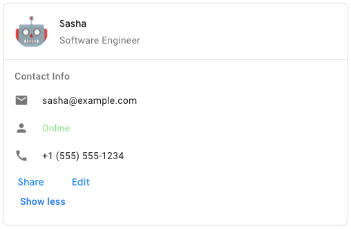
برای ایجاد پیام کارت نمونه در گوگل چت، از JSON زیر استفاده کنید:
{
  "cardsV2": [
    {
      "cardId": "unique-card-id",
      "card": {
        "header": {
           "title": "Sasha",
           "subtitle": "Software Engineer",
           "imageUrl":
           "https://developers.google.com/workspace/chat/images/quickstart-app-avatar.png",
           "imageType": "CIRCLE",
           "imageAltText": "Avatar for Sasha"
         },
         "sections": [
           {
             "header": "Contact Info",
             "collapsible": true,
             "uncollapsibleWidgetsCount": 1,
             "widgets": [
               {
                 "decoratedText": {
                   "startIcon": {
                     "knownIcon": "EMAIL"
                   },
                   "text": "sasha@example.com"
                 }
               },
               {
                 "decoratedText": {
                   "startIcon": {
                     "knownIcon": "PERSON"
                   },
                   "text": "<font color=\"#80e27e\">Online</font>"
                 }
               },
               {
                 "decoratedText": {
                   "startIcon": {
                     "knownIcon": "PHONE"
                   },
                   "text": "+1 (555) 555-1234"
                 }
               },
               {
                 "buttonList": {
                   "buttons": [
                     {
                       "text": "Share",
                       "onClick": {
                        "openLink": {
                           "url": "https://example.com/share"
                         }
                       }
                     },
                     {
                       "text": "Edit",
                       "onClick": {
                         "action": {
                           "function": "goToView",
                           "parameters": [
                             {
                               "key": "viewType",
                               "value": "EDIT"
                             }
                           ]
                         }
                       }
                     }
                   ]
                 }
               }
             ]
           }
         ]
       }
    }
  ]
}
| نمایش JSON |
|---|
{ "header": { object ( |
| فیلدها | |
|---|---|
header | سربرگ کارت. سربرگ معمولاً شامل یک تصویر در ابتدای کارت و یک عنوان است. سربرگها همیشه در بالای کارت ظاهر میشوند. |
sections[] | شامل مجموعهای از ویجتها است. هر بخش، سربرگ اختیاری مخصوص به خود را دارد. بخشها به صورت بصری توسط یک جداکننده خط از هم جدا میشوند. برای مثال در برنامههای چت گوگل، به بخش تعریف یک بخش از یک کارت مراجعه کنید. |
sectionDividerStyle | سبک جداکننده بین سرصفحه، بخشها و پاصفحه. |
cardActions[] | اقدامات کارت. اقدامات به منوی نوار ابزار کارت اضافه میشوند.
برای مثال، JSON زیر یک منوی عملیات کارت با گزینههای |
name | نام کارت. به عنوان شناسه کارت در پیمایش کارت استفاده میشود.
|
fixedFooter | پاورقی ثابت که در پایین این کارت نشان داده شده است. تنظیم
|
displayStyle | در افزونههای Google Workspace، ویژگیهای نمایش
|
peekCardHeader | هنگام نمایش محتوای متنی، هدر کارت Peek به عنوان یک نگهدارنده عمل میکند تا کاربر بتواند بین کارتهای صفحه اصلی و کارتهای متنی به جلو حرکت کند.
|
expressionData[] | دادههای عبارت برای کارت. برای افزونههای Google Workspace که Google Workspace Studio را توسعه میدهند، در دسترس است. برای برنامههای Google Chat در دسترس نیست. |
هدر کارت
نشاندهندهی سربرگ کارت است. برای مثال در برنامههای چت گوگل، به افزودن سربرگ مراجعه کنید.

 برای برنامههای Google Chat و افزونههای Google Workspace موجود است.
| نمایش JSON |
|---|
{
"title": string,
"subtitle": string,
"imageType": enum ( |
| فیلدها | |
|---|---|
title | الزامی. عنوان سربرگ کارت. سربرگ ارتفاع ثابتی دارد: اگر هم عنوان و هم زیرعنوان مشخص شده باشند، هر کدام یک خط را اشغال میکنند. اگر فقط عنوان مشخص شده باشد، هر دو خط را اشغال میکند. |
subtitle | عنوان فرعی سربرگ کارت. در صورت مشخص بودن، در خط جداگانهای زیر |
imageType | شکلی که برای برش تصویر استفاده میشود.
|
imageUrl | آدرس اینترنتی HTTPS تصویر در هدر کارت. |
imageAltText | متن جایگزین این تصویر که برای دسترسیپذیری استفاده میشود. |
نوع تصویر
شکلی که برای برش تصویر استفاده میشود.
برای برنامههای Google Chat و افزونههای Google Workspace موجود است.
| انومها | |
|---|---|
SQUARE | مقدار پیشفرض. یک ماسک مربعی روی تصویر اعمال میکند. برای مثال، یک تصویر ۴x۳ به ۳x۳ تبدیل میشود. |
CIRCLE | یک ماسک دایرهای روی تصویر اعمال میکند. برای مثال، یک تصویر ۴x۳ به دایرهای با قطر ۳ تبدیل میشود. |
بخش
یک بخش شامل مجموعهای از ویجتها است که به ترتیب مشخص شده به صورت عمودی رندر میشوند.
برای برنامههای Google Chat و افزونههای Google Workspace موجود است.
| نمایش JSON |
|---|
{ "header": string, "widgets": [ { object ( |
| فیلدها | |
|---|---|
header | متنی که در بالای یک بخش ظاهر میشود. از متن ساده با قالببندی HTML پشتیبانی میکند. برای اطلاعات بیشتر در مورد قالببندی متن، به افزونههای قالببندی متن در برنامههای چت گوگل و قالببندی متن در افزونههای فضای کاری گوگل مراجعه کنید. |
widgets[] | تمام ابزارکهای موجود در بخش. باید حداقل شامل یک ابزارک باشد. |
collapsible | نشان میدهد که آیا این بخش قابل جمع شدن است یا خیر. بخشهای قابل جمع شدن، برخی یا همه ویجتها را پنهان میکنند، اما کاربران میتوانند با کلیک روی «نمایش بیشتر» بخش را گسترش دهند تا ویجتهای پنهان شده آشکار شوند. کاربران میتوانند با کلیک روی «نمایش کمتر» دوباره ویجتها را پنهان کنند. برای تعیین اینکه کدام ویجتها پنهان هستند، |
uncollapsibleWidgetsCount | تعداد ویجتهای غیرقابلجمع که حتی با جمع شدن یک بخش، قابل مشاهده باقی میمانند. برای مثال، وقتی یک بخش شامل پنج ویجت باشد و |
id | یک شناسه منحصر به فرد که به بخشی اختصاص داده میشود که برای شناسایی بخشی که قرار است تغییر کند، استفاده میشود. این شناسه محدودیت کاراکتری ۶۴ کاراکتر دارد و باید به شکل برای افزونههای Google Workspace که Google Workspace Studio را توسعه میدهند، در دسترس است. برای برنامههای Google Chat در دسترس نیست. |
collapseControl | اختیاری. دکمه باز و بسته کردن بخش را تعریف کنید. این دکمه فقط در صورتی نمایش داده میشود که بخش قابل باز شدن باشد. اگر این فیلد تنظیم نشود، دکمه پیشفرض استفاده میشود. |
ویجت
هر کارت از ویجتهایی تشکیل شده است.
یک ویجت یک شیء مرکب است که میتواند یکی از انواع متن، تصویر، دکمه و سایر اشیاء را نمایش دهد.
| نمایش JSON |
|---|
{ "horizontalAlignment": enum ( |
| فیلدها | |
|---|---|
horizontalAlignment | مشخص میکند که آیا ویجتها در سمت چپ، راست یا مرکز یک ستون ترازبندی شوند. |
id | یک شناسه منحصر به فرد که به ویجت اختصاص داده شده و برای شناسایی ویجتی که قرار است تغییر کند، استفاده میشود. این شناسه محدودیت کاراکتری ۶۴ کاراکتر دارد و باید به شکل برای افزونههای Google Workspace که Google Workspace Studio را توسعه میدهند، در دسترس است. برای برنامههای Google Chat در دسترس نیست. |
visibility | مشخص میکند که آیا ویجت قابل مشاهده یا پنهان باشد. مقدار پیشفرض برای افزونههای Google Workspace که Google Workspace Studio را توسعه میدهند، در دسترس است. برای برنامههای Google Chat در دسترس نیست. |
eventActions[] | اقدامات رویدادی را که میتوانند روی ویجت انجام شوند، مشخص میکند. برای افزونههای Google Workspace که Google Workspace Studio را توسعه میدهند، در دسترس است. برای برنامههای Google Chat در دسترس نیست. |
data فیلد Union. یک ویجت فقط میتواند یکی از موارد زیر را داشته باشد. میتوانید از چندین فیلد ویجت برای نمایش موارد بیشتر استفاده کنید. data فقط میتوانند یکی از موارد زیر باشند: | |
textParagraph | یک پاراگراف متنی را نمایش میدهد. از متن ساده با قالببندی HTML پشتیبانی میکند. برای اطلاعات بیشتر در مورد قالببندی متن، به افزونههای قالببندی متن در برنامههای چت گوگل و قالببندی متن در افزونههای فضای کاری گوگل مراجعه کنید. برای مثال، JSON زیر یک متن پررنگ ایجاد میکند: |
image | یک تصویر را نمایش میدهد. برای مثال، JSON زیر تصویری با متن جایگزین ایجاد میکند: |
decoratedText | یک آیتم متنی تزئینشده را نمایش میدهد. برای مثال، JSON زیر یک ویجت متنی تزئینشده ایجاد میکند که آدرس ایمیل را نشان میدهد: |
buttonList | فهرستی از دکمهها. برای مثال، JSON زیر دو دکمه ایجاد میکند. اولی یک دکمه متنی آبی رنگ و دومی یک دکمه تصویری است که یک لینک را باز میکند: |
textInput | یک کادر متنی نمایش میدهد که کاربران میتوانند در آن تایپ کنند. برای مثال، JSON زیر یک ورودی متنی برای آدرس ایمیل ایجاد میکند: به عنوان مثالی دیگر، JSON زیر یک ورودی متنی برای یک زبان برنامهنویسی با پیشنهادهای ایستا ایجاد میکند: |
selectionInput | یک کنترل انتخاب را نمایش میدهد که به کاربران امکان انتخاب موارد را میدهد. کنترلهای انتخاب میتوانند کادرهای انتخاب، دکمههای رادیویی، سوئیچها یا منوهای کشویی باشند. برای مثال، JSON زیر یک منوی کشویی ایجاد میکند که به کاربران اجازه میدهد اندازه را انتخاب کنند: |
dateTimePicker | ویجتی را نمایش میدهد که به کاربران امکان میدهد تاریخ، زمان یا تاریخ و زمان را وارد کنند. برای مثال، JSON زیر یک انتخابگر تاریخ و زمان برای تعیین وقت ملاقات ایجاد میکند: |
divider | یک جداکننده خط افقی بین ابزارکها نمایش میدهد. برای مثال، JSON زیر یک جداکننده ایجاد میکند: |
grid | یک شبکه با مجموعهای از آیتمها را نمایش میدهد. یک شبکه میتواند هر تعداد ستون و آیتم را پشتیبانی کند. تعداد ردیفها با تقسیم کران بالای تعداد آیتمها بر تعداد ستونها تعیین میشود. یک شبکه با ۱۰ آیتم و ۲ ستون، ۵ ردیف دارد. یک شبکه با ۱۱ آیتم و ۲ ستون، ۶ ردیف دارد.
برای مثال، JSON زیر یک جدول دو ستونی با یک آیتم ایجاد میکند: |
columns | حداکثر ۲ ستون را نمایش میدهد. برای اضافه کردن بیش از ۲ ستون یا استفاده از ردیفها، از ویجت برای مثال، JSON زیر دو ستون ایجاد میکند که هر کدام شامل پاراگرافهای متنی هستند: |
carousel | یک carousel شامل مجموعهای از ویجتهای تو در تو است. برای مثال، این یک نمایش JSON از یک carousel است که شامل دو پاراگراف متنی است. |
chipList | فهرستی از چیپسها برای مثال، JSON زیر دو چیپ ایجاد میکند. اولی یک چیپ متنی و دومی یک چیپ آیکون است که یک لینک را باز میکند: |
متنپاراگراف
یک پاراگراف از متن که از قالببندی پشتیبانی میکند. برای مثال در برنامههای Google Chat، به افزودن یک پاراگراف از متن قالببندیشده مراجعه کنید. برای اطلاعات بیشتر در مورد قالببندی متن، به قالببندی متن در برنامههای Google Chat و افزونههای قالببندی متن در Google Workspace مراجعه کنید.
برای برنامههای Google Chat و افزونههای Google Workspace موجود است.
| نمایش JSON |
|---|
{
"text": string,
"maxLines": integer,
"textSyntax": enum ( |
| فیلدها | |
|---|---|
text | متنی که در ابزارک نمایش داده میشود. |
maxLines | حداکثر تعداد خطوط متنی که در ویجت نمایش داده میشود. اگر متن از حداکثر تعداد خطوط مشخص شده بیشتر باشد، محتوای اضافی پشت دکمه نمایش بیشتر پنهان میشود. اگر متن برابر یا کوتاهتر از حداکثر تعداد خطوط مشخص شده باشد، دکمه نمایش بیشتر نمایش داده نمیشود. مقدار پیشفرض ۰ است، در این صورت تمام متن نمایش داده میشود. مقادیر منفی نادیده گرفته میشوند. |
textSyntax | نحو متن. اگر تنظیم نشود، متن به صورت HTML نمایش داده میشود.
|
نحو متن
سینتکسی که برای قالببندی متن استفاده میشود.
برای برنامههای Google Chat در دسترس است و برای افزونههای Google Workspace در دسترس نیست.
| انومها | |
|---|---|
TEXT_SYNTAX_UNSPECIFIED | اگر متن مشخص نشده باشد، به صورت HTML نمایش داده میشود. |
HTML | متن به صورت HTML رندر میشود. این مقدار پیشفرض است. |
MARKDOWN | متن به صورت Markdown رندر میشود. |
تصویر
تصویری که توسط یک URL مشخص شده است و میتواند یک عمل onClick داشته باشد. برای مثال، به افزودن یک تصویر مراجعه کنید.
برای برنامههای Google Chat و افزونههای Google Workspace موجود است.
| نمایش JSON |
|---|
{
"imageUrl": string,
"onClick": {
object ( |
| فیلدها | |
|---|---|
imageUrl | URL HTTPS که تصویر را میزبانی میکند. برای مثال: |
onClick | وقتی کاربر روی تصویر کلیک میکند، این عمل انجام میشود. |
altText | متن جایگزین این تصویر که برای دسترسیپذیری استفاده میشود. |
آنکلیک
نحوهی پاسخ دادن به کلیک کاربران روی یک عنصر تعاملی روی کارت، مانند یک دکمه، را نشان میدهد.
برای برنامههای Google Chat و افزونههای Google Workspace موجود است.
| نمایش JSON |
|---|
{ "action": { object ( |
| فیلدها | |
|---|---|
| |
action | در صورت مشخص شدن، یک عمل توسط این |
openLink | اگر مشخص شده باشد، این |
openDynamicLinkAction | یک افزونه این عمل را زمانی که عمل نیاز به باز کردن یک لینک دارد، فعال میکند. این با
|
card | در صورت مشخص شدن، پس از کلیک کردن، یک کارت جدید به دسته کارتها اضافه میشود.
|
overflowMenu | اگر مشخص شده باشد، این |
اکشن
عملی که رفتار هنگام ارسال فرم را توصیف میکند. برای مثال، میتوانید یک اسکریپت Apps Script را برای مدیریت فرم فراخوانی کنید. اگر این عمل اجرا شود، مقادیر فرم به سرور ارسال میشوند.
برای برنامههای Google Chat و افزونههای Google Workspace موجود است.
| نمایش JSON |
|---|
{ "function": string, "parameters": [ { object ( |
| فیلدها | |
|---|---|
function | یک تابع سفارشی که هنگام کلیک یا فعال شدن عنصر حاوی آن، فراخوانی میشود. برای مثال، به بخش «خواندن دادههای فرم» مراجعه کنید. |
parameters[] | فهرست پارامترهای عملیاتی |
loadIndicator | نشانگر بارگذاری را مشخص میکند که اکشن هنگام فراخوانی اکشن نمایش میدهد. |
persistValues | نشان میدهد که آیا مقادیر فرم پس از انجام عمل باقی میمانند یا خیر. مقدار پیشفرض اگر اگر |
interaction | اختیاری. هنگام باز کردن یک کادر محاورهای الزامی است. در پاسخ به تعامل با کاربر، مانند کلیک کاربر روی دکمهای در یک پیام کارتی، چه باید کرد. اگر مشخص نشده باشد، برنامه با اجرای یک با مشخص کردن یک
|
requiredWidgets[] | اختیاری. این لیست را با نام ویجتهایی که این اقدام برای ارسال معتبر به آنها نیاز دارد، پر کنید. اگر ویجتهای فهرستشده در اینجا هنگام فراخوانی این اقدام مقداری نداشته باشند، ارسال فرم لغو میشود.
|
allWidgetsAreRequired | اختیاری. اگر این مقدار درست باشد، تمام ویجتها توسط این اقدام الزامی در نظر گرفته میشوند.
|
پارامتر عمل
فهرست پارامترهای رشتهای که هنگام فراخوانی متد اکشن باید ارائه شوند. برای مثال، سه دکمهی چرت زدن را در نظر بگیرید: چرت زدن الان، چرت زدن یک روز، یا چرت زدن هفتهی بعد. میتوانید از action method = snooze() استفاده کنید و نوع چرت زدن و زمان چرت زدن را در فهرست پارامترهای رشتهای وارد کنید.
برای کسب اطلاعات بیشتر، به CommonEventObject مراجعه کنید.
برای برنامههای Google Chat و افزونههای Google Workspace موجود است.
| نمایش JSON |
|---|
{ "key": string, "value": string } |
| فیلدها | |
|---|---|
key | نام پارامتر برای اسکریپت اکشن. |
value | مقدار پارامتر. |
شاخص بار
نشانگر بارگذاری را مشخص میکند که اکشن هنگام فراخوانی اکشن نمایش میدهد.
برای برنامههای Google Chat و افزونههای Google Workspace موجود است.
| انومها | |
|---|---|
SPINNER | یک چرخنده را نمایش میدهد تا نشان دهد که محتوا در حال بارگذاری است. |
NONE | هیچ چیزی نمایش داده نمیشود. |
تعامل
اختیاری. هنگام باز کردن یک کادر محاورهای الزامی است.
در پاسخ به تعامل با کاربر، مانند کلیک کاربر روی دکمهای در یک پیام کارتی، چه باید کرد.
اگر مشخص نشده باشد، برنامه با اجرای یک action - مانند باز کردن یک لینک یا اجرای یک تابع - به صورت عادی پاسخ میدهد.
با مشخص کردن یک interaction ، برنامه میتواند به روشهای تعاملی خاصی پاسخ دهد. برای مثال، با تنظیم interaction روی OPEN_DIALOG ، برنامه میتواند یک کادر محاورهای باز کند.
در صورت مشخص شدن، نشانگر بارگیری نشان داده نمیشود. اگر برای یک افزونه مشخص شود، کل کارت حذف میشود و هیچ چیزی در کلاینت نشان داده نمیشود.
برای برنامههای Google Chat در دسترس است و برای افزونههای Google Workspace در دسترس نیست.
| انومها | |
|---|---|
INTERACTION_UNSPECIFIED | مقدار پیشفرض. action به صورت عادی اجرا میشود. |
OPEN_DIALOG | یک کادر محاورهای ، یک رابط کاربری پنجرهای و مبتنی بر کارت که برنامههای چت برای تعامل با کاربران از آن استفاده میکنند، باز میکند. فقط توسط برنامههای چت در پاسخ به کلیک روی دکمههای پیامهای کارت پشتیبانی میشود. اگر برای یک افزونه مشخص شود، کل کارت حذف میشود و هیچ چیزی در کلاینت نشان داده نمیشود.
|
اوپن لینک
نشان دهنده یک رویداد onClick است که یک لینک را باز میکند.
برای برنامههای Google Chat و افزونههای Google Workspace موجود است.
| نمایش JSON |
|---|
{ "url": string, "openAs": enum ( |
| فیلدها | |
|---|---|
url | آدرس اینترنتی (URL) برای باز کردن. آدرسهای اینترنتی HTTP به HTTPS تبدیل میشوند. |
openAs | نحوه باز کردن لینک.
|
onClose | اینکه آیا کلاینت پس از باز کردن یک لینک، آن را فراموش میکند یا تا زمان بسته شدن پنجره، آن را مشاهده میکند.
|
اوپنآس
وقتی یک عمل OnClick یک لینک را باز میکند، کلاینت میتواند آن را به صورت یک پنجره با اندازه کامل (اگر فریم مورد استفاده کلاینت باشد) یا یک پوشش (مانند یک پنجره بازشو) باز کند. پیادهسازی آن به قابلیتهای پلتفرم کلاینت بستگی دارد و اگر کلاینت از مقدار انتخاب شده پشتیبانی نکند، ممکن است نادیده گرفته شود. FULL_SIZE توسط همه کلاینتها پشتیبانی میشود.
برای افزونههای Google Workspace در دسترس است و برای برنامههای Google Chat در دسترس نیست.
| انومها | |
|---|---|
FULL_SIZE | لینک به صورت یک پنجره با اندازه کامل باز میشود (اگر این همان قابی باشد که کلاینت از آن استفاده میکند). |
OVERLAY | لینک به صورت یک پوشش، مانند یک پنجره بازشو، باز میشود. |
روشن/خاموش
کاری که کلاینت هنگام بسته شدن لینکی که توسط یک اکشن OnClick باز شده است، انجام میدهد.
پیادهسازی به قابلیتهای پلتفرم کلاینت بستگی دارد. برای مثال، یک مرورگر وب ممکن است با استفاده از یک کنترلکننده OnClose لینکی را در یک پنجره پاپآپ باز کند.
اگر هر دو کنترلکنندهی OnOpen و OnClose تنظیم شده باشند و پلتفرم کلاینت نتواند از هر دو مقدار پشتیبانی کند، OnClose اولویت پیدا میکند.
برای افزونههای Google Workspace در دسترس است و برای برنامههای Google Chat در دسترس نیست.
| انومها | |
|---|---|
NOTHING | مقدار پیشفرض. کارت دوباره شارژ نمیشود؛ هیچ اتفاقی نمیافتد. |
RELOAD | پس از بسته شدن پنجره فرزند، کارت را دوباره بارگذاری میکند. اگر همراه با |
منوی سرریز
ویجتی که یک منوی پاپآپ با یک یا چند عمل ارائه میدهد که کاربران میتوانند آنها را فراخوانی کنند. به عنوان مثال، نمایش اعمال غیر اصلی در یک کارت. میتوانید از این ویجت زمانی استفاده کنید که اعمال در فضای موجود جا نمیشوند. برای استفاده، این ویجت را در عمل OnClick ویجتهایی که از آن پشتیبانی میکنند، مشخص کنید. به عنوان مثال، در یک Button .
برای برنامههای Google Chat و افزونههای Google Workspace موجود است.
| نمایش JSON |
|---|
{
"items": [
{
object ( |
| فیلدها | |
|---|---|
items[] | الزامی. فهرست گزینههای منو. |
آیتم منوی سرریز
گزینهای که کاربران میتوانند در یک منوی سرریز (overflow menu) فراخوانی کنند.
برای برنامههای Google Chat و افزونههای Google Workspace موجود است.
| نمایش JSON |
|---|
{ "startIcon": { object ( |
| فیلدها | |
|---|---|
startIcon | آیکونی که در جلوی متن نمایش داده میشود. |
text | الزامی. متنی که آیتم را برای کاربران شناسایی یا توصیف میکند. |
onClick | الزامی. عملی که هنگام انتخاب یک گزینه از منو فراخوانی میشود. این |
disabled | آیا گزینه منو غیرفعال است یا خیر. مقدار پیشفرض false است. |
آیکون
نمادی که در یک ابزارک روی کارت نمایش داده میشود. برای مثال در برنامههای چت گوگل، به افزودن یک نماد مراجعه کنید.
پشتیبانی از آیکونهای پیشفرض و سفارشی
برای برنامههای Google Chat و افزونههای Google Workspace موجود است.
| نمایش JSON |
|---|
{ "altText": string, "imageType": enum ( |
| فیلدها | |
|---|---|
altText | اختیاری. توضیحی در مورد آیکون مورد استفاده برای دسترسیپذیری. در صورت عدم تعیین مقدار، مقدار پیشفرض اگر آیکون در یک |
imageType | سبک برش اعمال شده بر روی تصویر. در برخی موارد، اعمال برش |
icons فیلد Union. آیکونی که در ویجت روی کارت نمایش داده میشود. icons میتوانند فقط یکی از موارد زیر باشند: | |
knownIcon | یکی از آیکونهای داخلی ارائه شده توسط Google Workspace را نمایش دهید. برای مثال، برای نمایش آیکون هواپیما، برای لیست کامل آیکونهای پشتیبانیشده، به آیکونهای داخلی مراجعه کنید. |
iconUrl | یک آیکون سفارشی که در یک URL HTTPS میزبانی میشود را نمایش دهید. برای مثال: انواع فایلهای پشتیبانیشده شامل |
materialIcon | یکی از آیکونهای متریال گوگل را نمایش دهید. برای مثال، برای نمایش آیکون چکباکس ، از
|
آیکون متریال
یک آیکون متریال گوگل ، که شامل بیش از ۲۵۰۰ گزینه است.
برای مثال، برای نمایش یک آیکون چکباکس با وزن و درجه سفارشی، موارد زیر را بنویسید:
{
"name": "check_box",
"fill": true,
"weight": 300,
"grade": -25
}
برای برنامههای Google Chat در دسترس است و برای افزونههای Google Workspace در دسترس نیست.
| نمایش JSON |
|---|
{ "name": string, "fill": boolean, "weight": integer, "grade": integer } |
| فیلدها | |
|---|---|
name | نام آیکون تعریف شده در Google Material Icon ، برای مثال، |
fill | آیا آیکون به صورت پر شده نمایش داده شود یا خیر. مقدار پیشفرض false است. برای پیشنمایش تنظیمات مختلف آیکون، به Google Font Icons بروید و تنظیمات را در قسمت Customize تنظیم کنید. |
weight | ضخامت خط دور آیکون. از بین {100، 200، 300، 400، 500، 600، 700} یکی را انتخاب کنید. در صورت عدم وجود، مقدار پیشفرض 400 است. اگر مقدار دیگری مشخص شود، مقدار پیشفرض استفاده میشود. برای پیشنمایش تنظیمات مختلف آیکون، به Google Font Icons بروید و تنظیمات را در قسمت Customize تنظیم کنید. |
grade | وزن و درجه بر ضخامت یک نماد تأثیر میگذارند. تنظیمات درجه نسبت به تنظیمات وزن، جزئیتر هستند و تأثیر کمی بر اندازه نماد دارند. از بین {-25، 0، 200} یکی را انتخاب کنید. در صورت عدم وجود، مقدار پیشفرض 0 است. اگر مقدار دیگری مشخص شود، از مقدار پیشفرض استفاده میشود. برای پیشنمایش تنظیمات مختلف آیکون، به Google Font Icons بروید و تنظیمات را در قسمت Customize تنظیم کنید. |
متن تزئینشده
ویجتی که متن را با تزئینات اختیاری مانند برچسب در بالا یا پایین متن، یک نماد در جلوی متن، یک ویجت انتخاب یا یک دکمه بعد از متن نمایش میدهد. برای مثال در برنامههای چت گوگل، به نمایش متن با متن تزئینی مراجعه کنید.
برای برنامههای Google Chat و افزونههای Google Workspace موجود است.
| نمایش JSON |
|---|
{ "icon": { object ( |
| فیلدها | |
|---|---|
icon | به نفع |
startIcon | آیکونی که در جلوی متن نمایش داده میشود. |
startIconVerticalAlignment | اختیاری. تراز عمودی آیکون شروع. اگر تنظیم نشود، آیکون به صورت عمودی در مرکز قرار میگیرد.
|
topLabel | متنی که بالای |
topLabelText | معادل
|
text | متن اصلی الزامی است. از قالببندی ساده پشتیبانی میکند. برای اطلاعات بیشتر در مورد قالببندی متن، به افزونههای قالببندی متن در برنامههای چت گوگل و قالببندی متن در فضای کاری گوگل مراجعه کنید. |
contentText | معادل
|
wrapText | تنظیم متن پوششی. اگر فقط روی |
bottomLabel | متنی که زیر |
bottomLabelText | معادل
|
onClick | این اکشن زمانی فعال میشود که کاربران روی |
control فیلد Union. یک دکمه، سوئیچ، کادر انتخاب یا تصویری که در سمت راست متن در ویجت decoratedText ظاهر میشود. control میتواند فقط یکی از موارد زیر باشد: | |
button | دکمهای که کاربر میتواند با کلیک روی آن، عملی را انجام دهد. |
switchControl | یک ویجت سوئیچ که کاربر میتواند با کلیک روی آن، وضعیت آن را تغییر داده و عملی را انجام دهد. |
endIcon | نمادی که بعد از متن نمایش داده میشود. |
ترازبندی عمودی
ویژگی ترازبندی عمودی را نشان میدهد.
| انومها | |
|---|---|
VERTICAL_ALIGNMENT_UNSPECIFIED | نوع نامشخص. استفاده نکنید. |
TOP | ترازبندی به موقعیت برتر. |
MIDDLE | ترازبندی در موقعیت میانی. |
BOTTOM | ترازبندی در موقعیت پایین. |
دکمه
یک دکمه متنی، آیکون یا ترکیبی از متن و آیکون که کاربران میتوانند روی آن کلیک کنند. برای مثال در برنامههای چت گوگل، به «افزودن دکمه» مراجعه کنید.
برای تبدیل یک تصویر به دکمهی قابل کلیک، یک ImageImageComponentonClick تنظیم کنید.
برای برنامههای Google Chat و افزونههای Google Workspace موجود است.
| نمایش JSON |
|---|
{ "text": string, "icon": { object ( |
| فیلدها | |
|---|---|
text | متنی که درون دکمه نمایش داده میشود. |
icon | یک آیکون درون دکمه نمایش داده میشود. اگر هم |
color | اختیاری. رنگ دکمه. در صورت تنظیم، برای تنظیم رنگ دکمه، مقداری را برای فیلدهای برای مثال، کد زیر رنگ را در حداکثر شدت خود به قرمز تنظیم میکند: فیلد |
onClick | الزامی. عملی که هنگام کلیک کاربر روی دکمه انجام میشود، مانند باز کردن یک لینک یا اجرای یک تابع سفارشی. |
disabled | اگر |
altText | متن جایگزینی که برای دسترسیپذیری استفاده میشود. متن توصیفی تنظیم کنید که به کاربران اطلاع دهد دکمه چه کاری انجام میدهد. برای مثال، اگر دکمهای یک هایپرلینک را باز میکند، میتوانید بنویسید: «یک تب جدید در مرورگر باز میکند و به مستندات توسعهدهندگان گوگل چت در https://developers.google.com/workspace/chat هدایت میشود» . |
type | اختیاری. نوع دکمه. در صورت عدم تنظیم، نوع دکمه به صورت پیشفرض |
رنگ
یک رنگ را در فضای رنگی RGBA نشان میدهد. این نمایش برای سادگی تبدیل به و از نمایشهای رنگ در زبانهای مختلف، به دلیل فشرده بودن، طراحی شده است. به عنوان مثال، فیلدهای این نمایش را میتوان به صورت بدیهی در اختیار سازندهی java.awt.Color در جاوا قرار داد؛ همچنین میتوان آن را به صورت بدیهی در اختیار متد +colorWithRed:green:blue:alpha در UIColor در iOS قرار داد؛ و با کمی کار، میتوان آن را به راحتی در یک رشتهی rgba() در CSS در جاوااسکریپت قالببندی کرد.
این صفحه مرجع اطلاعاتی در مورد فضای رنگی مطلق که باید برای تفسیر مقدار RGB استفاده شود - برای مثال، sRGB، Adobe RGB، DCI-P3 و BT.2020 - ندارد. به طور پیشفرض، برنامهها باید فضای رنگی sRGB را در نظر بگیرند.
وقتی نیاز به تصمیمگیری در مورد برابری رنگها باشد، پیادهسازیها، مگر اینکه خلاف آن مستند شده باشد، دو رنگ را در صورتی برابر در نظر میگیرند که تمام مقادیر قرمز، سبز، آبی و آلفای آنها حداکثر 1e-5 با هم تفاوت داشته باشند.
مثال (جاوا):
import com.google.type.Color;
// ...
public static java.awt.Color fromProto(Color protocolor) {
float alpha = protocolor.hasAlpha()
? protocolor.getAlpha().getValue()
: 1.0;
return new java.awt.Color(
protocolor.getRed(),
protocolor.getGreen(),
protocolor.getBlue(),
alpha);
}
public static Color toProto(java.awt.Color color) {
float red = (float) color.getRed();
float green = (float) color.getGreen();
float blue = (float) color.getBlue();
float denominator = 255.0;
Color.Builder resultBuilder =
Color
.newBuilder()
.setRed(red / denominator)
.setGreen(green / denominator)
.setBlue(blue / denominator);
int alpha = color.getAlpha();
if (alpha != 255) {
result.setAlpha(
FloatValue
.newBuilder()
.setValue(((float) alpha) / denominator)
.build());
}
return resultBuilder.build();
}
// ...
مثال (iOS / Obj-C):
// ...
static UIColor* fromProto(Color* protocolor) {
float red = [protocolor red];
float green = [protocolor green];
float blue = [protocolor blue];
FloatValue* alpha_wrapper = [protocolor alpha];
float alpha = 1.0;
if (alpha_wrapper != nil) {
alpha = [alpha_wrapper value];
}
return [UIColor colorWithRed:red green:green blue:blue alpha:alpha];
}
static Color* toProto(UIColor* color) {
CGFloat red, green, blue, alpha;
if (![color getRed:&red green:&green blue:&blue alpha:&alpha]) {
return nil;
}
Color* result = [[Color alloc] init];
[result setRed:red];
[result setGreen:green];
[result setBlue:blue];
if (alpha <= 0.9999) {
[result setAlpha:floatWrapperWithValue(alpha)];
}
[result autorelease];
return result;
}
// ...
مثال (جاوااسکریپت):
// ...
var protoToCssColor = function(rgb_color) {
var redFrac = rgb_color.red || 0.0;
var greenFrac = rgb_color.green || 0.0;
var blueFrac = rgb_color.blue || 0.0;
var red = Math.floor(redFrac * 255);
var green = Math.floor(greenFrac * 255);
var blue = Math.floor(blueFrac * 255);
if (!('alpha' in rgb_color)) {
return rgbToCssColor(red, green, blue);
}
var alphaFrac = rgb_color.alpha.value || 0.0;
var rgbParams = [red, green, blue].join(',');
return ['rgba(', rgbParams, ',', alphaFrac, ')'].join('');
};
var rgbToCssColor = function(red, green, blue) {
var rgbNumber = new Number((red << 16) | (green << 8) | blue);
var hexString = rgbNumber.toString(16);
var missingZeros = 6 - hexString.length;
var resultBuilder = ['#'];
for (var i = 0; i < missingZeros; i++) {
resultBuilder.push('0');
}
resultBuilder.push(hexString);
return resultBuilder.join('');
};
// ...
| نمایش JSON |
|---|
{ "red": number, "green": number, "blue": number, "alpha": number } |
| فیلدها | |
|---|---|
red | مقدار قرمزی در رنگ به عنوان مقداری در بازه [0، 1]. |
green | مقدار رنگ سبز در رنگ به عنوان مقداری در بازه [0، 1]. |
blue | مقدار آبی در رنگ به عنوان مقداری در بازه [0، 1]. |
alpha | کسری از این رنگ که باید به پیکسل اعمال شود. یعنی رنگ نهایی پیکسل با معادله زیر تعریف میشود: این بدان معناست که مقدار ۱.۰ مربوط به یک رنگ ثابت است، در حالی که مقدار ۰.۰ مربوط به یک رنگ کاملاً شفاف است. این روش به جای یک عدد اعشاری ساده، از یک پیام پوششی استفاده میکند تا بتوان بین مقدار پیشفرض و مقداری که تنظیم نشده است، تمایز قائل شد. در صورت حذف، این شیء رنگ به صورت یک رنگ ثابت رندر میشود (گویی به مقدار آلفا به صراحت مقدار ۱.۰ داده شده است). |
نوع
اختیاری. نوع دکمه. اگر فیلد color تنظیم شده باشد، type آن به صورت اجباری FILLED میشود.
برای برنامههای Google Chat در دسترس است و برای افزونههای Google Workspace در دسترس نیست.
| انومها | |
|---|---|
TYPE_UNSPECIFIED | استفاده نکنید. نامشخص. |
OUTLINED | دکمههای با حاشیهی مشخص، دکمههایی با تأکید متوسط هستند. آنها معمولاً شامل اقداماتی هستند که مهم هستند، اما اقدام اصلی در یک برنامهی چت یا یک افزونه نیستند. |
FILLED | یک دکمهی توپر، دارای یک محفظه با رنگ ثابت است. این دکمه بیشترین تأثیر بصری را دارد و برای اقدامات مهم و اصلی در یک برنامهی چت یا یک افزونه توصیه میشود. |
FILLED_TONAL | دکمههای با تُن رنگی توپر، حد وسط بین دکمههای توپر و دکمههای با تُن رنگی مشخص هستند. این دکمهها در مواردی مفید هستند که یک دکمه با اولویت پایینتر، به تأکید بیشتری نسبت به دکمه با تُن رنگی مشخص نیاز داشته باشد. |
BORDERLESS | یک دکمه در حالت پیشفرض دارای یک محفظه نامرئی نیست. اغلب برای اقدامات با اولویت پایین استفاده میشود، به خصوص هنگام ارائه چندین گزینه. |
سوئیچ کنترل
یا یک سوئیچ به سبک toggle یا یک کادر انتخاب درون یک ویجت decoratedText .
برای برنامههای Google Chat و افزونههای Google Workspace موجود است.
فقط در ویجت decoratedText پشتیبانی میشود.
| نمایش JSON |
|---|
{ "name": string, "value": string, "selected": boolean, "onChangeAction": { object ( |
| فیلدها | |
|---|---|
name | نامی که ویجت سوئیچ در رویداد ورودی فرم با آن شناسایی میشود. برای جزئیات بیشتر در مورد کار با ورودیهای فرم، به بخش «دریافت دادههای فرم» مراجعه کنید. |
value | مقداری که توسط کاربر وارد شده و به عنوان بخشی از رویداد ورودی فرم برگردانده میشود. برای جزئیات بیشتر در مورد کار با ورودیهای فرم، به بخش «دریافت دادههای فرم» مراجعه کنید. |
selected | وقتی |
onChangeAction | عملی که هنگام تغییر وضعیت سوئیچ باید انجام شود، مانند اینکه چه تابعی اجرا شود. |
controlType | نحوه نمایش سوئیچ در رابط کاربری.
|
نوع کنترل
نحوه نمایش سوئیچ در رابط کاربری.
برای برنامههای Google Chat و افزونههای Google Workspace موجود است.
| انومها | |
|---|---|
SWITCH | یک کلید به سبک تاگل. |
CHECKBOX | به نفع CHECK_BOX منسوخ شده است. |
CHECK_BOX | یک کادر انتخاب. |
لیست دکمه
فهرستی از دکمهها که به صورت افقی قرار گرفتهاند. برای مثال در برنامههای چت گوگل، به «افزودن یک دکمه» مراجعه کنید.
برای برنامههای Google Chat و افزونههای Google Workspace موجود است.
| نمایش JSON |
|---|
{
"buttons": [
{
object ( |
| فیلدها | |
|---|---|
buttons[] | مجموعهای از دکمهها. |
ورودی متن
فیلدی که کاربران میتوانند در آن متن وارد کنند. از پیشنهادها و اقدامات هنگام تغییر پشتیبانی میکند. از اعتبارسنجی ارسال فرم پشتیبانی میکند. وقتی Action.all_widgets_are_required روی true تنظیم شده باشد یا این ویجت در Action.required_widgets مشخص شده باشد، عملیات ارسال مسدود میشود مگر اینکه مقداری وارد شود. برای مثال در برنامههای چت گوگل، به افزودن فیلدی که کاربر بتواند در آن متن وارد کند ، مراجعه کنید.
برنامههای چت میتوانند مقدار متن وارد شده را در طول رویدادهای ورودی فرم دریافت و پردازش کنند. برای جزئیات بیشتر در مورد کار با ورودیهای فرم، به دریافت دادههای فرم مراجعه کنید.
وقتی نیاز به جمعآوری دادههای تعریفنشده یا انتزاعی از کاربران دارید، از ورودی متنی استفاده کنید. برای جمعآوری دادههای تعریفشده یا شمارششده از کاربران، از ویجت SelectionInput استفاده کنید.
برای برنامههای Google Chat و افزونههای Google Workspace موجود است.
| نمایش JSON |
|---|
{ "name": string, "label": string, "hintText": string, "value": string, "type": enum ( |
| فیلدها | |
|---|---|
name | نامی که ورودی متن در رویداد ورودی فرم با آن مشخص میشود. برای جزئیات بیشتر در مورد کار با ورودیهای فرم، به بخش «دریافت دادههای فرم» مراجعه کنید. |
label | متنی که در بالای فیلد ورودی متن در رابط کاربری ظاهر میشود. متنی را مشخص کنید که به کاربر کمک کند اطلاعات مورد نیاز برنامه شما را وارد کند. برای مثال، اگر نام کسی را میپرسید، اما به طور خاص به نام خانوادگی او نیاز دارید، به جای اگر |
hintText | متنی که در زیر فیلد ورودی متن ظاهر میشود و برای کمک به کاربران با وادار کردن آنها به وارد کردن مقدار خاصی طراحی شده است. این متن همیشه قابل مشاهده است. اگر |
value | مقداری که توسط کاربر وارد شده و به عنوان بخشی از رویداد ورودی فرم برگردانده میشود. برای جزئیات بیشتر در مورد کار با ورودیهای فرم، به بخش «دریافت دادههای فرم» مراجعه کنید. |
type | نحوه نمایش یک فیلد ورودی متن در رابط کاربری. به عنوان مثال، اینکه آیا فیلد تک خطی است یا چند خطی. |
onChangeAction | وقتی تغییری در فیلد ورودی متن رخ میدهد، چه باید کرد. مثلاً کاربری متنی را به فیلد اضافه میکند یا حذف میکند. نمونههایی از اقداماتی که باید انجام شود شامل اجرای یک تابع سفارشی یا باز کردن یک کادر محاورهای در گوگل چت است. |
initialSuggestions | مقادیر پیشنهادی که کاربران میتوانند وارد کنند. این مقادیر زمانی ظاهر میشوند که کاربران درون فیلد ورودی متن کلیک کنند. همزمان با تایپ کاربران، مقادیر پیشنهادی به صورت پویا فیلتر میشوند تا با آنچه کاربران تایپ کردهاند مطابقت داشته باشند. برای مثال، یک فیلد ورودی متن برای زبان برنامهنویسی ممکن است جاوا، جاوا اسکریپت، پایتون و ++C را پیشنهاد دهد. وقتی کاربران شروع به تایپ کردن مقادیر پیشنهادی به کاربران کمک میکنند تا مقادیری را وارد کنند که برنامه شما بتواند آنها را درک کند. هنگام اشاره به جاوا اسکریپت، برخی از کاربران ممکن است وقتی مشخص شود،
|
autoCompleteAction | اختیاری. مشخص کنید وقتی فیلد ورودی متن به کاربرانی که با آن تعامل دارند پیشنهاد میدهد، چه اقدامی انجام شود. اگر مشخص نشده باشد، پیشنهادات توسط اگر مشخص شده باشد، برنامه عملی را که در اینجا مشخص شده است، مانند اجرای یک تابع سفارشی، انجام میدهد.
|
validation | اعتبارسنجی قالب ورودی لازم برای این فیلد متنی را مشخص کنید.
|
placeholderText | متنی که در فیلد ورودی متن، زمانی که فیلد خالی است، نمایش داده میشود. از این متن برای ترغیب کاربران به وارد کردن مقدار استفاده کنید. برای مثال،
|
Union field | |
hostAppDataSource | A data source that's unique to a Google Workspace host application, such as Gmail emails, Google Calendar events, or Google Chat messages. Available for Google Workspace add-ons that extend Google Workspace Studio. Unavailable for Google Chat apps. |
نوع
How a text input field appears in the user interface. For example, whether it's a single line input field, or a multi-line input. If initialSuggestions is specified, type is always SINGLE_LINE , even if it's set to MULTIPLE_LINE .
Available for Google Chat apps and Google Workspace add-ons.
| Enums | |
|---|---|
SINGLE_LINE | The text input field has a fixed height of one line. |
MULTIPLE_LINE | The text input field has a fixed height of multiple lines. |
RenderActions
A set of render instructions that tells a card to perform an action, or tells the add-on host app or the Chat app to perform an app-specific action.
Available for Google Chat apps and Google Workspace add-ons.
| فیلدها | |
|---|---|
action | |
اکشن
| فیلدها | |
|---|---|
navigations[] | Pushes, pops, or updates a card. |
ناوبری
Add a new card to the stack (navigate forward). For Chat apps, only available for app home .
Available for Google Chat apps and Google Workspace add-ons.
navigations: {
pushCard: CARD
}
Replace the top card with a new card. For Chat apps, only available for app home .
Available for Google Chat apps and Google Workspace add-ons.
navigations: {
updateCard: CARD
}
پیشنهادات
Suggested values that users can enter. These values appear when users click inside the text input field. As users type, the suggested values dynamically filter to match what the users have typed.
For example, a text input field for programming language might suggest Java, JavaScript, Python, and C++. When users start typing Jav , the list of suggestions filters to show Java and JavaScript .
Suggested values help guide users to enter values that your app can make sense of. When referring to JavaScript, some users might enter javascript and others java script . Suggesting JavaScript can standardize how users interact with your app.
When specified, TextInput.type is always SINGLE_LINE , even if it's set to MULTIPLE_LINE .
Available for Google Chat apps and Google Workspace add-ons.
| نمایش JSON |
|---|
{
"items": [
{
object ( |
| فیلدها | |
|---|---|
items[] | A list of suggestions used for autocomplete recommendations in text input fields. |
SuggestionItem
One suggested value that users can enter in a text input field.
Available for Google Chat apps and Google Workspace add-ons.
| نمایش JSON |
|---|
{ "text": string } |
| فیلدها | |
|---|---|
Union field | |
text | The value of a suggested input to a text input field. This is equivalent to what users enter themselves. |
اعتبارسنجی
Represents the necessary data for validating the widget it's attached to.
Available for Google Chat apps and Google Workspace add-ons.
| نمایش JSON |
|---|
{
"characterLimit": integer,
"inputType": enum ( |
| فیلدها | |
|---|---|
characterLimit | Specify the character limit for text input widgets. Note that this is only used for text input and is ignored for other widgets.
|
inputType | Specify the type of the input widgets.
|
InputType
The type of the input widget.
| Enums | |
|---|---|
INPUT_TYPE_UNSPECIFIED | Unspecified type. Do not use. |
TEXT | Regular text that accepts all characters. |
INTEGER | An integer value. |
FLOAT | A float value. |
EMAIL | An email address. |
EMOJI_PICKER | A emoji selected from system-provided emoji picker. |
HostAppDataSourceMarkup
A data source from a Google Workspace application. The data source populates available items for a widget.
| نمایش JSON |
|---|
{ "chatDataSource": { object ( |
| فیلدها | |
|---|---|
Union field data_source . The Google Workspace application that populates available items for a widget. data_source can be only one of the following: | |
chatDataSource | A data source from Google Chat. |
workflowDataSource | A data source from Google Workflow. |
ChatClientDataSourceMarkup
For a SelectionInput
Available for Google Chat apps and unavailable for Google Workspace add-ons.
| نمایش JSON |
|---|
{
"spaceDataSource": {
object ( |
| فیلدها | |
|---|---|
Union field source . The Google Chat data source. source can be only one of the following: | |
spaceDataSource | Google Chat spaces that the user is a member of. |
SpaceDataSource
A data source that populates Google Chat spaces as selection items for a multiselect menu. Only populates spaces that the user is a member of.
Available for Google Chat apps and unavailable for Google Workspace add-ons.
| نمایش JSON |
|---|
{ "defaultToCurrentSpace": boolean } |
| فیلدها | |
|---|---|
defaultToCurrentSpace | If set to |
WorkflowDataSourceMarkup
* Only supported by Google Workspace Workflow, but not Google Chat apps or Google Workspace add-ons.
In a TextInputSelectionInputDateTimePicker
| نمایش JSON |
|---|
{
"includeVariables": boolean,
"type": enum ( |
| فیلدها | |
|---|---|
includeVariables | Whether to include variables from the previous step in the data source. |
type | The type of data source. |
نوع
An enum that represents the type of the workflow data source.
| Enums | |
|---|---|
UNKNOWN | Default value. Don't use. |
USER | Google Workspace users. The user can only view and select users from their Google Workspace organization. |
SPACE | Google Chat spaces that the user is a member of. |
USER_WITH_FREE_FORM | Users can choose to view and select existing members from their Google Workspace organization or manually enter an email address or a valid domain. |
SelectionInput
A widget that creates one or more UI items that users can select. Supports form submission validation for dropdown and multiselect menus only. When Action.all_widgets_are_required is set to true or this widget is specified in Action.required_widgets , the submission action is blocked unless a value is selected. For example, a dropdown menu or checkboxes. You can use this widget to collect data that can be predicted or enumerated. For an example in Google Chat apps, see Add selectable UI elements .
Chat apps can process the value of items that users select or input. For details about working with form inputs, see Receive form data .
To collect undefined or abstract data from users, use the TextInput widget.
Available for Google Chat apps and Google Workspace add-ons.
| نمایش JSON |
|---|
{ "name": string, "label": string, "type": enum ( |
| فیلدها | |
|---|---|
name | Required. The name that identifies the selection input in a form input event. For details about working with form inputs, see Receive form data . |
label | The text that appears above the selection input field in the user interface. Specify text that helps the user enter the information your app needs. For example, if users are selecting the urgency of a work ticket from a drop-down menu, the label might be "Urgency" or "Select urgency". |
type | The type of items that are displayed to users in a |
items[] | An array of selectable items. For example, an array of radio buttons or checkboxes. Supports up to 100 items. |
onChangeAction | If specified, the form is submitted when the selection changes. If not specified, you must specify a separate button that submits the form. For details about working with form inputs, see Receive form data . |
multiSelectMinQueryLength | For multiselect menus, the number of text characters that a user inputs before the menu returns suggested selection items. If unset, the multiselect menu uses the following default values:
|
dataSourceConfigs[] | Optional. The data source configs for the selection control. This field provides more fine-grained control over the data source. If specified, the Available for Google Workspace add-ons that extend Google Workspace Studio. Available for the |
multiSelectMaxSelectedItems | For multiselect menus, the maximum number of items that a user can select. Minimum value is 1 item. If unspecified, defaults to 3 items. |
hintText | Optional. Text that appears below the selection input field meant to assist users by prompting them to enter a certain value. This text is always visible. Available for Google Workspace add-ons that extend Google Workspace Studio. Unavailable for Google Chat apps. |
Union field
| |
externalDataSource | An external data source, such as a relational database. |
platformDataSource | A data source from Google Workspace. |
SelectionType
The format for the items that users can select. Different options support different types of interactions. For example, users can select multiple checkboxes, but can only select one item from a dropdown menu.
Each selection input supports one type of selection. Mixing checkboxes and switches, for example, isn't supported.
Available for Google Chat apps and Google Workspace add-ons.
| Enums | |
|---|---|
CHECK_BOX | A set of checkboxes. Users can select one or more checkboxes. |
RADIO_BUTTON | A set of radio buttons. Users can select one radio button. |
SWITCH | A set of switches. Users can turn on one or more switches. |
DROPDOWN | A dropdown menu. Users can select one item from the menu. For Google Chat apps, you can populate items using a dynamic data source and autosuggest items as users type in the menu. For example, users can start typing the name of a Google Chat space and the widget autosuggests the space. To dynamically populate items for a dropdown menu, use one of the following types of data sources:
For examples of how to implement dropdown menus for Chat apps, see Add a dropdown menu and Dynamically populate drop-down menus .
|
MULTI_SELECT | A menu with a text box. Users can type and select one or more items. For Google Workspace add-ons, you must populate items using a static array of For Google Chat apps, you can also populate items using a dynamic data source and autosuggest items as users type in the menu. For example, users can start typing the name of a Google Chat space and the widget autosuggests the space. To dynamically populate items for a multiselect menu, use one of the following types of data sources:
For examples of how to implement multiselect menus for Chat apps, see Add a multiselect menu .
|
SelectionItem
An item that users can select in a selection input, such as a checkbox or switch. Supports up to 100 items.
Available for Google Chat apps and Google Workspace add-ons.
| نمایش JSON |
|---|
{ "text": string, "value": string, "selected": boolean, "bottomText": string, "startIconUri": string } |
| فیلدها | |
|---|---|
text | The text that identifies or describes the item to users. |
value | The value associated with this item. The client should use this as a form input value. For details about working with form inputs, see Receive form data . |
selected | Whether the item is selected by default. If the selection input only accepts one value (such as for radio buttons or a dropdown menu), only set this field for one item. |
bottomText | For multiselect menus, a text description or label that's displayed below the item's |
Union field start_icon . For multiselect menus, the URL for the icon displayed next to the item's text field. Supports PNG and JPEG files. Must be an HTTPS URL. For example, https://developers.google.com/workspace/chat/images/quickstart-app-avatar.png . start_icon can be only one of the following: | |
startIconUri | |
PlatformDataSource
For a SelectionInput
Available for Google Chat apps and unavailable for Google Workspace add-ons.
| نمایش JSON |
|---|
{ "commonDataSource": enum ( |
| فیلدها | |
|---|---|
Union field data_source . The data source. data_source can be only one of the following: | |
commonDataSource | A data source shared by all Google Workspace applications, such as users in a Google Workspace organization. |
hostAppDataSource | A data source that's unique to a Google Workspace host application, such spaces in Google Chat. This field supports the Google API Client Libraries but isn't available in the Cloud Client Libraries. To learn more, see Install the client libraries . |
CommonDataSource
A data source shared by all Google Workspace applications .
Available for Google Chat apps and unavailable for Google Workspace add-ons.
| Enums | |
|---|---|
UNKNOWN | Default value. Don't use. |
USER | Google Workspace users. The user can only view and select users from their Google Workspace organization. |
DataSourceConfig
A configuration object that helps configure the data sources for a widget.
Available for Google Chat apps and Google Workspace add-ons that extend Google Workspace Studio.
| نمایش JSON |
|---|
{ "remoteDataSource": { object ( |
| فیلدها | |
|---|---|
Union field data_source . The data source. data_source can be only one of the following: | |
remoteDataSource | The data is from a remote data provider. |
platformDataSource | The data is from a Google Workspace application. |
minCharactersTrigger | The minimum number of characters the user must enter before this data provider is triggered (ie, before it starts returning results). |
DateTimePicker
Lets users input a date, a time, or both a date and a time. Supports form submission validation. When Action.all_widgets_are_required is set to true or this widget is specified in Action.required_widgets , the submission action is blocked unless a value is selected. For an example in Google Chat apps, see Let a user pick a date and time .
Users can input text or use the picker to select dates and times. If users input an invalid date or time, the picker shows an error that prompts users to input the information correctly.
Available for Google Chat apps and Google Workspace add-ons.
| نمایش JSON |
|---|
{ "name": string, "label": string, "type": enum ( |
| فیلدها | |
|---|---|
name | The name by which the For details about working with form inputs, see Receive form data . |
label | The text that prompts users to input a date, a time, or a date and time. For example, if users are scheduling an appointment, use a label such as |
type | Whether the widget supports inputting a date, a time, or the date and time. |
valueMsEpoch | The default value displayed in the widget, in milliseconds since Unix epoch time . Specify the value based on the type of picker (
|
timezoneOffsetDate | The number representing the time zone offset from UTC, in minutes. If set, the |
onChangeAction | Triggered when the user clicks Save or Clear from the |
Union field data_source . The data source specified to represent a date and time. data_source can be only one of the following: | |
hostAppDataSource | A data source that's unique to a Google Workspace host application, such as Gmail emails, Google Calendar events, or Google Chat messages. Available for Google Workspace add-ons that extend Google Workspace Studio. Unavailable for Google Chat apps. |
DateTimePickerType
The format for the date and time in the DateTimePicker widget. Determines whether users can input a date, a time, or both a date and time.
Available for Google Chat apps and Google Workspace add-ons.
| Enums | |
|---|---|
DATE_AND_TIME | Users input a date and time. |
DATE_ONLY | Users input a date. |
TIME_ONLY | Users input a time. |
تقسیم کننده
This type has no fields.
Displays a divider between widgets as a horizontal line. For an example in Google Chat apps, see Add a horizontal divider between widgets .
Available for Google Chat apps and Google Workspace add-ons.
For example, the following JSON creates a divider:
"divider": {}
شبکه
Displays a grid with a collection of items. Items can only include text or images. For responsive columns, or to include more than text or images, use Columns
A grid supports any number of columns and items. The number of rows is determined by items divided by columns. A grid with 10 items and 2 columns has 5 rows. A grid with 11 items and 2 columns has 6 rows.
Available for Google Chat apps and Google Workspace add-ons.
For example, the following JSON creates a 2 column grid with a single item:
"grid": {
  "title": "A fine collection of items",
  "columnCount": 2,
  "borderStyle": {
    "type": "STROKE",
    "cornerRadius": 4
  },
  "items": [
    {
      "image": {
        "imageUri": "https://www.example.com/image.png",
        "cropStyle": {
          "type": "SQUARE"
        },
        "borderStyle": {
          "type": "STROKE"
        }
      },
      "title": "An item",
      "textAlignment": "CENTER"
    }
  ],
  "onClick": {
    "openLink": {
      "url": "https://www.example.com"
    }
  }
}
| نمایش JSON |
|---|
{ "title": string, "items": [ { object ( |
| فیلدها | |
|---|---|
title | The text that displays in the grid header. |
items[] | The items to display in the grid. |
borderStyle | The border style to apply to each grid item. |
columnCount | The number of columns to display in the grid. A default value is used if this field isn't specified, and that default value is different depending on where the grid is shown (dialog versus companion). |
onClick | This callback is reused by each individual grid item, but with the item's identifier and index in the items list added to the callback's parameters. |
GridItem
Represents an item in a grid layout. Items can contain text, an image, or both text and an image.
Available for Google Chat apps and Google Workspace add-ons.
| نمایش JSON |
|---|
{ "id": string, "image": { object ( |
| فیلدها | |
|---|---|
id | A user-specified identifier for this grid item. This identifier is returned in the parent grid's |
image | The image that displays in the grid item. |
title | The grid item's title. |
subtitle | The grid item's subtitle. |
layout | The layout to use for the grid item. |
ImageComponent
Represents an image.
Available for Google Chat apps and Google Workspace add-ons.
| نمایش JSON |
|---|
{ "imageUri": string, "altText": string, "cropStyle": { object ( |
| فیلدها | |
|---|---|
imageUri | The image URL. |
altText | The accessibility label for the image. |
cropStyle | The crop style to apply to the image. |
borderStyle | The border style to apply to the image. |
ImageCropStyle
Represents the crop style applied to an image.
Available for Google Chat apps and Google Workspace add-ons.
For example, here's how to apply a 16:9 aspect ratio:
cropStyle {
 "type": "RECTANGLE_CUSTOM",
 "aspectRatio": 16/9
}
| نمایش JSON |
|---|
{
"type": enum ( |
| فیلدها | |
|---|---|
type | The crop type. |
aspectRatio | The aspect ratio to use if the crop type is For example, here's how to apply a 16:9 aspect ratio: |
ImageCropType
Represents the crop style applied to an image.
Available for Google Chat apps and Google Workspace add-ons.
| Enums | |
|---|---|
IMAGE_CROP_TYPE_UNSPECIFIED | Don't use. Unspecified. |
SQUARE | Default value. Applies a square crop. |
CIRCLE | Applies a circular crop. |
RECTANGLE_CUSTOM | Applies a rectangular crop with a custom aspect ratio. Set the custom aspect ratio with aspectRatio . |
RECTANGLE_4_3 | Applies a rectangular crop with a 4:3 aspect ratio. |
BorderStyle
The style options for the border of a card or widget, including the border type and color.
Available for Google Chat apps and Google Workspace add-ons.
| نمایش JSON |
|---|
{ "type": enum ( |
| فیلدها | |
|---|---|
type | The border type. |
strokeColor | The colors to use when the type is To set the stroke color, specify a value for the For example, the following sets the color to red at its maximum intensity: The |
cornerRadius | The corner radius for the border. |
BorderType
Represents the border types applied to widgets.
Available for Google Chat apps and Google Workspace add-ons.
| Enums | |
|---|---|
BORDER_TYPE_UNSPECIFIED | Don't use. Unspecified. |
NO_BORDER | No border. |
STROKE | Default value. Outline. |
GridItemLayout
Represents the various layout options available for a grid item.
Available for Google Chat apps and Google Workspace add-ons.
| Enums | |
|---|---|
GRID_ITEM_LAYOUT_UNSPECIFIED | Don't use. Unspecified. |
TEXT_BELOW | The title and subtitle are shown below the grid item's image. |
TEXT_ABOVE | The title and subtitle are shown above the grid item's image. |
ستونها
The Columns widget displays up to 2 columns in a card or dialog. You can add widgets to each column; the widgets appear in the order that they are specified. For an example in Google Chat apps, see Display cards and dialogs in columns .
The height of each column is determined by the taller column. For example, if the first column is taller than the second column, both columns have the height of the first column. Because each column can contain a different number of widgets, you can't define rows or align widgets between the columns.
Columns are displayed side-by-side. You can customize the width of each column using the HorizontalSizeStyle field. If the user's screen width is too narrow, the second column wraps below the first:
- On web, the second column wraps if the screen width is less than or equal to 480 pixels.
- On iOS devices, the second column wraps if the screen width is less than or equal to 300 pt.
- On Android devices, the second column wraps if the screen width is less than or equal to 320 dp.
To include more than two columns, or to use rows, use the Grid
Available for Google Chat apps and Google Workspace add-ons. The add-on UIs that support columns include:
- The dialog displayed when users open the add-on from an email draft.
- The dialog displayed when users open the add-on from the Add attachment menu in a Google Calendar event.
| نمایش JSON |
|---|
{
"columnItems": [
{
object ( |
| فیلدها | |
|---|---|
columnItems[] | An array of columns. You can include up to 2 columns in a card or dialog. |
ستون
A column.
| نمایش JSON |
|---|
{ "horizontalSizeStyle": enum ( |
| فیلدها | |
|---|---|
horizontalSizeStyle | Specifies how a column fills the width of the card. |
horizontalAlignment | Specifies whether widgets align to the left, right, or center of a column. |
verticalAlignment | Specifies whether widgets align to the top, bottom, or center of a column. |
widgets[] | An array of widgets included in a column. Widgets appear in the order that they are specified. |
HorizontalSizeStyle
Specifies how a column fills the width of the card. The width of each column depends on both the HorizontalSizeStyle and the width of the widgets within the column.
| Enums | |
|---|---|
HORIZONTAL_SIZE_STYLE_UNSPECIFIED | Don't use. Unspecified. |
FILL_AVAILABLE_SPACE | Default value. Column fills the available space, up to 70% of the card's width. If both columns are set to FILL_AVAILABLE_SPACE , each column fills 50% of the space. |
FILL_MINIMUM_SPACE | Column fills the least amount of space possible and no more than 30% of the card's width. |
HorizontalAlignment
Specifies whether widgets align to the left, right, or center of a column.
Available for Google Chat apps and unavailable for Google Workspace add-ons.
| Enums | |
|---|---|
HORIZONTAL_ALIGNMENT_UNSPECIFIED | Don't use. Unspecified. |
START | Default value. Aligns widgets to the start position of the column. For left-to-right layouts, aligns to the left. For right-to-left layouts, aligns to the right. |
CENTER | Aligns widgets to the center of the column. |
END | Aligns widgets to the end position of the column. For left-to-right layouts, aligns widgets to the right. For right-to-left layouts, aligns widgets to the left. |
VerticalAlignment
Specifies whether widgets align to the top, bottom, or center of a column.
| Enums | |
|---|---|
VERTICAL_ALIGNMENT_UNSPECIFIED | Don't use. Unspecified. |
CENTER | Default value. Aligns widgets to the center of a column. |
TOP | Aligns widgets to the top of a column. |
BOTTOM | Aligns widgets to the bottom of a column. |
ابزارکها
The supported widgets that you can include in a column.
| نمایش JSON |
|---|
{ "textParagraph": { object ( |
| فیلدها | |
|---|---|
Union field | |
textParagraph | |
image | |
decoratedText | |
buttonList | |
textInput | |
selectionInput | |
dateTimePicker | |
chipList | |
ChipList
A list of chips layed out horizontally, which can either scroll horizontally or wrap to the next line.
Available for Google Chat apps and Google Workspace add-ons.
| نمایش JSON |
|---|
{ "layout": enum ( |
| فیلدها | |
|---|---|
layout | Specified chip list layout. |
chips[] | An array of chips. |
طرح بندی
The chip list layout.
| Enums | |
|---|---|
LAYOUT_UNSPECIFIED | Don't use. Unspecified. |
WRAPPED | Default value. The chip list wraps to the next line if there isn't enough horizontal space. |
HORIZONTAL_SCROLLABLE | The chips scroll horizontally if they don't fit in the available space. |
تراشه
A text, icon, or text and icon chip that users can click.
Available for Google Chat apps and Google Workspace add-ons.
| نمایش JSON |
|---|
{ "icon": { object ( |
| فیلدها | |
|---|---|
icon | The icon image. If both |
label | The text displayed inside the chip. |
onClick | Optional. The action to perform when a user clicks the chip, such as opening a hyperlink or running a custom function. |
enabled | Whether the chip is in an active state and responds to user actions. Defaults to |
disabled | Whether the chip is in an inactive state and ignores user actions. Defaults to |
altText | The alternative text that's used for accessibility. Set descriptive text that lets users know what the chip does. For example, if a chip opens a hyperlink, write: "Opens a new browser tab and navigates to the Google Chat developer documentation at https://developers.google.com/workspace/chat" . |
Carousel
A carousel, also known as a slider, rotates and displays a list of widgets in a slideshow format, with buttons navigating to the previous or next widget.
For example, this is a JSON representation of a carousel that contains three text paragraph widgets.
{
  "carouselCards": [
    {
      "widgets": [
        {
          "textParagraph": {
            "text": "First text paragraph in carousel",
          }
        }
      ]
    },
    {
      "widgets": [
        {
          "textParagraph": {
            "text": "Second text paragraph in carousel",
          }
        }
      ]
    },
    {
      "widgets": [
        {
          "textParagraph": {
            "text": "Third text paragraph in carousel",
          }
        }
      ]
    }
  ]
}
Available for Google Chat apps and unavailable for Google Workspace add-ons.
| نمایش JSON |
|---|
{
"carouselCards": [
{
object ( |
| فیلدها | |
|---|---|
carouselCards[] | A list of cards included in the carousel. |
CarouselCard
A card that can be displayed as a carousel item. Available for Google Chat apps and unavailable for Google Workspace add-ons.
| نمایش JSON |
|---|
{ "widgets": [ { object ( |
| فیلدها | |
|---|---|
widgets[] | A list of widgets displayed in the carousel card. The widgets are displayed in the order that they are specified. |
footerWidgets[] | A list of widgets displayed at the bottom of the carousel card. The widgets are displayed in the order that they are specified. |
NestedWidget
A list of widgets that can be displayed in a containing layout, such as a CarouselCard . Available for Google Chat apps and unavailable for Google Workspace add-ons.
| نمایش JSON |
|---|
{ "textParagraph": { object ( |
| فیلدها | |
|---|---|
Union field | |
textParagraph | A text paragraph widget. |
buttonList | A button list widget. |
image | An image widget. |
قابلیت مشاهده
Specifies whether an UI element is visible or hidden.
Available for Google Workspace add-ons that extend Google Workspace Studio. Unavailable for Google Chat apps.
| Enums | |
|---|---|
VISIBILITY_UNSPECIFIED | Unspecified visibility. Do not use. |
VISIBLE | The UI element is visible. |
HIDDEN | The UI element is hidden. |
EventAction
Represents an actionthat can be performed on an ui element.
Available for Google Workspace add-ons that extend Google Workspace Studio. Unavailable for Google Chat apps.
| نمایش JSON |
|---|
{ "actionRuleId": string, "postEventTriggers": [ { object ( |
| فیلدها | |
|---|---|
actionRuleId | The unique identifier of the ActionRule. |
postEventTriggers[] | The list of triggers that will be triggered after the EventAction is executed. |
Union field action . The action to perform. action can be only one of the following: | |
commonWidgetAction | Common widget action. |
ماشه
Represents a trigger.
Available for Google Workspace add-ons that extend Google Workspace Studio. Unavailable for Google Chat apps.
| نمایش JSON |
|---|
{ "actionRuleId": string } |
| فیلدها | |
|---|---|
actionRuleId | The unique identifier of the ActionRule. |
CommonWidgetAction
Represents an action that is not specific to a widget.
Available for Google Workspace add-ons that extend Google Workspace Studio. Unavailable for Google Chat apps.
| نمایش JSON |
|---|
{
"updateVisibilityAction": {
object ( |
| فیلدها | |
|---|---|
Union field action . The action to perform. action can be only one of the following: | |
updateVisibilityAction | The action to update the visibility of a widget. |
UpdateVisibilityAction
Represents an action that updates the visibility of a widget.
Available for Google Workspace add-ons that extend Google Workspace Studio. Unavailable for Google Chat apps.
| نمایش JSON |
|---|
{
"visibility": enum ( |
| فیلدها | |
|---|---|
visibility | The new visibility. |
CollapseControl
Represent an expand and collapse control.
Available for Google Chat apps and Google Workspace add-ons.
| نمایش JSON |
|---|
{ "horizontalAlignment": enum ( |
| فیلدها | |
|---|---|
horizontalAlignment | The horizontal alignment of the expand and collapse button. |
expandButton | Optional. Define a customizable button to expand the section. Both expandButton and collapseButton field must be set. Only one field set will not take into effect. If this field isn't set, the default button is used. |
collapseButton | Optional. Define a customizable button to collapse the section. Both expandButton and collapseButton field must be set. Only one field set will not take into effect. If this field isn't set, the default button is used. |
DividerStyle
The divider style of a card. Currently only used for dividers betweens card sections.
Available for Google Chat apps and Google Workspace add-ons.
| Enums | |
|---|---|
DIVIDER_STYLE_UNSPECIFIED | Don't use. Unspecified. |
SOLID_DIVIDER | Default option. Render a solid divider. |
NO_DIVIDER | If set, no divider is rendered. This style completely removes the divider from the layout. The result is equivalent to not adding a divider at all. |
CardAction
A card action is the action associated with the card. For example, an invoice card might include actions such as delete invoice, email invoice, or open the invoice in a browser.
Available for Google Workspace add-ons and unavailable for Google Chat apps.
| نمایش JSON |
|---|
{
"actionLabel": string,
"onClick": {
object ( |
| فیلدها | |
|---|---|
actionLabel | The label that displays as the action menu item. |
onClick | The |
CardFixedFooter
A persistent (sticky) footer that that appears at the bottom of the card.
Setting fixedFooter without specifying a primaryButton or a secondaryButton causes an error.
For Chat apps, you can use fixed footers in dialogs , but not card messages . For an example in Google Chat apps, see Add a persistent footer .
Available for Google Chat apps and Google Workspace add-ons.
DisplayStyle
In Google Workspace add-ons, determines how a card is displayed.
Available for Google Workspace add-ons and unavailable for Google Chat apps.
| Enums | |
|---|---|
DISPLAY_STYLE_UNSPECIFIED | Don't use. Unspecified. |
PEEK | The header of the card appears at the bottom of the sidebar, partially covering the current top card of the stack. Clicking the header pops the card into the card stack. If the card has no header, a generated header is used instead. |
REPLACE | Default value. The card is shown by replacing the view of the top card in the card stack. |
ExpressionData
Represents the data that is used to evaluate an expression.
Available for Google Workspace add-ons that extend Google Workspace Studio. Unavailable for Google Chat apps.
| نمایش JSON |
|---|
{ "id": string, "expression": string, "conditions": [ { object ( |
| فیلدها | |
|---|---|
id | The unique identifier of the ExpressionData. |
expression | The uncompiled expression. |
conditions[] | The list of conditions that are determined by the expression evaluation result. |
eventActions[] | The list of actions that the ExpressionData can be used. |
وضعیت
Represents a condition that can be used to trigger an action.
Available for Google Workspace add-ons that extend Google Workspace Studio. Unavailable for Google Chat apps.
| نمایش JSON |
|---|
{
"actionRuleId": string,
"expressionDataCondition": {
object ( |
| فیلدها | |
|---|---|
actionRuleId | The unique identifier of the ActionRule. |
Union field condition . The condition. condition can be only one of the following: | |
expressionDataCondition | The condition that is determined by the expression data. |
ExpressionDataCondition
Represents a condition that is evaluated using CEL.
Available for Google Workspace add-ons that extend Google Workspace Studio. Unavailable for Google Chat apps.
| نمایش JSON |
|---|
{
"conditionType": enum ( |
| فیلدها | |
|---|---|
conditionType | The type of the condition. |
ConditionType
The type of the condition.
| Enums | |
|---|---|
CONDITION_TYPE_UNSPECIFIED | Unspecified condition type. |
EXPRESSION_EVALUATION_SUCCESS | The expression evaluation was successful. |
EXPRESSION_EVALUATION_FAILURE | The expression evaluation was unsuccessful. |