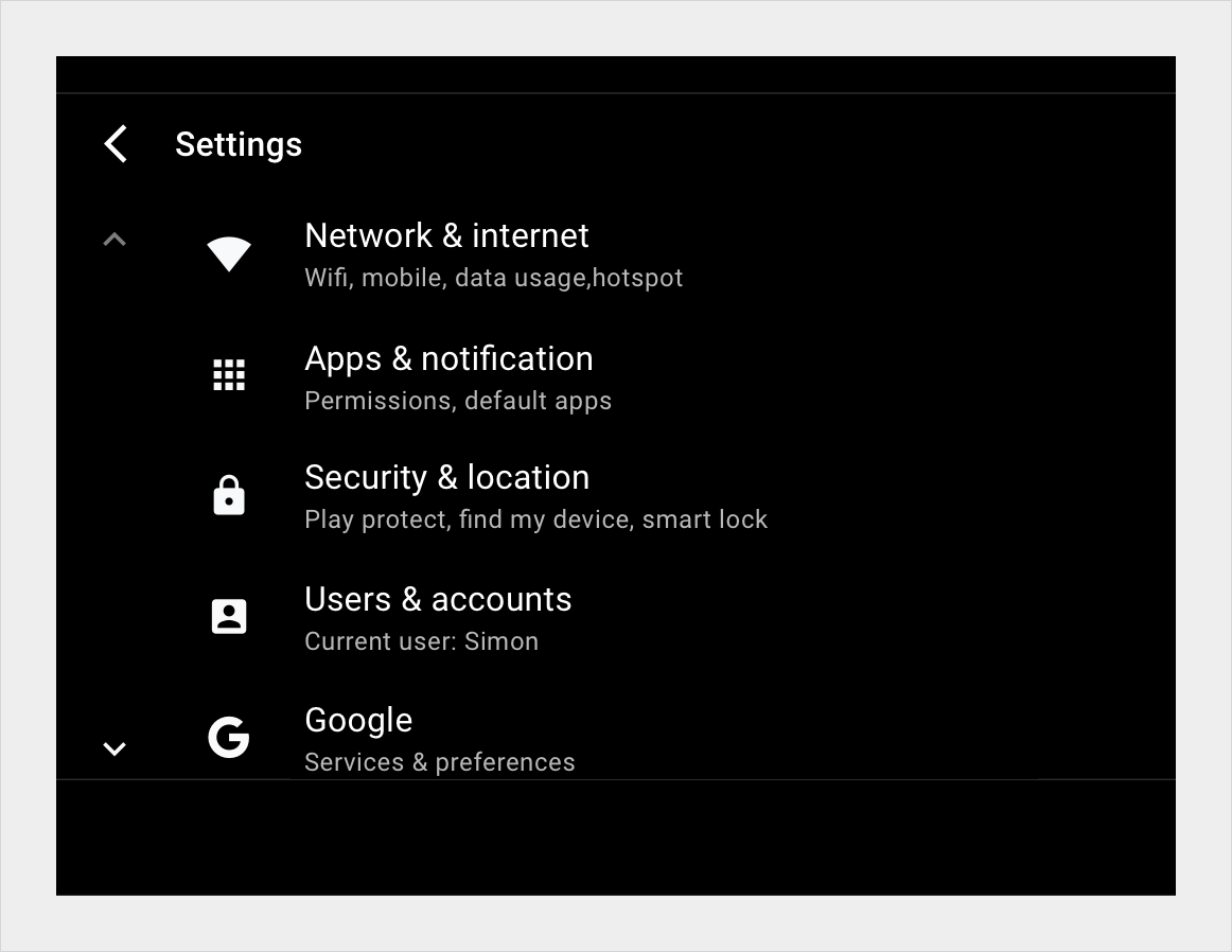
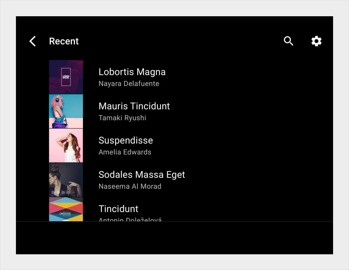
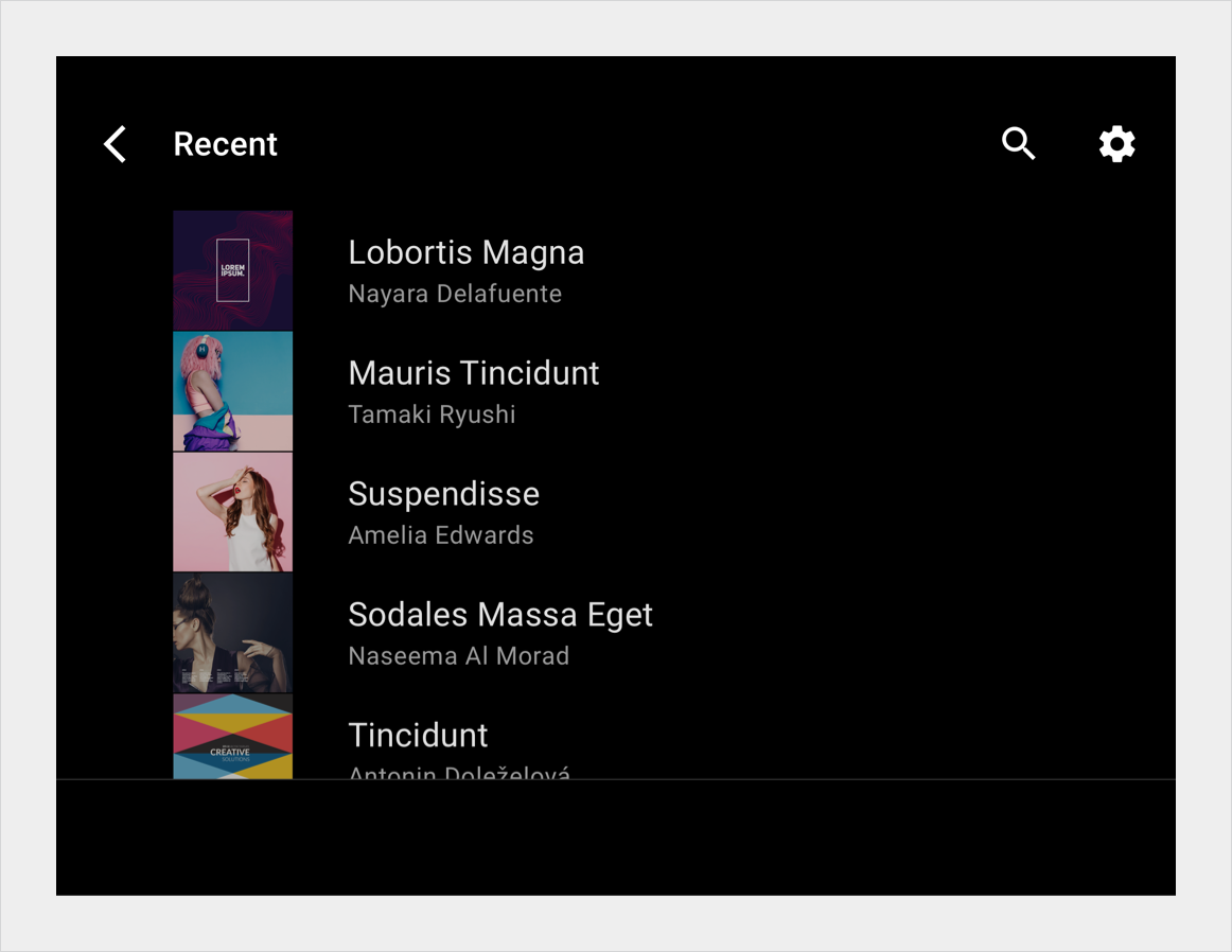
列表视图会将内容显示为可垂直滚动的单列列表中的专列项。当用户依靠阅读文字和查看数据进行选择时,此视图效果最佳。
与网格项相比,列表项需要的垂直空间更小,可以在屏幕上显示更多项。

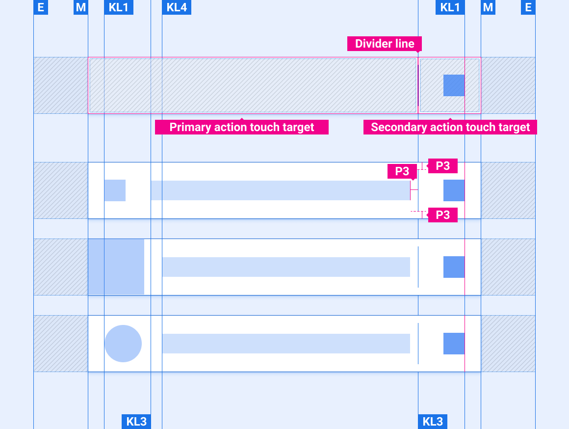
解剖学
在列表视图中,每行都包含一个表示一个列表项的图块。主要操作可填充功能块,以便用户从功能块中的任何位置发起操作。对于由图标和文本表示的补充操作,只有包含图标和文本的区域才是可操作。
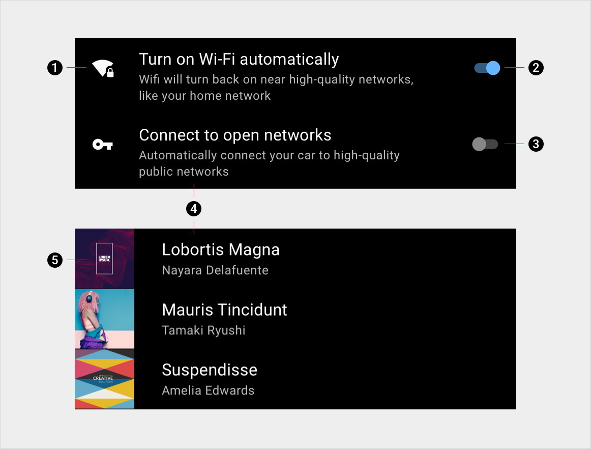
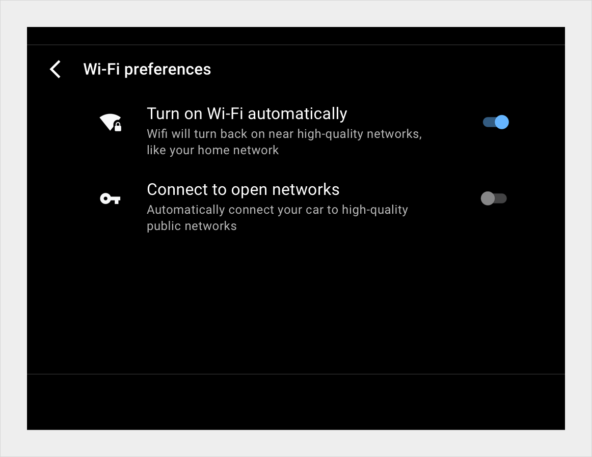
2. 切换器按钮已开启
3. 切换器按钮处于关闭状态
4. 主要文本和辅助文本
5. 内容图块
规格
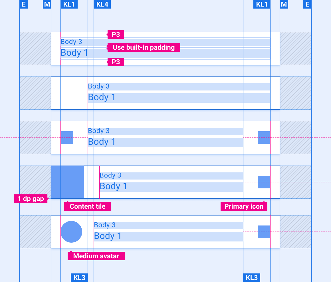
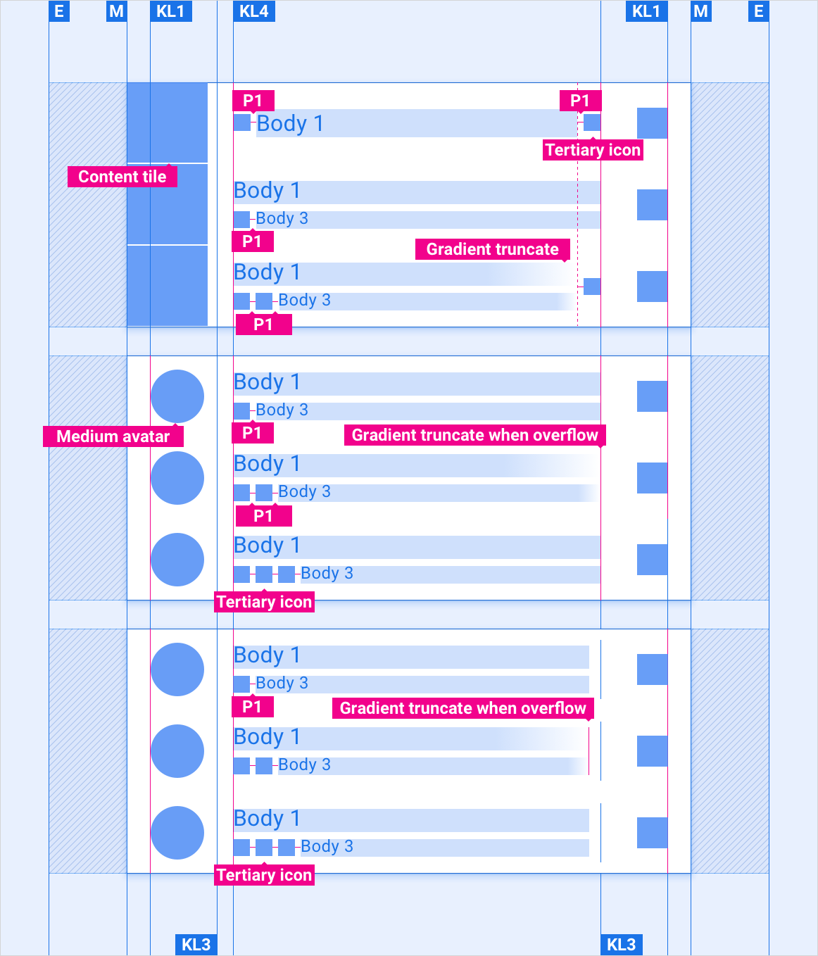
单行式列表项
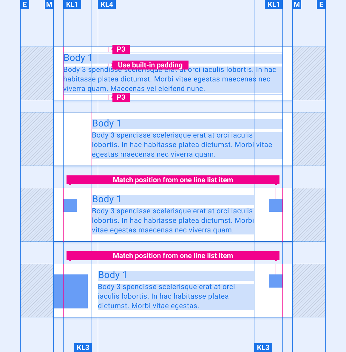
两行式列表项
两行列表项已反转
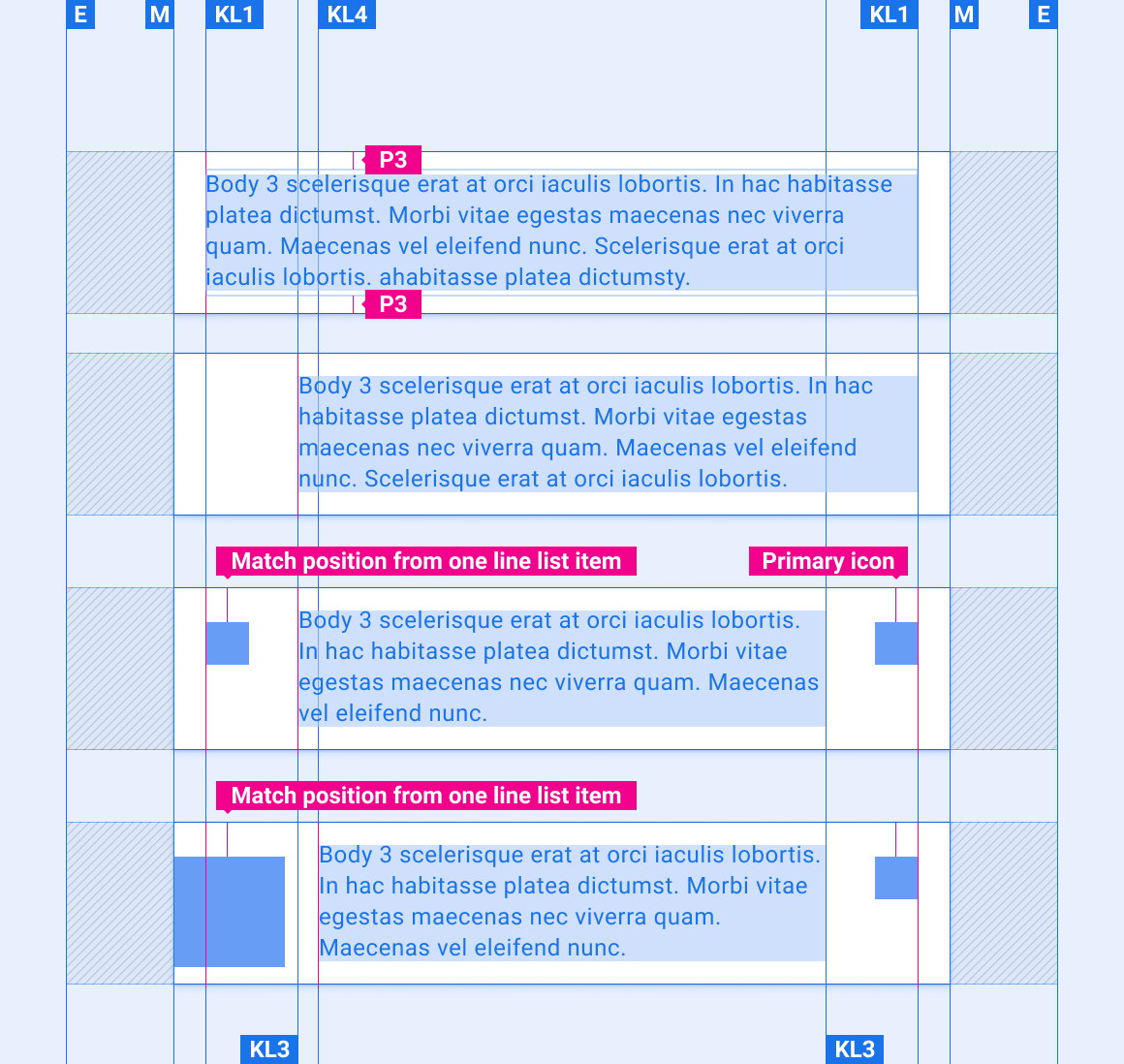
带标题的多行列表项
无标题的多行列表项
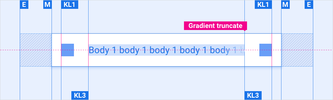
文本溢出列表项
包含拆分操作的列表项
指示器图标在列表项中的位置
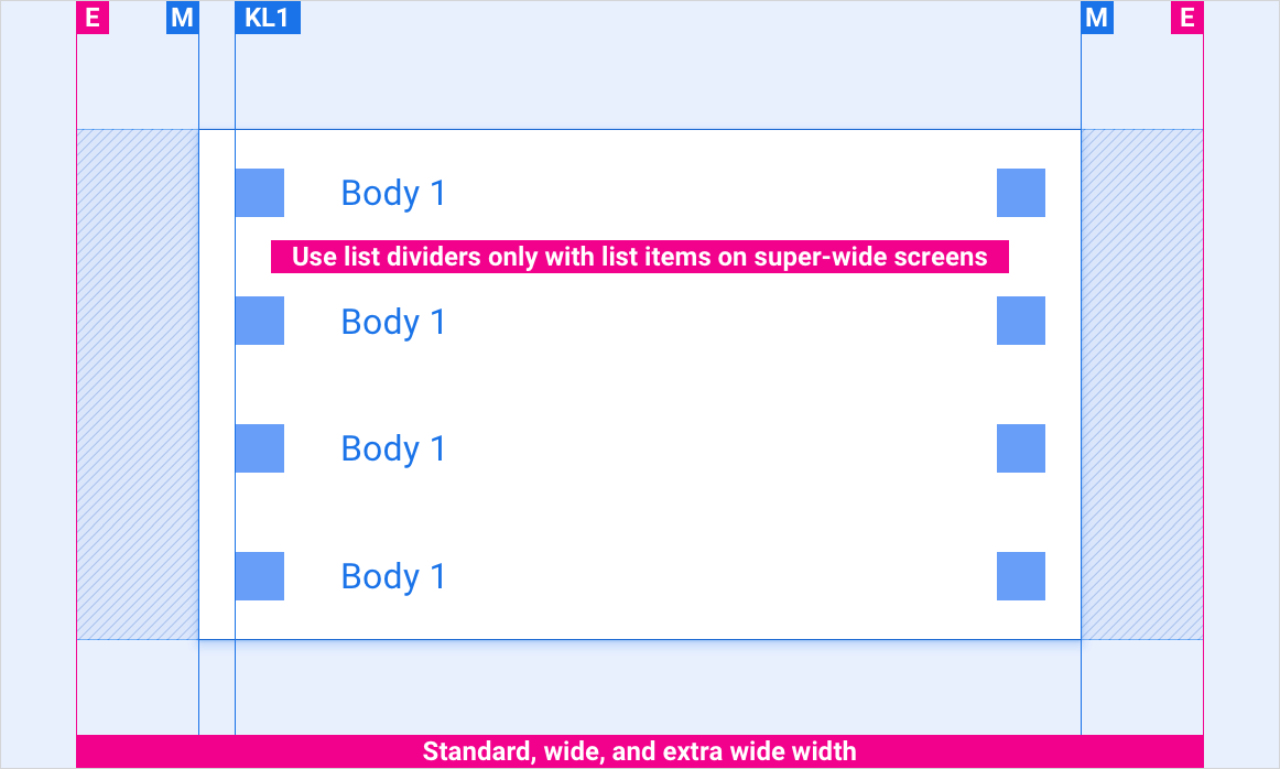
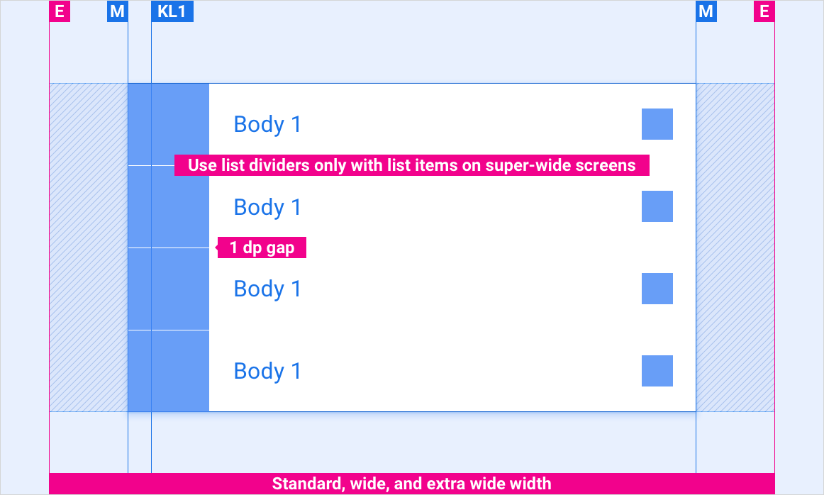
缩放布局
这些参考布局展示了如何调整列表项以适应各种宽度和高度的屏幕。(宽度和高度类别在布局部分进行定义。)请注意,在发生任何下采样或上采样之前,所有像素值都位于渲染的像素中。
标准屏幕、宽屏幕和超宽屏幕
包含内容图块的标准屏幕、宽屏幕和超宽屏幕
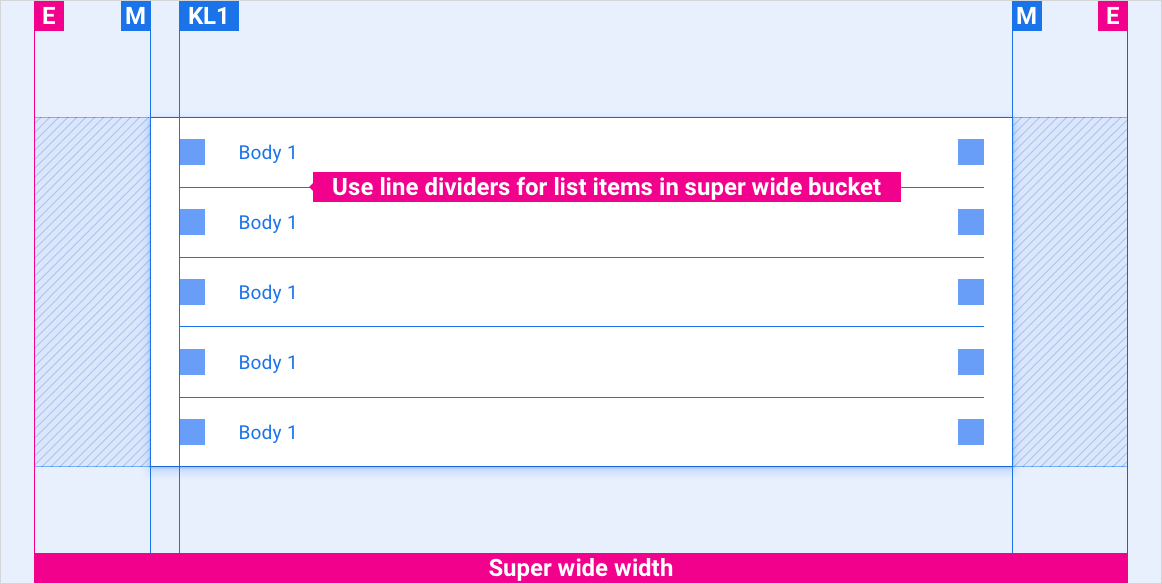
超宽屏幕
风格
排版
| 类型样式 | 字体 | 重量 | 尺寸 (dp) |
|---|---|---|---|
| 正文 1 | Roboto | 普通 | 32 |
| 正文 3 | Roboto | 普通 | 24 |
颜色
| 元素 | 颜色(日间模式) | 颜色(夜间模式) |
|---|---|---|
| 主要类型 / 图标 | White | 白色 @ 88% |
| 次要类型 / 图标 | 白色 @ 72% | 白色 @ 60% |
| 分割线 | 白色 @ 22% | 白色 @ 12% |
| 列表项背景 | 黑色 | 黑色 |
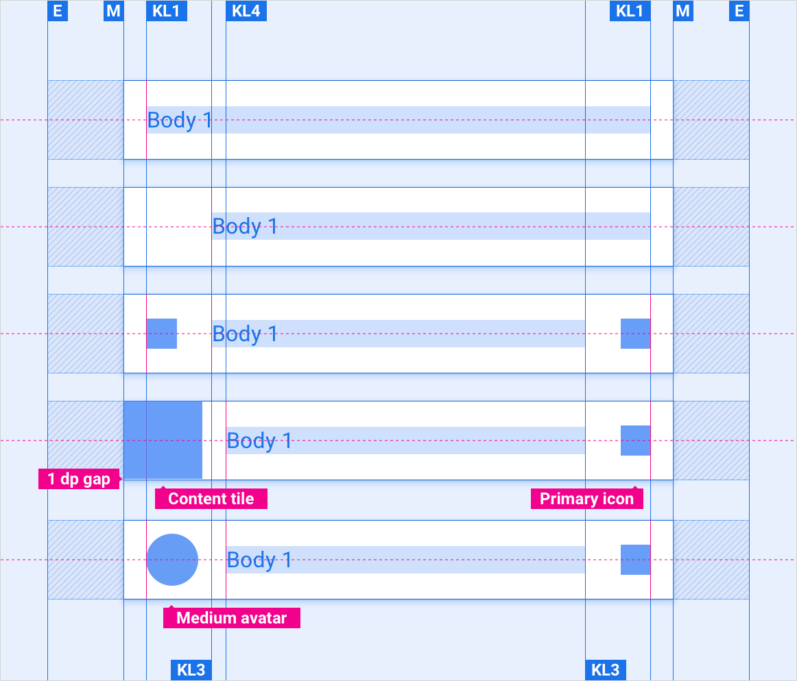
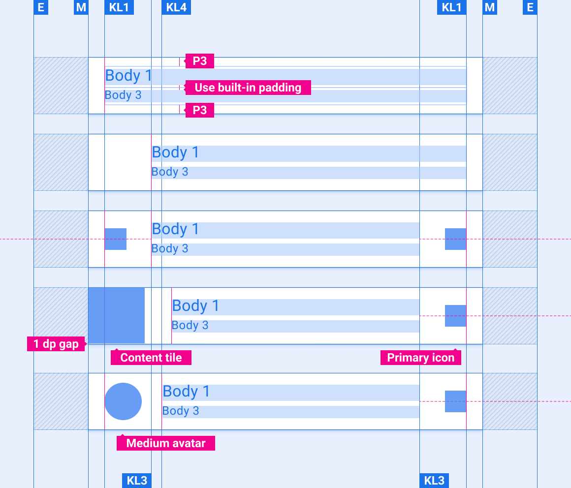
大小
| 元素 | 尺寸 (dp) |
|---|---|
| 列表项高度 | 96(短屏幕)/116(标准屏幕)/128(高屏幕) |
| 主图标 | 44 |
| 三级图标 | 24 |
| 内容图块 | 列表项高度减 1dp |
| 中型头像 | 76 |
| 分隔线粗细 | 1 |
示例