Page Summary
-
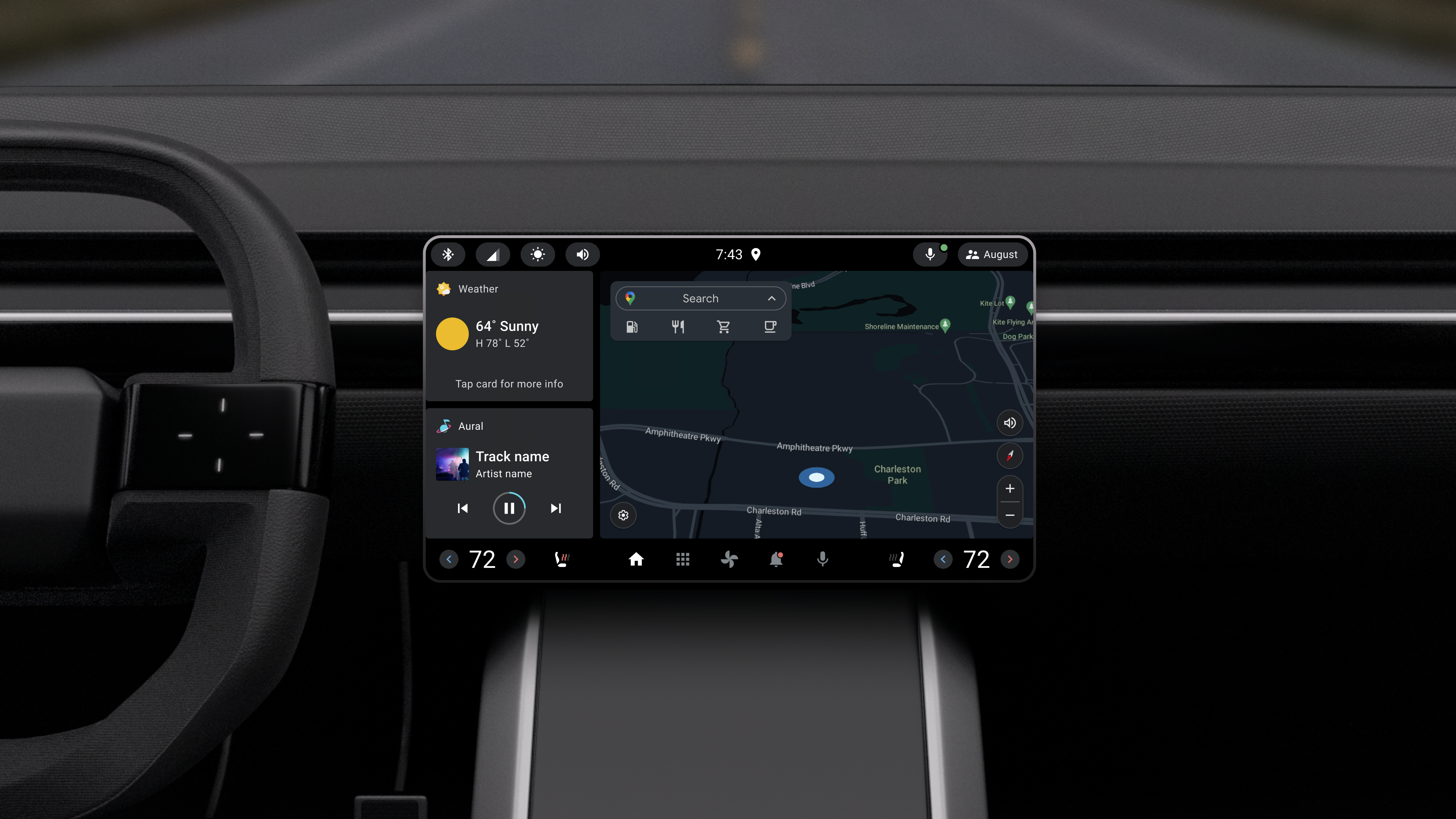
The small landscape reference design optimizes space on smaller screens, providing easy access to controls and apps.
-
This design allows drivers to perform common tasks with minimal distraction on small touchscreen landscape displays.
-
The small landscape reference design is one of two built-in reference designs in Android Automotive OS.
-
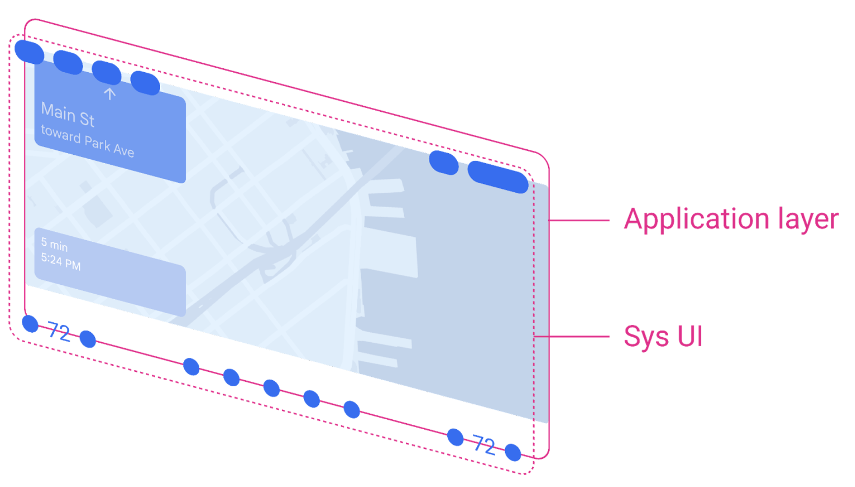
The spatial model consists of a system UI layer on top of an application layer.
-
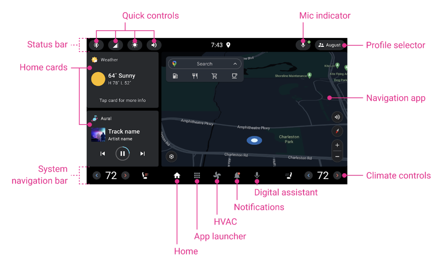
The Home screen includes a status bar, Home cards, an app area, and a navigation bar.
The small landscape reference design optimizes the space on smaller screens, giving drivers easy access to controls and apps.
With this design, drivers can see and perform a range of common tasks with minimal distraction on small touchscreen landscape displays. They can also enter into an immersive app experience.

The small landscape reference design is one of 2 fully-built reference designs in Android Automotive OS (AAOS). These designs provide essential system UI features and accommodate a range of vehicle configurations. OEMs can choose a reference design and customize it to reflect their vehicles and their brand.
Spatial model
The spatial model of the small landscape design consists of a system UI layer on top of an application layer.
The system UI layer includes a status bar at the top of the screen and a navigation bar at the bottom.
When an application is opened, it runs on the application layer and takes up the full space between the status bar and the navigation bar, as shown above. When the system is showing the Home screen, the application space is smaller, as shown in the next section.

Home screen anatomy
The Home screen for the small landscape reference design is structured as shown below.

The Home screen includes the following elements:
- Status bar at the top: It hosts the quick controls, clock, mic indicator, and profile selector.
- Home cards on the left (vertically stacked)
- App on the right (navigation app recommended)
- Navigation bar at the bottom of the screen: It hosts quick access to the app launcher, climate controls, Notification Center, and digital assistant
When an application is opened, the Home cards disappear and the app expands horizontally.