
Place Details 元件
Places UI Kit 的 Place Details 元件可讓您在應用程式中新增顯示地點詳細資料的個別 UI 元件。這個元件可自訂。
地點詳細資料元件可單獨使用,也能與其他 Google 地圖平台 API 和服務搭配使用。這個元件會採用地點 ID、資源名稱或經緯度座標,並傳回已算繪的地點詳細資料資訊。
Place Details 元件完全可套用主題,讓您自訂字型、顏色和圓角半徑,以符合您的用途和視覺品牌宣傳指南。您可以提供自訂 PlacesMaterialTheme 值,自訂地點詳細資料的外觀。您也可以指定 PlaceDetailsCompactView 項目清單,自訂要納入哪些地點詳細資料欄位,每個項目都對應到顯示的地點資訊。
版面配置變化版本
「地點詳細資料」元件支援兩種主要版面配置變體:
- 精簡:預覽重要資訊的版面配置。
- 完整:顯示所有可用地點詳細資料的完整版面配置。
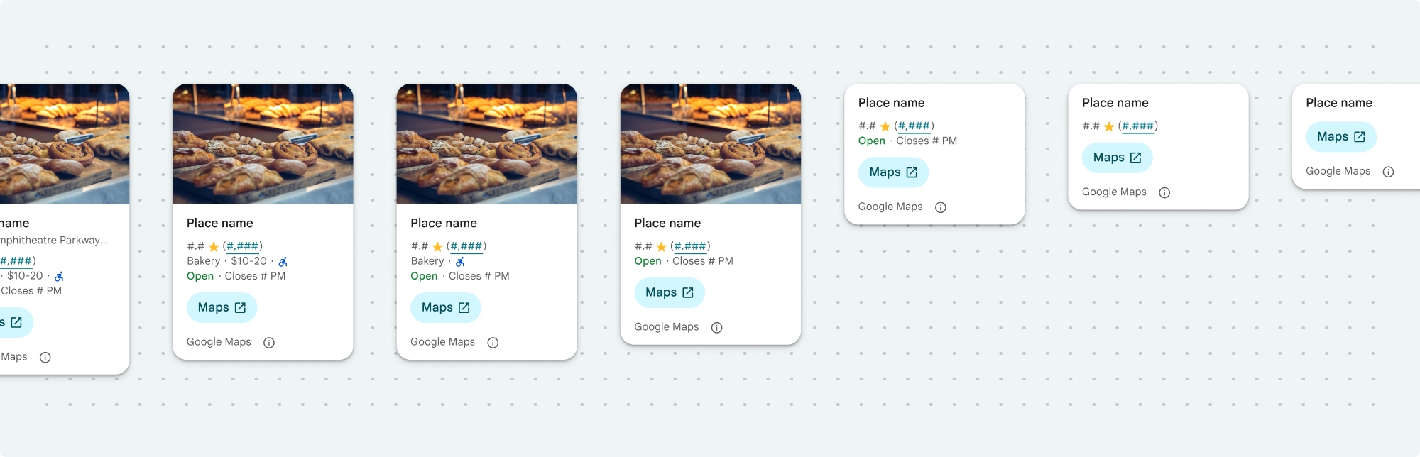
緊湊版面配置可以直向或橫向顯示。因此您可以將元件整合到各種設計版面配置和螢幕大小。完整版面配置只能以直向顯示。
您可以精細控管「地點詳細資料」元件中顯示的內容。你可以個別顯示或隱藏各個元素 (例如相片、評論和聯絡資訊),精確自訂元件的外觀和資訊密度。
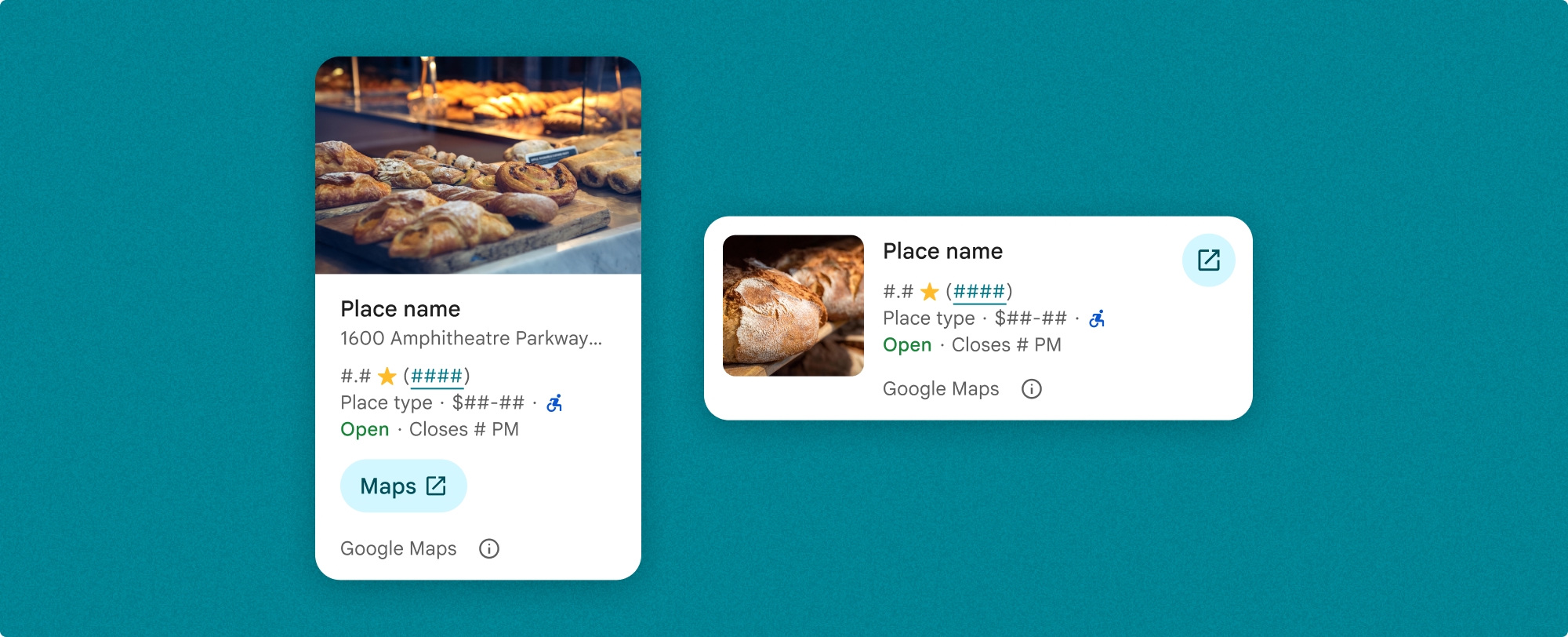
Place Details 密集檢視
地點詳細資料的精簡檢視畫面 (PlaceDetailsCompactView) 會以最少的空間顯示所選地點的詳細資料。這項功能可能適用於醒目顯示地圖上某個地點的資訊視窗、在社群媒體體驗中分享位置資訊 (例如在即時通訊中分享位置資訊)、建議選取目前位置,或在媒體文章中參照 Google 地圖上的地點。
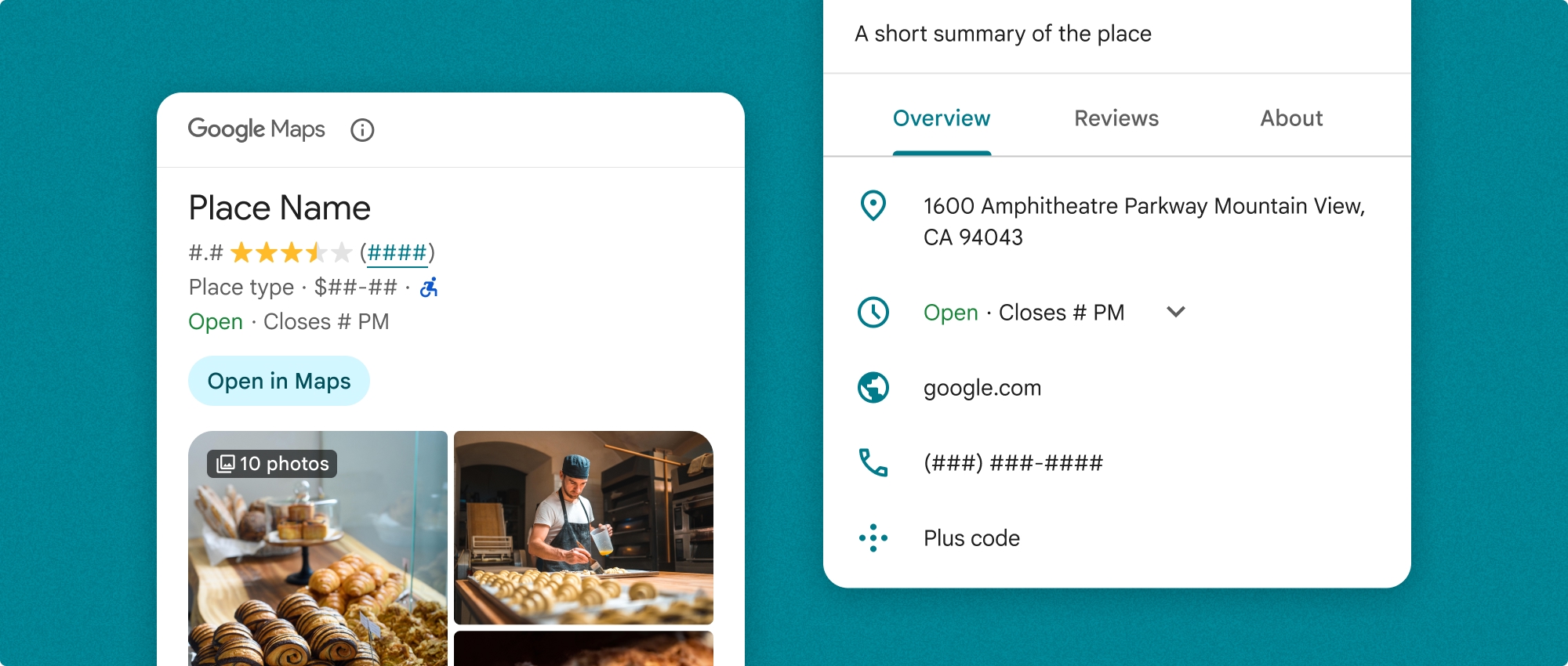
地點詳細資料完整檢視畫面
地點詳細資料完整檢視畫面 (PlaceDetailsView) 提供較大的介面,可顯示地點詳細資料資訊,並顯示更多類型的資訊。
內容顯示選項
您可以使用 PlaceDetailsCompactContent 或 PlaceDetailsContent 中的列舉,指定要顯示的內容。
| 精簡檢視 | 全文檢視 |
|---|---|
|
|
帳單
使用 Place Details UI Kit 時,系統會針對每次呼叫 PlaceDetailsQuery 方法收費。如果您多次載入相同地點,系統會針對每項要求向您收費。
在應用程式中新增地點詳細資料
Place Details 元件是 Swift UI 檢視區塊。您可以自訂地點詳細資料資訊的外觀和風格,以符合需求並配合應用程式的外觀。進一步瞭解自訂功能。
您可以選擇載入 Place Details 元件,並提供地點 ID、資源名稱或經緯度座標。你可以選擇任何方法,也可以選擇多種方法。將 PlaceDetailsQuery 結構體中的 identifier 設為 .placeID、.resourceName 或 .coordinate。
緊湊檢視畫面預設為直向,如要使用水平版面配置,請在 PlaceDetailsCompactView 中指定 orientation: .horizontal。您也可以視需要指定 orientation: .vertical,完整檢視畫面只能以直向顯示。
請參閱「地點詳細資料元件範例」一節中的範例。
自訂視覺外觀
自訂樣式
您可以自訂「地點詳細資料」元件的顏色、字體、間距、邊框和圓角。
Places UI Kit 採用設計系統方法,以 Material Design 為基礎 (並進行一些 Google 地圖專屬的修改),提供視覺自訂功能。請參閱 Material Design 的顏色和字體排版參考資料。根據預設,樣式會遵循 Google 地圖的視覺設計語言。
Places UI Kit 預設提供深色主題,因此您可能需要自訂深色和淺色主題。如要自訂深色主題,請在自訂主題中新增 .dark 和 attribution.darkModeColor 的值。
如要進一步瞭解樣式設定,請參閱「自訂樣式」一節。
自訂寬度和高度
密集檢視
建議寬度:
- 直向:介於 180 像素和 300 像素之間。
- 橫向:介於 180 像素和 500 像素之間。
最佳做法是不為精簡檢視區塊設定高度。這樣視窗中的內容就能設定高度,顯示所有資訊。
如果寬度小於 160 像素,可能無法正確顯示。
完整觀看次數
如要完整顯示,建議寬度介於 250 像素和 450 像素之間。寬度小於 250 像素的圖片可能無法正確顯示。
您可以設定元件的高度:直向地點詳細資料檢視畫面會在分配的空間內垂直捲動。
最佳做法是為完整檢視畫面設定高度。這樣視窗中的內容就能正常捲動。
Place Details 元件範例
使用垂直版面配置建立完整檢視畫面
Swift
  var selectedType: Set<PlaceDetailsCompactContent> = PlaceDetailsCompactView.standardContent

    // Query for loading the place details widget.
    @State var query: PlaceDetailsQuery = PlaceDetailsQuery(
      identifier: .placeID("ChIJT7FdmYiAhYAROFOvrIxRJDU"))

    var theme: PlacesMaterialTheme()
    var configuration: PlaceDetailsConfiguration {
      PlaceDetailsConfiguration(
        content: selectedType,
        theme: theme)
    }

    // Callback for the place details widget.
    let placeDetailsCallback: (PlaceDetailsResult) -> Void = { result in
      if let place = result.place {
        print("Place: \(place.description)")
      } else {
        print("Error: \(String(describing: result.error))")
      }
    }
    PlaceDetailsCompactView(
      orientation: .vertical, query: $query,
      configuration: configuration,
      placeDetailsCallback: placeDetailsCallback
    )
建立採用水平版面配置的精簡檢視畫面
Swift
  var selectedType: Set<PlaceDetailsCompactContent> = PlaceDetailsCompactView.standardContent

    // Query for loading the place details widget.
    @State var query: PlaceDetailsQuery = PlaceDetailsQuery(
      identifier: .placeID("ChIJT7FdmYiAhYAROFOvrIxRJDU"))

    var theme: PlacesMaterialTheme()
    var configuration: PlaceDetailsConfiguration {
      PlaceDetailsConfiguration(
        content: selectedType,
        theme: theme)
    }

    // Callback for the place details widget.
    let placeDetailsCallback: (PlaceDetailsResult) -> Void = { result in
      if let place = result.place {
        print("Place: \(place.description)")
      } else {
        print("Error: \(String(describing: result.error))")
      }
    }
    PlaceDetailsCompactView(
      orientation: .horizontal, query: $query,
      configuration: configuration,
      placeDetailsCallback: placeDetailsCallback
    )
建立垂直版面配置的全螢幕檢視畫面
Swift
  @State var query: PlaceDetailsQuery = PlaceDetailsQuery(
    identifier: .placeID("ChIJT7FdmYiAhYAROFOvrIxRJDU"))
  var theme: PlacesMaterialTheme()
  var selectedType: Set<PlaceDetailsContent> = PlaceDetailsCompactView.standardContent

  var configuration: PlaceDetailsConfiguration {
    PlaceDetailsConfiguration(
      content: selectedType,
      theme: theme)
  }
  let placeDetailsCallback: (PlaceDetailsResult) -> Void = { result in
    placeIDPickerFocused = true
    if let place = result.place {
      print("Place: \(place.description)")
    } else {
      print("Error: \(String(describing: result.error))")
    }
  }
  GooglePlacesSwift.PlaceDetailsView(
    query: $query,
    configuration: configuration,
    placeDetailsCallback: placeDetailsCallback
  )
自訂樣式屬性
這個範例說明如何自訂完整或精簡檢視畫面的預設樣式屬性。
Places UI Kit 預設提供深色主題,因此您可能需要自訂深色和淺色主題。如要自訂深色主題,請在自訂主題中新增 .dark 和 attribution.darkModeColor 的值。
Swift
  // Same for compact and full
func makeTemplateTheme(colorScheme: ColorScheme) -> PlacesMaterialTheme {
  var theme = PlacesMaterialTheme()
  var color = PlacesMaterialColor()
  color.surface = (colorScheme == .dark ? .blue : .gray)
  color.buttonBorder = (colorScheme == .dark ? .pink : .orange)
  color.outlineDecorative = (colorScheme == .dark ? .white : .black)
  color.onSurface = (colorScheme == .dark ? .yellow : .red)
  color.onSurfaceVariant = (colorScheme == .dark ? .white : .blue)
  color.onSecondaryContainer = (colorScheme == .dark ? .white : .red)
  color.secondaryContainer = (colorScheme == .dark ? .green : .purple)
  color.positive = (colorScheme == .dark ? .yellow : .red)
  color.primary = (colorScheme == .dark ? .yellow : .purple)
  color.info = (colorScheme == .dark ? .yellow : .purple)
  var shape = PlacesMaterialShape()
  shape.cornerRadius = 10
  var font = PlacesMaterialFont()
  font.labelLarge = .system(size: UIFontMetrics.default.scaledValue(for: 18))
  font.headlineMedium = .system(size: UIFontMetrics.default.scaledValue(for: 15))
  font.bodyLarge = .system(size: UIFontMetrics.default.scaledValue(for: 15))
  font.bodyMedium = .system(size: UIFontMetrics.default.scaledValue(for: 12))
  font.bodySmall = .system(size: UIFontMetrics.default.scaledValue(for: 11))
  var attribution = PlacesMaterialAttribution()
  attribution.lightModeColor = .black
  attribution.darkModeColor = .white
  theme.measurement.borderWidthButton = 1
  theme.color = color
  theme.shape = shape
  theme.font = font
  theme.attribution = attribution
  return theme
}
顯示特定內容
這個範例會使用上一個範例中建立的主題,建立只顯示媒體、地址、評分和類型的精簡檢視畫面。
Swift
  @State var query: PlaceDetailsQuery = PlaceDetailsQuery(
    identifier: .placeID("ChIJT7FdmYiAhYAROFOvrIxRJDU"))

  var body: some View {
    PlaceDetailsCompactView(
      orientation: .vertical, query: $query,
      contentType: [.media(), .address(), .rating(),
                    .type(), .price()], theme: theme,
      placeDetailsCallback: placeDetailsCallback, preferTruncation: false
    )
    .frame(width: 350)
  }