
BigQuery データから分析情報を得るには、分析ツールとビジネス インテリジェンス ツールが不可欠です。BigQuery は、Google とサードパーティの複数のデータ可視化ツールをサポートしています。これらのツールを使用して、次のような Places Insights データのクエリ結果を分析できます。
- BigQuery Studio の [可視化] タブ
- Colab ノートブック
- Looker Studio
- Google Earth Engine
- BigQuery Geo Viz
以下の例では、結果を可視化する方法について説明します。
- BigQuery Studio の [可視化] タブ。地理データビューアが統合されています。
- Colab ノートブック(ホスト型の Jupyter Notebook サービス)。
- Looker Studio: データを可視化し、ダッシュボードやレポートを作成して利用できるプラットフォーム。
- BigQuery Geo Viz。Google Maps API を使用して BigQuery の地理空間データを可視化するツール。
この例では、車椅子で入店できるレストランの可視化を示していますが、Places Insights のクエリとブランドデータのクエリはすべて可視化できます。
他のツールを使用してデータを可視化する方法については、BigQuery のドキュメントをご覧ください。
可視化するデータをクエリする
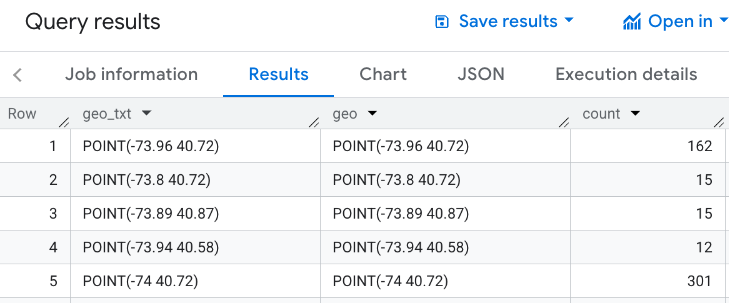
次の可視化の例では、次のクエリを使用して、ニューヨーク市のエンパイア ステート ビルから 3,000 メートル以内の車椅子対応の入り口があるレストランの数を生成します。このクエリは、各ポイントのサイズが 0.005 度の地理的なポイントあたりのレストラン数のテーブルを返します。
GEOGRAPHY ポイントに対して GROUP BY オペレーションを実行できないため、このクエリでは BigQuery の ST_ASTEXT 関数を使用して、各ポイントをポイントの STRING
WKT 表現に変換し、その値を geo_txt 列に書き込みます。次に、geo_txt を使用して GROUP BY を実行します。
SELECT
  geo_txt, -- STRING WKT geometry value.
  ST_GEOGFROMTEXT(geo_txt) AS geo, -- Convert STRING to GEOGRAPHY value.
  count
FROM (
  -- Create STRING WKT representation of each GEOGRAPHY point to
  -- GROUP BY the STRING value.
  SELECT WITH AGGREGATION_THRESHOLD
    ST_ASTEXT(ST_SNAPTOGRID(point, 0.005)) AS geo_txt,
    COUNT(*) AS count
  FROM
    `PROJECT_NAME.places_insights___us.places`
  WHERE
    'restaurant' IN UNNEST(types)
    AND wheelchair_accessible_entrance = true
    AND ST_DWITHIN(ST_GEOGPOINT(-73.9857, 40.7484), point, 3000)
  GROUP BY
    geo_txt
)
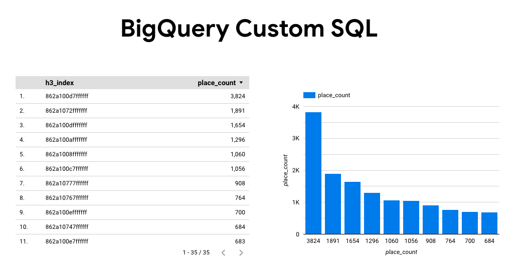
次の図は、このクエリの出力例を示しています。ここで、count には各ポイントのレストランの数が含まれています。
BigQuery Studio の [可視化] タブを使用してデータを可視化する
次の図は、[可視化タブ] を使用して BigQuery に表示されたデータを示しています。円の色が濃いほど、その場所にレストランが集中していることを示します。
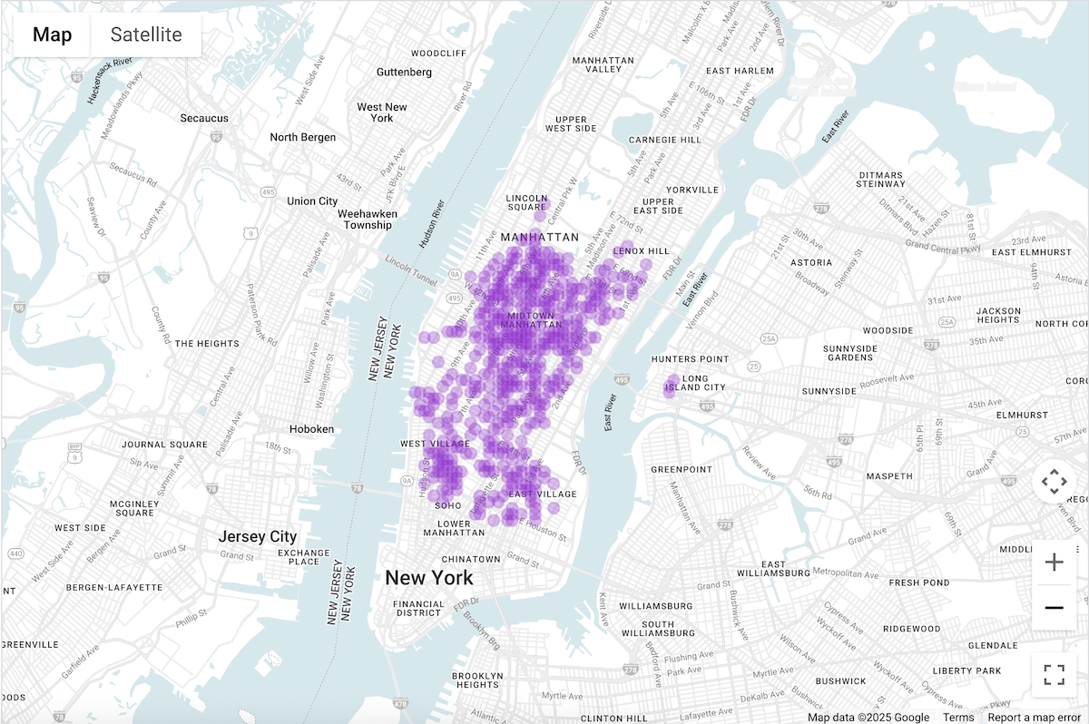
BigQuery Studio でデータを可視化する
- 上記のクエリをデータをクエリして可視化するで実行します。
- BigQuery の結果で、[可視化] タブをクリックします。
- 地図が開き、クエリされたポイントを表す円が表示されます。
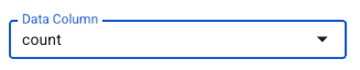
[ビジュアリゼーションの構成] で、[データ列] を [カウント] に設定します。
円が濃いほど、レストランの数が多いことを示します。
必要に応じて、他の設定を更新して、可視化のルック アンド フィールを変更できます。
構成オプションの詳細については、BigQuery の可視化に関するドキュメントをご覧ください。
Colab ノートブックを使用してデータを可視化する
Colab ノートブックでの可視化は、BigQuery Studio よりも制御性と洗練性が高く、Jupyter ノートブック環境を維持できます。
Colab で地理空間分析データを可視化するチュートリアルは、次の 3 つの形式で提供されています。
- Colab のドキュメントをご覧ください。
- YouTube 動画として。
- GitHub ノートブックでは、Workspace または Colab Enterprise でクローンを作成して使用できます。
このチュートリアルでは、pydeck、deck.gl、
- 散布図(通常はサンプリング用)。
- GeoJSON(検出用)。
- 階級区分図(強度)。
- ヒートマップ(密度用)。
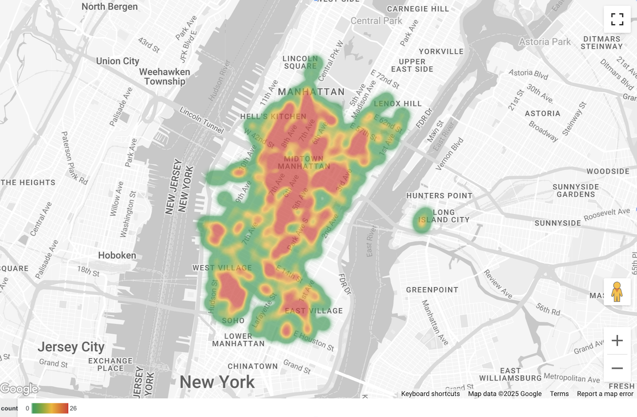
Looker Studio でデータを可視化する
次の図は、Looker Studio でこのデータがヒートマップとして表示されている様子を示しています。ヒートマップは、密度が低い(緑)から高い(赤)までを示しています。
Looker Studio にデータをインポートする
Looker Studio にデータをインポートするには:
データをクエリして可視化するで上記のクエリを実行します。
BigQuery の結果で、[次で開く] -> [Looker Studio] をクリックします。結果は Looker Studio に自動的にインポートされます。
Looker Studio はデフォルトのレポートページを作成し、タイトル、表、結果の棒グラフで初期化します。
ページ上のすべてを選択して削除します。
[挿入 -> ヒートマップ] をクリックして、レポートにヒートマップを追加します。
[グラフの種類 -> 設定] で、[データ] セクションから項目をドラッグして、次のようにフィールドを構成します。
ヒートマップは上記のように表示されます。必要に応じて、[グラフの種類 -> スタイル] を選択して、地図の外観をさらに構成できます。
BigQuery Geo Viz を使用してデータを可視化する
次の画像は、このデータが BigQuery Geo Viz で塗りつぶし地図として表示されている様子を示しています。塗りつぶし地図には、ポイント セルごとのレストランの密度が表示されます。ポイントが大きいほど密度が高くなります。
BigQuery Geo Viz にデータをインポートする
データを BigQuery Geo Viz にインポートするには:
データをクエリして可視化するで上記のクエリを実行します。
BigQuery の結果で、[次で開く] -> [GeoViz] をクリックします。
[クエリ] ステップが表示されます。
[実行] ボタンを選択して、クエリを実行します。地図上にポイントが自動的に表示されます。
[データ] を選択してデータを表示します。
[データ] セクションで、[スタイルを追加] ボタンをクリックします。
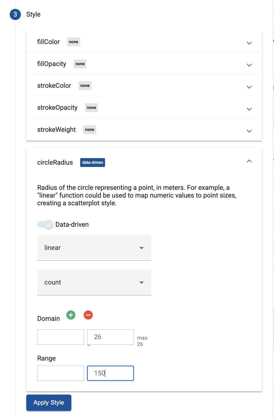
[circleRadius] を選択し、スライダーを使用してデータドリブン スタイリングを有効にします。
残りのフィールドを次のように設定します。
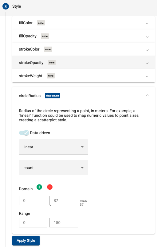
[スタイルを適用] をクリックして、地図にスタイルを適用します。