 在 GitHub 上查看源代码
本教程将介绍使用 Google Earth Engine 进行物种分布建模的方法。我们将简要概述物种分布模型,然后介绍如何预测和分析一种名为仙八色鸫(学名:Pitta nympha)的濒危鸟类的栖息地。
先运行我
运行以下单元格以初始化 API。输出将包含有关如何使用您的账号向此笔记本授予 Earth Engine 访问权限的说明。
import ee

# Trigger the authentication flow.
ee.Authenticate()

# Initialize the library.
ee.Initialize(project='my-project')
物种分布建模简介
下面我们来了解物种分布模型是什么、使用 Google Earth Engine 处理此类模型的优势、模型所需的数据以及工作流的结构。
什么是物种分布模型?
物种分布模型(以下简称 SDM)是用于估计物种实际或潜在地理分布的最常用方法。它包括确定适合特定物种的环境条件,然后确定这些适宜条件在地理上的分布情况。
近年来,SDM 已成为保护规划的重要组成部分,为此开发了各种建模技术。在 Google Earth Engine(以下简称 GEE)中实现 SDM 可轻松访问大规模环境数据,同时还可利用强大的计算能力和对机器学习算法的支持,从而实现快速建模。
SDM 所需的数据
SDM 通常会利用已知物种出现记录与环境变量之间的关系来确定种群可以维持的条件。换句话说,需要两种类型的模型输入数据:
- 已知物种的出现记录
- 各种环境变量
这些数据会输入到算法中,以确定与物种存在相关的环境条件。
使用 GEE 的 SDM 工作流
使用 GEE 的 SDM 工作流程如下:
- 物种出现数据的收集和预处理
- 感兴趣的地区的定义
- 添加了 GEE 环境变量
- 生成伪缺席数据
- 模型拟合和预测
- 变量重要性和准确性评估
使用 GEE 进行栖息地预测和分析
我们将以仙八色鸫 (Pitta nympha) 为案例研究对象,展示基于 GEE 的 SDM 的应用。虽然此示例中选择了特定物种,但研究人员只需对提供的源代码稍作修改,即可将该方法应用于任何感兴趣的目标物种。
仙八色鸫是韩国罕见的夏季迁徙鸟类和过境迁徙鸟类,由于近期朝鲜半岛气候变暖,其分布区域正在扩大。它被列为珍稀物种、国家二级濒危野生动物、自然纪念物第 204 号,在国家红皮书中被评估为区域性灭绝 (RE),根据 IUCN 类别被评估为易危 (VU)。
对仙八色的保护规划进行 SDM 分析似乎非常有价值。现在,我们继续通过 GEE 进行栖息地预测和分析。
首先,导入 Python 库。import 语句会引入模块的全部内容,而 from import 语句则允许从模块中导入特定对象。
# Import libraries
import geemap

import geemap.colormaps as cm
import pandas as pd, geopandas as gpd
import numpy as np, matplotlib.pyplot as plt
import os, requests, math, random

from ipyleaflet import TileLayer
from statsmodels.stats.outliers_influence import variance_inflation_factor
物种出现数据的收集和预处理
现在,我们来收集仙八色鸫的出现数据。即使您目前无法访问感兴趣物种的出现数据,也可以通过 GBIF API 获取有关特定物种的观测数据。GBIF API 是一种接口,可用于访问 GBIF 提供的物种分布数据,让用户能够搜索、过滤和下载数据,以及获取与物种相关的各种信息。
在以下代码中,species_name 变量被分配了物种的学名(例如,Pitta nympha 表示仙八色鸫),并将国家/地区代码(例如 country_codeKR 表示韩国)。base_url 变量存储了 GBIF API 的地址。params 是一个字典,包含要在 API 请求中使用的参数:
scientificName:设置要搜索的物种的学名。country:将搜索范围限制在特定国家/地区内。hasCoordinate:确保仅搜索具有坐标的数据 (true)。basisOfRecord:仅选择人工观测记录 (HUMAN_OBSERVATION)。limit:将返回的结果数上限设置为 10000。
def get_gbif_species_data(species_name, country_code):
    """
    Retrieves observational data for a specific species using the GBIF API and returns it as a pandas DataFrame.

    Parameters:
    species_name (str): The scientific name of the species to query.
    country_code (str): The country code of the where the observation data will be queried.

    Returns:
    pd.DataFrame: A pandas DataFrame containing the observational data.
    """
    base_url = "https://api.gbif.org/v1/occurrence/search"
    params = {
        "scientificName": species_name,
        "country": country_code,
        "hasCoordinate": "true",
        "basisOfRecord": "HUMAN_OBSERVATION",
        "limit": 10000,
    }

    try:
        response = requests.get(base_url, params=params)
        response.raise_for_status()  # Raises an exception for a response error.
        data = response.json()
        occurrences = data.get("results", [])

        if occurrences:  # If data is present
            df = pd.json_normalize(occurrences)
            return df
        else:
            print("No data found for the given species and country code.")
            return pd.DataFrame()  # Returns an empty DataFrame
    except requests.RequestException as e:
        print(f"Request failed: {e}")
        return pd.DataFrame()  # Returns an empty DataFrame in case of an exception
使用之前设置的参数,我们向 GBIF API 查询仙八色鸫 (Pitta nympha) 的观测记录,并将结果加载到 DataFrame 中以检查第一行。DataFrame 是一种用于处理表格格式数据(由行和列组成)的数据结构。如有必要,可以将 DataFrame 保存为 CSV 文件,然后重新读入。
# Retrieve Fairy Pitta data
df = get_gbif_species_data("Pitta nympha", "KR")
"""
# Save DataFrame to CSV and read back in.
df.to_csv("pitta_nympha_data.csv", index=False)
df = pd.read_csv("pitta_nympha_data.csv")
"""
df.head(1)  # Display the first row of the DataFrame
接下来,我们将 DataFrame 转换为包含地理信息列 (geometry) 的 GeoDataFrame,并检查第一行。GeoDataFrame 可以保存为 GeoPackage 文件 (*.gpkg),并可重新读入。
# Convert DataFrame to GeoDataFrame
gdf = gpd.GeoDataFrame(
    df,
    geometry=gpd.points_from_xy(df.decimalLongitude,
                                df.decimalLatitude),
    crs="EPSG:4326"
)[["species", "year", "month", "geometry"]]
"""
# Convert GeoDataFrame to GeoPackage (requires pycrs module)
%pip install -U -q pycrs
gdf.to_file("pitta_nympha_data.gpkg", driver="GPKG")
gdf = gpd.read_file("pitta_nympha_data.gpkg")
"""
gdf.head(1)  # Display the first row of the GeoDataFrame
这次,我们创建了一个函数,用于直观呈现 GeoDataFrame 中按年和月划分的数据分布,并以图表形式显示,然后可以将其保存为图片文件。借助热图,我们可以快速了解物种在不同年份和月份的出现频率,直观地呈现数据中的时间变化和模式。这样一来,我们便可以识别物种出现数据中的时间模式和季节性变化,以及快速检测数据中的离群值或质量问题。
# Yearly and monthly data distribution heatmap
def plot_heatmap(gdf, h_size=8):

    statistics = gdf.groupby(["month", "year"]).size().unstack(fill_value=0)

    # Heatmap
    plt.figure(figsize=(h_size, h_size - 6))
    heatmap = plt.imshow(
        statistics.values, cmap="YlOrBr", origin="upper", aspect="auto"
    )

    # Display values above each pixel
    for i in range(len(statistics.index)):
        for j in range(len(statistics.columns)):
            plt.text(
                j, i, statistics.values[i, j], ha="center", va="center", color="black"
            )

    plt.colorbar(heatmap, label="Count")
    plt.title("Monthly Species Count by Year")
    plt.xlabel("Year")
    plt.ylabel("Month")
    plt.xticks(range(len(statistics.columns)), statistics.columns)
    plt.yticks(range(len(statistics.index)), statistics.index)
    plt.tight_layout()
    plt.savefig("heatmap_plot.png")
    plt.show()
plot_heatmap(gdf)
1995 年的数据非常稀疏,与其他年份相比存在明显缺口;8 月和 9 月的样本也有限,与其他时间段相比,呈现出不同的季节性特征。排除这些数据有助于提高模型的稳定性和预测能力。
不过,请务必注意,排除数据可能会增强模型的泛化能力,但也可能会导致丢失与研究目标相关的重要信息。因此,在做出此类决定时应仔细考虑。
# Filtering data by year and month
filtered_gdf = gdf[
    (~gdf['year'].eq(1995)) &
    (~gdf['month'].between(8, 9))
]
现在,过滤后的 GeoDataFrame 会转换为 Google Earth Engine 对象。
# Convert GeoDataFrame to Earth Engine object
data_raw = geemap.geopandas_to_ee(filtered_gdf)
接下来,我们将 SDM 结果的栅格像素大小定义为 1 公里分辨率。
# Spatial resolution setting (meters)
grain_size = 1000
如果同一 1 公里分辨率的栅格像素内存在多个出现点,则这些出现点很可能在同一地理位置具有相同的环境条件。直接在分析中使用此类数据可能会导致结果出现偏差。
换句话说,我们需要限制地理位置抽样偏差的潜在影响。为此,我们将在每个 1 公里像素内仅保留一个位置,并移除所有其他位置,以便模型更客观地反映环境条件。
def remove_duplicates(data, grain_size):
    # Select one occurrence record per pixel at the chosen spatial resolution
    random_raster = ee.Image.random().reproject("EPSG:4326", None, grain_size)
    rand_point_vals = random_raster.sampleRegions(
        collection=ee.FeatureCollection(data), geometries=True
    )
    return rand_point_vals.distinct("random")


data = remove_duplicates(data_raw, grain_size)

# Before selection and after selection
print("Original data size:", data_raw.size().getInfo())
print("Final data size:", data.size().getInfo())
下图显示了比较预处理之前(蓝色)和之后(红色)的地理位置抽样偏差的可视化图表。为便于比较,该地图以汉拿山国家公园内仙八色鸫出现坐标高度集中的区域为中心。
# Visualization of geographic sampling bias before (blue) and after (red) preprocessing
Map = geemap.Map(layout={"height": "400px", "width": "800px"})

# Add the random raster layer
random_raster = ee.Image.random().reproject("EPSG:4326", None, grain_size)
Map.addLayer(
    random_raster,
    {"min": 0, "max": 1, "palette": ["black", "white"], "opacity": 0.5},
    "Random Raster",
)

# Add the original data layer in blue
Map.addLayer(data_raw, {"color": "blue"}, "Original data")

# Add the final data layer in red
Map.addLayer(data, {"color": "red"}, "Final data")

# Set the center of the map to the coordinates
Map.setCenter(126.712, 33.516, 14)
Map
感兴趣的地区的定义
定义感兴趣的区域(下文简称 AOI)是指研究人员用于表示他们想要分析的地理区域的术语。其含义与“研究区域”一词类似。
在此背景下,我们获得了发生点图层几何图形的边界框,并在其周围创建了一个 50 公里的缓冲区(最大容差为 1,000 米),以定义 AOI。
# Define the AOI
aoi = data.geometry().bounds().buffer(distance=50000, maxError=1000)

# Add the AOI to the map
outline = ee.Image().byte().paint(
    featureCollection=aoi, color=1, width=3)

Map.remove_layer("Random Raster")
Map.addLayer(outline, {'palette': 'FF0000'}, "AOI")
Map.centerObject(aoi, 6)
Map
添加了 GEE 环境变量
现在,我们向分析中添加环境变量。GEE 提供各种环境变量数据集,例如温度、降水、海拔、地表覆盖和地形。这些数据集使我们能够全面分析可能影响仙八色鸫栖息地偏好的各种因素。
在 SDM 中选择 GEE 环境变量时,应反映出物种的栖息地偏好特征。为此,应先对仙八色的栖息地偏好进行研究和文献综述。本教程主要侧重于介绍使用 GEE 的 SDM 工作流,因此省略了一些深入的细节。
WorldClim V1 生物气候:此数据集提供 19 个从月度温度和降水数据得出的生物气候变量。该数据集涵盖 1960 年至 1991 年期间的数据,分辨率为 927.67 米。
# WorldClim V1 Bioclim
bio = ee.Image("WORLDCLIM/V1/BIO")
NASA SRTM 数字高程 30 米:此数据集包含来自航天飞机雷达地形测绘任务 (SRTM) 的数字高程数据。这些数据主要是在 2000 年左右收集的,分辨率约为 30 米(1 角秒)。以下代码根据 SRTM 数据计算高程、坡度、坡向和山体阴影图层。
# NASA SRTM Digital Elevation 30m
terrain = ee.Algorithms.Terrain(ee.Image("USGS/SRTMGL1_003"))
全球森林覆盖变化 (GFCC) 多年全球 30 米树木覆盖:来自 Landsat 的植被连续场 (VCF) 数据集估计了植被高度大于 5 米时垂直投影的植被覆盖比例。此数据集提供 2000 年、2005 年、2010 年和 2015 年前后四个时间段的数据,分辨率为 30 米。此处使用的是这四个时间段的中位数值。
# Global Forest Cover Change (GFCC) Tree Cover Multi-Year Global 30m
tcc = ee.ImageCollection("NASA/MEASURES/GFCC/TC/v3")
median_tcc = (
    tcc.filterDate("2000-01-01", "2015-12-31")
    .select(["tree_canopy_cover"], ["TCC"])
    .median()
)
bio(气候生物学变量)、terrain(地形)和 median_tcc(树冠覆盖率)组合成一个多波段影像。从 terrain 中选择 elevation 波段,并为 elevation 大于 0 的位置创建 watermask。这样可以遮盖海平面以下的区域(例如海洋),并为研究人员全面分析 AOI 的各种环境因素做好准备。
# Combine bands into a multi-band image
predictors = bio.addBands(terrain).addBands(median_tcc)

# Create a water mask
watermask = terrain.select('elevation').gt(0)

# Mask out ocean pixels and clip to the area of interest
predictors = predictors.updateMask(watermask).clip(aoi)
如果将高度相关的预测变量同时纳入模型中,可能会出现多重共线性问题。多重共线性是指模型中自变量之间存在强线性关系的一种现象,会导致模型系数(权重)的估计不稳定。这种不稳定性会降低模型的可靠性,并使新数据的预测或解读变得困难。因此,我们将考虑多重共线性,并继续进行选择预测变量的过程。
首先,我们将生成 5,000 个随机点,然后提取单个多波段图像在这些点上的预测变量值。
# Generate 5,000 random points
data_cor = predictors.sample(scale=grain_size, numPixels=5000, geometries=True)

# Extract predictor variable values
pvals = predictors.sampleRegions(collection=data_cor, scale=grain_size)
我们将把提取的每个点的预测值转换为 DataFrame,然后检查第一行。
# Converting predictor values from Earth Engine to a DataFrame
pvals_df = geemap.ee_to_df(pvals)
pvals_df.head(1)
# Displaying the columns
columns = pvals_df.columns
print(columns)
计算给定预测变量之间的 Spearman 相关系数,并在热图中直观呈现。
def plot_correlation_heatmap(dataframe, h_size=10, show_labels=False):
    # Calculate Spearman correlation coefficients
    correlation_matrix = dataframe.corr(method="spearman")

    # Create a heatmap
    plt.figure(figsize=(h_size, h_size-2))
    plt.imshow(correlation_matrix, cmap='coolwarm', interpolation='nearest')

    # Optionally display values on the heatmap
    if show_labels:
        for i in range(correlation_matrix.shape[0]):
            for j in range(correlation_matrix.shape[1]):
                plt.text(j, i, f"{correlation_matrix.iloc[i, j]:.2f}",
                         ha='center', va='center', color='white', fontsize=8)

    columns = dataframe.columns.tolist()
    plt.xticks(range(len(columns)), columns, rotation=90)
    plt.yticks(range(len(columns)), columns)
    plt.title("Variables Correlation Matrix")
    plt.colorbar(label="Spearman Correlation")
    plt.savefig('correlation_heatmap_plot.png')
    plt.show()
# Plot the correlation heatmap of variables
plot_correlation_heatmap(pvals_df)
Spearman 相关系数有助于了解预测变量之间的一般关联,但不能直接评估多个变量之间的交互方式,也无法专门检测多重共线性。
方差膨胀因子(以下简称 VIF)是一种用于评估多重共线性的统计指标,可指导变量选择。它表示每个自变量与其他自变量的线性相关程度,较高的 VIF 值可能表明存在多重共线性。
通常,当 VIF 值超过 5 或 10 时,表明相应变量与其他变量高度相关,可能会影响模型的稳定性和可解释性。在本教程中,我们使用小于 10 的 VIF 值作为变量选择标准。以下 6 个变量是根据 VIF 选择的。
# Filter variables based on Variance Inflation Factor (VIF)
def filter_variables_by_vif(dataframe, threshold=10):

    original_columns = dataframe.columns.tolist()
    remaining_columns = original_columns[:]

    while True:
        vif_data = dataframe[remaining_columns]
        vif_values = [
            variance_inflation_factor(vif_data.values, i)
            for i in range(vif_data.shape[1])
        ]

        max_vif_index = vif_values.index(max(vif_values))
        max_vif = max(vif_values)

        if max_vif < threshold:
            break

        print(f"Removing '{remaining_columns[max_vif_index]}' with VIF {max_vif:.2f}")

        del remaining_columns[max_vif_index]

    filtered_data = dataframe[remaining_columns]
    bands = filtered_data.columns.tolist()
    print("Bands:", bands)

    return filtered_data, bands
filtered_pvals_df, bands = filter_variables_by_vif(pvals_df)
# Variable Selection Based on VIF
predictors = predictors.select(bands)

# Plot the correlation heatmap of variables
plot_correlation_heatmap(filtered_pvals_df, h_size=6, show_labels=True)
接下来,我们将在地图上直观呈现所选的 6 个预测变量。
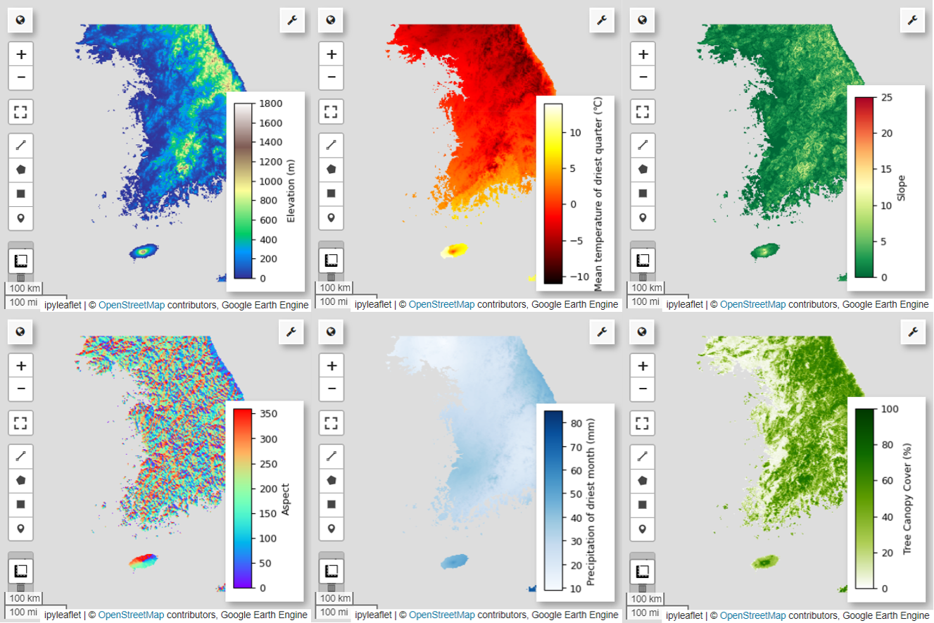
您可以使用以下代码探索地图可视化的可用调色板。例如,terrain 调色板如下所示。
cm.plot_colormaps(width=8.0, height=0.2)
cm.plot_colormap('terrain', width=8.0, height=0.2, orientation='horizontal')
# Elevation layer
Map = geemap.Map(layout={'height':'400px', 'width':'800px'})

vis_params = {'bands':['elevation'], 'min': 0, 'max': 1800, 'palette': cm.palettes.terrain}
Map.addLayer(predictors, vis_params, 'elevation')
Map.add_colorbar(vis_params, label="Elevation (m)", orientation="vertical", layer_name="elevation")
Map.centerObject(aoi, 6)
Map
# Calculate the minimum and maximum values for bio09
min_max_val = (
    predictors.select("bio09")
    .multiply(0.1)
    .reduceRegion(reducer=ee.Reducer.minMax(), scale=1000)
    .getInfo()
)

# bio09 (Mean temperature of driest quarter) layer
Map = geemap.Map(layout={"height": "400px", "width": "800px"})

vis_params = {
    "min": math.floor(min_max_val["bio09_min"]),
    "max": math.ceil(min_max_val["bio09_max"]),
    "palette": cm.palettes.hot,
}
Map.addLayer(predictors.select("bio09").multiply(0.1), vis_params, "bio09")
Map.add_colorbar(
    vis_params,
    label="Mean temperature of driest quarter (℃)",
    orientation="vertical",
    layer_name="bio09",
)
Map.centerObject(aoi, 6)
Map
# Slope layer
Map = geemap.Map(layout={'height':'400px', 'width':'800px'})

vis_params = {'bands':['slope'], 'min': 0, 'max': 25, 'palette': cm.palettes.RdYlGn_r}
Map.addLayer(predictors, vis_params, 'slope')
Map.add_colorbar(vis_params, label="Slope", orientation="vertical", layer_name="slope")
Map.centerObject(aoi, 6)
Map
# Aspect layer
Map = geemap.Map(layout={'height':'400px', 'width':'800px'})

vis_params = {'bands':['aspect'], 'min': 0, 'max': 360, 'palette': cm.palettes.rainbow}
Map.addLayer(predictors, vis_params, 'aspect')
Map.add_colorbar(vis_params, label="Aspect", orientation="vertical", layer_name="aspect")
Map.centerObject(aoi, 6)
Map
# Calculate the minimum and maximum values for bio14
min_max_val = (
    predictors.select("bio14")
    .reduceRegion(reducer=ee.Reducer.minMax(), scale=1000)
    .getInfo()
)

# bio14 (Precipitation of driest month) layer
Map = geemap.Map(layout={"height": "400px", "width": "800px"})

vis_params = {
    "bands": ["bio14"],
    "min": math.floor(min_max_val["bio14_min"]),
    "max": math.ceil(min_max_val["bio14_max"]),
    "palette": cm.palettes.Blues,
}
Map.addLayer(predictors, vis_params, "bio14")
Map.add_colorbar(
    vis_params,
    label="Precipitation of driest month (mm)",
    orientation="vertical",
    layer_name="bio14",
)
Map.centerObject(aoi, 6)
Map
# TCC layer
Map = geemap.Map(layout={"height": "400px", "width": "800px"})

vis_params = {
    "bands": ["TCC"],
    "min": 0,
    "max": 100,
    "palette": ["ffffff", "afce56", "5f9c00", "0e6a00", "003800"],
}
Map.addLayer(predictors, vis_params, "TCC")
Map.add_colorbar(
    vis_params, label="Tree Canopy Cover (%)", orientation="vertical", layer_name="TCC"
)
Map.centerObject(aoi, 6)
Map
生成伪缺席数据
在 SDM 过程中,物种的输入数据选择主要采用以下两种方法:
存在-背景方法:此方法会将观测到特定物种的位置(存在)与其他未观测到该物种的位置(背景)进行比较。这里的背景数据不一定是指物种不存在的区域,而是设置为反映研究区域的总体环境条件。它用于区分适合物种生存的环境和不太适合的环境。
存在-缺席法:此方法将观测到物种的位置(存在)与明确未观测到物种的位置(缺席)进行比较。其中,缺席数据表示已知物种不存在的特定位置。它并不反映研究区域的总体环境条件,而是指出了估计不存在该物种的位置。
在实践中,收集真实缺席数据往往很困难,因此经常使用人工生成的伪缺席数据。不过,请务必注意此方法的局限性和潜在错误,因为人工生成的伪缺席点可能无法准确反映真实的缺席区域。
选择这两种方法中的哪一种取决于数据可用性、研究目标、模型准确性和可靠性,以及时间和资源。在此示例中,我们将使用从 GBIF 收集的出现数据和人工生成的伪缺席数据,通过“存在-缺席”方法进行建模。
伪缺席数据的生成将通过“环境剖析方法”完成,具体步骤如下:
使用 k-means 聚类进行环境分类:基于欧几里得距离的 k-means 聚类算法将用于将研究区域内的像素划分为两个聚类。一个聚类将代表与随机选择的 100 个存在位置具有相似环境特征的区域,而另一个聚类将代表具有不同特征的区域。
在不同聚类中生成伪缺席数据:在第一步中确定的第二个聚类(与存在数据具有不同的环境特征)中,将随机生成伪缺席点。这些伪缺席点将表示预期不存在相应物种的位置。
# Randomly select 100 locations for occurrence
pvals = predictors.sampleRegions(
    collection=data.randomColumn().sort('random').limit(100),
    properties=[],
    scale=grain_size
)

# Perform k-means clustering
clusterer = ee.Clusterer.wekaKMeans(
    nClusters=2,
    distanceFunction="Euclidean"
).train(pvals)

cl_result = predictors.cluster(clusterer)

# Get cluster ID for locations similar to occurrence
cl_id = cl_result.sampleRegions(
    collection=data.randomColumn().sort('random').limit(200),
    properties=[],
    scale=grain_size
)

# Define non-occurrence areas in dissimilar clusters
cl_id = ee.FeatureCollection(cl_id).reduceColumns(ee.Reducer.mode(),['cluster'])
cl_id = ee.Number(cl_id.get('mode')).subtract(1).abs()
cl_mask = cl_result.select(['cluster']).eq(cl_id)
# Presence location mask
presence_mask = data.reduceToImage(properties=['random'],
reducer=ee.Reducer.first()
).reproject('EPSG:4326', None,
            grain_size).mask().neq(1).selfMask()

# Masking presence locations in non-occurrence areas and clipping to AOI
area_for_pa = presence_mask.updateMask(cl_mask).clip(aoi)

# Area for Pseudo-absence
Map = geemap.Map(layout={'height':'400px', 'width':'800px'})
Map.addLayer(area_for_pa, {'palette': 'black'}, 'AreaForPA')
Map.centerObject(aoi, 6)
Map
模型拟合和预测
现在,我们将数据划分为训练数据和测试数据。训练数据将用于通过训练模型找到最佳参数,而测试数据将用于评估之前训练的模型。在此背景下,需要考虑的一个重要概念是空间自相关。
空间自相关是 SDM 中的一个重要元素,与托布勒定律相关联。它体现了“万物皆有联系,但近处事物之间的联系比远处事物之间的联系更密切”这一概念。空间自相关表示物种位置与环境变量之间的显著关系。不过,如果训练数据和测试数据之间存在空间自相关,则这两个数据集之间的独立性可能会受到影响。这会严重影响对模型泛化能力的评估。
解决此问题的一种方法是空间块交叉验证技术,该技术涉及将数据划分为训练数据集和测试数据集。此技术涉及将数据划分为多个块,并使用每个块独立作为训练数据集和测试数据集,以减少空间自相关的影响。这样可以增强数据集之间的独立性,从而更准确地评估模型的泛化能力。
具体步骤如下:
- 创建空间块:将整个数据集划分为大小相等的空间块(例如,50x50 公里)。
- 训练集和测试集的分配:每个空间块随机分配给训练集 (70%) 或测试集 (30%)。这可以防止模型过拟合特定区域的数据,并力求获得更泛化的结果。
- 迭代交叉验证:整个过程重复 n 次(例如,10 次)。在每次迭代中,这些块都会再次随机分为训练集和测试集,旨在提高模型的稳定性和可靠性。
- 生成伪缺席数据:在每次迭代中,随机生成伪缺席数据以评估模型性能。
Scale = 50000
grid = watermask.reduceRegions(
    collection=aoi.coveringGrid(scale=Scale, proj='EPSG:4326'),
    reducer=ee.Reducer.mean()).filter(ee.Filter.neq('mean', None))

Map = geemap.Map(layout={'height':'400px', 'width':'800px'})
Map.addLayer(grid, {}, "Grid for spatial block cross validation")
Map.addLayer(outline, {'palette': 'FF0000'}, "Study Area")
Map.centerObject(aoi, 6)
Map
现在,我们可以拟合模型了。拟合模型需要了解数据中的模式,并相应地调整模型的参数(权重和偏差)。此过程可让模型在遇到新数据时做出更准确的预测。为此,我们定义了一个名为 SDM() 的函数来拟合模型。
我们将使用随机森林算法。
def sdm(x):
    seed = ee.Number(x)

    # Random block division for training and validation
    rand_blk = ee.FeatureCollection(grid).randomColumn(seed=seed).sort("random")
    training_grid = rand_blk.filter(ee.Filter.lt("random", split))  # Grid for training
    testing_grid = rand_blk.filter(ee.Filter.gte("random", split))  # Grid for testing

    # Presence points
    presence_points = ee.FeatureCollection(data)
    presence_points = presence_points.map(lambda feature: feature.set("PresAbs", 1))
    tr_presence_points = presence_points.filter(
        ee.Filter.bounds(training_grid)
    )  # Presence points for training
    te_presence_points = presence_points.filter(
        ee.Filter.bounds(testing_grid)
    )  # Presence points for testing

    # Pseudo-absence points for training
    tr_pseudo_abs_points = area_for_pa.sample(
        region=training_grid,
        scale=grain_size,
        numPixels=tr_presence_points.size().add(300),
        seed=seed,
        geometries=True,
    )
    # Same number of pseudo-absence points as presence points for training
    tr_pseudo_abs_points = (
        tr_pseudo_abs_points.randomColumn()
        .sort("random")
        .limit(ee.Number(tr_presence_points.size()))
    )
    tr_pseudo_abs_points = tr_pseudo_abs_points.map(lambda feature: feature.set("PresAbs", 0))

    te_pseudo_abs_points = area_for_pa.sample(
        region=testing_grid,
        scale=grain_size,
        numPixels=te_presence_points.size().add(100),
        seed=seed,
        geometries=True,
    )
    # Same number of pseudo-absence points as presence points for testing
    te_pseudo_abs_points = (
        te_pseudo_abs_points.randomColumn()
        .sort("random")
        .limit(ee.Number(te_presence_points.size()))
    )
    te_pseudo_abs_points = te_pseudo_abs_points.map(lambda feature: feature.set("PresAbs", 0))

    # Merge training and pseudo-absence points
    training_partition = tr_presence_points.merge(tr_pseudo_abs_points)
    testing_partition = te_presence_points.merge(te_pseudo_abs_points)

    # Extract predictor variable values at training points
    train_pvals = predictors.sampleRegions(
        collection=training_partition,
        properties=["PresAbs"],
        scale=grain_size,
        geometries=True,
    )

    # Random Forest classifier
    classifier = ee.Classifier.smileRandomForest(
        numberOfTrees=500,
        variablesPerSplit=None,
        minLeafPopulation=10,
        bagFraction=0.5,
        maxNodes=None,
        seed=seed,
    )
    # Presence probability: Habitat suitability map
    classifier_pr = classifier.setOutputMode("PROBABILITY").train(
        train_pvals, "PresAbs", bands
    )
    classified_img_pr = predictors.select(bands).classify(classifier_pr)

    # Binary presence/absence map: Potential distribution map
    classifier_bin = classifier.setOutputMode("CLASSIFICATION").train(
        train_pvals, "PresAbs", bands
    )
    classified_img_bin = predictors.select(bands).classify(classifier_bin)

    return [
        classified_img_pr,
        classified_img_bin,
        training_partition,
        testing_partition,
    ], classifier_pr
空间块分别划分为 70% 用于模型训练,30% 用于模型测试。在每次迭代中,伪缺席数据都会在每个训练集和测试集中随机生成。因此,每次执行都会生成不同的存在和伪缺席数据集,用于模型训练和测试。
split = 0.7
numiter = 10

# Random Seed
runif = lambda length: [random.randint(1, 1000) for _ in range(length)]
items = runif(numiter)

# Fixed seed
# items = [287, 288, 553, 226, 151, 255, 902, 267, 419, 538]
results_list = [] # Initialize SDM results list
importances_list = [] # Initialize variable importance list

for item in items:
    result, trained = sdm(item)
    # Accumulate SDM results into the list
    results_list.extend(result)

    # Accumulate variable importance into the list
    importance = ee.Dictionary(trained.explain()).get('importance')
    importances_list.extend(importance.getInfo().items())

# Flatten the SDM results list
results = ee.List(results_list).flatten()
现在,我们可以直观呈现仙八色的栖息地适宜性地图和潜在分布地图。在本例中,栖息地适宜性地图是通过使用 mean() 函数计算所有图片中每个像素位置的平均值来创建的,而潜在分布地图是通过使用 mode() 函数确定所有图片中每个像素位置最常出现的值来生成的。
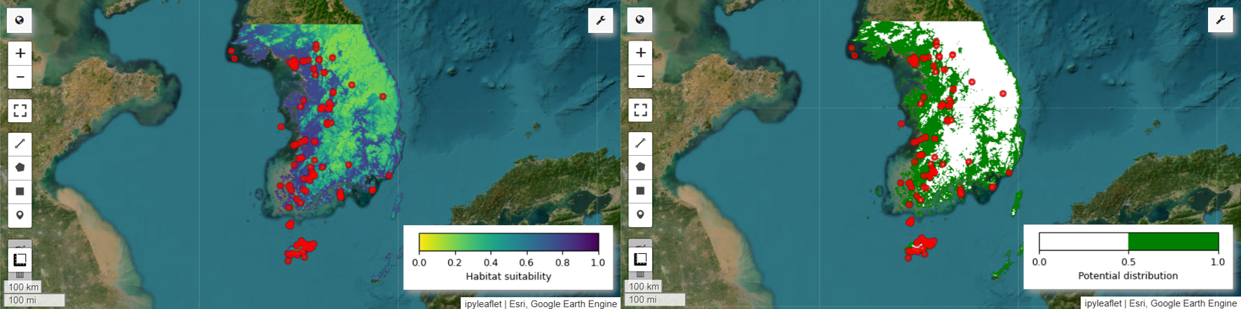
# Habitat suitability map
images = ee.List.sequence(
    0, ee.Number(numiter).multiply(4).subtract(1), 4).map(
    lambda x: results.get(x))
model_average = ee.ImageCollection.fromImages(images).mean()

Map = geemap.Map(layout={'height':'400px', 'width':'800px'}, basemap='Esri.WorldImagery')

vis_params = {
    'min': 0,
    'max': 1,
    'palette': cm.palettes.viridis_r}
Map.addLayer(model_average, vis_params, 'Habitat suitability')
Map.add_colorbar(vis_params, label="Habitat suitability",
                 orientation="horizontal",
                 layer_name="Habitat suitability")
Map.addLayer(data, {'color':'red'}, 'Presence')
Map.centerObject(aoi, 6)
Map
# Potential distribution map
images2 = ee.List.sequence(1, ee.Number(numiter).multiply(4).subtract(1), 4).map(
    lambda x: results.get(x)
)
distribution_map = ee.ImageCollection.fromImages(images2).mode()

Map = geemap.Map(
    layout={"height": "400px", "width": "800px"}, basemap="Esri.WorldImagery"
)

vis_params = {"min": 0, "max": 1, "palette": ["white", "green"]}
Map.addLayer(distribution_map, vis_params, "Potential distribution")
Map.addLayer(data, {"color": "red"}, "Presence")
Map.add_colorbar(
    vis_params,
    label="Potential distribution",
    discrete=True,
    orientation="horizontal",
    layer_name="Potential distribution",
)
Map.centerObject(data.geometry(), 6)
Map
变量重要性和准确性评估
随机森林 (ee.Classifier.smileRandomForest) 是一种集成学习方法,通过构建多个决策树来进行预测。每棵决策树都会独立地从不同的数据子集中学习,然后将结果汇总起来,以便做出更准确、更稳定的预测。
变量重要性是一种衡量指标,用于评估每个变量对随机森林模型中预测结果的影响。我们将使用之前定义的 importances_list 来计算并输出平均变量重要性。
def plot_variable_importance(importances_list):
    # Extract each variable importance value into a list
    variables = [item[0] for item in importances_list]
    importances = [item[1] for item in importances_list]

    # Calculate the average importance for each variable
    average_importances = {}
    for variable in set(variables):
        indices = [i for i, var in enumerate(variables) if var == variable]
        average_importance = np.mean([importances[i] for i in indices])
        average_importances[variable] = average_importance

    # Sort the importances in descending order of importance
    sorted_importances = sorted(average_importances.items(),
                                key=lambda x: x[1], reverse=False)
    variables = [item[0] for item in sorted_importances]
    avg_importances = [item[1] for item in sorted_importances]

    # Adjust the graph size
    plt.figure(figsize=(8, 4))

    # Plot the average importance as a horizontal bar chart
    plt.barh(variables, avg_importances)
    plt.xlabel('Importance')
    plt.ylabel('Variables')
    plt.title('Average Variable Importance')

    # Display values above the bars
    for i, v in enumerate(avg_importances):
        plt.text(v + 0.02, i, f"{v:.2f}", va='center')

    # Adjust the x-axis range
    plt.xlim(0, max(avg_importances) + 5)  # Adjust to the desired range

    plt.tight_layout()
    plt.savefig('variable_importance.png')
    plt.show()
plot_variable_importance(importances_list)
使用测试数据集,我们计算每次运行的 AUC-ROC 和 AUC-PR。然后,我们计算 n 次迭代的平均 AUC-ROC 和 AUC-PR。
AUC-ROC 表示“敏感度(召回率)与 1-特异度”图的曲线下面积,用于说明敏感度和特异度随阈值变化而变化的关系。特异性基于所有观测到的未发生情况。因此,AUC-ROC 涵盖混淆矩阵的所有象限。
AUC-PR 表示“精确率与召回率(敏感度)”图的曲线下面积,显示了精确率与召回率之间的关系随阈值变化而变化的情况。精确率基于所有预测的出现次数。因此,AUC-PR 不包含真负例 (TN)。
def print_pres_abs_sizes(TestingDatasets, numiter):
    # Check and print the sizes of presence and pseudo-absence coordinates
    def get_pres_abs_size(x):
        fc = ee.FeatureCollection(TestingDatasets.get(x))
        presence_size = fc.filter(ee.Filter.eq("PresAbs", 1)).size()
        pseudo_absence_size = fc.filter(ee.Filter.eq("PresAbs", 0)).size()
        return ee.List([presence_size, pseudo_absence_size])

    sizes_info = (
        ee.List.sequence(0, ee.Number(numiter).subtract(1), 1)
        .map(get_pres_abs_size)
        .getInfo()
    )

    for i, sizes in enumerate(sizes_info):
        presence_size = sizes[0]
        pseudo_absence_size = sizes[1]
        print(
            f"Iteration {i + 1}: Presence Size = {presence_size}, Pseudo-absence Size = {pseudo_absence_size}"
        )
# Extracting the Testing Datasets
testing_datasets = ee.List.sequence(
    3, ee.Number(numiter).multiply(4).subtract(1), 4
).map(lambda x: results.get(x))

print_pres_abs_sizes(testing_datasets, numiter)
def get_acc(hsm, t_data, grain_size):
    pr_prob_vals = hsm.sampleRegions(
        collection=t_data, properties=["PresAbs"], scale=grain_size
    )
    seq = ee.List.sequence(start=0, end=1, count=25)  # Divide 0 to 1 into 25 intervals

    def calculate_metrics(cutoff):
        # Each element of the seq list is passed as cutoff(threshold value)

        # Observed present = TP + FN
        pres = pr_prob_vals.filterMetadata("PresAbs", "equals", 1)

        # TP (True Positive)
        tp = ee.Number(
            pres.filterMetadata("classification", "greater_than", cutoff).size()
        )

        # TPR (True Positive Rate) = Recall = Sensitivity = TP / (TP + FN) = TP / Observed present
        tpr = tp.divide(pres.size())

        # Observed absent = FP + TN
        abs = pr_prob_vals.filterMetadata("PresAbs", "equals", 0)

        # FN (False Negative)
        fn = ee.Number(
            pres.filterMetadata("classification", "less_than", cutoff).size()
        )

        # TNR (True Negative Rate) = Specificity = TN  / (FP + TN) = TN / Observed absent
        tn = ee.Number(abs.filterMetadata("classification", "less_than", cutoff).size())
        tnr = tn.divide(abs.size())

        # FP (False Positive)
        fp = ee.Number(
            abs.filterMetadata("classification", "greater_than", cutoff).size()
        )

        # FPR (False Positive Rate) = FP / (FP + TN) = FP / Observed absent
        fpr = fp.divide(abs.size())

        # Precision = TP / (TP + FP) = TP / Predicted present
        precision = tp.divide(tp.add(fp))

        # SUMSS = SUM of Sensitivity and Specificity
        sumss = tpr.add(tnr)

        return ee.Feature(
            None,
            {
                "cutoff": cutoff,
                "TP": tp,
                "TN": tn,
                "FP": fp,
                "FN": fn,
                "TPR": tpr,
                "TNR": tnr,
                "FPR": fpr,
                "Precision": precision,
                "SUMSS": sumss,
            },
        )

    return ee.FeatureCollection(seq.map(calculate_metrics))
def calculate_and_print_auc_metrics(images, testing_datasets, grain_size, numiter):
    # Calculate AUC-ROC and AUC-PR
    def calculate_auc_metrics(x):
        hsm = ee.Image(images.get(x))
        t_data = ee.FeatureCollection(testing_datasets.get(x))
        acc = get_acc(hsm, t_data, grain_size)

        # Calculate AUC-ROC
        x = ee.Array(acc.aggregate_array("FPR"))
        y = ee.Array(acc.aggregate_array("TPR"))
        x1 = x.slice(0, 1).subtract(x.slice(0, 0, -1))
        y1 = y.slice(0, 1).add(y.slice(0, 0, -1))
        auc_roc = x1.multiply(y1).multiply(0.5).reduce("sum", [0]).abs().toList().get(0)

        # Calculate AUC-PR
        x = ee.Array(acc.aggregate_array("TPR"))
        y = ee.Array(acc.aggregate_array("Precision"))
        x1 = x.slice(0, 1).subtract(x.slice(0, 0, -1))
        y1 = y.slice(0, 1).add(y.slice(0, 0, -1))
        auc_pr = x1.multiply(y1).multiply(0.5).reduce("sum", [0]).abs().toList().get(0)

        return (auc_roc, auc_pr)

    auc_metrics = (
        ee.List.sequence(0, ee.Number(numiter).subtract(1), 1)
        .map(calculate_auc_metrics)
        .getInfo()
    )

    # Print AUC-ROC and AUC-PR for each iteration
    df = pd.DataFrame(auc_metrics, columns=["AUC-ROC", "AUC-PR"])
    df.index = [f"Iteration {i + 1}" for i in range(len(df))]
    df.to_csv("auc_metrics.csv", index_label="Iteration")
    print(df)

    # Calculate mean and standard deviation of AUC-ROC and AUC-PR
    mean_auc_roc, std_auc_roc = df["AUC-ROC"].mean(), df["AUC-ROC"].std()
    mean_auc_pr, std_auc_pr = df["AUC-PR"].mean(), df["AUC-PR"].std()
    print(f"Mean AUC-ROC = {mean_auc_roc:.4f} ± {std_auc_roc:.4f}")
    print(f"Mean AUC-PR = {mean_auc_pr:.4f} ± {std_auc_pr:.4f}")
%%time

# Calculate AUC-ROC and AUC-PR
calculate_and_print_auc_metrics(images, testing_datasets, grain_size, numiter)
本教程提供了一个使用 Google Earth Engine (GEE) 进行物种分布建模 (SDM) 的实用示例。一个重要的结论是,GEE 在 SDM 领域具有多功能性和灵活性。利用 Earth Engine 强大的地理空间数据处理功能,研究人员和环保人士可以无限可能地了解和保护地球上的生物多样性。通过应用本教程中获得的知识和技能,个人可以探索并为这个令人着迷的生态研究领域做出贡献。